The Working Group I (WGI) component of the IPCC 6th Assessment Report (AR6) has been released. One key development since AR5 was the involvement of professional graphic designers in creating the figures for the Summary for Policymakers (SPM). As a result, the graphics are clear and usable, having been user-tested through several design iterations. The data underlying the figures are also openly available.
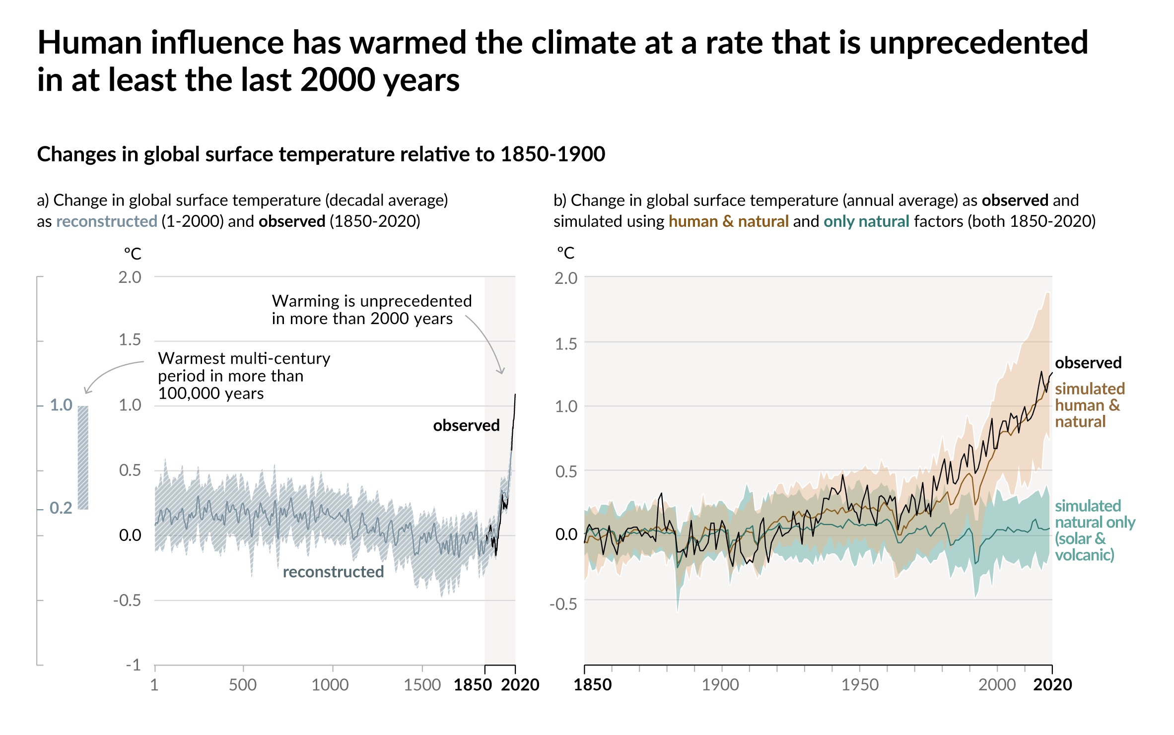
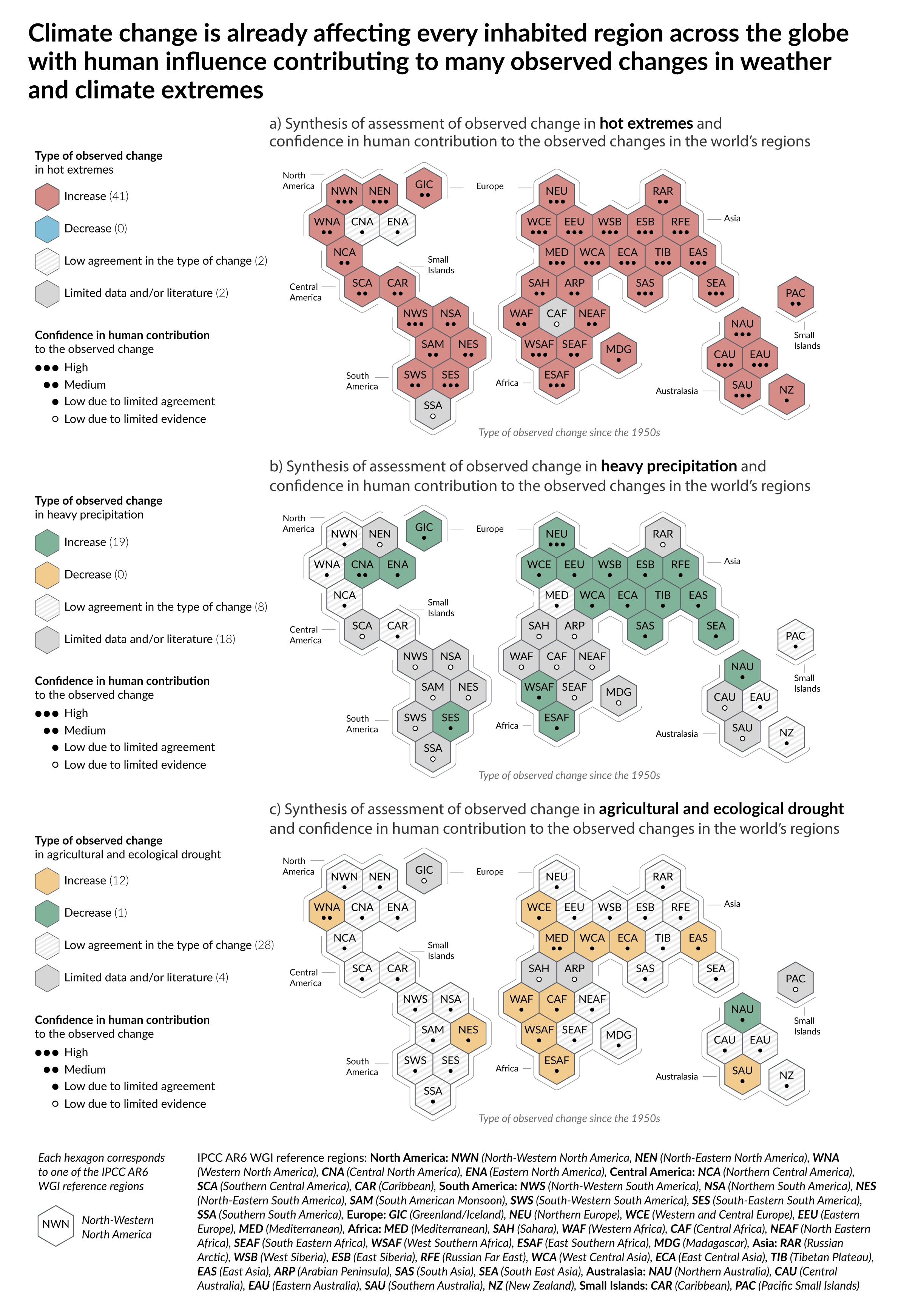
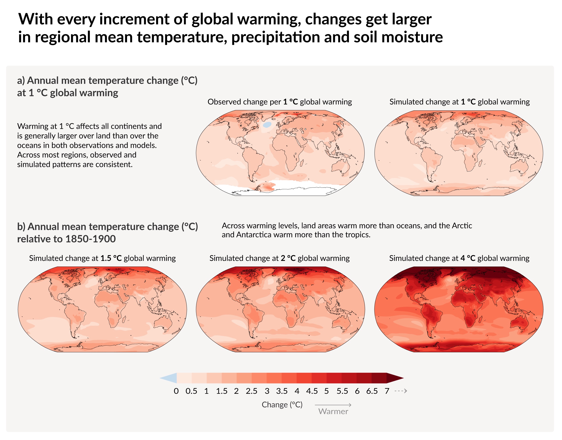
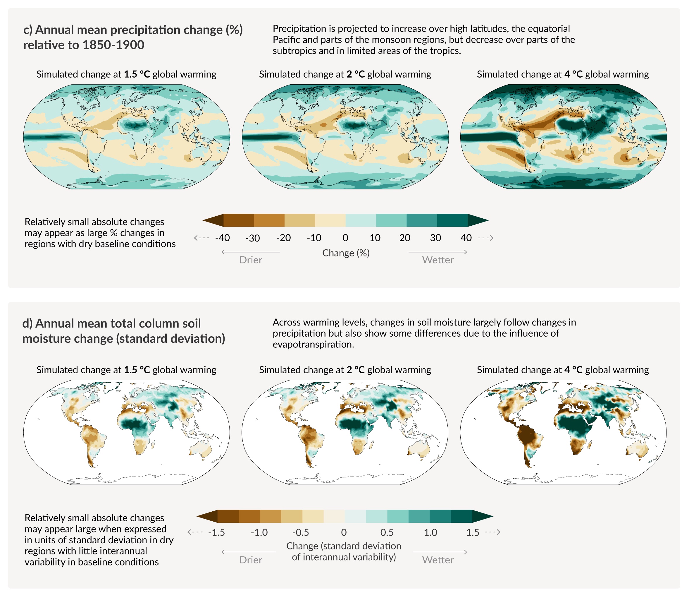
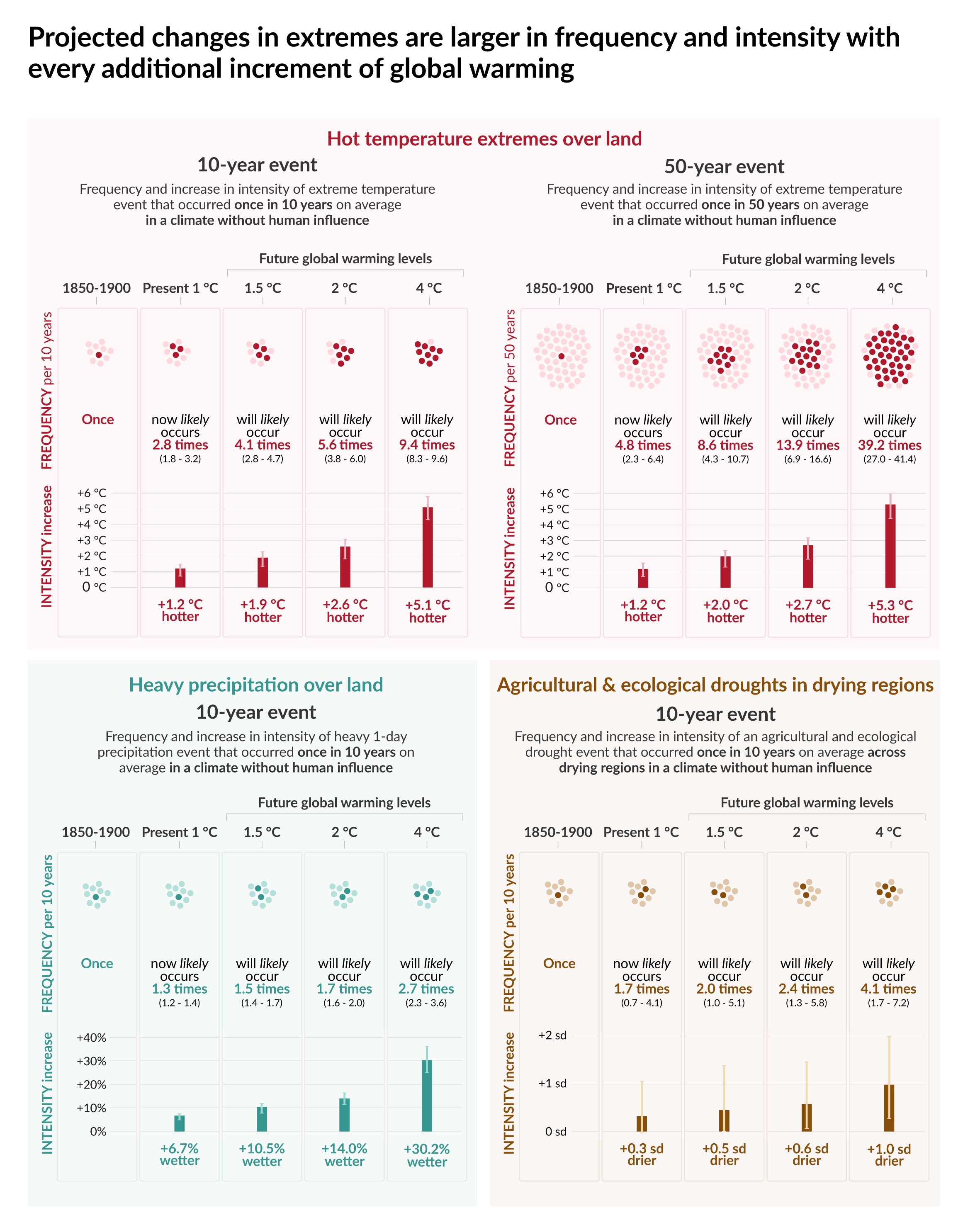
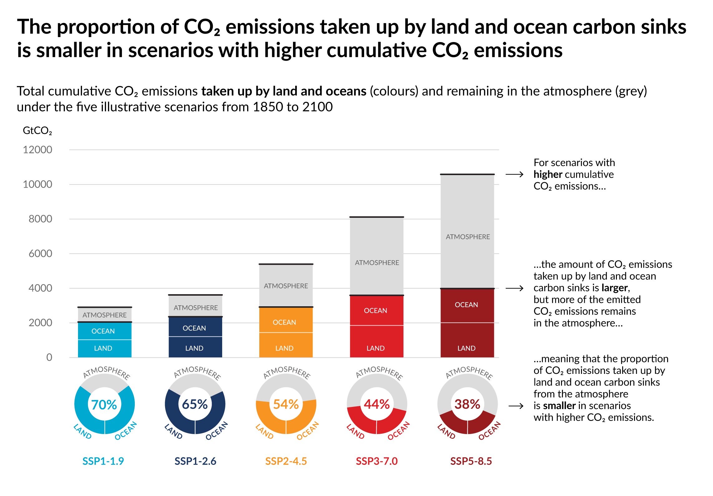
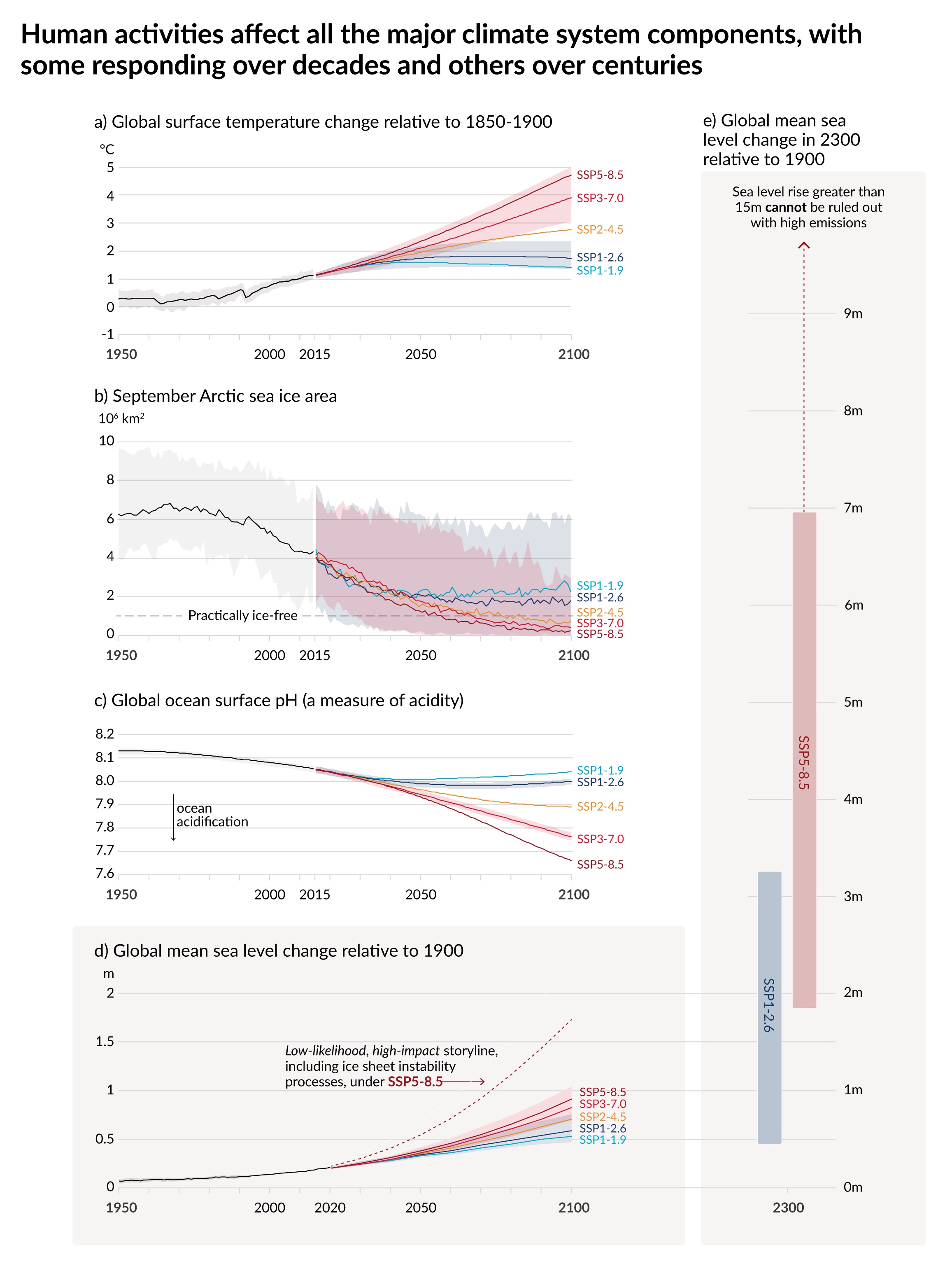
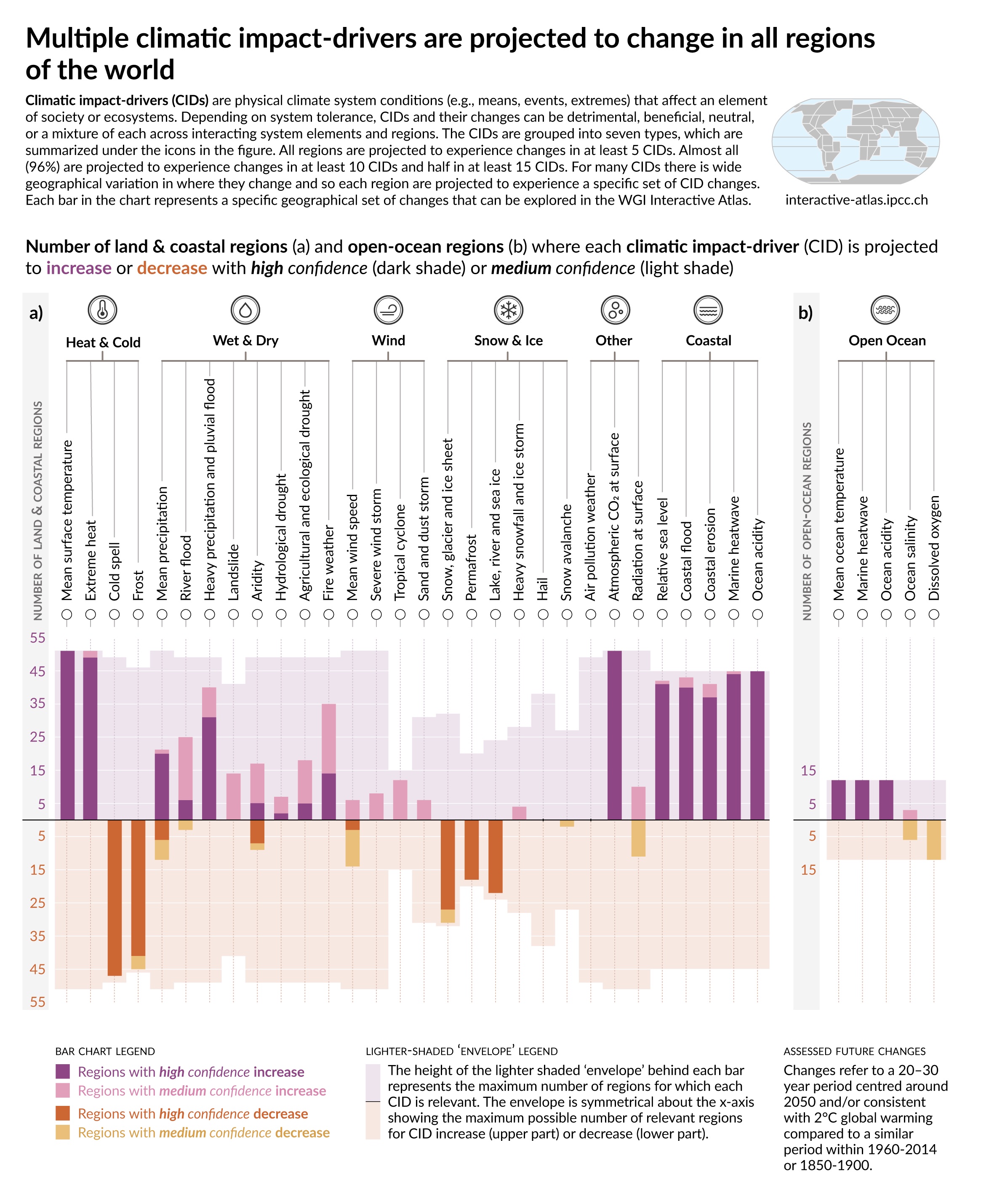
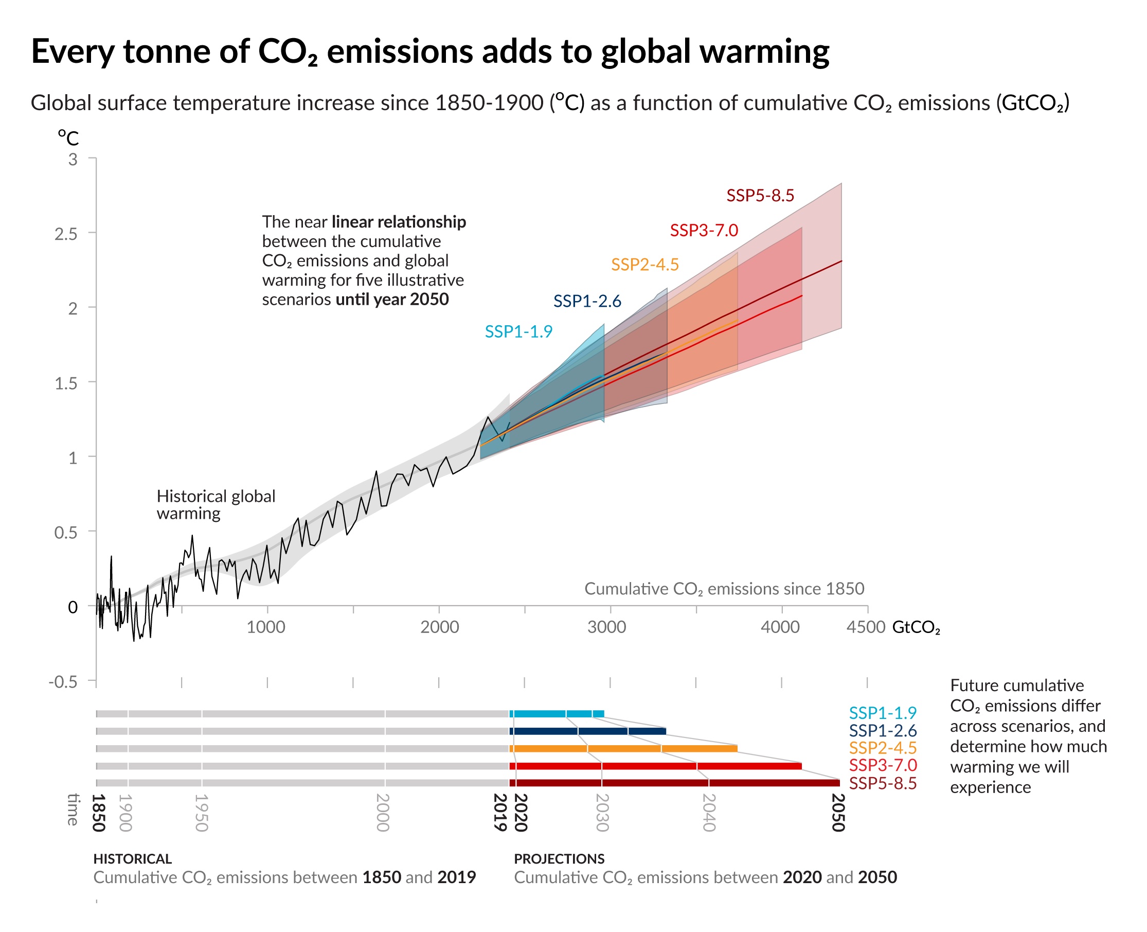
Together they tell a clear story of how and why the climate has changed and the effects already experienced in changes to extreme weather. The various scenarios for the future are described in terms of emissions, projections, the carbon budget and changes to the carbon cycle. Future changes in temperature, rainfall, soil moisture and different types of extremes are also highlighted, along with a broader set of climate impact metrics. One novel aspect is the focus on ‘global warming levels’ as a way of communicating changes, rather than a sole focus on scenarios and time.
Hopefully these graphics will be widely used to communicate the critical messages: there are widespread and rapid changes in climate which are due to human influences. Our choices about future emissions determine how serious the consequences are. The Paris Agreement global temperature limits will be beyond reach without rapid and immediate reductions in greenhouse gas emissions.


Note: SPM.4 has been corrected due to an errata.