Michael Mitchell (1939–2017)

The printer’s mark for Libanus Press, taken from an exemplar (Printer’s Collection Folio 094 LIB)


We were sad to hear that Michael Mitchell, one of England’s most noted fine typographers, passed away last week. Founder of the Libanus Press, Mitchell quickly became a leading typographer, most known for clear, yet aesthetically pleasing publications.

Libanus Press originally began as a letterpress, and it was his skills in typography that Mitchell was most known. After Libanus Press closed their letterpress in 2006, they moved into digital production, specialising in catalogues and informative guides for museums and cultural institutions. This included helping to design the catalogue for the Finzi Book Room at the University of Reading, held by Special Collections.

Mitchell also co-authored two works with Susan Wrightman, Book typography : a designer’s manual (2005) and Typographic style handbook (2017), both works regularly consulted by the University of Reading Typography students.

The battle of the Frogs and Mice, illustrated by Fiona Macvicar ; translated by T. Parnell. (Libanus Press, 1988) Printing Collection Folio 883.1.

The frontispiece of The Symposium of Plato, translated by Tom Griffith; engraved by Peter Forster (Libanus Press: 1986) Printing Collection Folio 888.4

Special Collections also holds copies of Libanus Press’ most noted publications. The Battle of frogs and mice, an ancient Greek parody of The Illiad, is beautifully illustrated by Fiona MacVicar, and allows the reader to spread the pages out.

Another publication, Symposium of Plato = Platōnos Symposion, beautifully presents the Greek and English text, allowing for a clear and concise translation.


We hold a collection of papers related to the Libanus Press as part of our Rowley Atterbury and Westerham Press Papers (MS 5347 C/1/122). This includes various ephemeral items, such as Open Day invitations and prospectuses, specimens, lists, forms, notices, keepsakes, bookplates, including notes written by Mitchell. All of these documents offer valuable insight into publication, and the study of private presses and typography.

An examplar of For Those in Peril, poems by Martin Trowell (1976), with added notes by Michael Mitchell.

An invitation to a Libanus Press Open Day for the 29th of April 1989, showing the everyday workings of the Press.


You can find out more about Mitchell in his obituary in the Guardian or through our information on the Rowley Atterbury Collection.


Sex, Scandals and Censorship: Mirabeau’s Errotika Biblion

Written by Erika Delbecque, Special Collections Librarian

Our copy of Errotika Biblion, part of the Overstone Library.

Inconspicuous amongst the venerable old tomes on the shelves of our rare book store, an unassuming binding contains one of the most infamous texts of the Ancient Regime: Errotika Biblion, Ancient Greek for The Erotic Book, by Honoré-Gabriel Riqueti, Count of Mirabeau. On the occasion of Valentine’s Day, we explore the scandalous love affairs, forbidden passions and relentless prosecution that are intertwined with its publication history.

Honoré-Gabriel Riqueti (1749-1791) was a famous French statesman who played a key role in the early stages of the French Revolution. He was equally well-known for numerous scandals, several of which landed him in prison. When he joined the French cavalry regiment aged 18, he had an affair with the love interest of a superior, which resulted in his first imprisonment. After he was released, he joined the French mission to Corsica as a volunteer, where he had another scandalous affair. In 1772 he married the rich heiress Marie-Marquerite-Emilie de Covet, allegedly under controversial circumstances. She was already engaged to someone else and had rejected him several times, so he devised a treacherous plan to win her hand. He is said to have bribed one of her maids to let him into the room next to hers, and appeared on the shared balcony in the morning in his underclothes, chatting to passers-by. Her furious father realised his daughter’s reputation was at risk and arranged for the marriage to take place within days.

The Chateau de Vincennes, where Mirabeau was imprisoned when he wrote Errotika Biblion (photograph by Daniel Kakiuthi)

Mirabeau was imprisoned again in 1775 for taking part in a violent brawl. Whilst he was there, he obtained permission to visit the nearby town of Joux, which is where he met Marie Thérèse de Monnier, known as ‘Sophie’, who was also married at the time. The couple escaped to the Low Countries, and Mirabeau was sentenced to death for seduction and abduction. He was captured in 1777 and imprisoned in the Chateau de Vincennes in Paris, where he would remain until his release in 1780. To pass the time, he became a prolific writer. He wrote a series of erotic letters to Marie Thérèse, which he published under a pseudonym as Les Lettres à Sophie:

Are you sometimes happy, O dearly beloved? Do you in your dreams seem to realise all that my love means to you? Do you feel my kisses on your lips, do you press your own to mine in an abandonment of tenderness? [1]

The table of contents page of Errotika Biblion

It was during his imprisonment at Vincennes that he also wrote the Errotika Biblion. It is a peculiar work. Organised by different sexual practices and perversions into eleven chapters, including topics such as bestiality (‘Béhéma’), female homosexuality (‘L’Anandryne’) and nymphomania (‘La Linguanmanie’), it purports to offer a history of human sexual behaviour. Mirabeau draws on quotes from the Bible and ancient sources to provide historical examples of each sexual practice, and attacks the corruption of the clergy and the aristocracy in the process.

Fully aware of the outrage that his work would cause, Mirabeau published the book anonymously under a false imprint: although it was in fact printed in Switzerland by François Mallet, a bookseller who would later be arrested for publishing this work, the title page states it was printed ‘in Rome, at the Vatican Printing House’. This deliberate attempt to provoke the clerical authorities did not go unnoticed. The work was immediately banned by the Ancient Regime, and its publishers and booksellers were ardently prosecuted. It was destroyed on such a large scale, that only fourteen copies of the first edition are said to have survived.

The title page of Errotika biblion with the false imprint

However, all these efforts could not stop the text from circulating widely and achieving a notorious status. In 1783, the same year in which it was published, a pirated edition appeared on the market. A second official edition was printed in 1792, after which the book was included in the Index Librorum Prohibitorum, the list of books that were forbidden by the Roman Catholic Church. Although the work remained banned until the mid-nineteenth century, it was never out of print.

Given the amount of censorship it attracted, Mirabeau would undoubtedly be surprised to know that his infamous book is now freely available to all. Digitised copies from the Bibliothèque nationale de France and Ohio State University can be consulted online through, respectively,Gallica and the Haiti Trust website. Anyone who wishes to view our copy is welcome to contact us to make an appointment to view it in our reading room.

References

[1]  Mirabeau, Honoré-Gabriel de Riquetti. Mirabeau’s love-letters. London: A.L. Humphreys, 1909. Available at: <https://archive.org/details/mirabeauslovelet00miraiala>.

New Exhibition: The John and Griselda Lewis Printing Collection

The John and Griselda Lewis Printing Collection consists of over 20,000 examples of printed documents covering several centuries and a wide variety of research subjects –from Fifteenth Century religious texts, Nineteenth Century love tokens to Twentieth Century book design. It complements other important printing and publishing collections held at the University’s Special Collections Service and the Department of Typography and Graphic Communication. A selection of favourite items from the collection is currently on display here at the Museum of English Rural Life.

A page from a journal article, decorated with red flowers.

An Illustration from Le Journal de la Decoration c.1906 (JGL 23 23)

John Lewis and His Chance Find

John Lewis spent many years as a lecturer in graphic design at the Royal College of Art, and wrote several publications on printing and book design. His 1962 publication Printed Ephemera: The Changing Uses of Type and Letterforms in English and American Printing is considered pivotal in giving credence to the notion of paper ephemera as a subject for academic study.

His interest in ephemera began as a young man. Lewis started his career as a printer for the firm of Cowells in Ipswich. While working here in the mid-1950s Lewis found a large scrapbook in a secondhand bookshop. The book contained an assortment of printed matter including printer’s marks, specimens of typefaces, tradesman’s bills and public notices. The scrapbook had been compiled in the 1820s by a Dr Lodge, at one time the librarian of the University of Cambridge. The exact purpose of the scrapbook remains a mystery, but John Lewis was compelled to purchase the book and study its contents. This original volume, which he later dissembled, formed the starting point of Lewis’s fascination with paper ephemera. In his collecting he was joined by his wife, the noted ceramicist Griselda Lewis. They believed that such temporary documents contain a wealth of evidence of everyday life in the past, as well as charting the development of printing techniques in the UK.

Wolpe and Weinreb

In addition to John and Griselda’s original collection, a proportion of the archive was originally collected by the typographer and illustrator Berthold Wolpe, a fellow lecturer at the Royal College of Art. The collection was further added to by Ben Weinreb, a London-based dealer in rare books who purchased the collection sometime around 1990. What survives today is an amalgamation of the collecting interests of these various parties. The result is a rare and diverse collection of printed ephemera incorporating early printing specimens, newspaper advertisements, street literature, book covers and trade cards, plus specimens of calligraphy, lithography and fine art printing. As such, material in this collection can support the research of many aspects of social history, as well as students of graphic design and the visual arts.

A black and white magazine cover of a woman, with the words Wendingen on the cover.

Cover from a 1924 edition of Wendingen magazine of art and architecture (JGL 29-4 -15)

During his ownership of the collection, Weinreb arranged the documents into various categories. Roughly the first half of the collection is organised by document type. These include Early Manuscripts and Printed Books, Prospectuses, and Trade Cards, Letterheads and Catalogues. Much of the latter half is arranged by themes, such as Religion, Maritime, Agriculture, and so on, each of which contain a broad mixture of documents. The majority of documents were glued and mounted onto around 1,900 light cardboard sheets, presumably as an aid to displaying and discussing the collection.


 Our Project

The collection is now fully catalogued, and is to be made available via our online catalogue. Each cardboard sheet has been digitally photographed. In addition, we are mid-way through a programme of conservation, as the glues used to mount the documents are harmful to their long term preservation. Documents are being carefully removed from their mounts and placed in archive-quality folders. This not only creates a better preservation environment, but also makes them easier for visitors to access in our reading room. In the short term parts of the collection are unavailable to researchers, but archive staff can advise enquirers as to specifics of availability.

The John and Griselda Lewis Printing Collection is being celebrated with an exhibition here at our Special Collections Service, housed at the Museum of English Rural Life. This exhibition showcases a range of attractive and unusual documents from the collection, and runs until Sunday 11th February.

Image of the Exhibition space.

A snapshot of our John and Griselda Lewis Exhibition.

Finding one of the oldest examples of printing in Britain: the story of the Caxton leaf

Written by Erika Delbecque, UMASCS Librarian, as part of the 2017 Being Human festival: Lost and Found.

The leaf on my desk was stained, torn in places, and fairly unremarkable. Unlike other loose leaves from the fifteenth century that I had been working on, which mostly contained standard texts that circulated widely at the time, the text proved difficult to identify. My secondary school Latin enabled me to, slowly, make some sense of the heavily abbreviated lines.

I read sentences such as

Feria iij. de sancto Augustino. et memoria sub silencio. de martiribus et de trinitate

On the third weekday, [hold a service] about Saint Augustine. And a remembrance in silence of the saints and the Trinity.

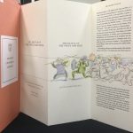
The Caxton leaf that was discovered at the University of Reading (detail)

It became clear that this was a page from a practical book aimed at clergy: an ordinal. Research into the publication history of this type of book led me to a version of the ordinal written by Clement Maydeston, a medieval priest from Middlesex. His text became the standard ordinal in the late fifteenth century.

However, the font and the layout of the text on the leaf did not match any known editions of Maydeston’s work. By chance, I read that an earlier version of the ordinal had been printed by William Caxton in 1477, which survived only in two fragments of eight damaged pages each. These had been discovered in the binding of a book in the library of the Grammar School at St Albans in 1858. Describing the pages, William Blades, the scholar who made the discovery, noted:

The lines are not spaced out to one length. A full page has 22 lines (cited in Wordsworth 1894)

The Caxton leaf that was discovered at the University of Reading

Sure enough, the leaf in my hands had 22 lines, which were not spaced out to one length. Could it be…? The surviving fragments that Blades had discovered, which are now kept at the British Library, are available digitally through Early English Books Online.

The font matched. The layout matched. The page measurements matched.

The unassuming leaf that had been in our collections for almost twenty years turned out to be a unique survivor from a long lost William Caxton book.

Late hym come to Westmonester

Having learned how to print in the Low Countries, Caxton arrived in London to set up the first British printing press about a year before this ordinal was printed. He was a shrewd businessman, seeking out texts to print that would appeal to a large audience. An ordinal would have been a safe bet in Catholic Britain: there was a steady demand for liturgical handbooks from the clergy.

To advertise his ordinal, Caxton printed notices that were pasted on walls and doors in London, in which he urged customers to head to his shop in Westminster to buy the book because it is “wel and truly correct” and “good chepe”. Incidentally, it is oldest surviving printed advertisement in the English language.

Advertisement for Sarum Pie [‘Ordinale ad usum Sarum’] ([Westminster: William Caxton, c.1476-7]) ©Bodleian Libraries

A perilous journey

What happened between the time when the freshly printed leaf left Caxton’s presses and the moment it was discovered in our collections over 500 years later? The leaf contains clues that offer tantalising glimpses into the journey it made before it ended up on our shelves.

Detail of the Caxton leaf showing the red paraph marks

The first of these are the red marks on the page, so-called “paraph marks” which indicate the start of new sections. Unlike the letters on the page these were not printed, but added by hand. Books from the fifteenth century were modelled on medieval manuscripts, and specialised scribes called “rubricators” would add page numbers and paraph marks in coloured ink. Although it was common for customers to take their printed book to a rubricator themselves, evidence from surviving books printed by Caxton suggests that he employed in-house rubricators in his workshop (Tokunaga, 2012). Their work would have turned our book into a finished product, ready to be sold in Caxton’s shop at the “almonesrye  at the reed pale” in Westminster.

Detail of the Caxton leaf showing the offsets from a leather binding

At some point in the following centuries, its fortunes changed. The Reformation, which raged across Britain and the rest of Europe in the sixteenth century, eliminated the need for Catholic ordinals. Dark offsets from leather towards the edges of the leaf hint at what happened next: the leaf was folded and used to reinforce the cover of a later book. Rather than wasting new paper, which was a relatively expensive commodity at the time, bookbinders often recycled leaves from earlier documents for this purpose. So, we largely owe the survival of the Caxton leaf to the thriftiness of these craftsmen!

Portrait of William Caxton from a proof illustration to John Johnson’s ‘Typographia or the Printers Instructor’. 1824 ©British Museum

What happened next is shrouded in mystery. At one point, someone must have taken the leaf out of the binding, although it is unlikely that they realised its significance. The leaf may have changed hands several times, until the late typographer John Lewis purchased it as part of a collection of loose early printed leaves in the 1950s. Lewis suggests that these leaves may have slumbered in bindings of rare books at Cambridge University Library, until they were removed by a diligent sticky-fingered librarian:

A dozen years or so ago, I bought from a bookseller in Ipswich, Suffolk, an album compiled about the year 1820 by a Dr Lodge, sometime librarian to the University Library at Cambridge. […] As librarian to a great library, Dr Lodge’s opportunities for collecting pages from damaged books and packings from broken bindings were extensive (1990, pp. 9-10).

In this way, unbeknown to Lewis himself, a unique Caxton leaf made its way into his collection of historical examples of printing and graphic design. In 1997, this collection was purchased by the University of Reading, where it would sit on the shelves awaiting detailed cataloguing for the next twenty years.

Libraries within libraries

We will probably never know what detours and stops our Caxton leaf made on its five-century long journey from London to Reading via Cambridge and Ipswich. When I identified the leaf as an early example of Caxton’s printing, I realised that what I held in my hands was a unique witness of the introduction of what is perhaps the most significant invention of the modern age. This small, humble leaf has now assumed its rightful place amongst the treasures of our collection. Who knows what other treasures are lurking hidden in bindings on library shelves, libraries within libraries waiting to be discovered?

References

Lewis, John 1990, Printed Ephemera. 2nd ed, Woodbridge: Antique collectors’ club.

Wordsworth, Christopher (ed.) 1894, The Tracts of Clement Maydeston: With the Remains of Caxton’s Ordinale, London: Harrison and Sons, 1894.

Tokunaga, Satako 2012, Rubrication in Caxton’s early English books, c.1476–1478. Transactions of the Cambridge Bibliographical Society, 15.1 59-78.

Archive Animals- Ducks

Written by Bethan Davies, Trainee Liaison Librarian. 

After a special visit from our friend Hodor from Reading University Library, we decided to take a deeper look at our duck related objects in our collection. Along the way, we found several literary pseudonyms, famous works set to music, and a very famous Beatrix Potter creation…


Image of title page of book with illustrations of wild poultry.

The title page of Book of Domestic Poultry (Reserve 636.5) with illustration of wild poultry.

The Illustrated Book of Domestic Poultry, ed. Martin Doyle

Published in 1854, The Illustrated Book of Domestic Poultry includes stunning oil colour prints of a range of domestic fowl, and includes detailed information on breeding and rearing individual species. The named editor “Martin Doyle” is actually the pseudonym for the Irish writer and philanthropist Rev. William Hickey. Hickey was concerned with the state of the poor Irish farmer and wrote several tracts relating practical advice on husbandry and agricultural methods.

The illustrations from this title were drawn from nature by Charles Havey Wighall (1794 – 1877), a landscape and portrait painter. Wighall also wrote several guides to painting and drawing, including the apt Guide to Animal Drawing (1862).


Ploof the Wild Duck, by Lida

Cover of children's book with image of a duck.

Ploof the Wild Duck (Children’s Collection F. 598 LID.

Taken from our Children’s Collection, Ploof the Wild Duck (1938) follows the titular duckling as he grows up alongside his seven siblings, exploring the lake and hiding from predators along the way. The book is actually a translation of the French original (previously titled “Plouf, canard sauvage”). It is part of the  Pere Castor’s Wild Animal Books series. Pere Castor (real name  Paul Faucher), was an influential educator, who used his new publishing business to create a series of educational works for children. For Castor, images were particuarly important in ensuring children remembered the information they were being given. Thus Castor’s books stood out from other children’s books at the time for having high quality designs and illustrations. The illustrations in Ploof are drawn by the Russian illustrator Feodor Rojankovsky (Rojan), a respected children’s illustrator who worked with Castor on several works, before moving to America.

Sheet of music.

Up Tails, All! appears in the Cramer’s Library series, as part of the Finzi Music Reserve Collection 780.81 SHA 4.31


Up Tails, All! (The Duck’s Ditty), Martin Shaw & Kenneth Grahame

In the children’s classic The Wind in the Willows, Ratty, sitting by the river, makes up a “ditty” about his

friends the ducks. The poem was later put to words by the composer Martin Shaw, in “Up Tails, All! (The Duck’s Ditty)”. Shaw who helped to edit The Oxford Book of Carols, was noted for his commitment to the English church and “Englishness” in general. The song was especially popular with school children, with the children being told to “wag their fingers” along to the beat!


Front cover of small book with image of a duck.

Our first edition copy of Jemima Puddle Duck (Children’s Collection 823.9.

The Tale of Jemima Puddle Duck, by Beatrix Potter

Possibly the most recognisable of the duck related works in our collection, (and this blog writer’s personal favourite), The Tale of Jemima Puddle Duck is one of the most popular of Beatrix Potter’s works. The tale follows a similar narrative to Little Red Riding Hood and other fairytales, as the naive protagonist is led into danger. The tale is also notable for showcasing Potter’s realistic portrayal  of life and death on the farm. Our original first edition copy is part of our larger series of the Tales of Beatrix Potter.


If you want to follow Hodor in viewing these books, you can find them through our Library Catalogue, or contact us directly via phone or email!


References

Bromley, H. (2001). Tale of Jemima Puddle Duck, the (1908). In V. Watson (Ed.), The Cambridge guide to children’s books in English. [Online]. Cambridge: Cambridge University Press.

“Charles Harvey Weigall”, 2017. National Galleries Scotland. [Online] Available at:  https://www.nationalgalleries.org/art-and-artists/artists/charles-harvey-weigall

Goodwin, G. ‘Hickey, William (1787–1875)’, rev. Anne Pimlott Baker, Oxford Dictionary of National Biography, Oxford University Press, 2004; online edn, Oct 2009 [http://www.oxforddnb.com/view/article/13209, accessed 18 Oct 2017]

Lallement-Renonciat, Annie. “Castor, Père.” In The Oxford Encyclopedia of Children’s Literature. : Oxford University Press, 2006.

“Music suitable for Schools.” (1928). The School Music Review : A Monthly Periodical Devoted to the Interest of Music in Schools, 37(436), 140-141.

Nières-Chevrel, I.(2006). Rojankovsky, Feodor. In The Oxford Encyclopedia of Children’s Literature. : Oxford University Press.


Studwell, W.E. & Jones, D. (1998) “Martin Shaw”, Music Reference Services Quarterly, 6:4, 67-69, DOI: 10.1300/J116v06n04_15

New exhibition: From Italy to Britain: Winckelmann and the spread of neoclassical taste

Illustration of a Herculanean dancer. From: Ottavio Baiardi. The antiquities of Herculaneum. London: S. Leacroft, 1773.

Although Johann Joachim Winckelmann may not be a household name today, his influence on British art, design, and architecture was profound. Our new exhibition, ‘From Italy to Britain: Winckelmann and the spread of neoclassical taste’, tells the story of his contribution to the revival of classical arts and culture in Britain in the 18th and 19th centuries. In this post, Professor Amy Smith, one of the exhibition curators, explains how Winckelmann’s discoveries in Italy influenced and inspired generations of British artists, craftsmen and architects.

Like many antiquarians of his day, Johann Joachim Winckelmann (1717–1768) first learned about the Classics through immersion in literature. As a teacher then librarian in his native Germany, Winckelmann encountered the ancient world primarily through literary texts, as well as the souvenirs—coins, gems and figurines—Grand Tourists and other travellers had brought north from their visits to Italy. Once he arrived in Rome, where he rose to prominence at Prefect of Antiquities in the Vatican, Winckelmann studied the remains of Greek, Graeco-Roman and Roman art on a larger scale. Through personal contacts, letters and other writings, Winckelmann influenced his and subsequent generations of scholars, aesthetes, collectors, craftsmen and artists both within and beyond Italy.

The judgment of Paris. From: John Flaxman. The Iliad of Homer. London: Longman, 1805.

Winckelmann’s influence came to Britain through decorative designs in country houses that copied the style of wall paintings found in the excavations at Pompeii and Herculaneum, on which he had reported. His influence is also visible in John Flaxman’s adaptations of classical and neoclassical images in drawings that illustrated the works of Homer and reliefs that decorate Josiah Wedgwood’s jasperware.

Winckelmann’s writings also encouraged an interest in Greek architecture and architectural sculpture, which was copied and adapted, for example, in Oxford’s Radcliffe Observatory. The upper story of this remarkable building, designed by Henry Keene in 1772 and completed by James Wyatt in 1794, copies Athens’ octagonal Tower of the Winds, with reliefs that emulate Wedgwood’s jasperware friezes.

The Tower of the Winds. From: James Stuart and Nicholas Revett. The antiquities of Athens. London: Haberkorn, 1762-94.

In the next generation architects continued to incorporate Hellenising elements into monuments such as Reading’s Simeon Monument (designed by Sir John Soane in 1804) and Oxford’s Ashmolean Museum (designed by Charles Robert Cockerell in 1845). The latter incorporates casts of the original friezes for the Temple of Apollo Epikourios at Bassae, the originals of which were found by Cockerell and acquired by the British Museum. Knowledge of Greek architectural reliefs in the British Museum was disseminated on a smaller scale through engravings and miniature casts designed, manufactured and sold by John Henning (1771–1851).

The exhibition at Special Collections, From Italy to Britain: Winckelmann and the spread of neoclassical taste, displays some of Winckelmann’s letters, 18th–19th century printed volumes and drawings and relevant artefacts, ancient and modern, that illustrate Winckelmann’s broad influence. The exhibition, a collaboration of University of Reading’s Ure Museum of Greek Archaeology (www.reading.ac.uk/ure) with Special Collections, runs from 15 September through 15 December 2017.

For information on opening hours and how to find us, please see our website.

All images © University of Reading Special Collections

#ReadaBookDay – Our top suggestions!

In celebration of #ReadABookDay, members of staff at The MERL and Special Collections have been sharing their favourite books from within our collection on Twitter. This blog post looks in a bit more depth at our selections (beyond the 140 character limit).

David’s Choice- The Eagle Annual (1950)

David’s selection is from our Children’s Collection, which includes a significant run of the Eagle comics

David with the 1950 Annual of the Eagle. (CHILDREN’S COLLECTION–052)

and three annuals. Created in 1950, Eagle comics were created by Marcus Morris, an Anglican vicar who was disillusioned with children’s literature at the time. The comics ran from 1950 to 1969, and included the iconic character Dan Dare, iconic pilot of the future. The comic holds nostalgic value for many readers, including David, who can remember rereading old copies of Eagle when he was a young boy.


Erika’s Choice- Sallust’s Coniuratio Catilinae et Bellum Iugurthinum (1569)

Erika’s choice of Sallust, including marginalia. (RESERVE–878.2)

Translated into The Conspiracy of Catiline and Jugurthine War, Erika’s choice comes from one of the earliest Roman historians. This particular copy was printed in the late 15th century by Aldus Manutius, an influential figure in early Venetian printing.  The reason Erika chose this book, however, is because it includes a large number of drawings and doodles within the margins. The study of marginalia within books has become an important aspect of reception studies and book history, and provides an insight into the character of historical readers.


Claire’s Choice- The history of a Banbury cake (1835?) 

Another look into our Children’s Collection now, which comprises over 6,000 books and journals written

Claire’s Choice- a talking Banbury cake on a journey to Bristol. (CHILDREN’S COLLECTION–828.7-HIS)

for children. Although the collection mainly covers the 19th and early 20th century. Claire’s choice,

however, is one of the 900 works which are pre-1851. Titled The history of a Banbury Cake: an entertaining book for children, the book is based around a talking Banbury cake, and it’s subsequent adventures from Oxford to Bristol. You can find more about Banbury from our previous blog here, alongside a further look at cakes within the Special Collections. 


Bethan’s Choice- The girlhood of Shakespeare’s heroines (1884)

Bethan’s choice- The girlhood of Shakespeare’s heroines. (RESERVE–822.33-CLA)

Bethan is one of our newest recruits to Special Collections, but she has already picked out a possible favourite- The girlhood of Shakespeare’s heroines by Mary Cowden Clarke. Clarke was often a partner with her husband Charles Clarke in various Shakespearean studies (Marshall & Thompson 2011). The girlhood of Shakespeare’s heroines was previously maligned by critics as supposedly focusing upon Shakespeare’s female characters as actual people, rather than literary creations. However, more recent research has shown Clarke’s writings to be more subversive and feminist then previously thought (Brown 2005). A previous English Literature student, Bethan  liked the focus on Shakespeare’s female characters, and the illustrations included throughout the book.


If you’re interested in any of the items mentioned here, please feel free to contact us for more information! We hope we’ve inspired you to pick out your favourite books.


References

Brown, S. A. (2005) “The Prequel as Palinode: Mary Cowden Clarke’s Girlhood of Shakespeare’s Heroines,” in Holland, P. (ed.) Shakespeare Survey. Cambridge: Cambridge University Press (Shakespeare Survey), pp. 95–106.

Marshall, Gail, & Thompson, Ann (2011) ‘Mary Cowden Clarke’, in Gail Marshall (ed.), Great Shakespeareans volume 7. 


Ladybird: Art from the Auction House

Clare Plascow (Collections Officer) describes her exciting auction experience, a rare opportunity to see examples of John Berry’s work for Ladybird during MERL’s extended hours tonight… and her love for kippers… 

I like the word kippers. This might seem like a little bit of odd revelation to have come to on a relatively warm day in August, but I think it’s justified having looked through the latest arrival of artwork.

All laid out ready to be checked over

To explain this rather unusual statement, I’ll have to take you back a few months to April. Walking past a colleague’s office, I was hailed with query:

Did you want to go to an auction?

It rapidly transpired that this auction was the next day in Yorkshire, but I was intrigued as it would be the first of two which would include artwork by Ladybird artist John Berry.

Ladybird books with illustrations by John Berry

The University of Reading’s Special Collection Services holds the Ladybird Archive on behalf of publisher Penguin Random House. Containing approximately 20,000 illustrations in 740 boxes and with the first permanent gallery dedicated to the subject, you’d be mistaken for thinking the University has every illustration by Ladybird within its stores. The truth is there are a few gaps in the collection with some artists retaining the majority, if not all of their work. John Berry was one of them.

Some of the artwork which was already at the University

Berry was employed by Ladybird Books Ltd from 1961 to 1978. Previously a war artist, his first illustrations with Ladybird made their way into The Ladybird Book of London. There a sense of his whimsical humour can be found with the addition of his own Ford estate car directly in front of the Bank of England.

The Bank of England and Berry’s car

Bigger projects soon beckoned with Berry made responsible for creating artworks for the entire People at Work series. Made up of twenty titles, this series generated a glimpse into the pre-digital age employment of the 1960s and early 1970s. Drawing from a combination of photographic reference material and real life, Berry was able to capture day-to-day working life across a broad range of occupations.

It is in this popular series that the aforementioned kippers make their appearance. Written by husband and wife team, Ina and John Havenhand in 1963, The Fisherman was the fourth book in the People at Work series. Designed “to give interesting and accurate information about the Fishing Industry” the hardback volume included the differences between various boats and nets, along with a mention of the variety of ways herrings can be eaten; whether fresh, canned, or smoked.

A clarification: kippers are basically smoked herrings.

Precariously balanced using the edges of the kiln, the man in this illustration is adding herrings to the lines hung across his smoking oven. Depicted in various shades of pink and brown the image could be seen as monotonous, however it’s a testament to Berry’s artistic skill that a sense of intrigue and drama can be found. Looking from below it’s impossible for the viewer to tell how many kippers are being smoked or just how high he has climbed…

For a closer look at these new artworks come along to the extended opening hours of Museum of English Rural Life, this evening from 5pm – 9pm.

Recently Acquired Ladybird Artwork- Extended Hours Exhibition

Don’t miss this special opportunity to view our recently acquired additions to our Ladybird Archive!

Thanks to our partnership with Ladybird Books Ltd, Special Collections will be displaying a total of 59 original illustrations by

Ladybird exhibit

A view of the Exhibition within the MERL (photo courtesy of A. Koszary).

the artist John Berry. The artwork will be displayed within the University’s Museum of English Rural Life (The MERL), during extended opening hours on the 31st of August 2017.

Artist John Berry (1920-2009), provided illustrations for 35 books for Ladybird during the 1960s and 70s. Notably, the acquisitions include examples from the “People at Work” series, showing illustrations of the miner, the soldier, the sailor, the airman, the fisherman, the shipbuilders, and the life-boat men. Examples from Learning to Ride, the Public Services series (water, gas, electricity) and Come to Holland were also purchased.

For millions of children, Berry’s illustrations would have served as an early introduction to the world of work; today they provide a glimpse into how roles and careers were viewed at the time. A talented realist painter, Berry served as a war artist before becoming a high-profile portrait painter, as well as undertaking work for advertisers, such as the famous Esso tiger.

Guy Baxter, Head of Archive Services at the University of Reading, said: “We are tremendously proud to have been the home of the Ladybird Archive for over 15 years. Thanks to generous funding and support from Ladybird Books Ltd, we have been able to ensure that a very strong representative sample of John Berry’s work for Ladybird has been secured. This will greatly enhance our ever-changing displays in the Ladybird Gallery, and bring enjoyment to many future generations.”

Our exciting new exhibitions will be on display from 5-9pm tomorrow evening, as part of our monthly extended opening hours. Entry into the MERL, and the Ladybird Gallery, is free.

Brian Aldiss (1925-2017)

Brian Aldiss Collection in the Special Collections store

We were sad to hear that Brian Aldiss (born 1925), one of Britain’s most notable writers of science fiction, passed away earlier this week.  Author of the Helliconia trilogy, one of Aldiss’ short stories inspired the 2001 film AI: Artificial Intelligence.  

Frankenstein unbound by Brian W. Aldiss [RESERVE–823.914-ALD]

Bury my heart at W.H. Smith’s: a writing life by Brian Aldiss. [ W.H. SMITH COLLECTION–010]


In 2000 Aldiss received an honorary degree from the University of Reading.  We hold a selection of his papers including notebooks for works such as Helliconia, typescripts of Aldiss’ autobiography Bury my heart at WH Smith’s and other works, articles and books by and about Aldiss, interviews and other papers.

You can read a full obituary on the Guardian website or find out more about our Brian Aldiss Collection.