ICON print identification course

ICON print identification course

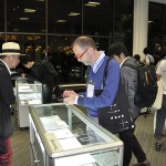
This week we were pleased to welcome members of the Institute of Conservation, for whom we ran a hands-on print identification course. To find out more about our short courses, including next week’s poster workshop in conjunction with the V&A and the Arts Council England Subject Specialist Network (Wednesday 24 April), contact Diane Bilbey (d.j.bilbey@reading.ac.uk)

We run regular two-day short courses explaining printing ­processes, specially tailored to the needs of librarians, archivists, ­curators, and social historians. Led by Martin Andrews, each day focuses on one of the three main processes – letterpress, lithography, and intaglio – and participants are able to examine original printing materials and prints from the Department’s extensive collections, and try out tools, materials, and techniques in hands-on sessions. By the end of the course you will be able to indentify a wide range of printing procesess, take prints yourself, and use the replica Gutenberg press featured in Stephen Fry’s ­television documentary.

¶ For more information on the Posters SSN, contact Catherine Flood (c.flood@vam.ac.uk) at the V&A

Students and industry (2)

Existing OUP designs


This week saw the launch of an exciting new project for Part 2 students in collaboration with Oxford University Press. OUP Education Division’s head of schools design Kate Kunac-Tabinor and designer Fiona MacColl have provided realistic briefs for innovative new covers for Keystage 3 textbooks in Science, English, and French, and they explained the design commissioning process to students on the Editorial Design module as part of the project launch. They’ll be returning to Reading at the end of term to see the results …

Steen Ejlers on the Danish lettering tradition

Steen Ejlers 2009Danish architect and graphic designer Steen Ejlers wil be talking in the Department on Monday 25 February at 10am about the Danish lettering tradition of the 20th century.

Steen Ejlers is associate professor at the Institute of Design & Communication at the Royal Danish Academy of Fine Arts. His current research project ‘Danish Font Design of the 20th Century’ is a culmination of many years of historical interest in type design, and he has published books on Claus Achton Friis, Gunnar Biilmann Petersen, and Ib Andersen.

Reading at the ICA

ICA The MallReading’s new partnership with the ICA was launched tonight, as Typography and Art began a collaboration that will provide a London venue for both departments for teaching and public events, drawing on Reading’s strengths in both disciplines and on the ICA’s ability to connect with a young, vibrant audience. The launch event was preceded by workshop sessions in the ICA’s studio space for MA Book Design and BA students, run by John Morgan and Ruth Blacksell. Watch this space for more news.

ICA_Reading_2

ICA_Reading_3

Celebrating Ken Garland

ken

Designer, teacher, author, and photographer Ken Garland is celebrated in the current issue of Creative Review. Ken has been associated with the Department since its inception in the 1960s, and generations of students were inspired by his provocative teaching – learning how to think about the ‘why’ of design as well as the ‘how’.

Ken will talk at St Bride on Tuesday 12 February, followed by a panel discussion in which some of Ken’s Reading students – Anne Odling-Smee, Fraser Muggeridge – will take part in a panel discussion chaired by author Adrian Shaughnessy

Ken Garland: Structure and Substance 

Photograph of Ken Garland by Liam Lewis


Reading graduate is ‘Penguin’s brightest star’

Penguin’s brightest star is not an author but illustrator (and Reading Typography graduate) Coralie Bickford-Smith, according to AbeBooks. The AbeBooks site features an interview and shows her brilliant covers for Penguin Classics, the Great Food series and her interpretation of a three-volume edition of the Arabian Nights. There is even more at Coralie’s own website, http://www.cb-smith.com


Non-Latin scripts: from metal to digital type

Available from the St Bride shop, Non-Latin scripts: from metal to digital type reproduces previously unpublished items for the Department’s Non-Latin Type Collection. Collection curator Fiona Rosscontributes a major essay on the type design process for non-Latin scripts and describes the exhibits, Graham Shaw discusses the relationship between these scripts and print technology, and John D. Berry’s afterword discusses the need for global resources in typography. An introduction by Paul Luna draws attention to the research possibilities of the Reading collection.


The publication records the ground-breaking exhibition this autumn at ATypI Hong Kong, hosted at the Hong Kong Polytechnic University Library, which displayed over 150 items from the collection, many of which are illustrated in the book. Exhibition co-curators Ross and Vaibhav Singh selected documents and artefacts to tell the story of type production across technologies in Amharic, Arabic, Bengali, Burmese, Devanagari, Gurmukhi, Kannada, Malayalam, Oriya, Sinhala, Tamil, Telugu, and Thai. A supporting display of newspapers in these scripts showed many of the fonts in use.

The 3-week long exhibition was launched by a keynote presentation by Paul Luna, who discussed the research possibilities of the Reading collection and laid stress on the need for the more immaterial evidence of contemporary font production to be preserved in the same way as physical evidence from the past, the survival of which helps us understand the processes involved and provides an evidence base for current font design. With an audience drawn from China and the East Asia region, India, Europe and the Americas, this was global exposure for one of Reading’s key research collections, with appreciation being expressed both at the conference and subsequently on social media.

For more images from the book and the exhibition, follow this link.