Crossing Borders in Antwerp

typosium 2014

The ninth Typosium, organised by Initiaal, took place at the Museum Plantin Moretus in Antwerp on 30 August, with the theme Crossing Borders/Genze(n)loos. Our own Jo De Baerdemaeker, Fiona Ross and Gerard Unger were amongst the presenters. Gerard spoke about his Alverata project, a contemporary typeface drawing on romanesque sources and employing a wide range of historically-inspired alternate shapes. Fiona wand Jo conducted a Dialogue on type, looking at a range of projects for global scripts.  Pictures on Jan Van der Linden’s photostream.


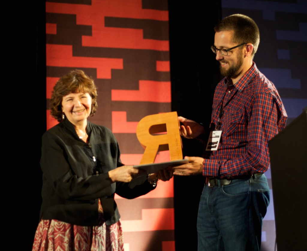
Fiona Ross is awarded the SoTA Award

Fiona Ross receives the SoTA Award

In a room bursting with applause and cheerful congratulations, Fiona Ross was awarded the prestigious SoTA Typography Award for her design and teaching work, during the TypeCon conference in Washington DC. The event began with prerecorded messages by graduates sending their congratulations from many countries holding up warm messages in some of the many scripts Fiona has supervised, followed by salutations by John Hudson and Gerry Leonidas.

Fiona’s first career in type design started when she took the job of coordinator for non-Latin typefaces at Linotype in 1978. John Hudson reminded the audience that “Over the following decade at Linotype, Fiona would build the non-Latin design department into the most technically and aesthetically creative team of its kind, employing designers, draughting staff and computer programmers selected by her. At a time when other companies were busy converting their old metal and photo types to the new digital technologies, Fiona undertook an extensive programme of innovative new typeface design for Indian, Arabic and Southeast Asian scripts, often working closely with the newspaper publishers and editors who were Linotype’s biggest customers.”

Hudson continued: “In addition to developing new designs for Indian scripts at this pivotal moment of technological change, Fiona also pioneered the use of phonetic keyboard input, using software to drive the visual display of characters, rather than requiring the typesetter to enter text in visual order. This model, in which phonetic character strings and visual glyph strings are separated—the now familiar separation of content and display—, influenced both ISCII, the Indian national standard for computing, and the Unicode Standard.”

Hudson outlined the many collaborations between Tiro Typeworks and Fiona as an independent consultant, starting with their collaboration, with Tim Holloway, on the redesign of the Yakout Arabic newspaper typeface: “…the first of many collaborations, each of which has been a wonderful adventure for me and a fascinating education. Together, we have made new types for Adobe, Microsoft and Linotype, in a range of scripts including Arabic, Bengali, Devanagari, Tamil, Telugu, and Thai. In the past two years we have been honoured to create custom types for the publishing of the Murty Classical Library of India by Harvard University Press.”

Fiona’s research focuses on the relationship of technology and typeface design, and has led to texts such as her book on the history of Bengali type, a key reference for the script. Her texts offer an exemplary model for the integration of research into typeface design, and are central to the building of a global reference library for non-Latin typeface design.

Through her teaching and supervision in the Department of Typography over the last 15 years, Fiona has helped establish the methodology for research-informed typeface design that is central to the MA Typeface Design programme, and a key element in a range of PhD projects. Important research projects on Arabic, Tibetan, and several Indian scripts, bear the mark of her approach. Far beyond the supervision within the Department, Fiona’s sharing and nurturing attitude to researchers and designers from around the world fosters an attitude of collaboration and learning that defines non-Latin typeface design today.
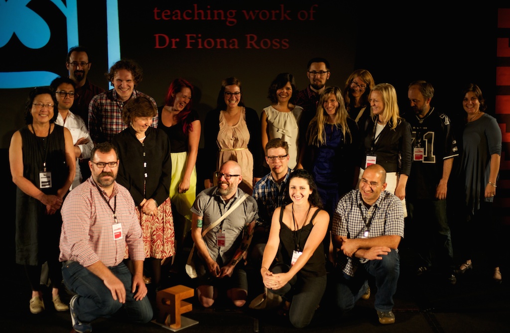
Reading group(Photographs by Laurence Penney)

This is not about fonts

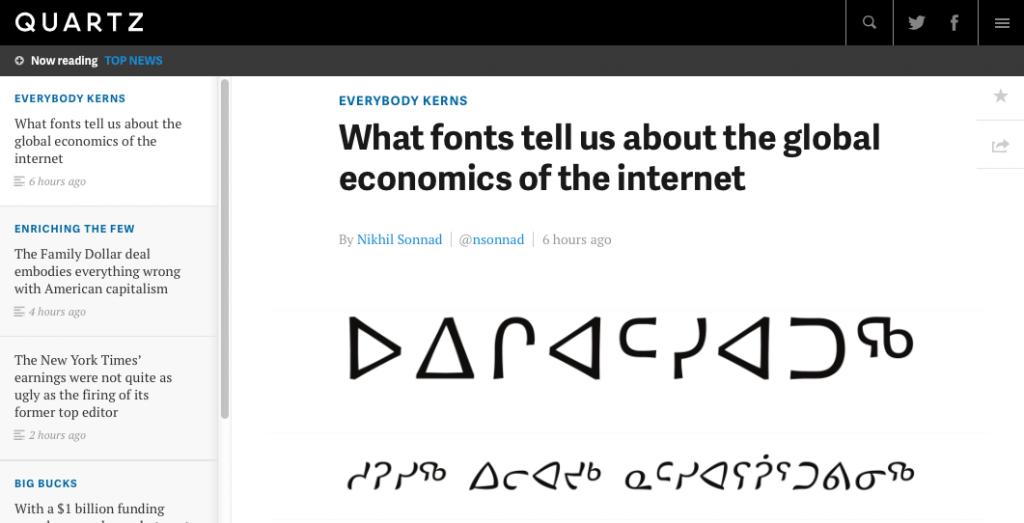
QZ article on fontsQuartz just published an extensive report on the globalisation of the typeface design market and the impact on the communication sector, with support from Gerry Leonidas, alumnus David Březina, and a reference to MATD alumna Juliet Shen’s design for Lushootsheed.

Quartz’s post is another entry in a the growing list of articles in business and general interest publications about typefaces, evidence that awareness about the importance of typeface design is spreading to fields far outside the design sector.


Student–staff collaboration on biodiversity tracking tool

KiteSiteSignagePalmer2014

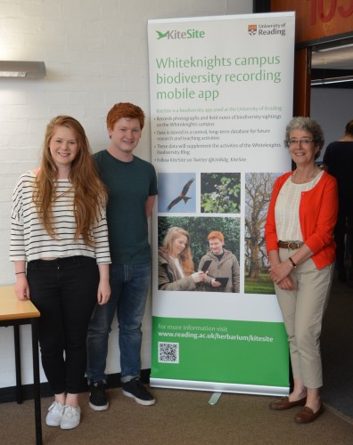
The University has launched its biodiversity mapping tool, KiteSite, which is to be used in teaching to track sightings of plant and animal life and, through GPS, map their location on campus. The tool was developed from existing open-source software by a joint team of biologists, computer scientists and designers as part of a University-funded Teaching and Learning Development project. Typography and Graphic Communication student, Liam Basford (pictured centre), developed the branding and communications for the project. He is with Bethany Everett (left), one of a group of student volunteers who tested the tool, and Alison Black, of Centre for Information Design Research, who was part of the academic team involved in the project.

Журнал «Шрифт» features the MATD

Moment from the Type Journal interview

The notable Russian online journal «Шрифт» (“Type”) published a substantial interview of Gerry Leonidas, programme director of the MA Typeface Design. The interview, which focuses on Reading’s pioneering approach to typographic education, is accompanied by images of student work and moments from the Department captured by Evgenia Basyrova.

The original text of the interview, in English, is available on this page.

Non-Latin festival in Bangkok

Granshan 2013

The University of Reading is a partner in the 2013 Granshan: Design and Identity conference in Bangkok, currently under way. The  Department is contributing with a special version of the “From hot-metal to OpenType” exhibition, which opened to the public yesterday in the library of Chulalongkorn University.

Speakers include Typography staff Gerard Unger and Gerry Leonidas, and graduates Paul Hunt and Ben Mitchell.


Yearbook of Type

Yearbook of Type 1

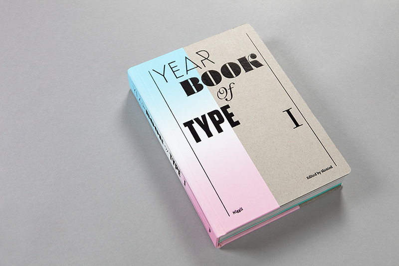
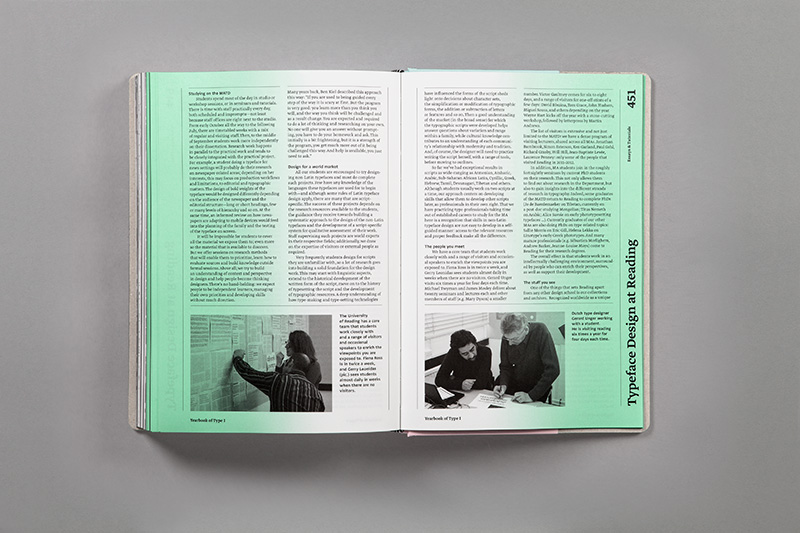
Edited by the same team that publish the Slanted magazine, this substantial reference volume for new typefaces has just been published by Niggli. The  volume presents typefaces in generous specimens, and includes a number of essays on typeface design. Amongst them, a detailed presentation of the MA Typeface Design programme. The impressively produced volume is available from Slanted’s shop.

Slanted_YearbookofType1_30


Reading at ICTVC 5, Nicosia

Reading at ICTVC 5, Nicosia

ICTVC 5

Reading staff and graduates have returned from the fifth International Conference on Typography & Visual Communication, hosted by the University of Nicosia. ICTVC is the brainchild of Dr Klimis Mastoridis (a Reading alumnus) who, since the first event in 2002, has given the conference a distinct character that sets it apart from most such events. Amongst typography-orientated events, ICTVC is probably the most diverse in the range of academics and practitioners it brings together. And, even in this smallest of its iterations, it attracted speakers and delegates from four continents.

The combination of research and practice makes ICTVC a very good fit for Typography, and it was no surprise to see the Department represented well. The speaker lineup included staff members Mary Dyson, Gerry Leonidas, and Sue Walker, and current PhD candidates Sallie Morris and Niki Sioki. PhD alumni Petra Cerne Oven, Sue Perks, Karel van der Waarde, and MA alumni Julián Moncada, Elena Papassissa, Vaibhav Singh, and Adi Stern also presented papers.

For a general report on the conference, head over to Mark Barratt’s post on the Eye magazine blog.

Monotype Recorder online

Monotype Recorder online

Monotype’s lauded Pencil to Pixel exhibition (in Wapping last November, and New York earlier this month) included a relaunched Monotype Recorder, after a hiatus of fifteen years (the previous issue had been published to mark the Centenary of the company, on the occasion of the 1997 ATypI conference, in Reading). The new issue celebrates Robin Nicholas’ long career and contribution to the company, as well as to typeface design in general. A few days ago Monotype posted the bulk of the issue as an online magazine, including Robin’s interview to Eye magazine, and Gerry’s comment on Robin’s work.