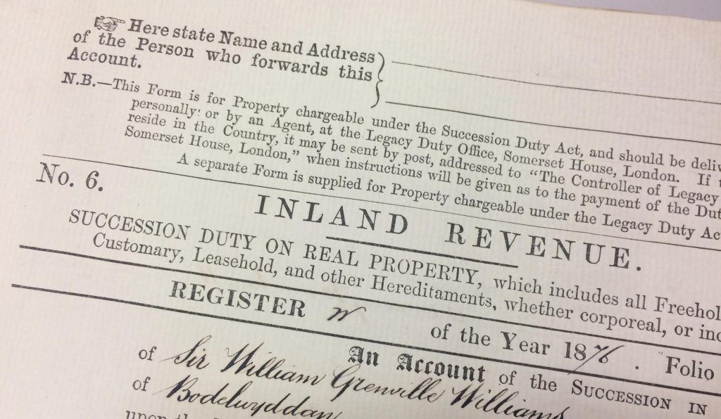
Typographic differentiation in an inland revenue succession document. (Image: Department of Typography & Graphic Communication Collection)
This week, CIDR researcher Jeanne-Louise Moys shared her research on typography and document design with legal and plain language practitioners at a Clarity breakfast talk. Her talk explored how effective typography can improve how people engage with legal and complex information, as well as contribute to their judgments of credibility.
Drawing on examples of legal documents (including historic examples from the Department of Typography & Graphic Communication collections and a range of current printed and digital examples), Jeanne-Louise explored how typographic differentiation (TD) is applied to legal information.
TD is the way in which designers use variations (such as typeface, size, weight, placement and spacing) to provide essential visual cues for readers. It is a useful concept for effective document design because it can make legal information seem less daunting to readers, support their understanding and help them navigate information. If applied effectively to document or interface design, it can help readers:
- recognise a document’s genre
- identify what kind of information they are reading
- make judgments about whether information is relevant to them
- identify key information (through emphasis)
- understand complex information and document structure (through a visual hierarchy of headings)
- distinguish components in different registers (such as shifts between explanation and commentary)
- decide whether/how to read a document.
TD also helps explain how documents carry genre associations, which influence readers’ assumptions about credibility, provenance and tone. For legal documents, it plays a key role in establishing a sense of authority and helping readers identify what kind of information they are presented with.
Jeanne-Louise’s presentation also highlighted how principles for enhancing clarity and simplicity in writing, such as using shorter words and sentences, are important from a typographic point of view. Her research suggests that the typographic texture of information influences people’s assumptions about information complexity before they start reading. She found that people made assumptions about how interesting or difficult information was based on the length of words, sentences and paragraphs, even when they couldn’t read the text because it was presented as a third-order approximation of English (i.e. nonsense words that mimic the character combinations or real words).
Her presentation concluded with some key tips for making legal documents more accessible, such as:
- Write considerately and simply – shorter words, sentences and paragraphs
- Use legible typefaces appropriate to the kind of display or output
- Avoid setting text with a very long line length
- Use lists to break up visually dense and complex paragraphs
- Create a clear structure and visual hierarchy (signposting)
- Use space and alignment to support and clarify structure and hierarchy
- Allow sufficient ‘breathing space’
- Develop texture and emphasis but don’t overdo it or over-fragment the information – emphasis should be helpful not confusing
- Avoid setting text in full capitals (caps are considered ‘bad practice’ in terms of inclusive design)
- Consider alternative formats for users with disabilities and ensure that appropriate cues about structure are built in for text-readers.
