
By Amara Thornton (Research Officer, Ure Museum of Greek Archaeology)
The publishing house Adam and Charles Black was established in 1834 in Edinburgh. Now its archive is held in University of Reading Special Collections, and over the last few weeks I’ve been looking at one part of the collection – the Letterbooks containing delicate copies of “letters out” from the company to prospective and contracted authors and artists.
Much publishing and book history concentrates on fiction – novelists, short story writers and the publishers and editors with whom they worked. But there is also interest in non-fiction publishing history, particularly in relation to popular science and travel. I’m interested in non-fiction publishing and book history too; my first book, Archaeologists in Print: Publishing for the People (UCL Press, 2018), focuses on works written by archaeologists for a general readership.
It was in researching for Archaeologists in Print that I first came across the A. & C. Black archive at Reading. The company acquired another publishing house, Ernest Benn Ltd, in 1984. As Benn had published several popular archaeology books – including various archaeological volumes in its “Sixpenny Library” – I came to Reading initially in 2015 to see archives relating to these books.
But I’m currently concentrating on the firm of A. & C. Black and its non-fiction and reference books. In the early 20th century, the company published various series of illustrated art, history, archaeology, science and travel books. These ranged from pretty pricey twenty shilling “Colour Books” to smaller volumes for as little as one shilling and sixpence.
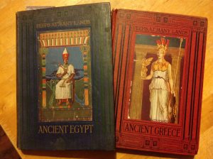
Picture of Peeps at Ancient Egypt and Peeps at Ancient Greece. (Photo: Amara Thornton)
During the early 20th century, the firm developed special series aimed particularly at children, “Peeps”. In the “Peeps” A. & C. Black catered for young readers’ interest in diverse subjects – there were “Peeps at Many Lands and Cities”, “Peeps at History”, “Peeps at Great Railways”, “Peeps at Nature”, “Peeps at Industries” and individual “Peeps” for topics such as “Great Men”, “Postage Stamps”, “Heraldry”, and “Architecture”. The Scotsman considered the “Peeps” to be “as varied as the films in a cinema house and quite as entertaining.”
One of A. & C. Black’s “Peep” authors was a Scottish minister named James Baikie. When he began writing for the firm he was based at the United Free Church in Ancrum, in the Scottish borders, and a popular lecturer. He started as a science writer; his first book, Through the Telescope (1906), was a popular introduction to astronomy (his Times obituary noted he had been a Fellow of the Royal Astronomical Society from the age of 25). On the strength of Telescope‘s success, Baikie pitched an idea for a new book – this time on Egyptology.
The response from A. & C. Black director W. W. Callender was hesitant at first. He would not accept the proposal outright, but asked for a specimen chapter.[1] On reviewing this and other articles Baikie had written on the subject, Callender offered terms for publication, which Baikie accepted.[2] Story of the Pharaohs was eventually published in A. & C. Black’s Autumn List for 1908. A review copy was sent to the Egypt Exploration Fund among a few others.[3] The publication was the start of a new archaeology series for A. & C. Black; Story was marketed alongside two other titles, George Cormack’s Egypt in Asia (about “pre-Biblical Syria and Palestine”), and Ethel Ross Barker’s Buried Herculaneum.
Story of the Pharaohs was an almost immediate success (despite eminent archaeologist Flinders Petrie‘s refusal to provide an introduction).[4] While much of the correspondence on the book relates to image permissions, two letters sent post-publication relate to the efforts the company made to market the book in Egypt. A letter from Callender to Baikie on 27 November 1908 noted “You will be pleased to hear that all the Cairo booksellers are stocking your book…” and outlined plans to send special copies to the city’s “six principal hotels” for hotel managers to place – prominently, of course – on Reading Room tables. Although no list of the six hotels is extant it seems unlikely that Cairo’s famous Shepheard’s Hotel wasn’t one of them. Only one letter to a manager is included in the Letterbooks; it went to the Ghezirah Palace Hotel.[5]
One of the reasons I’m looking into James Baikie is because I’m interested in his wife, Constance Newman (Smith) Baikie, an artist whose stunning illustrations contribute a definite ‘wow factor’ to accompany Baikie’s texts. She provided in-text line drawings for Story of the Pharaohs, but it was really Baikie’s first “Peep” that enabled her to stretch her creative wings. This was Peep at the Heavens, another work on astronomy.
On submission of a sample illustration – a watercolour drawing of Saturn – Callender only had minor revisions to make to enable the work, when reproduced, to fit the physical size of the book. He offered James Baikie terms of 20 shillings per drawing for his wife’s work and equal credit for her work on the book’s title page.[6] Notably (and unfortunately), there is no correspondence in the Letterbooks directly to Constance Baikie on her work during this period – everything went to her husband. But I’m hoping that as the Baikies relationship with A. & C. Black strengthened, she began to correspond directly with the firm herself.
When all eight of her illustrations were received in the spring of 1911, Callender was enthusiastic about the skill she demonstrated, declaring “The drawings are excellently done and most interesting…”.[7] It’s not hard to see why – the frontispiece illustration for Peeps at the Heavens is a striking image of “The Moon in Eclipse” – the sphere is in red-tinted shadow barring a thin crescent, brilliantly illuminated. She went on to provide colour illustrations to accompany most of her husband’s other books with A. & C. Black.
Beyond my special interest in the Baikies, a number of other interesting details emerge from the Letterbooks. Each book begins with an Index, listing in roughly alphabet

Corelli’s name listed in the Index of Letterbooks (A/1/26 C)
ical order the names of those to whom letters were sent. Perusing the Letterbook Indexes revealed the company’s efforts to solicit work from a number of well-known women.
The first woman whose name popped out at me in this way was Marie Corelli, a noted and very popular novelist of the period. In February 1907 the firm wrote to her at her home, Mason Croft, in Stratford-upon-Avon, to ask her to write text for a book on the town. She must have responded positively. The next letter, sent a week later, sought to pin down firm details on the proposed book, suggesting Corelli could have a great deal of creative freedom:
“Your letter is so kind that we venture to trouble you again. May we ask if you would write the letterpress were we able to secure an artist of whom you thoroughly approved & to whom you could give instructions as to the choice of subject, etc., & if so, what terms you would suggest.”[8]
This theme of soliciting notable women for text continues in subsequent letterbooks, as two years later the company wrote to Gertrude Jekyll, garden designer, writer and horticulturalist, to ask her to write the text for a “colour book” on gardens.[9] (There is no indication in the Letterbooks of whether or not Jekyll agreed.)
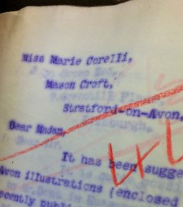
A close up of Marie Corelli’s name and address at Mason Croft, Stratford upon Avon.
A. & C. Black’s Art Editor Gordon Home wrote to Countess Elizabeth Von Arnim (author of Elizabeth and Her German Garden) in spring 1911 to ask her to provide text for a “colour book” on Germany. Like Corelli, von Arnim was also offered great creative freedom:
“Should the project attract you we would not wish to restrict you as to the method or style you employed so long as the reader gathered an idea of German life, scenery, historic spots, medieval towns and so on.”
As with Jekyll, there is no evidence in the letterbooks that von Arnim agreed to the proposal.[10]
The letterbooks also provide insights into the diversity of contributors to A. & C. Black series. I was fascinated to come across two letters to a Japanese artist named Wakana Utagawa. The firm contracted her to create eight colour and twenty black and white illustrations for its “Peep at the History of Japan”. The first letter was sent to her at the Baillie Gallery, located on Bruton Street in London, where in Spring 1911 she was exhibiting a series of her paintings to rave reviews.[11]
There is great potential for interesting research and analysis in the A. & C. Black archive in a variety of fields – but particularly the popular publishing of science, archaeology, art, and history, yielding further insights into the artist- and writer-contributors. The possibilities to recover hidden histories (for lack of a better term) abound, even where the subjects are relatively well known. I’m looking forward to continuing my own research into the Letterbooks during the course of my time at Reading. I hope that this post encourages others to dive in to the Letterbooks too.
The catalogue for the A. & C. Black archive held in University of Reading Special Collections can be found here. For further information, email specialcollections@reading.ac.uk.
Dr Amara Thornton is Research Officer for the Ure Museum of Greek Archaeology.
References/Further Reading
Adam & Charles Black Letterbooks A/1/26, 29, 30, 32, 36, 39.
The Scotsman, 1912. Christmas Gift Books. [British Newspaper Archive], 28 November.
The Sphere. 1911. A Talented Japanese Artist Now in England. [British Newspaper Archive] 18 March.
The Times, 1931. Dr James Baikie. Times Historical Archive. 7 February.
Footnotes
[1] ACB A/1/26/56 and 89, Callender to Baikie 23 and 28 Nov 1908.
[2] ACB A/1/26/598 Callender to Baikie 27 Mar 1907.
[3] ACB A/1/30/123 Callender to Baikie 3 Sep 1908.
[4] ACB A/1/29/835 and 882 Callender to Baikie 13 and 20 Jul 1908.
[5] ACB A/1/30/696 and 731 Callender to Baikie 27 Nov and 5 Dec 1908.
[6] ACB A/1/36/392 Callender to Baikie 21 Jan 1911.
[7] ACB A/1/36/694 Callender to Baikie 4 Mar 1911.
[8] ACB/1/26/427 and 444. A&C Black to Corelli, 15 and 21 Feb 1907.
[9] ACB/1/32/116 A&C Black to Jekyll, 5 Feb 1909.
[10] ACB/1/36/695 A&C Black to von Arnim 6 Mar 1911.
[11] ACB/1/39/774 and 819. Home to Utagawa 3 and 9 Aug 1911.


