Reading types in Oxford English dictionaries

Parable type in the New Oxford Dictionary of English

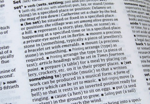
Many of the various printed editions of Oxford dictionaries are now typeset principally in Parable, a typeface designed by Christopher Burke, Research Fellow in the Department. These include the Concise, Compact, Paperback, Pocket, Little, and Colour Oxford Dictionary as well as the Oxford Paperback Thesaurus. Parable is also used effectively in the Oxford Dictionary of English (pictured) – a hefty hardback representing contemporary usage – for the entry texts, alongside Frutiger and Argo (designed by our Visiting Professor, Gerard Unger).

Christopher designed Parable between 1996 and 2002, specifically for use at small typesizes in books such as dictionaries and bibles. It was introduced into the Oxford dictionary range in 2004 by OUP designer Michael Johnson (also an alumnus of the department) when he was redesigning the Concise Oxford Dictionary. At Michael’s request, Christopher designed an alternative italic ampersand especially for the entry ‘ampersand’, because the dictionary’s editors were uncomfortable with Parable’s Granjonesque one. (See more about this here.)

Introduction to wood engraving

Rob Banham has a new appreciation for the art of wood engraving after his first attempt at the process. He was one of the first students to take ‘Introduction to wood engraving’ at St Bride Library. Material from the Library, including blocks and prints by Thomas Bewick and Eric Gill, provided inspiration during six weeks in which the students were guided from their first nervous cuts through to printing an edition of their first block. The course is run by painter and printmaker Peter S Smith who currently has his work on show at St Bride along with prints by Rob and the other students. St Bride offers a variety of printing and printmaking courses in their Print Workshop.

Typography in textbooks, in Warsaw

OdAlaMaKota logo

The International Conference Od „Ala Ma Kota” Do E-Matury in Warsaw will bring together typographers, designers, publishers, entrepreneurs, teachers, and policy makers from different European countries, to explore the correlation of the design of educational materials and efficiency in education.The rapid-fire event (TED-style condensed presentations of 16 minutes each) will review the current thinking on paper textbook design, and question how to design for new technologies entering the classrooms, from primary to higher education. Gerry Leonidas will link conventional typography with the interactive, expansive, and global typography emerging in text-intensive publications. Bringing things full circle, Gerry first spoke of these trends in Warsaw: nearly five years ago, in the 1st Book Design Lectures by the STGU (English report by the Book Institute here) on “Book design in transition: a threat or an opportunity for designers?”