The wonderful exhibition of typewriters and related ephemera currently on display in Typography’s exhibition area made me look again through my collection of early typing manuals.
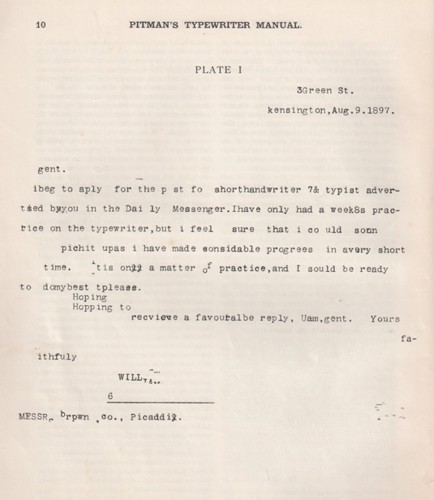
Re-reading some of these it is clear that this new technology took quite a bit of getting used to. Pitman’s typewriter manual, first published in 1893, included a ‘specimen of typewriting illustrating, perhaps in an exaggerated form, most of the errors and irregularities to be found in unskilled work’.
The specimen is accompanied by a detailed narrative that draws attention to the defects and how they might be rectified, including irregularity of impression, irregularity of spacing, unevenness at the beginning of paragraphs, unevenness of spacing between lines and slovenliness. There are solutions to working with a limited character set, and examples of changes in language and the use of graphic conventions.
The section ‘Misuse of certain characters’, for example, discusses the use of wrong characters for the figures 1 and 0, and that the former is often written with the capital ‘I’ and the latter with the small-letter ‘o’. It goes on:
‘As the keyboards of machines are but rarely furnished with a complete set of numerical characters, the capital I very naturally suggests itself to the beginner as the best character for the representation of the figure 1, and he sometimes goes on using it for this purpose long after he has become proficient. The lower-case l [el] should be used for this purpose.’
The ‘&’ is mentioned as another character subject to misuse, often substituted for the word ‘and’ whereas it should be reserved for two ‘special cases’: in combination with ‘c’ in ‘&c’ for ‘etcetera’; and in the name of companies as Brown, Smith & Robertson. The solidus ‘/’ is described as ‘properly the sign for shillings, though it may, perhaps, be legitimately used in one or two combinations like o/o for per cent, B/L for Bill of Lading, a/c for account’. An example of its misuse is 4/10/10 for 4 October 1910.
Later typing manuals didn’t need to include examples of poor typing. Instead, as well as technical skills and keyboard practice, they provided instruction on detailed and complex matters of visual organisation. Some of the ‘rules’ for setting things out derived from printers’ and publishers’ house style manuals, but many of the conventions prescribed were determined by the limitations of the machine.


