Heritage and creativity: new lettering for HMS Victory

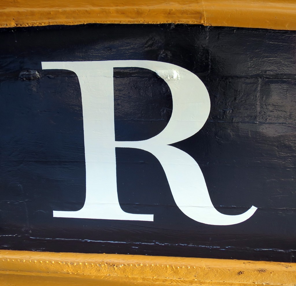
The name of HMS Victory, launched in 1765, the oldest ship of the Royal Navy that is still in commission, has been repainted. The name had been painted when the vessel was refurbished in 2005 for the two-hundredth anniversary of the battle of Trafalgar, but unfortunately the style used was Trajan, the Roman inscriptional letter that was quite unknown in England in 1805. Since the ship was being repainted during 2015 in a colour that is believed to be closer to that used in 1805, the opportunity was taken to repaint the name at the stern, using the ‘English vernacular’, the bold traditional style of lettering that is believed to have been in use at that date. The model for the style was engraved lettering by George Bickham. There was also guidance from contemporary paintings, and from scale models of 18th-century warships at the National Maritime Museum.

The letters were painted by Phil Surey from drawings by Adrien Vasquez of John Morgan Studios. Advice and historical research was by James Mosley.

Victory name - 2015-10-03 1 Victory name - 2015-10-03 2 - letter R

Thesaurus of ephemera terms

In November 2013 Typography’s Centre for Ephemera Studies (CES) published a Thesaurus of Ephemera Terms, which is freely available for download here, in two versions: alphabetical and top term order.

Ephemera Thesaurus

Top term report

At present there are no plans to provide a searchable version. While not wishing to undermine the integrity of the thesaurus it is understood that users will adapt it for their own purposes as circumstances change.

We would welcome any comments and suggestions for improvement received before the end of 2014, as we intend to issue a revised version in 2015.

Please send comments and suggestions to ephthes@reading.ac.uk.


Getting from A to B: inspiration from the archives


AAroutepage

Our collection of twentieth-century town plans, road maps and route plans includes four AA Route Sheets that were individually made in the 1940s for the trips members wanted to take.

The little booklets contain a combination of directions, maps, town plans and points of interest. The routes outlined in our recent acquisitions are London to Bournemouth, London to Liverpool, Chiswick to Middlesbrough and Middlesbrough back to Chiswick. They contain ‘places of interest’ descriptions of parts of the route: ‘Much pleasant woodland & some high ground after leaving Winchester’ as well as a detailed account of the route, in an abbreviated form that makes sense in context:  ‘under second rly.br.bear lt.into’.

By 1948 AA membership returned to the pre-war level of over 700,000 and demand for routes like these increased rapidly, particularly when petrol rationing ended in 1950. The evocative ‘places of interest’ information was dropped at this time when details of the return route were added to the reverse of the route sheets. These route guides were the Sat Nav of their day, ideal for people that wanted a handy set of instructions on how to get from A to B.

 Laura Weill, Typography Collections assistant

Banks and Miles Christmas tins and drums

2014-01

We are delighted to draw attention to some items from the Banks & Miles Collection. This lovely set of 17 tins and drums were kindly donated by the once chief architect to the Zoological Society of London. Colin Banks and John Miles were the society’s typographical and graphic design consultants. The donor was also a close friend of the duo at the time.

These tins and drums were sent out by Banks and Miles each Christmas to clients and associates, each relating to design work they had done that year. The examples in the collection range from the late 1960s- mid 1980s. Some of the tubs even contain their original contents.

Our examples include a London Underground design, dating to 1979, when Banks and Miles revised Edward Johnston’s classic sans for London Transport. This drum contains two napkins with a red underground logo reading ‘Banks and Miles’. Another using the distinctive British Telecom design, this contains a very helpful international dialing code card. In 1975, they referenced their iconic work with the Post Office, turning the tub into a mini post box.

These are such lovely objects, especially those containing their original gifts, showcasing some really great examples of classic British Design.

Michael Twyman awarded Sir Misha Black Medal

We are delighted to announce that Professor Michael Twyman has been awarded the 2014 Sir Misha Black Medal for his contribution to design education.

Professor Sue Walker recalls:

‘Writing about ‘Typography as a university subject’ in 1970, Michael identified four ‘basic beliefs’ that governed the structure of the Reading course:

  • the visual form of typography should relate closely to the language used and its organisation reflect and reinforce its meaning;
  • typographic designers should understand the technical means at their disposal;
  • the reader must be respected;
  • typographic design is planning in relation to the above three, usually in the context of a client, an organisation, a budget and a deadline.

These statements are still relevant today, and have influenced the approach to design taken by our students.’

Funding for doing a PhD

Typography is part of the AHRC Doctoral Training Centre, Design Star.

Design Star invites applications for full- and part-time Arts and Humanities Research Council studentships which include fees and a stipend.

Find out why you should join us, and how to apply at www.designstar.org.uk

Design Star brings together world-class research in design for industry, interaction design, design process, communication design, sustainable design design history, curation and creative practice. Its spread of design disciplines is linked by a common approach to research that encourages the integration of history, theory and engagement.

Design Star research training is innovative, stimulating and relevant supported by a broader range of expertise and covering more methods than within any one single institution.

Funding for up to 12 PhD studentships is available for 2014/15.

The deadline for applications is Friday 28 February 2014.

Success for Vermillion

anneb

Typography alumna Anne Brady’s company, Vermillion, has scooped success at the annual Institute of Designers of Ireland by winning not one, but two awards in the digital category.

The two winning apps come from the two ends of Vermillion’s client spectrum. The first explored the fascinating world of singer-songwriter Pierce Turner and concentrated on the writing and production of his much-acclaimed song Snow, from his album Songs for a Very Small Orchestra. The second win was in the academic area and is called Books of Dublin. It showcases a selection of rare books from two of Dublin’s most renowned antiquarian libraries and includes commentaries from leading academic specialists. You can download both free to your iPad from the App Store.

Speaking at the awards ceremony, IDI President Andrew Bradley said that the awards “further demonstrate the impact of design in the area of new media. It proves beyond doubt how creative design skills can add value and indeed change the dynamics within the exciting and constantly developing field of digital communications and marketing.”

A new Papal Inscription in Westminster Cathedral

Finished floor

Typography alumna, Caroline Webb, has designed and installed a new Papal inscription for Westminster Cathedral, to commemorate the visit of Pope Benedict in 2010.

The 7 foot long inscription is made of one piece of Carrara Marble inlayed with letters of green and red Porphery and lies in the main entrance to the Cathedral.

The marble inlay was done by Pietra Dura craftsman Thomas Greenaway.The inscription took 2 years to design and produce, and a week to fix in the floor. The commission was technically challenging in every way; Caroline will be writing a full article to document its creation.

Sanguinis 3 lines copy Quod copy  3 copy

Congratulations to John Morgan

To follow up on my earlier post:

We are delighted that the John Morgan Studio has won the graphics category in the Designs of the Year award.
 

image (crop)

Reading Typography graduate, John Morgan, has been nominated for the 2013 Designs of the year competition run by the Design Museum for his work on the visual identity for the 13th Architecture Biennale in Venice.

Read about his work on the Eye blog: Common ground: a designer’s letter from Venice.

John is currently teaching students on our MA Book Design course.