Fabula – a typeface for children

abenteuer-schule-ABC

Fabula is gaining popularity for use in resources for children, both on paper and on screen.

The typeface was designed under Sue Walker’s direction by a team of staff and students at Reading, including Vincent Connare, José Scaglione and Gerry Leonidas, as part of an EU-funded project producing bilingual story books for children. Since then it has been available for free, along with advice if required, from the Typographic design for children web site.

Some examples of how Fabula has been used:

Jashanjit Kaur, a designer based in Hyderabad, India used Fabula for Amigo, described as ‘a socialising platform for school children that provides a medium for sharing their ideas and pursuing interests in a safe and secure environment’.

Cecelia Erlich used the letterforms in a Spanish television programme, La cucaracha.

Dietmar Brühmüller used the font for the whole range of four young children’s games, including the one illustrated above.

Design is not a matter of surface appearance

Typography supports the Design Commission’s launch on 13 March 2013 of Restarting Britain 2: Design and Public Services, and strongly endorses its opening statement: ‘Design is integral to the DNA of each and every public service. Design is not a matter of surface appearance.’

Prof Sue Walker, who contributed written evidence to the Commission, has also been invited to become a member of the Associate Parliamentary Design and Innovation Group (APDIG) to highlight existing work in the design research field that has not yet been exploited by policy makers and those in government, to point to design research as an untapped resource for policy makers. The group will report to a parliamentary seminar in June.

APDIG brings together colleagues from universities recognised for excellent and relevant design research. Information design research has much to offer government and public services through its user-centred and often collaborative methods, as well as through research outcomes that inform the presentation of complex material, in print and online.

An example of research-led information design is the Centre for Information Design Research’s work for the Behavioural Insights Team, a group of economists and psychologists working within the Cabinet Office, to help with a trial they are running to support unemployed people looking for work. Earlier this week the forms were shown in the Independent in a piece describing the impact made during testing.


‘Isotype revisited’ in Vienna

photo1

Members of the ‘Isotype revisited’ team, Christopher Burke, Eric Kindel, Michael Twyman and Sue Walker, participated in an interdisciplinary symposium and workshop at the invitation of the University of Vienna and the Institut Wiener Kreis.

The two-day symposium, ‘A tribute to Otto Neurath’, took place at Vienna’s Künstlerhaus gallery and coincided with its exhibition Zeit(lose) Zeichen (Time(less) Signs), featuring work made by artists and designers influenced by Isotype and Neurath. Christopher Burke was among the symposium’s speakers; his talk was on ‘The “Weiner Methode der Bildstatistik” (Isotype): between Art and Design’.

photo2

The one-day workshop that followed was hosted by the Institut Wiener Kreis and took place at the University of Vienna. Those from Reading contributed talks about teamwork in making Isotype charts, the children’s books series the ‘Visual History of Mankind’, the making of the public information films directed by Paul Rotha, the outcomes of the ‘Isotype revisited’ project and on-going initiatives at Reading associated with the Isotype Collection.

Typography graduate’s ‘Design of the Year’

image (crop)

Reading Typography graduate, John Morgan, has been nominated for the 2013 Designs of the year competition run by the Design Museum for his work on the visual identity for the 13th Architecture Biennale in Venice.

Read about his work on the Eye blog: Common ground: a designer’s letter from Venice.

John is currently teaching students on our MA Book Design course.

Railways under London

Railways-under-London-dust-jacket-cov

The London Underground celebrates 150 years today. One of the best representations of the London Underground was a book for children, Railways under London by Marie Neurath, published by Max Parrish in 1948.

This book explained to young readers how the Underground worked, including how escalators and lifts work, how platforms are built for speed and how machines print tickets and give change. Some of the illustrations in the book are straightforward and easy to understand; others are much more complex and require detailed study.

Much of the preparatory material for the book is in the Otto and Marie Neurath Isotype Collection held here in the Typography Department at Reading. Notes and sketches shows the care that was taken in making sure that the explanations were technically correct: the designers and artists often worked from engineering drawings supplied by London Transport, and final drawings were sent to experts for checking before they were produced in the book.


underground

This cross-section diagram conveys depth by showing tunnels at different levels, and shows how people got to and away from the trains by stairs and escalators. The people pictograms take different forms: some represent people standing still; a shortened leg on the standing still pictogram represents people walking up and down stairs, and a side view configuration indicates people walking.


escalator

This diagram explains how escalators work. A full explanation requires the reader to engage with the text, which is written in a very child-friendly way. The pictures of the posters on the wall, albeit comprising Isotype images, and the people on the stair, in particular one holding the handrail and one walking off the escalator, adds contextual information relevant to the London Underground.


See  www.isotyperevisited.org


Design Issues: visual essays

Sue Walker joins Design Issues as Associate Editor, Archives to develop visual essays that derive from high quality collections and archives of design-related materials worldwide.

Design Issues, the first American academic journal to examine design history, theory, and criticism, provokes enquiry into the cultural and intellectual issues surrounding design. It is one of the world’s foremost research journals and a flagship product of MIT Press.

 Call for contributions

We are looking for visual essays that explain an important and interesting ‘design issue’, from any period, through images from a collection or archive. This might be

  • a set of related images that explains something, or tells a story, of cultural or social importance
  • a set of seemingly unrelated images that, when accompanied by verbal explanation, become linked together to tell something new
  • a series of single images that each represent a significant cultural or social issue

Each essay will be six black-and-white pages designed by MA Book Design students at the University of Reading, under the supervision of the Programme Director, Ruth Blacksell. The published material will have to be accompanied by copyright clearance on all the visual material.

Send proposals, or ideas for discussion, to:

Prof Sue Walker
Department of Typography & Graphic Communication
University of Reading
Whiteknights
Reading RG6 2AU

Email: s.f.walker@reading.ac.uk

Using collections in research


Just published in the Journal of Design History, a paper by Sue Walker based on material in the Otto and Marie Neurath Collection, discusses an iconic series of books for children. ‘Explaining history to children: Otto and Marie Neurath’s work on the Visual History of Mankind’ is part of the AHRC-funded ‘Isotype revisited’ project www.isotyperevisited.org

Full Text:
http://jdh.oxfordjournals.org/cgi/content/full/eps031?
ijkey=7xIdEtKckzoulZB&keytype=ref
PDF:
http://jdh.oxfordjournals.org/cgi/reprint/eps031?
ijkey=7xIdEtKckzoulZB&keytype=ref

Typewriters: ‘new technology’ for everyday use


The wonderful exhibition of typewriters and related ephemera currently on display in Typography’s exhibition area made me look again through my collection of early typing manuals.

Re-reading some of these it is clear that this new technology took quite a bit of getting used to. Pitman’s typewriter manual, first published in 1893, included a ‘specimen of typewriting illustrating, perhaps in an exaggerated form, most of the errors and irregularities to be found in unskilled work’.

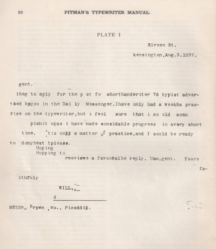
The specimen is accompanied by a detailed narrative that draws attention to the defects and how they might be rectified, including irregularity of impression, irregularity of spacing, unevenness at the beginning of paragraphs, unevenness of spacing between lines and slovenliness. There are solutions to working with a limited character set, and examples of changes in language and the use of graphic conventions.

The section ‘Misuse of certain characters’, for example, discusses the use of wrong characters for the figures 1 and 0, and that the former is often written with the capital ‘I’ and the latter with the small-letter ‘o’. It goes on:
‘As the keyboards of machines are but rarely furnished with a complete set of numerical characters, the capital I very naturally suggests itself to the beginner as the best character for the representation of the figure 1, and he sometimes goes on using it for this purpose long after he has become proficient. The lower-case l [el] should be used for this purpose.’

The ‘&’  is mentioned as another character subject to misuse, often substituted for the word ‘and’ whereas it should be reserved for two ‘special cases’: in combination with ‘c’ in ‘&c’ for ‘etcetera’; and in the name of companies as Brown, Smith & Robertson. The solidus ‘/’ is described as ‘properly the sign for shillings, though it may, perhaps, be legitimately used in one or two combinations like o/o for per cent, B/L for Bill of Lading, a/c for account’. An example of its misuse is 4/10/10 for 4 October 1910.

Later typing manuals didn’t need to include examples of poor typing. Instead, as well as technical skills and keyboard practice, they provided instruction on detailed and complex matters of visual organisation. Some of the ‘rules’ for setting things out derived from printers’ and publishers’ house style manuals, but many of the conventions prescribed were determined by the limitations of the machine.