Non-Latin scripts: from metal to digital type

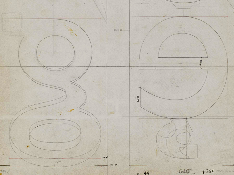
Available from the St Bride shop, Non-Latin scripts: from metal to digital type reproduces previously unpublished items for the Department’s Non-Latin Type Collection. Collection curator Fiona Rosscontributes a major essay on the type design process for non-Latin scripts and describes the exhibits, Graham Shaw discusses the relationship between these scripts and print technology, and John D. Berry’s afterword discusses the need for global resources in typography. An introduction by Paul Luna draws attention to the research possibilities of the Reading collection.


The publication records the ground-breaking exhibition this autumn at ATypI Hong Kong, hosted at the Hong Kong Polytechnic University Library, which displayed over 150 items from the collection, many of which are illustrated in the book. Exhibition co-curators Ross and Vaibhav Singh selected documents and artefacts to tell the story of type production across technologies in Amharic, Arabic, Bengali, Burmese, Devanagari, Gurmukhi, Kannada, Malayalam, Oriya, Sinhala, Tamil, Telugu, and Thai. A supporting display of newspapers in these scripts showed many of the fonts in use.

The 3-week long exhibition was launched by a keynote presentation by Paul Luna, who discussed the research possibilities of the Reading collection and laid stress on the need for the more immaterial evidence of contemporary font production to be preserved in the same way as physical evidence from the past, the survival of which helps us understand the processes involved and provides an evidence base for current font design. With an audience drawn from China and the East Asia region, India, Europe and the Americas, this was global exposure for one of Reading’s key research collections, with appreciation being expressed both at the conference and subsequently on social media.

For more images from the book and the exhibition, follow this link.

Return to Prague

Following an invitation by the very active Petra Dočekalová of TypoSemestr, Gerry Leonidas will give a lecture at the Tranzit Gallery in Prague on Monday 26 November. The lecture will be followed by a two-day workshop on Greek type design, in the Academy of Arts, Architecture and Design.

(The trip is timed perfectly to pick up some issues of the latest TYPO magazine, which is full of Reading connections!)


Pencils to Pixels, and more

Gill drawings

The University is a partner in the Pencil to Pixel exhibition which opened yesterday in the Metropolitan Wharf, in Wapping. After the taster of Gill’s drawings seen in Beauty in the Making last spring, Monotype pulled out all the stops for Pencil to Pixel: the event marks the first public viewing of many materials from the archives in Salfords, from original drawings by Bruce Rogers and Chris Brand, to an unbound folio masterpiece of Modern typography belonging to Adrian Frutiger, to an innovative display taking over the entirety of one of the walls, displaying a never-reccurring combination of typeforms from the company’s library. The exhibition is accompanied by twelve “collections” (booklets showcasing themed selections of typefaces by Abbott Miller, Patrick Burgoyne, and others), and a range of specimens and keepsakes.

The exhibition marks the publication of two major editions: a new issue of the Recorder, celebrating Robin Nicholas’ career in the company (with an opening article by Gerry Leonidas), and a special issue of Eye magazine, dedicated to the contributions of Monotype to type and typography. Both editions include superb photography, and should become instantly collectable – not least because the material in the exhibition is unlikely to be made available in this scale anytime soon.

There are many Reading connections with the exhibition, starting with the main organisers: Dan Rhatigan and James Fooks-Bale are both graduates of the Department. The special Recorder issue  follows on from the Centenary Issue of 1997, published on the occasion of the ATypI conference in Reading; and the Linotype the Film publicity on display sports the exquisite (but unreleased, yet) redesign of Metro by another graduate, Toshi Omagari. Not least, the Recorder includes a picture of Robin teaching a few years back in a room eerily similar to the studio where Book- and Information Design postgraduates spend their days!

More about the exhibition in blog posts by Eye and Gerry.

Data Journalism: A designer’s perspective

An Information Design Association talk by Lulu Pinney

6.30pm on 15 October
Performing Arts Lab, Royal College of Art

The internet has had a profound impact on journalism, as it has on many things. The vast quantity of data the internet has enabled us to discover, collect, explore and share is part of this. Visual design provides a powerful tool for finding and telling the stories contained within data. With data journalism spanning several disciplines designers have much to contribute, and much to learn.

BOOK A TICKET…
http://www.amiando.com/idadatajournalism.html

Lulu Pinney
Educated to become a numbers person but equally curious about pictures and words, Lulu gained design experience at Pentagram, Haymarket Business Publishing and BBC News Online. She now teaches, creates and blogs about infographics.

Type design and inter-disciplinary innovation

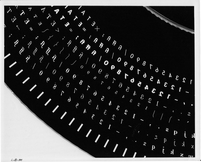
Phototypesetting disk segment

The Musée de l’imprimerie in Lyons is hosting ‘La lettre à l’heure des révolutions technologiques’, an exhibition about typeface design and technological revolutions throughout the twentieth century curated by Alice Savoie, celebrated typeface designer and PhD researcher in the Department.

This exhibition, which runs to 14 October, illustrates the challenges faced by users and producers of typefaces during the three major technological shifts in the industry: from foundry type to hot-metal, to photo-composition, and to digital typesetting. The exhibition explores the considerable influence these changes have had on the design process, and the progressive disembodiment of type, which transformed the industry and redefined the roles of both designers and manufacturers.

The material presented draws on the typographical archives held by three major institutions: the Musée de l’imprimerie in Lyon, the Monotype archives held by Monotype Imaging in Salfords (UK), and the non-Latin collections in the Department.

The closing of the exhibition is marked by the Congress of the Association of European Printing Museums. The two-day event features an exceptional roster of speakers: Iris Kockelbergh (Director of the unique Plantin-Moretus Museum in Antwerp), Andrea De Pasquale (Director of the Braidense National Library in Milan, and the University Library in Turin), Charlotte Delannée, Johan Seivering, and Andréas Schweitzer (of the Association pour le patrimoine industriel, Suisse), Honourary Friend of the Department Mathieu Lommen (Curator of graphic collections, Amsterdam University Library), and our very own James Mosley, Richard Southall, and Alice Savoie.

Whatever Next

Whatever Next

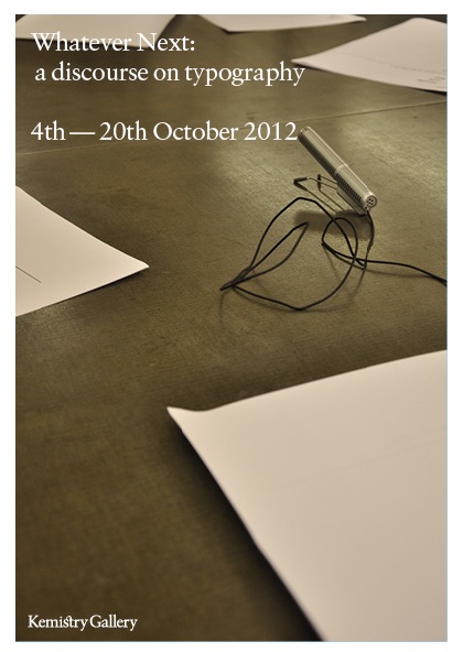
Founded by Camberwell Press‘ creative director, James Edgar, Whatever Next: a discourse in typography is an exhibition and book stemming from a series of conversations that took place in 2011. The discussions are prefaced by four essays, one of which is by Gerry Leonidas. The book will be launched at the Kemistry Gallery on 4 October, with a corresponding exhibition of visual responses to the discussions by contributors. The exhibition will run until 20 October, and is open daily 10:00–18:00, and 11:00–16:00 on Saturdays.

Simplicity at the London Design Festival

Simple is smart

Alison Black, Professor of User-centred Design, shared a platform with leading designers and creative thinkers at the 2012 London Design Festival, explaining the importance of simplicity when developing products and services. Charing the event, which took place at the V&A Museum, was Philip Davies of Siegel+Gale. Other panel members were Merlin Crossingham, creative director of Wallace and Gromit at Aardman Animations; Stephen Fear, British Library entrepreneur-in-residence; and Charlie Allen, bespoke London tailor.

The panel shared their perspectives on the fundamental significance of implementing simplicity to connect to the modern consumer. They also provided their views on a wide range of topics, including how to embrace simplicity while avoiding the simplistic. Another interesting discussion centered around the idea that people have different perceptions and interpretations of simplicity.

“Brands that provide simpler interactions and experiences are winning the battle to stand out in the competitive marketplace,” said Philip Davies. “Simplicity is a powerful tool that helps brands get into consumers’ heads faster, and stay there for longer. As the UK continues to struggle in economic uncertainty, those brands that offer experiences that are clear, direct and easily communicated will generate strong customer loyalty and forge ahead.”

The lively debate played out on Twitter. Highlights from both #SimplicityTalks and the live event will be curated, together with opinions, images and ideas from select influencers who are renowned for simplicity in their fields, to create a book that will showcase the profound impact of simplicity.