Science communication for children

A new AHRC-funded project begins today. Transforming science for young people: Marie Neurath and Isotype books for children aims to find new audiences for the approach to science communication taken by Marie Neurath in her books for children, produced in the 1940s and 1950s.  The illustrations in these books, in series such as the ‘Wonder world of nature’ and ‘Wonders of the modern world’, were innovative in their approach to the design of complex information.

Following on from Isotype revisited, the project will make extensive use of the materials in the Otto and Marie Neurath Isotype Collection, to identify approaches to science communication relevant to teaching in primary schools today. We will work with teachers and teacher educators as part of the design process to ensure that their ideas and needs are taken into account. Pilot schools will be involved in evaluating the effectiveness of the resources to ensure they are relevant and effective.

An exhibition at House of Illustration in London in summer 2019, Marie Neurath: Picturing Science, will display examples of Marie Neurath’s illustrations from the children’s books, as well as sketches, drawings and correspondence that show the iterative nature of the design process.

Project people and partners

Prof Sue Walker and Prof Eric Kindel, Department of Typography & Graphic Communication, University of Reading

Dr Andrew Happle, Institute of Education, University of Reading

Dr Emma Minns (Project Officer)

Partners:

Design Science

House of Illustration

Activity in Antwerp

Our use of the Lettering, Printing and Graphic Design Collections in the Typography Department, and our distinctive approach to collections-based research, was exceptionally well demonstrated at the 2018 ATypI conference in Antwerp. We enjoyed top quality presentations by Typography staff and PhD students. In a conference with over 550 international delegates, who repeatedly mentioned the ‘Reading’ influence in conversations and comments, it was humbling to realise just how influential and significant our work with collections has been in developing new knowledge about type and typography, and in inspiring people to undertake research.

Typography staff

Fiona Ross and Alice Savoie introduced their new Leverhulme-funded project: ‘Women in Type
Eric Kindel: ‘Objet-type: the French stencil letter

AHRC-funded Design Star PhD students

Riccardo Olocco: ‘The success of Jenson’s roman type
Borna Izadpanah: ‘Early Persian printing and typography in Europe

Recently graduated PhD student

Emanuela Conidi: ‘Uncovering Arabic type history, informing design

Women in Type

Type Drawing Office of the Monotype Corporation in the 1920s. © Monotype

‘Women in type: a social history of women’s role in type-drawing offices, 1910–90’ is a new three-year research project now underway in the Department, funded by the Leverhulme Trust and led by Professor Fiona Ross. The project team includes Dr Alice Savoie and Dr Helena Lekka. For more information about this exciting and timely project, see the Leverhulme Trust’s newsletter for January 2018 (p. 11).

Looking at children’s reading books

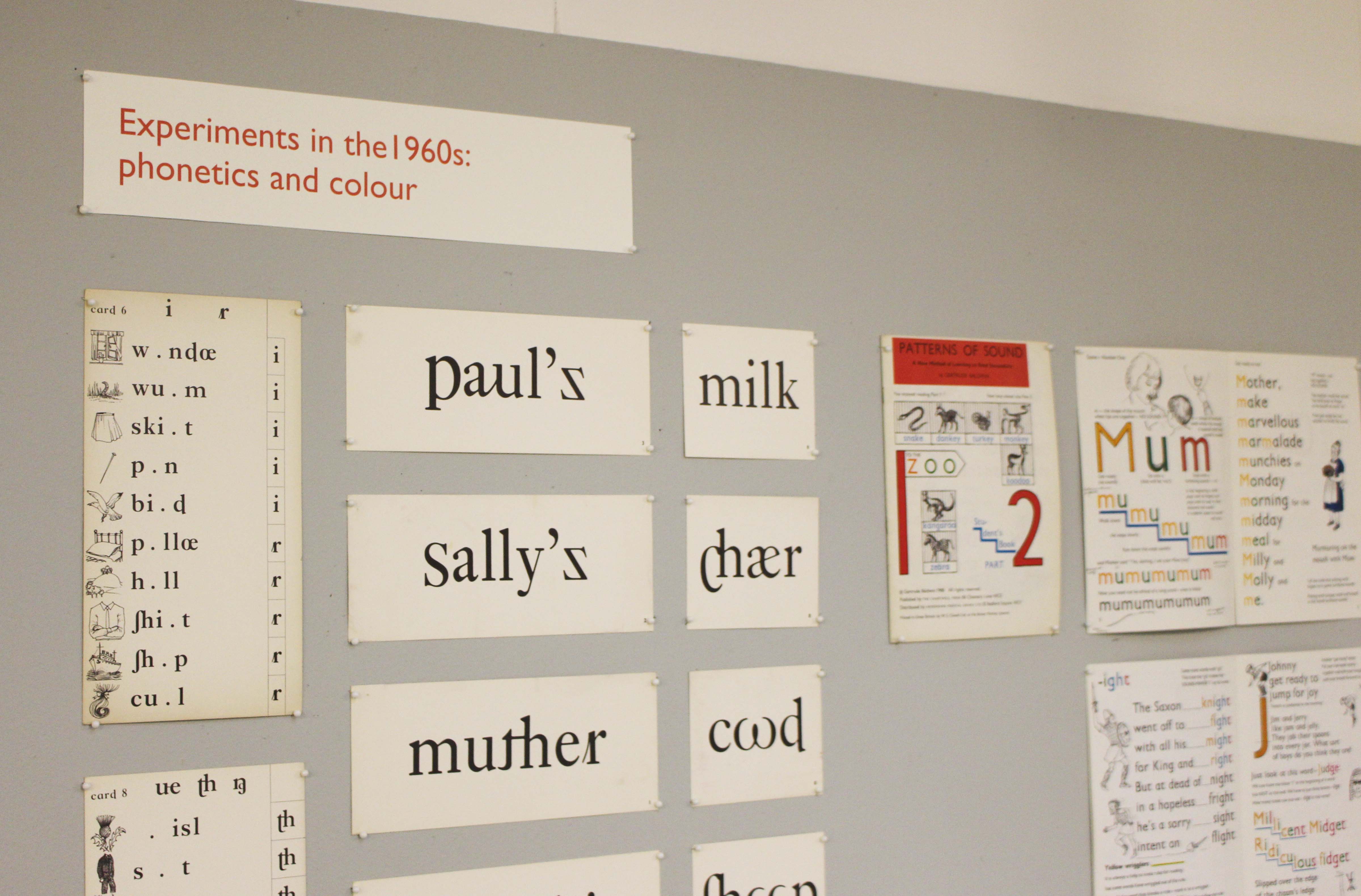
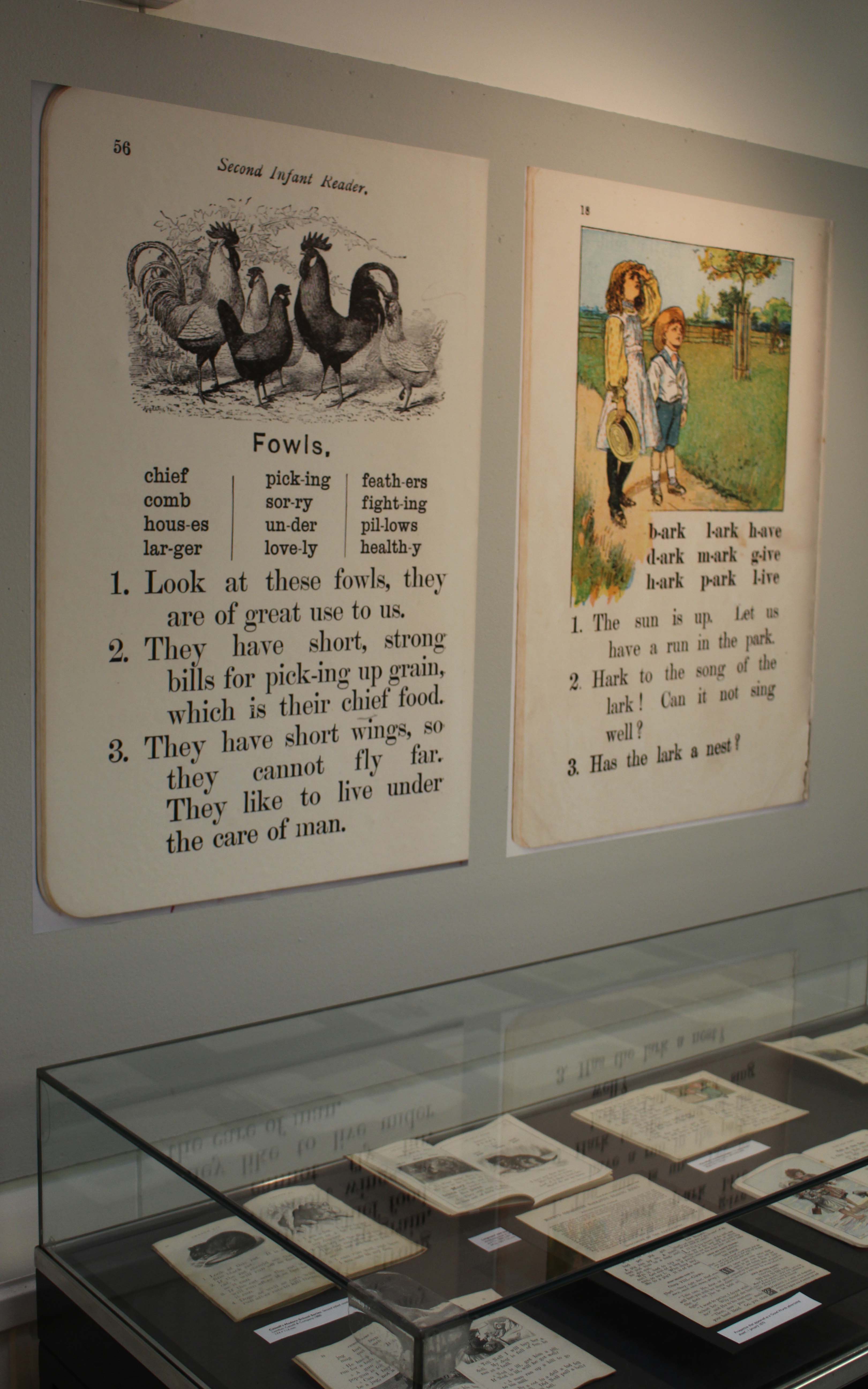
A collections-based research exhibition about typography and illustration in books for teaching reading from the 1880s to the 1960s.


kidsex2

Monday 11 January 2016 to Friday 18 March 2016

Open from 10.00 am to 4.00 pm, Monday to Friday

Department of Typography & Graphic Communication, ToB2, Earley Gate

More information from Laura Weill l.weill@reading.ac.uk

The use of typography and illustration in reading books for children has changed during the last hundred years. There has been a gradual shift from graphic conventions determined by printing and typesetting practice for adult readers to those more appropriate for beginning and emerging readers. Illustrations have become more important and many reading schemes used known artists to create the much-loved characters who featured in the narrative.

kidsex

Successful undergraduate summer research project

Mel and Peter

Congratulations go to Part 3 students, Mel Towriss and Peter Loveland (pictured above) who, over the summer, took part in the University’s Undergraduate Research Opportunity Programme (UROP) and worked with Centre for Information Design Research. Their project examined how on-screen text format affected people’s reading speed and comprehension, as well as people’s views on which text formats were most appropriate for different purposes. The texts used for the study dealt with employers’ responsibilities to run a payroll and were drawn from the GOV.UK web site. Mel and Peter found strong agreement among study participants regarding the text formats; for example, what might be appropriate for beginner or professional readers of the information. Reading times for the different formats did not differ significantly across format but there were differences in comprehension of the information they presented. Mel and Peter were runners up in a research poster  competition for all students taking part in the UROP scheme and will be taking their poster to the 2015 British Conference of Undergraduate Research.

Launch of dementia carers’ handbook

Dementia Handbook

Last week saw the launch of the Berkshire Healthcare handbook for carers of people with dementia. The handbook is the product of a joint research project between Centre for Information Design Research and Berkshire Healthcare Foundation Trust to understand the information needs of carers of people with dementia and respond with an appropriately designed resource. Once the handbook itself has been launched our research will continue, to examine how it is used; and the complete process of initial research, design development and user feedback will be made public so that it can be used by other healthcare organisations, in the UK and elsewhere. The project has been commissioned by Berkshire West Confederation of Clinical Commissioning Groups as part of their response to the Prime Minister’s Dementia Challenge which was set up to encourage innovative approaches to dementia care.

Although there has been increased media coverage of dementia over recent years, it is still a poorly understood condition, and most people have no idea of the medical and social support services that are available to help someone with dementia stay independent. The handbook aims to fill gaps in people’s understanding and provide practical tools that will help family members and friends who are looking after someone who has dementia.

The handbook has been developed with the input of scores of carers, who have contributed to interviews about their experience, reviewed drafts of the handbook content and commented on design prototypes. Similarly, professionals from Berkshire Healthcare’s dementia services have also given their input, helping shape the handbook from the beginning of the project. Involving people who will use information resources in their development is standard practice at Centre for Information Design Research and the Cochrane Review has recently cited evidence for the effectiveness of health information that is developed with the input of its potential users.

The collaboration between CIDR and Berkshire Healthcare started with the development of a pain assessment questionnaire for carers to complete, to help doctors understand the pain symptoms of people with dementia who were admitted to hospital and to adjust their pain medication accordingly. This questionnaire has been trialed successfully at the Royal Berkshire Hospital and is now being presented at geriatric medicine conferences as an example of the positive impact of empowering dementia patients’ carers to contribute to the process of care.

Centre for Information Design Research is now carrying out a range of projects relating to health care, including tackling medicines waste, increasing the detection and treatment of acute kidney injury in hospitals and documenting assessments of patients’ capacity to make decisions about their treatment.

The Dementia handbook for carers has been designed as a paper resource, which is what research showed carers needed. The boxes of copies taken to the launch were snapped up, with comments from carers that it was just what they had been looking for.  But it can also be accessed on-line at www.berkshirehealthcare.nhs.uk/dementiahandbook.

The Handbook has featured on Meridian TV, BBC Radio Berkshire and Jackfm.

Doing a PhD at Reading

Titus Nemeth thesis

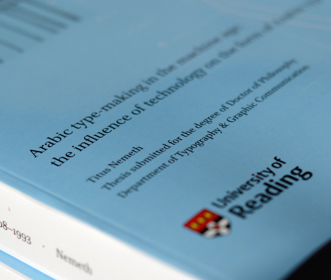
Titus Nemeth submitted his PhD thesis in 2013, on the evolution of Arabic type-making under the influence of changing technologies. The thesis spans the period from 1908, when the first adaptation of Arabic to mechanical typesetting introduced machine-aided composition; and 1993, when the adoption of Unicode marked the end of typeface design’s association with specific platforms. Titus’ research was supported by an AHRC Studentship.

Titus’ PhD represents a number of type-related research projects drawing on archival material, and is a useful reference for all researchers in this area. He has now published on his blog an engaging reflection on his experience doing a PhD at Reading. His article is a source of inspiration and guidance for potential researchers, and contains useful advice for research at this level.

The PhD was not Titus’ first experience in Reading. He had graduated from the MA Typeface Design in 2006, having completed an important Latin/Arabic typeface and a dissertation on Arabic newspaper typography.


CIDR out and about

The Department’s Centre for Information Design Research (CIDR) has popped up in a couple of places on the web, recently.

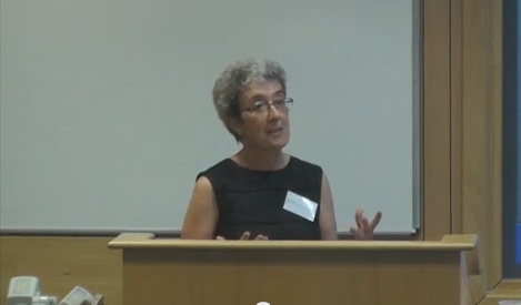
You can see a talk by Alison Black to Oxford Academic Health Science Network on the Centre’s projects on the design of information for dementia care here.

AB talks to AHSN

And you can read Alison discussing the communication of uncertainty in meteorological forecasts here as part of CIDR’s NERC-funded collaboration with the University’s Departments of Meteorology and Psychology.

More about both at CIDR’s blog

50% chance of rain

UROP students Silchester

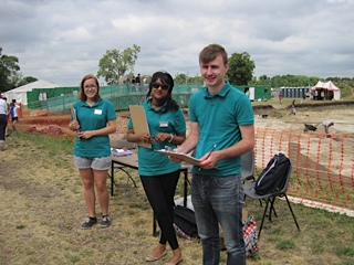
Left to right, Rachel Bartlett, Shyamali Abraham and Matt Standage, questionnaires at the ready

Public at Silchester

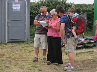
Many members of the public took time off from the dig to give us their input

Typography & Graphic Communication student, Matt Standage, has been working together with Meteorology student, Rachel Bartlett and Psychology student, Shyamali Abraham on a joint project between the University’s Meteorology Department, Centre for Information Design Research and Psychology Department on the communication of probabilistic weather forecasts. These are forecasts that show the chance of rain as a percentage – often used in American weather forecasts but less typical in the UK. In this study we are looking at people’s response to percentages presented as numbers, words (likely, unlikely etc.) and through graphic representation.

The project is part of the University’s Undergraduate Research Opportunities (UROP) scheme. In the picture (top) you see the UROP team poised to hand out questionnaires to members of the public visiting the Archeology Department’s open day at Silchester last Saturday.

The republic responded generously by taking time to complete our questionnaires, indicating what types of information they typically use to make weather-based decisions and how they prefer to see information about the chance of rain in forecasts. Some 250+ questionnaires later we’re very grateful to the Silchester team for hosting us, to all who kindly allowed themselves to be distracted from their visit to the dig to respond to the questionnaire and also to the many people in Reading town centre who also took part in the research.

Fabula – a typeface for children

abenteuer-schule-ABC

Fabula is gaining popularity for use in resources for children, both on paper and on screen.

The typeface was designed under Sue Walker’s direction by a team of staff and students at Reading, including Vincent Connare, José Scaglione and Gerry Leonidas, as part of an EU-funded project producing bilingual story books for children. Since then it has been available for free, along with advice if required, from the Typographic design for children web site.

Some examples of how Fabula has been used:

Jashanjit Kaur, a designer based in Hyderabad, India used Fabula for Amigo, described as ‘a socialising platform for school children that provides a medium for sharing their ideas and pursuing interests in a safe and secure environment’.

Cecelia Erlich used the letterforms in a Spanish television programme, La cucaracha.

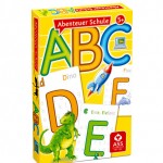
Dietmar Brühmüller used the font for the whole range of four young children’s games, including the one illustrated above.