‘Michael Harvey in his own words’ at Snape

MH private view    MH exhibition

Our exhibition ‘Michael Harvey in his own words’, with additional curation by Nick Sloan, is now open at Snape Maltings from 25 March to 28 May 2016.

We were delighted that the Lettering & Commemorative Arts Trust asked if the exhibition, based on material from the archives in Typography and in Special Collections, could be moved to Snape. Here’s a press view.

Getting to grips with specification: hands-on with the collections

On the first day of term, Paul Luna and Jeanne-Louise Moys kicked off the part 2 book design project with an inspiring workshop using hand-drawn specifications from our collections. Highlights from the collections included: Paul Stiff’s exquisitely-detailed information design specifications and George Mackie’s book specifications.

The workshop examined the ways in which drawing can help students internalise typographic knowledge and empower them to effectively plan and implement designs. We explored different kinds of design drawings from quick sketches to wow clients in meetings, through sketches used in our own design planning and exploration, and finally to detailed specification layouts for communicating with typesetters and printers.

The students also had an opportunity to practice rendering type by hand in editorial specifications, using our Linotype type specimens.


IMG_0260

 Prof Paul Luna engages our part 2 students with a Paul Stiff specification that effectively demonstrates how typographic hierarchy and detail can be encoded simply through variations in lines.


IMG_0262

Visiting student from Ravensburg University, Severin Mantel studies Paul Stiff’s soil chart specification up close.


IMG_0263

Part 2 students (from L to R) Ed Hendry, Jessie Webb and Phoebe Madden try out their drawing skills with our specifications and type specimens for inspiration.

Using the collections: thoughts from the 2014/15 winners of the Michael Twyman Bursary

Michael Twyman Bursary awards winners, Monica Olveira and Sergio TrujilloPerez, have both commented on their experience of working with the collections in Typography.

Sergio said:

“I have been exposed to an eye-opening teaching philosophy which combines theory, practice and history . . . we as students have been encouraged not only to explore but also to interact with the items found within the Department’s collection of printed material. Everything from antique books, newspapers, posters and ephemera, to original sketches, production pieces and printing tools, has been at our disposal. The close contact with these collection pieces provides the historical context needed to better understand, appreciate and practice any design profession. It is definitely a unique experience to work in such a historically rich and creative environment, and I am extremely thankful that I was able to do so.”


Image3

Monica used material from the collections for her professional assignment project, which involved assisting with curation, and designing an exhibition:

“One of the reasons that made me decide to enrol in the MA Book Design was having the opportunity to explore the archive and come face to face with so many materials that I had only seen before in books or the internet. Since day one of the MA I tried to sneak in to the reading room and timidly into the archive but not really knowing what to look for yet. This finally happen when we were given our professional assignment and my tutor suggested that I developed a forthcoming exhibition at the Department curated by Eric Kindel.

This exhibition brought together two periodicals — Future and Fortune — to show the diversity of graphic information during the post-war years. Future magazine was part of the Isotype Collection held in the Department’s archive while Fortune belonged to private collections.

To acquaint myself with the materials I spent a few days in the archive going through different issues of Future and Fortune. Getting to know better both periodicals helped me to devise a more informed graphic language for the exhibition as well as understand how to structure it. The final stage was bringing all the elements together, from the magazines on display inside the cases, the text panels and large images on the wall, to the booklets and website.

Putting together such an exhibition was quite a laborious process due to the various elements involved, but one that made me come across so many unknown materials. The archive is full of boxes, drawers and shelves still there to explore, some of them I hope to discover in my final year.”

TDi sets the pace

Fiona Ross and material

When the TDi summer course in typeface design ran for the first time, there were few opportunities for people with a requirement to develop their understanding of the emerging discipline. Seven years on, there are many short courses focusing on typeface design and typography, but still none that can match the TDi’s approach of immersing participants in learning through direct engagement with archival material.

TDi 2015

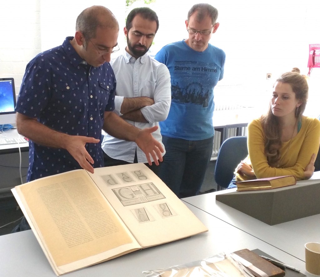
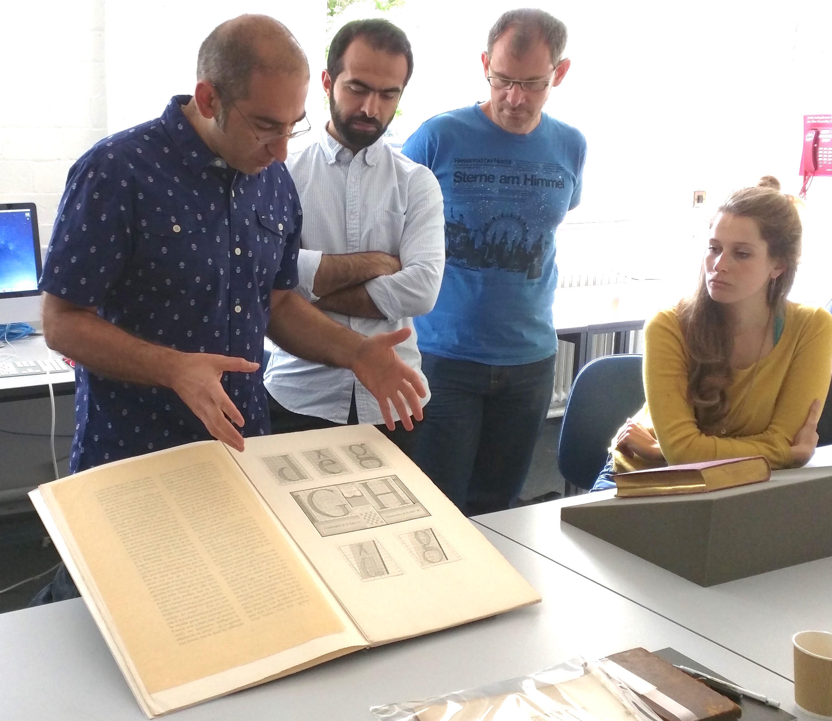
Gerry Leonidas explains the tension between designers and makers to Mohammad Sharaf, Sascha Brawer, and Arianna Tilche.

The TDi’s model of placing the development of practical skills within the historical context in an intensely hands-on manner has proven especially successful with experienced professionals, educators, and researchers from related fields. This combination of expertise and unique materials that underpin enlightening narratives is instrumental to the course’s continued success.

TDi 2015

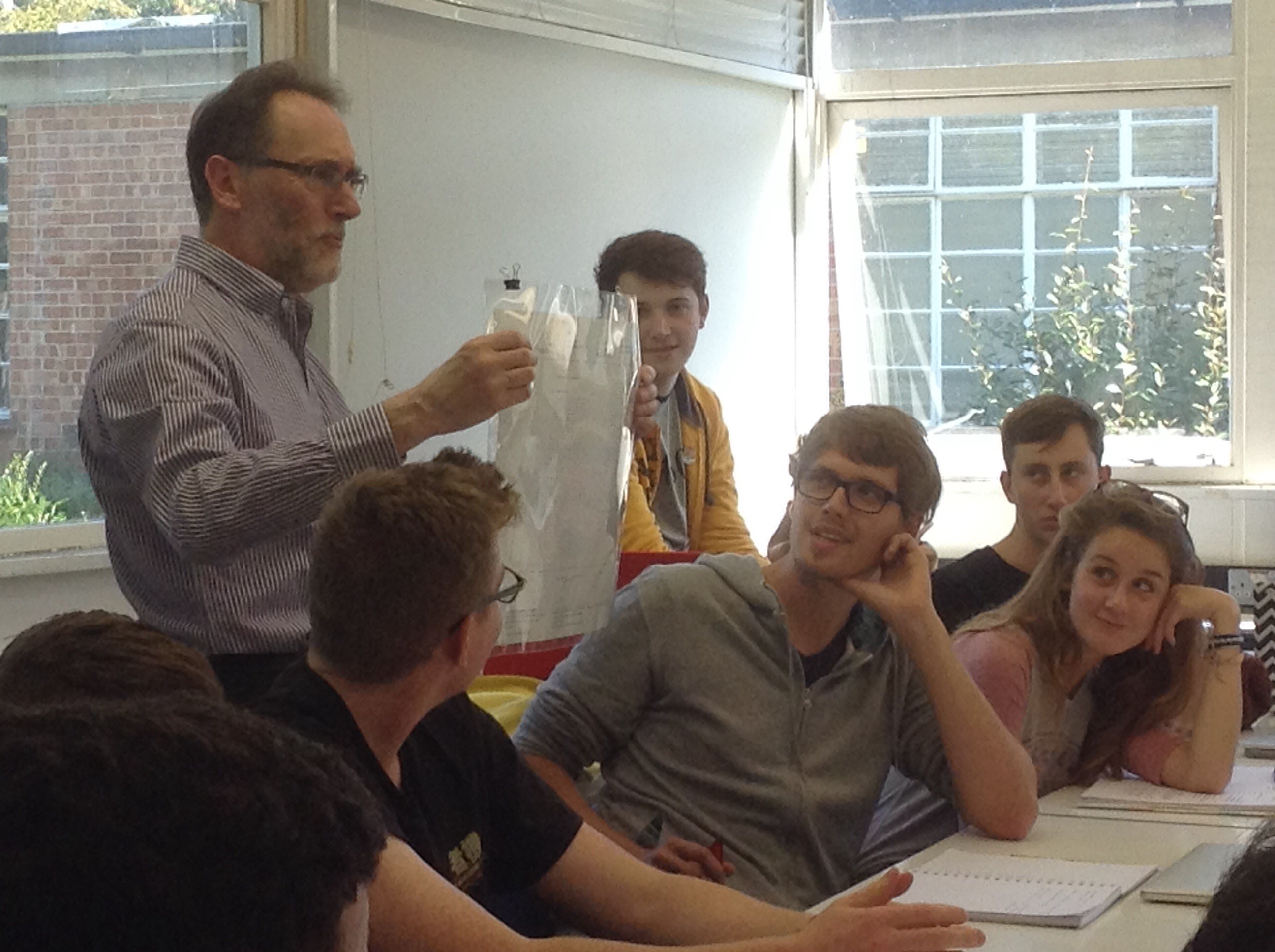
Eric Kindel discusses modularity with Craig Eliason, with Irmi Wachendorff, Alan Qualtrough, and Rui Abreu.

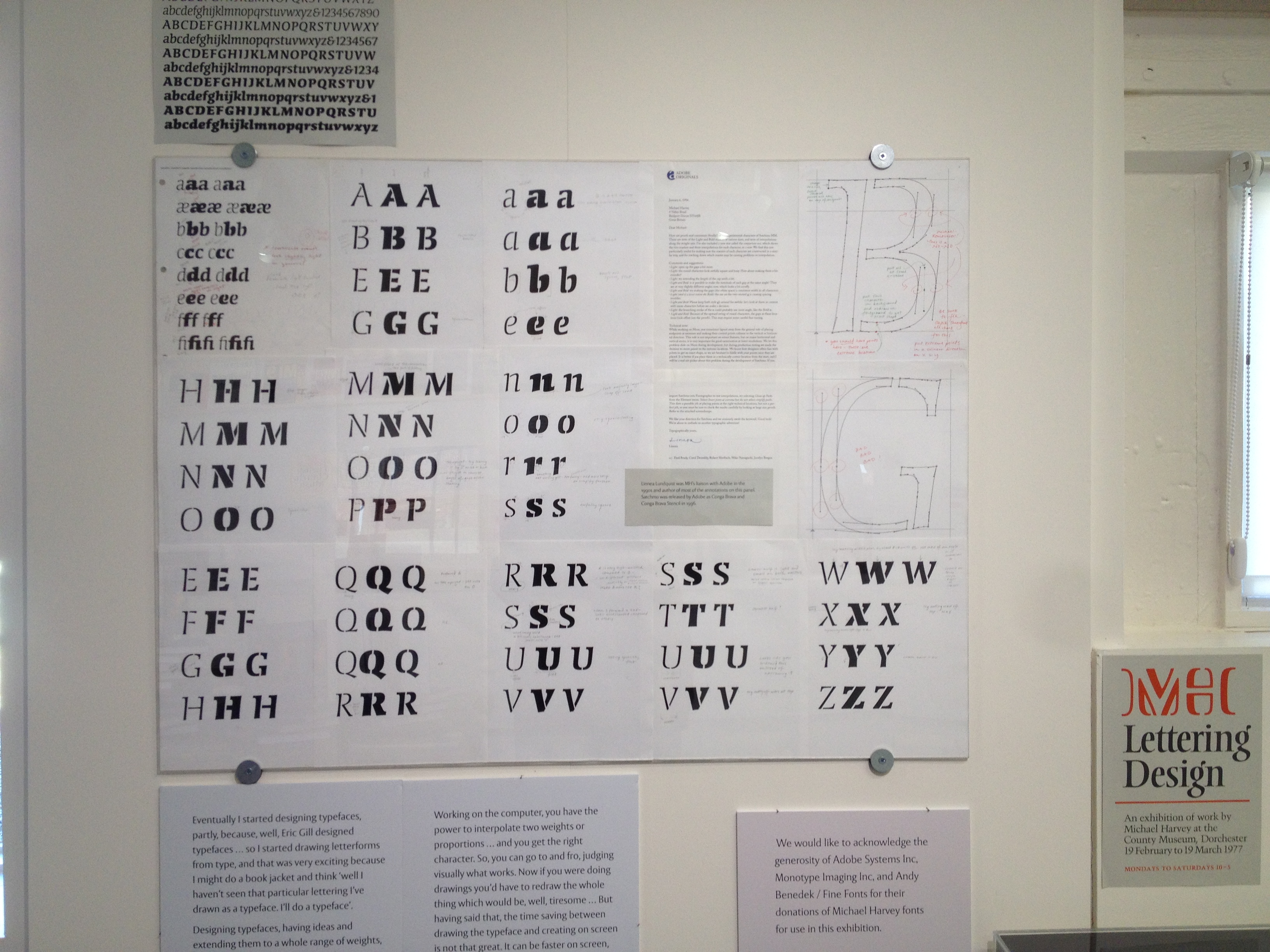
Using materials from the Department’s Collections & Archives, and research collections built up over the years by staff, enables rapid learning that is both detailed and deep. Experiencing original materials enables participants to discuss materiality, the conditions of making, the technologies surrounding type-making and typesetting, and the distribution of objects in a much more revealing and memorable way. Looking at several objects in parallel enables comparisons that are simply impossible to conduct effectively through reproductions in print or screen.

TDi 2015

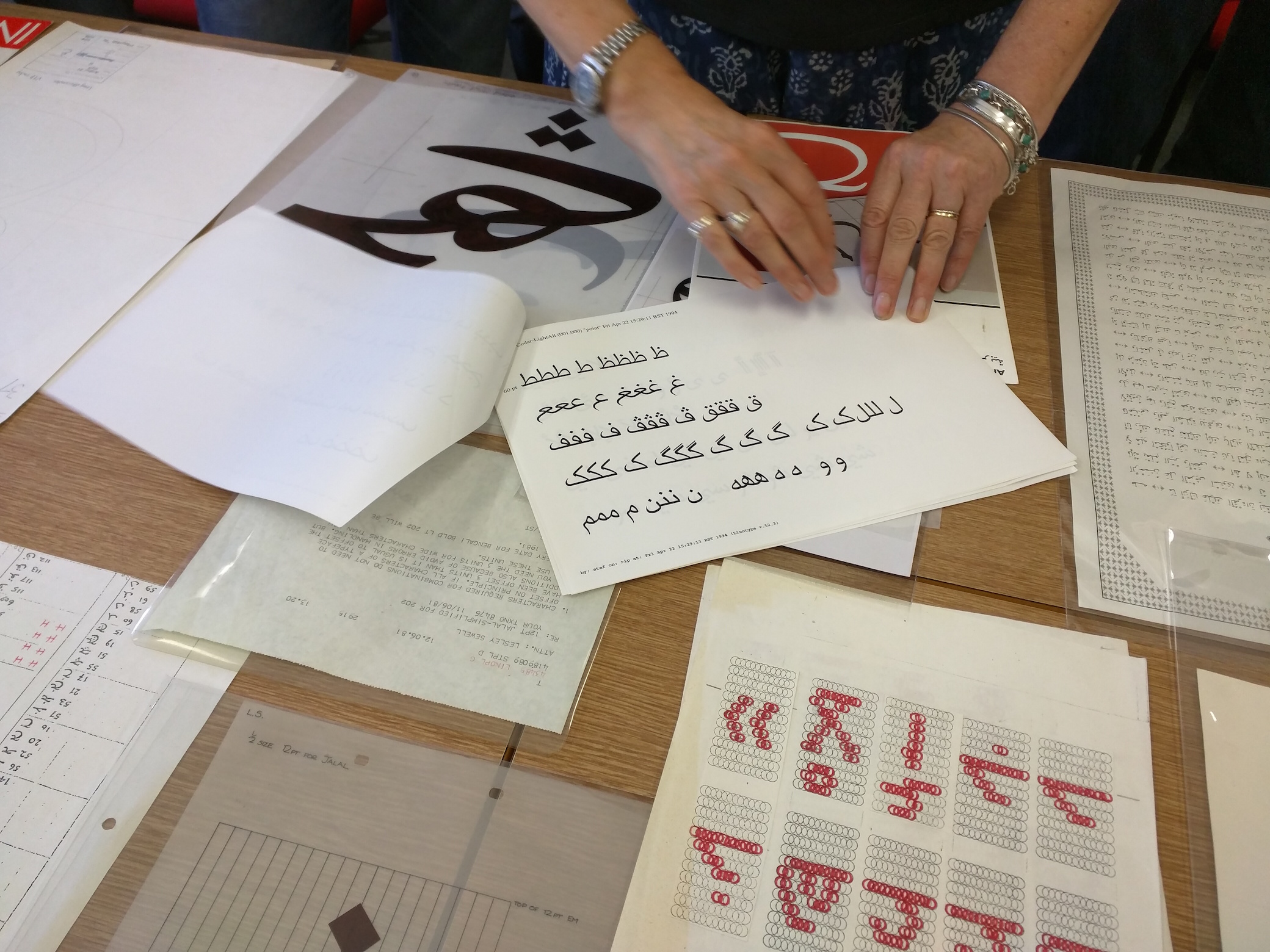
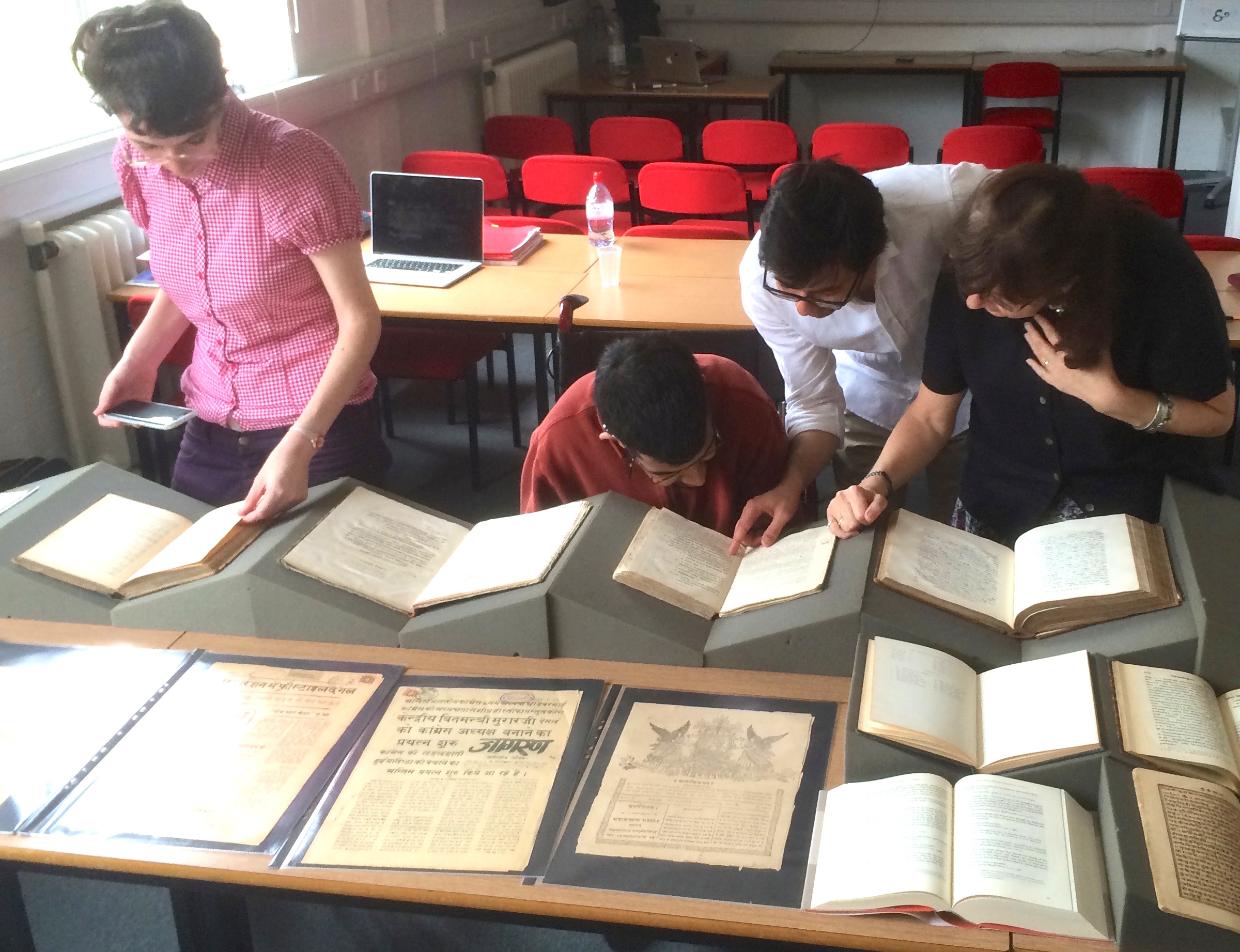
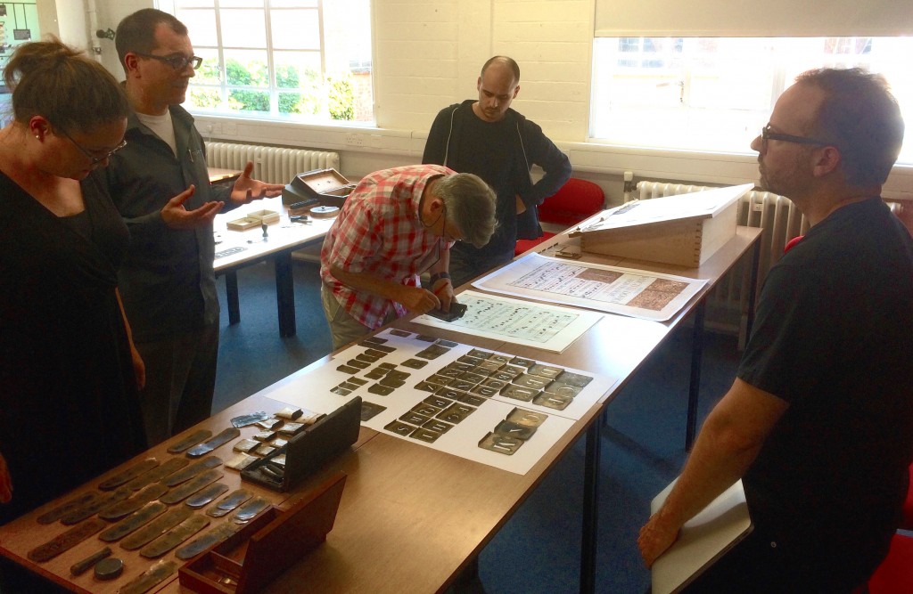
Fiona Ross comments on items from Vaibhav Singh’s collection to Siva Kalyan, with Stav Axenfeld.

Original materials are particularly helpful when staff work with participants who may have considerable expertise in tangential fields, but not in typography. In these cases, the archival material makes all the difference: many participants lack the fundamental education in typographic design, but have highly developed skills in other fields. The immediacy and depth of comparisons we can make wit real objects allows TDi staff to construct narratives that help participants make connections between their fields and typography, and engage at a fairly high level of discussion.

TDi 2015

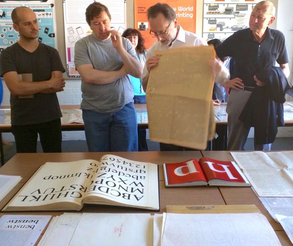
Paul Luna discusses dense text typesetting with Rui Abreu, Stuart Gill, and Walter Bohatsch.

The approach exemplified by the TDi is not unique to typeface design: any discipline with a rich, interdisciplinary background benefits from narratives that reveal the connections between context, decisions, and users through the output of these interactions. The interest of educators who have participated, including some with leadership responsibilities, is an encouraging confirmation of the transferability of the approach. On the other hand, the material collections themselves tend to be unique or extremely challenging to build from scratch, underlining Reading’s unique advantage.

TDi 2015

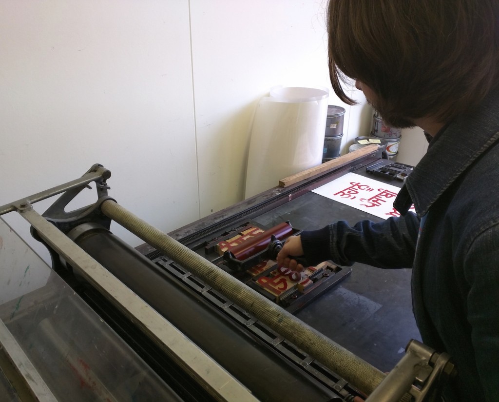
Noel Pretorius inks up Devanagari wooden type, used to explain challenges in complex typesetting.

Another area where teaching with original material can make the difference is with groups with very different language levels. Running a seminar with a set of images necessarily relies on deeper, more complex verbal explanations, since flat projections do not reveal the salient points in an object. Using the original material allows participants to understand both the context and the key elements in an object, and thus construct meaningful narratives with more concise descriptions that utilise interactive archival sessions. The value of this approach is recognised increasingly, as the breadth of participants on our courses expands into regions without traditions of strong language skills. Our experience shows that sessions capitalise on participants’ native critical thinking and learning skills, in a way that that attenuates the impact of the lack of confidence in English.

TDi group photo

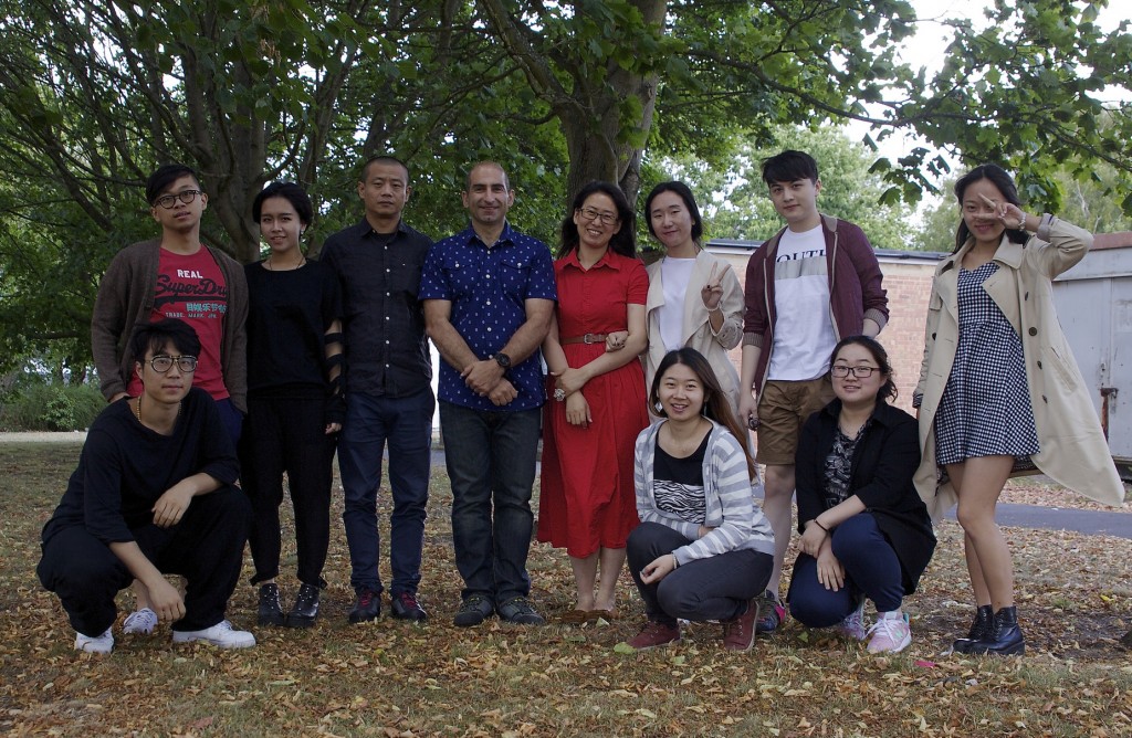
A very happy group from the Central Academy of Fine Arts, and the Shandong University of Art & Design, at the end of a course on typeface design full of unique objects.

Inspired by ephemera


Y3ephproj

Cameron Armstrong, who has recently graduated from Typography, has won an Examiners’ Award for his self-directed project which was inspired by material from the Maurice Rickards Collection of Ephemera. Here are some examples from the book he designed showing creativity and ingenuity in a variety of nineteenth- and twentieth-century letterforms and design.

Isotype at Design4Health

Isotype-Fighting-TB

Sue Walker curated a small exhibition at the Design4Health conference at Sheffield Hallam University 13–16 July 2015.

‘Isotype: Fighting tuberculosis’ showed full-size examples of some of the 20 ‘educational charts’ produced in the 1930s for the National Tuberculosis Association in the USA.

The charts were well-received. Conference participants, comprising academics and health practitioners, commented that both the content and the style of presentation were relevant today.

Identifying prints: what is the process and how is it done

v&a1

This 3-day course, Tuesday 23 – Thursday 25 June 2015, was run jointly by the Typography Department at Reading, the V&A and the AHRC Design Star Consortium. Delegates included PhD students, curators and librarians from National Portrait Gallery, the V&A, the Ashmolean Museaum, and Kew Gardens, and members of the Baxter Society.

The first two days were hosted by Martin Andrews who, with Alan Hardie, introduced delegates to hand-on letterpress, intaglio and lithographic printing using the presses in the Typography Department. Martin used prints from the collections and archives to support close observation using hand lenses to explain what to look for when you are trying to identify the printing processes used.

The third day was spent at the V&A where Elizabeth James, Senior Librarian, National Art Library Collections, and Annemarie Bilclough, Assistant Curator in Prints and Drawings introduced treasures from their Departments, and gave delegates the challenging task of identifying the printing processes that were used. In the afternoon, Michael Twyman from Reading led a session on lithography and chromolithography.

Zorian Clayton, Assistant Curator of Prints, V&A said:

Seeing the processes done in the studio and seeing so many examples of each type as we were talking through them.  Being able to have a go drawing directly on copper plates and stone was invaluable for understanding the process and getting a more all-round understanding of the complexities of print making. 

It was also good to meet people from other institutions and to compare what sort of queries and questions come up regarding their print collections.

[The course] has given me the confidence to identify numerous different types of printing which is necessary in my current job at the V&A.  We routinely respond to public queries and have an opinions day where members of the public can bring in their personal objects for appraisal so it will be very useful then also.  I also do a lot of cataloguing of prints so I feel I have a more grounded expertise now and look forward to putting it into practice.