Weather in Cameroon and Adaptation Plan for Climate Change

By: Chimene Daleu

The Republic of Cameroon is a country in central Africa. The country extends from the coast of the Gulf of Guinea and the Atlantic Ocean through west-central Africa to Lake Chad. The majority of Cameroon has a tropical climate with two seasons: the rainy and dry seasons.

Figure 1: Mean monthly precipitation across Cameroon (1961-2001). Plot taken from Ernest Molua, 2006

The geography of Cameroon is highly diverse. The country contains highlands in central and western regions, plains in the north, and tropical forests in the south and along the coast. Its topographic features superimpose climatic variations on this north‐south gradient. The low‐lying coastal plain rises rapidly to the inland regions of high plateaus and mountain ranges. The Cameroon mountain range stretches along the country’s northern border with Nigeria, with peaks in excess of 13,000 ft. This diversity in the geography of Cameroon causes its weather to vary markedly from one region to the other. Overall, the southern regions of Cameroon are generally humid and equatorial, while the climate becomes semi‐arid toward the northern regions. The rainy season is from May to November with most precipitation falling on coastal regions (e.g., Douala, see Figure 1). The wettest months – which should be avoided if you are not a fan of rain – are between July and October (see Figure 1). The climate is pleasant in the dry season between November and February; the “Harmattan”-season between December and February is characterized by the dry and dusty north-easterly trade wind, which blows from the Sahara Desert over West and Central Africa into the Gulf of Guinea.

Figure 2: Mean monthly temperature across Cameroon (1961-2001). Plot taken from Ernest Molua, 2006

The semi‐arid north of Cameroon (Maroua, see Figure 2) is the hottest and driest part of the country. That region experiences average temperatures between 22‐27°C in the cooler seasons (SON, DJF), and 26‐31°C in the warmer seasons (MAM, JJA). On the other hand, temperatures in the southern regions are largely dependent on altitude, ranging between 20-25°C, and varying little with season. Annual rainfall is highest in the coastal and mountainous regions of Cameroon (e.g., Douala; see Figure 1). The driest season is in December, January and February. The main wet season lasts between May and November for most of the country, when the West African Monsoon winds blow from the southwest, bringing moist air from the ocean. Rainfall can exceed  600 mm per month in the wettest regions (e.g., Douala and Kribi; see Figure 1), while in the semi‐arid northern regions of Cameroon the peak monthly rainfall does not exceed 400 mm (e.g., Maroua; see Figure 1). The southern plateau region has two shorter rainy seasons, occurring between May and June and between September and October (e.g., Yaounde).

When it comes to climate change impacts, Cameroon is particularly exposed because of its territories in the Sahelian zone, which are hit hard by desertification, and its territories in coastal areas that are threatened by rising sea levels. Due to the great geographic diversity in Cameroon, the nature of climate change and its impacts vary widely from one region to another. However, all agroecological zones will be affected in one way or another as well as all the sectors. The Cameroonian people must, therefore, face an important challenge, as their economic and social well-being are largely dependent on the viability of the main development sectors.

Cameroon is already facing consequences of climate change, including an abnormal recurrence of extreme weather phenomena such as high temperatures, violent winds, and heavy rainfall, which endanger communities’ ecosystems and the services they provide. The most recent extreme weather phenomena occurred over the first two weeks of October 2019, when heavy rains poured ceaselessly, destroying farms, crops and houses. This left 70,000 homeless in the northern part of Cameroon and 30,000 homeless across the border in Chad, where the Logone River broke its banks on October 1st. It was the worst flooding in northern Cameroon since 2012 when heavy rainfall persisted in the area for over a month and claimed 60 lives.

Photo by Raphael Mwadime

The economy of Cameroon depends strongly on agriculture. Therefore, the effects of global warming and climate change are likely to threaten both the welfare of the population and the economic development. For instance, the aforementioned heavy rainfall and flooding have undermined Cameroon’s efforts to reduce poverty and develop a strong, diversified, and competitive economy. Agricultural policy should, therefore, prepare for changing climate hazards. As a result, the National Adaptation Plan for Climate Change (NAPCC) was created to assist the Cameroonian people in facing such important challenges in accordance with the United Nations Framework Convention on Climate Change (UNFCCC). In 2016, within the framework of strengthening their partnership for effective fundraising for the NAPCC implementation, the Ministry of Environment, Nature Protection and Sustainable Development (MINEPDED) and Global Weather Partnership (GWP) Cameroon initiated the process of the development of a National Investment Plan for Adaptation on Climate Change (NIPACC).

The approach, taken for preparing the NAPCC, was participatory, multidisciplinary, and systematic. The NAPCC was built on 4 strategic axes:

  • improving knowledge on climate change
  • educating the population to climate change adaptation
  • reduce the country’s vulnerability to the impacts of climate change and strengthen its capacity for adaptation and resilience
  • facilitate the coherent integration of climate change adaptation in relevant policies and programs, especially in development planning processes and strategies

References

Some of this information was found in Wikipedia. Figures 1 and 2 were found in Molua, 2006, and Figure 3 was found online.

Ernest L. Molua (2006) Climatic trends in Cameroon: implications for agricultural management. Clim. Res., 30, 255-262. https://doi.org/10.3354/cr030255.

Banseka H. and L. C. T. Levesque (2018) Cameroon: Preparing the National Adaptation Plan for Climate Change (NAPCC) and its Investment Strategy. 

Posted in Climate, Climate change | Tagged | Leave a comment

Air Quality in Reading during COVID-19

By Helen Dacre

I’ve been working from home for exactly a month now and like everyone else have been adapting to a new routine.  This involves taking a daily shuffle around Caversham to get some exercise. There’s been a noticeable lack of traffic on the roads which makes my daily shuffle a lot more enjoyable.  This got me thinking about the effect of the current travel restrictions on air pollution. If there are fewer cars on the road emitting pollutants, then perhaps air quality may have changed?

Air pollution measurements are taken routinely at a network of over 100 monitoring sites across the UK. One of these sites is located in the centre of Reading at Cemetery Junction which sits between 2 busy roads, Wokingham Road and London Road.  It’s been taking measurements since 2003.  The data from this station (Reading New Town) is freely available from the Defra website.

Figure 1: Hourly measured Ozone concentrations at Reading New Town from 1 March 2020 to 15 April 2020.  Date of social distancing implementation on 16 March 2020 (magenta dashed) and non-essential travel restrictions on 23 March 2020 (black dashed). Data from www.uk-air.defra.gov.uk.

So, my first port of call was to take a look at the data from the Reading New Town monitoring station.  Figure 1 shows the hourly ozone measurements between 1 March and 15 April 2020.   The magenta dashed line shows the date on which social distancing was recommended (16 March) and the black dashed line shows the date on which non-essential travel restrictions were enforced, the so-called “lockdown” (23 March).  As you can see, there’s lots of variability in the data including a strong diurnal cycle.  There does appear to be an increase in ozone towards the end of the timeseries but it’s difficult to say whether this is due to changes in emissions of ozone precursors or due to changes in the meteorology.

The amount of ozone formed depends on the concentrations of other substances present in the air, such nitrogen oxides (NOx) and hydrocarbons. The concentration of these substances tends to be higher in polluted air, so we expect ozone concentrations to be lower when NOx is higher. However, NOx concentrations also tend to be higher when meteorological conditions are such that atmospheric dispersion is less efficient. These conditions are often associated with sunny high pressure, such as that we experienced last week. Therefore, meteorology plays a large role in determining the concentration of ozone, which is one of the research topics that I’m interested in.

So, if we want to find out what’s driving the increase in ozone, we need to work out how to remove the variations that are due to changes in the weather.  The best way to do this is to build a statistical model to predict the ozone concentrations using meteorological variables and other inputs. So that’s what I’ve done.  As inputs to my model, I used 12 years of data (2008-2020) including wind speed, wind direction, temperature, time of day, day of the week, Julian day and the date. My model predicts what we might expect ozone concentrations to be during the current meteorological conditions.

Figure 2: Hourly measured Ozone concentrations (grey), 24-hour moving averaged measured Ozone concentrations (blue) and predicted Ozone concentrations (red) at Reading New Town from 1 March 2020 to 15 April 2020.

Figure 2 shows the observations, with a 24-hour moving average applied (blue) and my model predictions for the same period (red).  Surprisingly, my simple model captures the ozone variability in the period prior to lockdown quite well. After lockdown it appears that the measured ozone is higher than my model predictions, possibly indicating the effect of reduced NOx emissions?

Figure 3: Accumulated difference between measured concentrations and predicted concentrations from 1 March 2020. Ozone (left) and NOx (right)

To emphasise the differences, I also plotted the accumulated difference between my model prediction and the observed ozone concentrations from the 1 March, shown in Figure 3 (left).  The accumulated difference is initially small since the over or underestimations predicted by my model (which is far from perfect) cancel each other out.  However, after lockdown there’s a steep increase in the difference indicating that ozone is above that expected, possibly due to a reduction in NOx.

To see if this increase in ozone is due to a reduction in NOx emissions, I also built a statistical model to predict NOx concentrations. My model for NOx isn’t quite as good as that for ozone because NOx has much larger extremes.  But the accumulated difference plot shown in Figure 3 (right), does show the opposite behaviour to that for ozone; i.e. that my model overpredicts the observed NOx after the 16 March 2020, when social distancing was introduced.

NOx contains NO2 which is bad for human health, particularly for those with asthma. It increases the likelihood of respiratory problems and can cause wheezing, coughing and bronchitis.  So, the evidence suggests that NOx emissions have been decreasing during the COVID-19 travel restriction period which is good news for my daily shuffle. There’s plenty of analysis still to be done to see if these results are robust across other sites in the UK, but for now enjoy the peace and quiet on the roads and stay safe and well.

Posted in Air quality, Boundary layer, Climate | Leave a comment

Understanding the role of climate change in the 2018 Kerala floods.

By: Kieran Hunt & Arathy Menon

These days, when a weather-related catastrophe occurs, one of the first questions raised in the aftermath is “did this happen because of climate change?”. Because of the stochastic and chaotic nature of weather, it is all but impossible to determine whether a single event was caused by climate change. There are, however, experiments that we can do to figure out whether climate change makes a certain type of event more likely, or for a given case, to what extent it has modified the impacts.

Our study explores the second of these options in the context of the devastating Kerala floods of 2018. During mid-August of that year, a monsoon depression passed unusually far south over the Indian subcontinent. This, in turn, excited the moist monsoonal westerlies, causing very heavy rainfall when they struck the mountain range that runs along the southwest Indian coast – the Western Ghats. The deluge fell mostly over Kerala, which had been saturated just several weeks earlier from rains associated with another low-pressure system. The reservoirs rapidly hit capacity, dams were opened state-wide, and the resulting flooding killed 483 people and displaced over a million more.

Figure 1: Average rainfall over 15-17 August 2018 (computed using data from NCMRWF). Also shown are the tracks of the precursor low-pressure system (6-9 August) and monsoon depression (13-17 August). The border of Kerala is shown in thick black.

Kerala lies mostly over the ecologically fragile Western Ghats and has a complex topography with the Arabian Sea to the west and mountains to the east. It also receives a large amount of rain with an average of about 300 cm during the monsoon season. About 50 major dams in Kerala provide water for agriculture and hydro-electric power generation. As a result of the torrential rains in August 2018, the authorities had to open the sluices of 35 of these major dams as they reached maximum capacity.

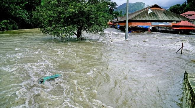
Figure 2: A photo showing the flooded Periyar river, submerging the surrounding areas during the August 2018 flood (Source: The Hindu).

So, how do we probe the role of climate change in all this? We set up three experiments, using a technique called “pseudo global warming”.The first, a control, is a simulation of the 2018 Kerala floods as they happened using a regional weather model (WRF, with coupled hydrology to allow river simulation) forced at the boundaries with ERA-Interim reanalysis data. We use the control experiment to verify the model is working correctly (for example, by checking the simulated rainfall looks close to observations) and as a benchmark against which we can judge our other two experiments. For the first of our two perturbation experiments, we “subtract” the effect of observed global warming by using output from the CMIP5 pre-industrial experiments to adjust our boundary conditions – in essence keeping the high-frequency information responsible for the floods and modulating the low-frequency information that describes the background climate (e.g. large-scale changes in temperature and humidity). The second perturbation experiment uses the same method to “add” projected global warming in 2100 from the CMIP5 RCP8.5 experiments. Thus, our three experiments describe how the floods would look like in the current climate (control), a climate where no human-induced global warming takes place (pre-industrial), and a climate where much more global warming takes place (RCP8.5).

Results show that the rainfall affecting Kerala during August 2018 would have been 18% greater had human-induced climate change never occurred; in contrast, it would be 36% higher in the 2100 future climate. The first result seems counterintuitive at first glance: the world has warmed considerably since the pre-industrial era, and that warming brings with it a lot of additional moisture, so we would naively expect more rainfall, not less. What’s going on? Well, another result of climate change (both observed and projected) is a weakening of monsoon depressions – and in this case, that weakening has a stronger effect on the rainfall than the increase in humidity. This tug-of-war changes hands, dramatically, in the future climate experiment as the moisture increase easily overwhelms the weakened dynamics, which you can see in Figure 3.

Figure 3. Relative contributions to changes in moisture flux from changes in moisture (left column) and winds (right column).

How would this change in rainfall have affected the reservoirs and rivers? To answer this, we need to use a hydrological model that takes information from our weather model (e.g. rainfall, winds, temperature) and computes the response of local rivers and groundwater. Perhaps unsurprisingly, changes in the average river discharge over Kerala are almost identical to the changes in precipitation. However, given the highly variable Keralan topography, local responses to the climate perturbations can vary significantly. It’s beyond the scope of a blog post to go through each reservoir individually, so let’s focus on the largest one: Idukki. Built from nearly 500,000 cubic metres of concrete, the Idukki reservoir is responsible for over a quarter of Kerala’s total freshwater capacity. Figure 4 shows the modelled inflow rate and storage for the three experiments, with observational data for comparison. The model performs well, with simulated storage closely matching observations (phew!), at least until authorities opened the floodgates in mid-August. The most interesting take-away, however, is the gap between the respective orange lines and the dashed grey line – this represents the additional capacity that the reservoir would’ve needed to prevent flooding, and the minimum amount of water that would end up inundating downstream parts of Kerala. In the control experiment, this excess amounts to 589 million cubic metres of water in the control experiment, but 852 million in the future climate experiment, an increase of 45%. Other major dams show broadly similar patterns, although the effect of the future climate worsens significantly towards the south of the state.

Figure 4: Modelled inflow (blue:control; grey:pre-industrial; red:future) and storage (orange solid:control; dashed:pre-industrial; dotted:future) for the Idukki reservoir system. For comparison, black crosses show the daily observations of storage, and the grey dashed line shows the stated maximum capacity of the reservoir.

Summarising, the 2018 Kerala floods were likely made less damaging by climate change, as global warming has weakened monsoon depressions. However, if they were to happen again in a future climate (RCP8.5) scenario at the end of this century, the effect of increased tropical humidity would far outweigh the weakened depressions, likely resulting in a significantly more catastrophic scenario.

References:

Dash, S. K., J. R. Kumar, & M. S. Shekhar, (2004). On the decreasing frequency of monsoon depressions over the Indian region. Curr. Sci., 86, 1404-1411, https://www.jstor.org/stable/24109213?seq=1

Dee, D. P., and Coauthors, (2011). The ERA‐Interim reanalysis: Configuration and performance of the data assimilation system. Quart. J. Roy. Meteor. Soc., 137(656), 553-597, https://rmets.onlinelibrary.wiley.com/doi/full/10.1002/qj.828

Gochis D. J., Yu W. & Yates D. N. (2014) The WRF-Hydro model technical description and user’s guide, version 2.0. Tech. rep., NCAR

Hunt, K. M. R., & A. Menon, A. (2020). The 2018 Kerala floods: a climate change perspective. Climate Dynamics, 54, 2433-2446, https://doi.org/10.1007/s00382-020-05123-7

Mitra, A. K., I. M. Momin, E. N. Rajagopal, S. Basu, M. N. Rajeevan, & T.N. Krishnamurti, (2013) Gridded daily Indian monsoon rainfall for 14 seasons: Merged TRMM and IMD gauge analyzed values. J. Earth Syst. Sci., 122(5), 1173-1182, https://www.ias.ac.in/describe/article/jess/122/05/1173-1182

Prein, A., R. M. Rasmussen, K. Ikeda, C. Liu, M. P. Clark & G. J. Holland, (2017) The future intensification of hourly precipitation extremes. Nat. Climate Change, 7, 48–52, https://doi.org/10.1038/nclimate3168

Sandeep, S., R. S. Ajayamohan, W. R. Boos, T. P. Sabin, & V. Praveen, (2018). Decline and poleward shift in Indian summer monsoon synoptic activity in a warming climate., Proc. Natl. Acad. Sci. U.S.A., 115(11), 2681-2686, https://doi.org/10.1073/pnas.1709031115


Posted in Climate, Flooding, Monsoons | Tagged | Leave a comment

An overview of a dataset digitized by citizen science volunteers – the 1900-1910 Daily Weather Reports

By: Philip Craig

Two years ago the citizen science project Weather Rescue was used to digitize hand-written weather observations from the Met Office’s Daily Weather Reports from the years 1900-1910 (Figure 1). These were, as the name suggests, daily documents that published weather observations from various locations around Great Britain and Ireland, plus some countries in western Europe (Figure 2). This was the second phase of Weather Rescue and was based on a very successful effort to digitize hourly observations at the Ben Nevis observatory and two stations in Fort William.

The Daily Weather Reports were digitized by 2148 volunteers between December 2017 and July 2018 with five volunteers asked to transcribe each observation of pressure, temperature and rainfall. If the volunteers entered the same value it would be stored in a spreadsheet for the appropriate day, but if enough volunteers disagreed on a value it would be flagged as an error in the spreadsheet and subjected to quality control.

Figure 1: the top half of page 1 of the Daily Weather Report from Wednesday 1st July 1903.

This is where I came in. For six months beginning in July 2018 I conducted the quality control on the entire dataset of observations recovered from the Daily Weather Reports. That was 4017 spreadsheets with a growing number of stations each year. To quality control the dataset, I compared every flagged error to the entry in the original documents (available online from the Met Office’s National Meteorological Library and Archive). Any values that were illegible I deleted from the spreadsheet, but I had confidence in some of the values so replaced the error in the spreadsheet with the value from the original document. Using multiple volunteers for each observation helped to avoid transcription errors such as confusing a 3 for an 8 or typing the wrong number, which are easy mistakes to make but this method removes the obvious errors by volunteers.

It’s fair to say that processing 4017 daily spreadsheets for six months was a pretty tedious task.  I mostly identified the errors by eye but also used a simple Python script to show any errors I had missed. Most spreadsheets only had a small number of errors, but some spreadsheets required substantially more work. For example, there were some spreadsheets with lots of errors that may have been caused by some misaligned images from the scanned documents. Although this was a tedious task it was generally very straightforward, and since I’d just spent months writing my PhD thesis it was a nice change! I also learned to understand the old Imperial units for pressure and temperature for the first time after having only ever used metric units!

The new data recovered from the Daily Weather Reports has filled some gaps and corrected errors in the existing observational records. For example, in the International Surface Pressure Databank version 4.7 (ISPDv4.7) there are no stations in England and Wales for 1900-1910, with four in Scotland, three in Ireland and one in the Channel Islands. Weather Rescue has provided new pressure observations from 28 stations in Great Britain, Ireland and the Channel Islands (Figure 2) – data from Stornoway, Aberdeen and Valentia are already in ISPDv4.7. The new pressure data will help to constrain the ensemble of the Twentieth Century Reanalysis (20CR). The lack of pressure observations means that there is often large uncertainty of the atmospheric circulation across the 80 realizations in 20CR version 3 (20CRv3), particularly for high impact weather events such as cyclones!

Figure 2: map of stations in the 1900-1910 Daily Weather Reports. The country boundaries are the modern day borders.

The full observations dataset is available from the Centre for Environmental Data Analysis. It contains 1,832,926 observations of pressure, temperature and rainfall from 72 stations in Great Britain, Ireland and Western Europe (Figure 2). The data are stored in daily spreadsheets and in the Station Exchange Format (SEF), which is to be the international standard for exchanging historical weather data. In the daily spreadsheets, the data are stored in their original Imperial units: pressure in inches of mercury (in Hg), temperature in degrees Fahrenheit (°F) and rainfall in inches (in). These were converted into SI units for the SEF files: pressure in hectopascals (hPa), temperature in degrees Celsius (°C) and rainfall in millimetres (mm).

Please also keep an eye out for my paper coming up in Geoscience Data Journal that describes the dataset and quality control process in more detail. I also compare the recovered observations to 20CRv3 and the Met Office’s gridded precipitation dataset.

References

Compo, G. P., and Coauthors, 2019: The International Surface Pressure Databank version 4. Research Data Archive at the National Center for Atmospheric Research, Computational and Information Systems Laboratory, accessed 30 March 2020, http://rda.ucar.edu/datasets/ds132.2/

Craig, P.M. and Hawkins, E. (2019) Met Office daily weather reports 1900-1910. Centre for Environmental Data Analysis, accessed 30 March 2020, https://catalogue.ceda.ac.uk/uuid/235ff4a040854dcd8dfb754bbb898479

Craig,P.M. and Hawkins, E., 2020; Digitising observations from the Met Office Daily Weather Reports for 1900-1910 using citizen scientist volunteers. submitted to Geoscience Data J.

Hawkins,E., S. Burt, P. Brohan, M. Lockwood, H. Richardson, M. Roy, and S. Thomas, 2019; Hourly weather observations from the Scottish Highlands (1883–1904) rescued by volunteer citizen scientists. Geosci Data J., 6, 160-173. https://doi.org/10.1002/gdj3.79  

Hollis, D., M. McCarthy, M. Kendon, T. Legg, and I. Simpson, 2019; HadUKGrid: A new UK dataset of gridded climate observations. Geosci. Data J., 6, 151-159. https://doi.org/10.1002/gdj3.78

Le Blancq, F., 2010; Rescuing old meteorological data. Weather., 65, 277-280. https://doi.org/10.1002/wea.510

Slivinski, L.C., and Coauthors, 2019; Towards a more reliable historical reanalysis: Improvements for version 3 of the Twentieth century Reanalysis system. Quart. J. Roy. Meteor. Soc., 145, 2876-2908. https://doi.org/10.1002/qj.3598

Posted in Climate, Data collection | Leave a comment

The Atmospheres of Two Exoplanets

By: Peter Cook

One of the big discoveries of recent decades has been the finding of thousands of exoplanets, and it now seems that most stars have planets.  Remarkably, detailed measurements have now been made of some of these despite the huge distances involved.  The first two exoplanets to have their atmospheres studied in detail, and their spectra directly observed, are HD209458b (also called Osiris) at a distance of 159 light years and HD189733b (having no other name at present) at a distance of 64.5 light years.  Both are large planets, similar in size to Jupiter and mostly composed of hydrogen and helium.  They orbit very close to their stars so are referred to as being “Hot Jupiters” (many of the exoplanets found so far are Hot Jupiters, though this is probably a selection effect as such planets are the easiest to find).

Osiris was first found using the motion of its star (as both go around a mutual centre of gravity) which revealed its mass, and then again when it transited its star (revealing its size).  Osiris is only 0.047 astronomical units (AU) from its star (one AU is the average distance between the Earth and Sun) and orbits in only 3.5 days.  While roughly similar in mass and radius to Jupiter it has a very low density (0.37 times that of water), and since its star is slightly more massive and brighter than the Sun Osiris has probably been inflated by violent heating of its outer atmosphere.  By studying changes in the total infrared emission from the planet and star, as Osiris hides part of the star during transit and is then eclipsed by the star, the temperature of the atmosphere was revealed to be around 1400 K by the Spitzer Space Telescope.  The spectra obtained seems to show a dry atmosphere containing sodium atoms and silicate particles, while high-precision observations by the European Southern Observatory’s (ESO) Very Large Telescope and the CRyogenic high-resolution InfraRed Echelle Spectrograph (CRIRES) measured gasses streaming from the day to night side at a speed of around 7000 km/hour (Osiris must be tidally locked and so keep the same side facing its star).  Further measurements imply that Osiris is very dark in colour, reflecting less than 10% of visible light, and has patchy high-altitude hot clouds composed of metal oxides.  Osiris is surrounded by an envelope of hydrogen, carbon and oxygen, more than twice the size of the planet, with a significant tail pointing away from the star.  This was discovered by the Hubble Space Telescope Imaging Spectrometer by measuring star light passing thorugh it and shows mass lost from the planet and blown away by its star.  Osiris has probably lost a few percent of its mass over its lifetime.

HD189733b was also found using both the transit and radial velocity methods, only 0.031 AU from its star and orbits in 2.2 days (though is not quite as hot as Osiris since its star is less massive and fainter than the Sun).  Observations by the Spitzer Space Telescope over 33 hours were used to create a temperature map (see figure).  These are in the range 973-1212 K with the peak offset 30 degrees east of the sub-stellar point (again the planet must be tidally locked) showing that absorbed energy is distributed fairly evenly through the atmosphere and hence wind speeds would be of order 8700 km/hour.  Again, the atmosphere seems to be fairly dry; sodium has been detected (3 times the concentration as at Osiris) and carbon dioxide.  Visible light polarimetry shows that HD189733b is blue in colour (unlike the very dark Osiris), probably due to Rayleigh scattering of blue light in the atmosphere and the absorption of red light by molecules.  An X-ray spectrum of the planet’s transit (H1 Lyman-Alpha) shows an extended exosphere of hydrogen and hence a slow evaporation.  Some further measurements indicated the presence of water vapour and methane in the atmosphere (though these should quickly react together in the high temperatures to form carbon monoxide), and silicate particles (in which case, HD189733b could have rain consisting of molten glass!).

This information is from Wikipedia, and the Spitzer Space Telescope map was also found online.

Posted in Climate, Space | Leave a comment

What is “net zero” for methane?

By: Bill Collins

Recent research is suggesting that the way methane is accounted for in climate targets overemphasises its contribution to climate change at the end of the century. This might mean that countries or sectors (e.g. agriculture) with large methane emissions might have to impose overly stringent CO2 cuts to compensate (but is that a bad thing?), while countries that are able to reduce methane emissions might get away with insufficient CO2 cuts.

The new way of looking at methane reveals that to stabilise temperatures it is the rate of methane emission that is important rather than the total methane emitted (Collins et al. 2020, Allen et al. 2018, Cain et al. 2019). Therefore, a useful way of comparing methane and CO2 is to compare a change in the rate of methane emissions (tonnes per year) with a change in cumulative CO2 emissions (tonnes). This would have considerable implications as to what “net zero” means for each country.

The big step change in understanding from the IPCC 5th Assessment Report (IPCC 2013) was the concept of an almost linear relationship between the amount of carbon dioxide emitted and resulting temperature. From this it follows that to stabilise temperatures the net amount of carbon dioxide emitted will have to decline to zero. This was recognised in the Paris Agreement in which Article 4 refers to achieving “a balance between anthropogenic emissions by sources and removals by sinks of greenhouse gases in the second half of this century”. Some countries (including the UK) have therefore adopted a target of “net zero” greenhouses gas emissions by 2050.

Net zero is clear for CO2, but what about for methane? Methane has a natural removal sink through chemical oxidation in the atmosphere. Should this process be considered part of the “removals by sinks” specified in the Paris Agreement or should only direct capture of methane be counted? Methane behaves very differently to CO2 such that if we maintain global methane emissions at the current level then the concentrations of methane will stabilise and not contribute further to global warming. Reduction in methane emissions will even make a cooling contribution to climate. This contrasts with CO2 where constant emissions lead to a constant warming rate and reduced emissions still lead to a reduced warming rate until they decline to zero.

So how do we include methane in the net zero target? A common way to compare greenhouse gases is through a metric called the 100-year Global Warming Potential (GWP100) that compares the energy imbalance (radiative forcing) caused by emissions of a tonne of each gas averaged over the following 100 years. The GWP100 suggests 1 tonne of methane emission is equivalent to 34 tonnes of CO2 (Collins et al. 2020). Because methane has a short lifetime in the atmosphere (around 12 years) its climate impacts are much smaller by the end of the century (say 2070 or 2095) – only equivalent to 14 or 8 tonnes of CO2 respectively (Collins et al. 2020). This means that GWP100 overestimates the temperature effects of methane on the sort of time frames when we might reach peak warming.

Achieving “net zero in 2050”: schematic comparison of assumptions assuming a constant decline in methane emissions to 2100. CO2 equivalent emissions for methane (dotted red) are based on a rate/cumulative metric of 3000 years. Total CO2 equivalent (dotted black) are the sum of the solid green and dotted red.

Left: Scaling the methane emissions by 30 (GWP100), non-zero methane in 2050 means negative CO2 emissions are needed to compensate. The CO2 equivalent emissions become net zero earlier than 2050 and stay negative leading to an early peak in temperature and a decline afterwards.

Right: using the rate vs cumulative metric (GWP* or combined-GTP – see text), decreasing methane emissions in 2050 means CO2 emissions can be slightly positive. The CO2 equivalent emissions become net zero in 2050 and remain zero leading to a stabilisation of temperature at 2050.

The solution is to put all this together. Temperatures depend on the rate of methane emissions, but the accumulation of CO2 emissions. Hence a useful metric compares changes in these two quantities rather than GWP100 which compares changes in cumulative emissions of both. These rate vs. cumulative metrics are called GWP* in Allen et al. (2018) and combined-GTP in Collins et al. (2020), and a mix of GWP100 and GWP* has been called “CO2-warming equivalent” in Cain et al. (2019). These metrics have values of around 3000 years – depending exactly on how they are calculated. This importance of these new metrics is that a zero change (i.e. constant) emission rate of methane is equivalent to a net zero change in cumulative CO2, and a reduction in methane emission rate of 1 tonne per year is equivalent to a one-off negative emission of around 3000 tonnes of CO2.

Using the standard GWP100 metric for methane means CO2 emissions have to be more strongly negative to compensate, whereas for the GWP* or combined-GTP metric the CO2 emissions can be slightly positive (or more likely less negative to compensate for other gases). The second method leads to the desired stabilisation of climate, but the first method has lower temperatures. Is it better to overvalue methane if it makes us take more severe action on CO2, or to use a metric more closely tied to the temperature stabilisation that may lead to complacency?

References:

Allen, M. R., J. S.Fuglestvedt, K. P. Shine, A. Reisinger, R. T. Pierrehumbert, and P. M. Forster, 2016: New use of global warming potentials to compare cumulative and short-lived climate pollutants. Nat. Climate Change, 6, 773–776. https://doi.org/10.1038/nclimate2998

Cain, M., J. Lynch, M. Allen, J. S. Fuglestvedt, D. J. Frame, and A. H. Macey, 2019: Improved calculation of warming-equivalent emissions for short-lived climate pollutants, npj Climate Atmos. Sci., 2, https://doi.org/10.1038/s41612-019-0086-4

Collins, W. J., D. J. Frame, J. S. Fuglestvedt, and K. P. Shine, 2020: Stable climate metrics for emissions of short and long-lived species – combining steps and pulses. Environ. Res. Lett., 15, 2, 024018 https://doi.org/10.1088/1748-9326/ab6039

Posted in Climate, Climate change, Climate modelling | Leave a comment

Housebuilding ban on floodplains isn’t enough – flood-prone communities should take back control

By: Hannah Cloke

February 2020 has brought more than its fair share of bad weather to the north of England, the Midlands and Wales. Shrewsbury, Bewdley and Telford swam in the Severn, while the Ouse invaded York. For some, the adage that it’s grim up north rang true.

The recent flooding is a reminder that all parts of the UK are vulnerable to natural hazards, and the costs aren’t just economic. Flood water can enter a building in minutes, but the impact on communities can last years. Flooded homes and businesses take months to clean up and dry out, and the long-term impact on the health and relationships of those affected is often overlooked.

Climate change has made some types of floods more likely, but past government policy has ensured that the ensuing crises are worse than they might otherwise have been. While there’s an urgent need for new homes, 1.8 million people currently live in areas at significant risk of flooding, and homes are still being built on floodplains.

The chief executive of the Environment Agency, Sir James Bevan, argued that if we must build in the floodplain, homes should be built with garages on the ground floor and living space upstairs, to ensure floods cause minimal damage. This might sound radical, but some of the oldest buildings along Britain’s rivers and coastline, such as millhouses and warehouses, have stone floors and steps up to first floor entrances. They were designed hundreds of years ago to ensure their occupants could ride out intermittent flooding.

Figure 1: Old millhouses – like this building in the US – are often raised above ground level, in anticipation of flooding. StudioKismet/Shutterstock

Climate change may force countries, such as the UK, to adopt radical practices from parts of the world that flood more frequently, such as houses that are designed to float when floods come, rising on stilts as the water rises. It’s an idea that is familiar to those living in stilt houses beside the Amazon river, and it’s also found favour in the Netherlands.

For those who already live on the floodplain, there are less dramatic but important adaptations that can be made. Internally reinforced, mechanically sealable flood doors can be installed to keep water out. Carpets and wooden floorboards that soak up dirty flood waters can be swapped for waterproof concrete and stone-slab floors. Electrical sockets can be raised and non-return valves can be fitted to toilets to stop sewage filling homes when it floods.

Communities that can weather floods

Making Britain more resilient to floods is not just a task for individuals. The government now has an opportunity to prove its long-term commitment to the north of England in particular, by creating detailed plans to increase resilience to floods. Backing the HS2 railway and moving the House of Lords out of London might grab headlines, but making sure the region is resilient in the face of future flooding requires less glamorous investment.

It’s equally important that money isn’t just thrown at the areas that were flooded last – or which might have voted Conservative in the last election. Every flooded community, no matter where they are in the country, deserves support, and managing flood risk is about more than just installing large flood defences or water-proofing homes. A long-term approach requires policies that link the necessary changes in land use, agriculture, housing and development.

Part of this could give communities the power to take control of their own destiny by creating regional flood forums, giving residents’ groups a say in how communities prepare for and respond to floods. Too many people are left with the impression that the government, or other distant authorities, can be trusted with sole responsibility for preventing flooding, and are then left feeling powerless and abandoned when floods happen.

 
Figure 2: Communities in Wales reel from the impact of Storm Dennis. Could involving residents in flood management make them more resilient to future floods? EPA-EFE/DIMITRIS LEGAKIS

It’s essential that everyone who lives in or moves to an area at risk of flooding knows that the risk of flooding is real. It’s difficult to imagine that your home could be flooded if you have never seen water lapping at your front door or rising up your kitchen cabinets. This is especially true for those living in properties that don’t immediately border running water.

But the historical record tells us that even before modern climate change, big floods have always happened. And floods are like buses, sometimes nothing happens for ages and then several come, one after the other. Flood risk maps exist, but the message is not getting through to those who need them.

Perhaps flood risk should come to be seen like earthquake risk zones in other countries. It would mean public signs clearly positioned to show that you are in a flood zone and that there is danger to life, health and property. It would ensure that strong building regulations are adhered to and school lessons are specifically devoted to knowing how to keep people safe.

We certainly need new ideas for connecting people with the realities of living with climate change. Ensuring that everyone can find out about their flood risk, shape decision-making on land management, and adapt their homes accordingly could empower people to prepare for the floods that will inevitably come.

This article was originally published in the Conversation.

Posted in Climate, Climate change, Flooding | Leave a comment

Meiyu—Baiu—Changma Rains

By: Amulya Chevuturi

The arrival of the summer monsoon rains over southern China is called Meiyu, literally translated as “plum rains”. These are also called Baiu in Japan and Changma in Korea. As the monsoon progresses, these rain belts first occur over Taiwan, southern China and Okinawa region from early-May to mid-June, then continue towards the Yangtze River valley and the main islands of Japan from mid-June to mid-July, and finally reach the Korean Peninsula and north-eastern China during mid-July to mid-August. This northward march of the rain belts occurs in tandem with the seasonal progression of the East Asian summer monsoon. These rain belts, which last on an average for 8 days, are named after the respective regional names of the season. 

Figure 1: Example of the Meiyu—Baiu—Changma rain belt cloud cover (demarcated with a red dotted line) over parts of southern China, Taiwan and Okinawa Islands on 14th June 2017. Source: WorldView NASA.

These rain belts are formed due to monsoon frontal systems, which are strongly influenced by the moisture flow from the monsoon winds in the lower atmosphere. These east-to-west extended frontal systems may last for 3 to 22 days and lead to local-scale variability within the large-scale monsoon season over East Asia. As these frontal systems move north, their characteristics transition from those of tropical disturbances to mid-latitude ones. The rainfall from these systems contributes up to 45% of the total monsoon rainfall over some regions of East Asia. A snapshot of cloud cover during one such rain belt over East Asia, on 14th June 2017, is shown in Figure 1. This weather system led to devastating amounts of rainfall, which lasted almost up to 10 days. It left many displaced people, had damaged infrastructure and ruined crops, due to subsequent floods and landslides.

Figure 2: (a) Mean position of the monsoon front band during May (red), June (purple) and July (blue) and (b) mean June rainfall associated with the mean June frontal band (purple) in ERA5 dataset from 1979-2014.

Researchers in our department, inspired by previous research, have defined an objective method to identify these frontal systems by detecting regions with strong temperature and moisture gradients by using the north-to-south gradient of the equivalent potential temperature. Through this method we can identify the narrow band of the monsoon frontal systems and detect any rainfall within approximately 600 kilometres of the band, as the Meiyu—Baiu—Changma rain belt. Using this method, we have identified the monthly average position of the monsoon front and accompanying rainfall for May, June and July from 1979-2014, using the newest reanalysis dataset from European Centre for Medium-Range Weather Forecasts (ECMWF), named ERA5, shown in Figure 2. We clearly observe the northward progression of the frontal bands from May—June—July, and more rainfall south of the frontal band position. We also found larger contribution to total monsoon rainfall during May than in July, from the monsoon fronts, due to a greater number of frontal systems early in the season.

When we analysed the representation of these monsoon fronts in the UK Met Office model, we found that although the model can generally represent the average position of these frontal systems, it overestimates the associated rainfall. This rainfall error in the model stems from the overall overestimation of the summer monsoon rainfall over East Asia. Further, the monsoon fronts are influenced by the El Niño Southern Oscillation (ENSO) conditions (based on the equatorial Pacific sea surface temperature) in the proceeding winter. Warmer temperatures (El Niño phase), increase the occurrence of these frontal systems, whereas an opposite response is seen due to colder sea surface temperatures (La Niña phase). Although the model correctly depicts this remote teleconnection between ENSO phases and the monsoon fronts, the strength of the remote relationship is much stronger in the model.

The monsoon rainfall from such systems affect the lives of over a billion people. Our continued work for better understanding of these monsoon frontal systems and their representation in the models, will ultimately improve the prediction of rainfall during the monsoon season. This will allow for improved disaster management, agricultural planning and water resource allocation, and thus benefitting the regional economy.

References

Charlier, P., 2017: Thousands Evacuated, Army on Standby as Heavy Rain Pounds Taiwan. Taiwan English News, accessed 04 March 2020, https://taiwanenglishnews.com/thousands-evacuated-army-on-standby-as-heavy-rain-pounds-taiwan/.

Ding, Y.H, and J.C. Chan, 2005: The East Asian summer monsoon: an overview, Meteor. Atmos. Phys., 89, 117-142. DOI: https://doi.org/10.1007/s00703-005-0125-z.

Jun-Mei, L., J. Jian-Hua, and T. Shi-Yan, 2013: Re-discussion on East Asian Meiyu rainy season, Atmos. Oceanic. Sci. Lett., 6(5), 279-283. DOI: https://doi.org/10.3878/j.issn.1674-2834.13.0024.

Li, Y., Y. Deng, S. Yang, and H. Zhang, 2018: Multi-scale temporospatial variability of the East Asian Meiyu-Baiu fronts: characterization with a suite of new objective indices, Climate Dynamics, 51, 1659–1670. DOI: https://doi.org/10.1007/s00382-017-3975-4.

Sampe, T., and S.P. Xie, 2010: Large-scale dynamics of the Meiyu-Baiu rainband: Environmental forcing by the westerly jet, J. Climate, 23, 113-134, DOI: https://doi.org/10.1175/2009JCLI3128.1.

Posted in ENSO, Monsoons | Tagged | Leave a comment

Water Vapour Absorption and its Role in the Earth’s Energy Budget

By: Jon Elsey

I’m Jon, a postdoc working with Prof. Keith Shine in the Atmospheric Radiation, Composition and Climate (ACRC) group. My work is very much in the “R” of ACRC, and specifically on the role of water vapour on atmospheric radiation.

When we think of “radiation”, you might think of the Hulk, or conjure up images of nuclear meltdown, or some other catastrophe. What I actually mean here by radiation is light emitted by the Sun (visible light, ultraviolet and high frequency infrared) which we call shortwave radiation, or by the Earth and its atmosphere (mostly lower-frequency infrared) which we call longwave radiation.

 Figure 1: The longwave and shortwave atmospheric absorption processes are circled. All units in W m-2. (from Stephens et al. (2012), Nature Geoscience).

This radiation is part of the Earth’s energy budget shown in Figure 1; shortwave radiation comes in from the Sun, which is then absorbed by the atmosphere and surface, with some being reflected back to space. The absorbed radiation heats up the surface and atmosphere, which then emit radiation in the longwave. The radiation emitted up from the surface in the longwave is then absorbed again by the atmosphere, trapping this energy within the Earth system. This is the well-known greenhouse effect, the main contributors to which are water vapour (H2O) and CO2.

The energy emitted by the Sun and Earth is in the form of a spectrum, made up of the visible, infrared and ultraviolet light I mentioned earlier. This radiation is absorbed by atmospheric gases at specific frequencies. For example, CO2 and water vapour absorb radiation very differently – CO2 absorbs very strongly in only very specific parts of the spectrum, whereas H2O absorbs radiation very strongly across most of the shortwave and longwave, with opaque regions (the so-called absorption bands) interspersed with much more transparent regions (the atmospheric windows).

Figure 2: Plot of the optical depth from CO2 (blue), H2O (orange) and H2O continuum (green) for the entire depth of a real atmosphere (measured in Cornwall, UK). The red dotted line shows the demarcation between the longwave and shortwave. Note that the y-axis is on a logarithmic scale – the 105 line is 1000x stronger than the 102 line, etc.

Figure 2 shows the absorption in a real atmosphere measured during my PhD, in units of optical depth, which is just a measure of how opaque the atmosphere is. So, looking at Figure 2, if water vapour absorbs more radiation than CO2, then why are we worried so much about CO2? The issue here is to do with what we call climate forcings and climate feedbacks. A forcing can be thought of as due to something outside of the climate system causing a change in its properties, while a feedback is the result of the climate system responding to a forcing.

In this context, CO2 contributes to the forcing (we emit CO2, which causes the atmosphere to heat up) and water vapour is a feedback (higher temperature leads to more water vapour in the atmosphere from evaporation of the oceans). This means that as CO2 heats up the Earth, it also causes an increase in the water vapour absorption, trapping much more radiation than the CO2 would alone, amplifying the overall effect on the climate by a factor of 2-3.

My own work focuses on what we call atmospheric spectroscopy, the study of how water vapour (and other molecules!) absorb radiation. Specifically, I study the continuum absorption, the green line in Figure 2. Like the spectral lines of water vapour, this continuum absorption occurs both in the shortwave and longwave, but is distinct from the lines in that it is smoothly-varying (in frequency) with no distinguishable features in the atmospheric windows. It is in these windows that the continuum is most significant.

From a climate science point of view, it is the effect on the energy budget that we are most interested in. Previous studies indicate that the shortwave continuum which I study could be significant in this context. However, measuring the continuum in the lab is really rather difficult, since there are no obvious features to look at, leading to difficulty in extracting the real absorption from any kind of instrumental noise.

There are a few groups working on studying this shortwave continuum, but with poor agreement between their measurements. My work is a collaboration between Reading and the Rutherford Appleton Laboratory, using state-of-the-art spectroscopic techniques. These measurements are still ongoing, but will hopefully go some way to solving this puzzle and contributing to our understanding of how water vapour absorption affects the climate.

References:

Myhre, G., D. Shindell, F.-M. Bréon, W. Collins, J. Fuglestvedt, J. Huang, D. Koch, J.-F. Lamarque, D. Lee, B. Mendoza, T. Nakajima, A. Robock, G. Stephens, T. Takemura and H. Zhang, 2013: Anthropogenic and Natural Radiative Forc-ing. In: Climate Change 2013: The Physical Science Basis. Contribution of Working Group I to the Fifth Assessment Report of the Intergovernmental Panel on Climate Change [Stocker, T.F., D. Qin, G.-K. Plattner, M. Tignor, S.K. Allen, J. Boschung, A. Nauels, Y. Xia, V. Bex and P.M. Midgley (eds.)]. Cambridge University Press, Cambridge, United Kingdom and New York, NY, USA

Radel, G., Shine, K. P. and Ptashnik, I. V. (2015) Global radiative and climate effect of the water vapour continuum at visible and near-infrared wavelengths. Quarterly Journal of the Royal Meteorological Society, 141 (688). pp. 727-738. ISSN 1477-870X. https://doi.org/10.1002/qj.2385

Stephens, G., Li, J., Wild, M. et al. An update on Earth’s energy balance in light of the latest global observations. Nature Geoscience, 5, 691–696 (2012). https://doi.org/10.1038/ngeo1580

Shine, K.P., Campargue, A., Mondelain, D., McPheat, R.A., Ptashnik, I.V. and Weidmann, D., The water vapour continuum in near-infrared windows–current understanding and prospects for its inclusion in spectroscopic databases. Journal of Molecular Spectroscopy, 327, pp.193-208. (2016). https://doi.org/10.1016/j.jms.2016.04.011

Posted in Climate, Climate change, Radiation | Leave a comment

Building a predictive framework for studying causality in complex systems

By: Nachiketa Chakraborty

I’m Nachiketa Chakraborty, a postdoctoral researcher working on the ERC project CUNDA (Causality under Non-linear Data Assimilation) led by Peter Jan van Leeuwen. My central goal is to come up with a Bayesian framework for studying causal relations within complex systems that are higher dimensional and have non-linear, coupled processes. My background is in astrophysics, with a special interest in using mathematical techniques (like time-series analyses) to study the origin of variability in emissions from astrophysical sources involving black holes at their center [1,2,3]. It is fascinating to note that these methods are in fact highly relevant in building this causal framework for the processes in the Earth sciences, such as for the inter-ocean exchange problem in Indian, the South Atlantic and the Southern Ocean – a critical ingredient of the climate system [4].

Study of cause and effect is central to every science. It is what allows us to identify processes that are instrumental in giving rise to the phenomena we observe. For instance, it is the force of gravity that causes objects in air to fall back towards the Earth. In geosciences, this relationship between causes and effects plays out in more complex ways. For one, this is because there are multiple competing causes for every effect. Furthermore, this relationship is highly nonlinear; in other words, amplifying or increasing the strength of the causal process does not simply increase or decrease the observed effect proportionally. Finally, the different processes are interdependent. Therefore, it is not possible to decouple different effects and study them independently building up our understanding from simpler models. 

All these aspects come into play in the longstanding inter-ocean exchange problem in oceanography. We wish to know if exchange between the Indian, the South Atlantic and Southern Ocean is caused predominantly by local effects (namely, the highly turbulent eddying south of the African continent), or is in fact due to global scale dynamics (such as large scale modes of the Southern Ocean). What is known currently is that processes ranging from the very local to very global are plausible drivers. Disentangling these requires development of sophisticated methods building from existing methods [5].

As a person from a physics background using mathematical techniques to analyse data, causality represents a perfect area to blend these two. In both mathematics and physics, causality is a key concept. Within physics, central to the concept of causality is the existence of a plausible mechanism that causes the effects we observe and time ordering. This is quantified through equations which can be used to predict observations.

Mathematically, causality as a concept has many components. First, we need a set of conditions defining the presence of a causal connection or cause and effect. The most popular way of using data to do this is by establishing statistical dependencies between the variables observed. This brings us to the next key mathematical aspect of causality which is the mathematical measure quantifying causation. Shannon’s information theory measures are the most popular and best studied of the measures quantifying causality. This is the strategy that is used to establish causality in systems or areas where we do not have known plausible mechanisms (such as econometrics) or it is too complex to have one (as in biological systems). Finally, in order to properly quantify causality within processes in systems, we need to provide the uncertainty on the estimates. In order to do that, we wish to adopt a Bayesian approach to causality. Combining the physical and the mathematical, data-driven approach, we hope to build towards solutions for complex systems.

References:

[1] Ait Benkhali, F., W. Hofmann, F. M.Rieger, and N. Chakraborty, 2019: Evaluating Quasi-Periodic Variations in the γ-ray Lightcurves of Fermi-LAT Blazars, Astron. Astrophys., DOI: https://doi.org/10.1051/0004-6361/201935117, available at https://arxiv.org/abs/1901.10246   

[2] Morris, P., N. Chakraborty, and G. Cotter, 2017: Deviations from normal distributions in artificial and real time series: A false positive prescription, Mon. Not. R. Astron. Soc., 2, 2117–2129, https://doi.org/10.1093/mnras/stz2259

[3] Chakraborty, N., 2020: Investigating Multiwavelength Lognormality with Simulations: Case of Mrk 421, Galaxies 2020, 8(1), 7, https://doi.org/10.3390/galaxies8010007

[4]  de Ruijter, W. P. M., A. Biastoch S. S. Drijfhout J. R. E. Lutjeharms R. P. Matano T. Pichevin P. J. van Leeuwen W. Weijer, 1999: Indian‐Atlantic interocean exchange: Dynamics, estimation and impact, J. Geophys. Res.104, C9, 20885– 20910, doi:10.1029/1998JC900099.

[5] Amblard, P.-O., and O. Michel, 2012: The Relation between Granger Causality and Directed Information Theory: A Review. Entropy15, 113–143, doi:10.3390/e15010113. http://dx.doi.org/10.3390/e15010113.

Posted in Climate, Oceans | Tagged | Leave a comment