Including Human Behaviour in Models to Understand the Impact of Climate Change on People

By Megan McGrory

In 2020 56% of the global population lived in cities and towns, and they accounted for two-thirds of global energy consumption and over 70% of CO2 emissions. The share of the global population living in urban areas is expected to rise to almost 70% in 2050 (World Energy Outlook 2021). This rapid urbanization is happening at the same time that climate change is becoming an increasingly pressing issue. Urbanization and climate change both directly impact each other and strengthen the already-large impact of climate change on our lives. Urbanization dramatically changes the landscape, with increased volume of buildings and paved/sealed surfaces, and therefore the surface energy balance of a region. The introduction of more buildings, roads, vehicles, and a large population density all have dramatic effects on the urban climate, therefore to fully understand how these impacts intertwine with those of climate change, it is key to model the urban climate correctly.

Modelling an urban climate has a number of unique challenges and considerations. Anthropogenic heat flux (QF) is an aspect of the surface energy balance which is unique to urban areas. Modelling this aspect of urban climate requires input data on heat released from activities linked to three aspects of QF: building (QF,B), transport (QF,T) and human/animal metabolism (QF,M). All of these are impacted by human behaviour which is a challenge to predict, as it changes based on many variables, and typical behaviour can change based on unexpected events, such as transport strikes, or extreme weather conditions, which are both becoming increasingly relevant worries in the UK.

DAVE  (Dynamic Anthropogenic actiVities and feedback to Emissions) is an agent-based model (ABM) which is being developed as part of the ERC urbisphere and NERC APEx projects to model QF and impacts of other emissions (e.g. air quality), in various cities across the world (London, Berlin, Paris, Nairobi, Beijing, and more). Here, we treat city spatial units (500 m x 500 m, Figure 1) as the agents in this agent-based model. Each spatial unit holds properties related to the buildings and citizen presence (at different times) in the grid. QF can be calculated for each spatial unit by combining the energy emissions from QF,B, QF,T, and QF,M within a grid. As human behaviour modifies these fluxes, the calculation needs to capture the spatial and temporal variability of people’s activities changing in response to their ‘normal’ and other events.

To run DAVE for London (as a first test case, with other cities to follow), extensive data mining has been carried out to model typical human activities and their variable behaviour as accurately as possible. The variation in building morphology (or form) and function, the many different transport systems, meteorology, and data on typical human activities, are all needed to allow human behaviour to drive the calculation of QF, incorporating dynamic responses to environmental conditions.

DAVE is a second generation ABM, like its predecessor it uses time use surveys to generate statistical probabilities which govern the behaviour of modelled citizens (Capel-Timms et al. 2020). The time use survey diarists document their daily activities every 10 minutes. Travel and building energy models are incorporated to calculate QF,B and QF,T. The building energy model, STEBBS (Simplified Thermal Energy Balance for Building Scheme) (Capel-Timms et al. 2020), takes into account the thermal characteristics and morphology of building stock in each 500 m x 500 m spatial unit area in London. The energy demand linked to different activities carried out by people (informed by time use surveys) impacts the energy use and from this anthropogenic heat flux from building energy use fluxes (Liu et al. 2022).

The transport model uses information about access to public transport (e.g. Fig. 1). As expected grids closer to stations have higher percentage of people using that travel mode. Other data used includes road densities, travel costs, and information on vehicle ownership and travel preferences to assign transport options to the modelled citizens when they travel.

Figure 1: Location of tube, train and bus stations/stops (dots) in London (500 m x 500 m grid resolution) with the relative percentage of people living in that grid who use that mode of transport (colour, lighter indicates higher percentage). Original data Sources: (ONS, 2014), (TfL, 2022)

An extensive amount of analysis and pre-processing of data are needed to run the model but this provides a rich resource for multiple MSc and Undergraduate student projects (past and  current) to analyse different aspects of the building and transport data. For example, a current project is modelling people’s exposure to pollution, informed by data such as shown in Fig. 2, linked with moving to and between different modes of transport between home and work/school. Therefore the areas that should be used/avoided to reduce risk of health problems by exposure to air pollution.

Figure 2:  London (500 m x 500 m resolution) annual mean NO2 emissions (colour) with Congestion Charge Zone (CCZ, blue) and Ultra Low Emission Zone (ULEZ, pink).  Data source: London Datastore, 2022

Future development and use of the model DAVE will allow for the consideration of many more unique aspects of urban environments and their impacts on the climate and people.

Acknowledgements: Thank you to Matthew Paskin and Denise Hertwig for providing the Figures included.

References:

Capel-Timms, I., S. T. Smith, T. Sun, and S. Grimmond, 2020: Dynamic Anthropogenic activitieS impacting Heat emissions (DASH v1.0): Development and evaluation. Geoscientific Model Development, 13, 4891–4924

London Datastore, 2022: Greater London Authority, London Atmospheric Emissions Inventory 2019.

International Energy Agency, 2021: World Health Organisation 2021, (Accessed January 2023)

Liu, Y., Z. Luo, and S. Grimmond, 2022: Revising the definition of anthropogenic heat flux from buildings: role of human activities and building storage heat flux. Atmospheric Chemistry and Physics, 22, 4721–4735

ONS, 2014: Office for National Statistics, WU03UK – Location of usual residence and place of work by method of travel to work (Accessed August, 2022).

TfL, 2022: Transport for London timetables, (Accessed July 2022)

Posted in Climate, Climate change, Climate modelling, Urban meteorology | Leave a comment

Making Flights Smoother, Safer, and Greener

By: Paul Williams

Atmospheric turbulence is the leading cause of weather-related injuries to air passengers and flight attendants. Bumpy air is estimated to cost the global aviation sector up to $1bn annually, and evidence suggests that climate change is causing turbulence to strengthen. For all these reasons, improving turbulence forecasts is essential for the continued comfort and safety of air travellers.

Clear-air turbulence is particularly hazardous to aviation because it is undetectable by on-board radar. A previously unrecognised mechanism that we proposed is now thought to be a significant source of clear-air turbulence. That mechanism is localised instabilities initiated by gravity waves that are spontaneously emitted by the atmosphere. Several years ago, we set out to use this knowledge to develop a practical turbulence-forecasting algorithm. Our method works by analysing the atmosphere and using a set of equations to identify the regions where the winds are becoming unbalanced, leading to the production of gravity waves and ultimately turbulence.

We conducted some initial tests on the accuracy of our forecasting algorithm, with promising results. At that time, the US Federal Government’s goals for aviation turbulence forecasting were not being achieved, either by automated systems or by experienced human forecasters, but our algorithm came tantalisingly close. We published our results, concluding that major improvements in clear-air turbulence forecasting could result if our method were to become operational.

Rough air has long plagued the global aviation sector. Tens of thousands of aircraft annually encounter turbulence strong enough to throw unsecured objects and people around inside the cabin. On scheduled commercial flights involving large airliners, official statistics indicate that several hundred passengers and flight attendants are injured every year, but because of under-reporting we know that the real injury rate is probably in the thousands.

Turbulence also has consequences for the environment, by causing excessive fuel consumption and CO2 emissions. Up to two-thirds of flights deviate from the most fuel-efficient altitude because of turbulence. This wastes fuel and it contributes to climate change through unnecessary CO2 emissions. At a time when we are all concerned about aviation’s carbon footprint, reducing turbulence encounters represents an attractive opportunity to help make flying greener.

Furthermore, climate change is expected to make turbulence much worse in future. In particular, our published projections indicate that there will be hundreds of per cent more turbulence globally by 2050–2080. These findings underline the increasingly urgent need to develop better aviation turbulence-forecasting techniques.

It is therefore excellent news for air travellers that our improved turbulence-forecasting algorithm is now being used operationally by the Aviation Weather Center (AWC) in the National Weather Service (NWS), which is the US equivalent of the Met Office. The turbulence forecasts are freely available via an official US government website. They forecast turbulence up to 18 hours ahead, updated hourly. Our algorithm is the latest in a basket of diagnostics that are optimally combined to produce the final published forecast.

Every day since 20 October 2015, turbulence forecasts made with our algorithm have been used in flight planning by commercial and private pilots, flight dispatchers, and air-traffic controllers. They are benefiting from advance knowledge of the locations of turbulence, with greater accuracy than ever before, allowing flight routes through smooth air to be planned. Pilots and air-traffic controllers are benefiting from a reduced workload, because unexpected turbulence results in burdensome re-routing requests. Airlines are benefiting from fewer unplanned diversions around turbulence and reduced fuel costs and emissions associated with those diversions.

To date, our algorithm has helped improve the comfort and safety of air travel on billions of passenger journeys. Our algorithm has won several awards recently, but the real prize is the knowledge that it is making a difference to people’s lives every day. In the time it has taken you to read this article, thousands of passengers have taken to the skies and are benefiting from smoother, safer, and greener flights.

References:

Williams, P. D. and Storer, L. N. (2022) Can a climate model successfully diagnose clear-air turbulence and its response to climate change? Quarterly Journal of the Royal Meteorological Society148(744), pp 1424-1438. doi:10.1002/qj.4270

REF (2021) Improved turbulence forecasts for the aviation sector, Research Excellence Framework (REF) Impact Case Study, on-line at results2021.ref.ac.uk/impact/2bbca9b9-cc5f-4ad7-b7ad-7e1b2393e8d3.

Lee, S. H., Williams, P. D. and Frame, T. H. A. (2019) Increased shear in the North Atlantic upper-level jet stream over the past four decades. Nature572(7771), pp 639-642. doi:10.1038/s41586-019-1465-z

Williams, P. D. (2017) Increased light, moderate, and severe clear-air turbulence in response to climate change. Advances in Atmospheric Sciences34(5), pp 576-586. doi:10.1007/s00376-017-6268-2

McCann, D. W., Knox, J. A. and Williams, P. D. (2012) An improvement in clear-air turbulence forecasting based on spontaneous imbalance theory: the ULTURB algorithm. Meteorological Applications, 19(1), pp 71-78. doi:10.1002/met.260

Posted in aviation, Climate, Environmental hazards, Turbulence | Leave a comment

From Ürümqi to Minneapolis: Clustering City Climates with Self-Organising Maps

By: Niall McCarroll

As a Research Software Engineer, my job involves developing, testing and maintaining software that scientists can use to analyse earth observation and climate data.  Recently I’ve been developing some software that can be used to visualise climate data.  A Self-Organising Map is an artificial neural network algorithm invented in the 1980s by Finnish scientist Teuvo Kohonen.   Artificial neural networks are computer programs which attempt to replicate the interconnection of neurons in the brain in order to learn to recognise patterns in input data.  The Self-Organising Map algorithm helps us compare items that are described by a list of many data values, by plotting them on a two-dimensional map such that items that have similar lists of data values appear closer together on the map.  By doing so, we are clustering similar items together.

To help me test the software I chose a simple example task to solve, in a domain that I can easily understand. Suppose that we would like to compare the climates of many different cities.  City location data was obtained from https://simplemaps.com/data/world-cities.  We can obtain climate data from the global meteorological dataset ERA5 released by the European Centre for Medium Range Weather Forecasts (ECMWF).  ERA5 includes mean monthly estimates of air temperatures over land (Muñoz Sabater, J., 2019).  From this we can calculate the monthly mean temperatures from a 20km square area containing each city we’d like to compare, for the years from 2000 to 2021.  I prepared a dataset of 120 large cities with the series of 12 monthly mean temperatures at their locations from the ERA5 data.

We could easily base our climate comparison on single data values, for example the mean annual temperature around each city, but that would miss some important differences.  For example, Belo Horizonte (Brazil) and Houston (USA) have very similar annual mean temperatures according to this dataset, but widely different seasonal variations in their temperatures – we could not say that they enjoyed a similar climate.

Instead, we can use the Self-Organising Map algorithm on this data to plot each city onto a “climate map” (Figure 1) where cities that have similar monthly mean temperature patterns should be clustered closer together on the climate map.  The original location of cities on a conventional world map is ignored.  You’ll see that the climate map is divided into hexagonal cells to which cities are allocated by the algorithm.  I have coloured each cell according to the mean annual temperature of the cities placed by the algorithm into that cell. Blank cells happen to have no cities from the test dataset allocated – but cannot be considered to represent areas like oceans or ice caps on a conventional map where cities cannot exist.To test the software, we need to consider whether the algorithm has made a reasonable attempt to place the cities from our dataset into clusters in our climate map.  For those cities with which I am familiar, the map does appear to have clustered cities with similar temperature patterns together. The map colours indicate that we see larger regions made up of multiple cells containing generally warmer or cooler climates.  In most but not all cases, cities from the same original region appear nearby in the new map – intuitively we would expect this.

We can plot the temperature patterns for cities that are clustered close together in the new map and check that the patterns are similar. This gives us some confidence that the software may be working as expected.  Figure 2 shows plots of the two cities, Minneapolis (USA) and Ürümqi (China) located in the same cell (highlighted in Figure 1) in our self-organising map.  You can see that the variation In monthly mean temperatures are similar.

This simple dataset has been useful for testing my implementation of the Self-Organising Map algorithm.  For a more realistic comparison of climates as we experience them, we would need to expand our dataset to consider other variables such as rainfall, snowfall, wind, humidity and consider how temperatures vary between day and night.   I hope this post has helped to explain what Self-Organising Maps can be useful for, in the context of understanding climate data.

Acknowledgements

Muñoz Sabater, J., (2019) was downloaded from the Copernicus Climate Change Service (C3S) Climate Data Store.

The results contain modified Copernicus Climate Change Service information 2023. Neither the European Commission nor ECMWF is responsible for any use that may be made of the Copernicus information or data it contains.

References:

Muñoz Sabater, J., 2019: ERA5-Land monthly averaged data from 1981 to present. Copernicus Climate Change Service (C3S) Climate Data Store (CDS), accessed 06 January 2023, https://doi.org/10.24381/cds.68d2bb30


Posted in Climate, Data Visualisation, Machine Learning | Leave a comment

How On Earth Do We Measure Photosynthesis?

By: Natalie Douglas

Photosynthesis is a biological process that removes carbon (in the form of carbon dioxide) from the atmosphere and is therefore a key process in determining the amount of climate change. So, how do we measure it so that we can use it in climate modelling? The answer is, in short, we don’t.

Photosynthesis is the process by which green plants absorb carbon dioxide (CO2) and water and use sunlight to synthesise the nutrients required to sustain themselves. Since plants absorb CO2, and generate oxygen as a by-product, the rate at which they do so is a fundamental atmospheric process and plays a critical role in climate change. In climate science, we refer to this rate as Gross Primary Productivity or GPP. It is typically measured in kgm-2s-1 which is kilograms of carbon per square metre per second. But why do we need to know this? Climate models, also known as General Circulation Models (GCMs), divide the Earth’s surface into three-dimensional grid cells that typically have a horizontal spatial resolution of 100km by 150km at mid-latitudes. Using supercomputers, a set of mathematical equations that govern ocean, atmosphere and land processes are solved and the results passed between neighbouring cells to model the exchange of matter (such as carbon) and energy over time [1]. Fundamental to their solution are what we call initial conditions (the state of the climate variables at the start of the model run) and boundary conditions (the state of the required variables at the land surface). Due to the sheer complexity of the processes involved, we require another type of model to provide the latter – land surface models.

It isn’t possible to simply measure photosynthesis; an instrument that quantifies the amount of carbon a plant absorbs from the atmosphere doesn’t actually exist. There are, however, eddy covariance towers that are capable of measuring carbon fluxes at a given location. The locations of these towers are sparse but do provide good estimates for the fluxes at a given location. If it were possible to provide eddy covariance fluxes at all grid locations, say at their centres, this would suffice for a GCM, but since this is completely infeasible, we have the need for land surface models. The Joint UK Land Environment Simulator, or JULES, is the UK’s land surface component of the Met Office’s Unified Model used for both weather and climate applications [2], [3]. Before JULES can model carbon fluxes it requires an ensemble of information including surface type, particulars on weather and soil, model parameter values, and its own initial conditions.  A module within JULES is then able to calculate the carbon uptake at the surface boundary of the grid cell based on the number of leaves within the grid, the differences in CO2 concentrations between the leaf surface and the atmosphere, and several limiting factors such as light availability and soil moisture [4]. Figure 1 shows a representation of the monthly average of GPP for June 2017 as modelled by JULES.

Figure 1.

Earth Observation (EO) plays a crucial role in developing current climate research. There are numerous satellites in space capturing various characteristics of the Earth’s surface at regular intervals and at different spatial resolutions. Scientists cleverly transform this data, using mathematics, into the required variables. For example, NASA’s MODIS (MODerate resolution Imaging Spectroradiometer) satellites measure light in various wavelengths and a team of scientists convert this data into an 8-day GPP product [5]. Neither models nor EO data are 100% accurate when it comes to determining the variables required for land surface and climate change models and so much of today’s research focuses in combining both sets of information in a method called Data Assimilation (DA). Using mathematics again, DA methods take both model estimates and observations as well as information regarding their uncertainty to find an optimal guess of the ‘true’ state of the variables. These methods allow us to get a better picture of the current and future states of our planet.

References:

[1] https://www.climate.gov/maps-data/climate-data-primer/predicting-climate/climate-models

[2] https://jules.jchmr.org/

[3] https://www.metoffice.gov.uk/research/approach/modelling-systems/unified-model

[4] M. J. Best et al, ‘The Joint UK Land Environment Simulator (JULES), model description – Part 1: Energy and water fluxes’, Geoscientific Model Development, Vol. 4, 2011, (677-699).

[5] https://modis.gsfc.nasa.gov/data/dataprod/

Posted in Climate, Climate modelling, earth observation | Leave a comment

Using ChatGPT in Atmospheric Science

By: Mark Muetzelfeldt

ChatGPT is amazing. Seriously. Go try it: chat.openai.com/chat. So what is it? It is an artificial intelligence language model that has been trained on vast amounts of data, turning this into an internal representation of the structure of the language used and a knowledge base that it can use to answer questions. From this, it can hold human-like conversations through a text interface. But that doesn’t do it justice. It feels like a revolution has happened, and that ChatGPT surpasses the abilities of previous generations of language AIs to the point where it represents a leap forwards in terms of natural interactions with computers (compare it with pretty much any chatbot that answers your questions on a website). It seems to be able to understand not just precise commands, but vaguer requests and queries, as well as having an idea about what you mean when you ask it to discuss or change specific parts of its previous responses. It can produce convincing stories and essays on a huge variety of topics. It can write poemsCVs and cover letterstactful emails, as well as producing imagined conversations. With proper prompting, it can even help generate a fictitious language.

It has one more trick up its sleeve: it can generate functional computer code in a variety of languages from simple text descriptions of the problem. For example, if you prompt it with “Can you write a python program that prints the numbers one to ten?”, it will produce functional code (side-stepping some pitfalls like getting the start/end numbers right in range), and can modify its code if you ask it not to use a loop and use numpy.

But this really just scratches the surface of its coding abilities: it can produce Python astrophoto processing code (including debugging an error message), Python file download code, and an RStats shiny app.

All of this has implications for academia in general, particularly for the teaching and assessment of students. Its ability to generate short essays on demand on a variety of topics could clearly be used to answer assignment questions. As the answer is not directly copied from one source, it will not be flagged as plagiarism by tools such as Turnitin. Its ability to generate short code snippets from simple prompts could be used on coding assignments. If used blindly by a student, both of these would detrimentally shortcut the student’s learning process. However, it also has the potential to be used as a useful tool in the writing and coding processes. Let’s dive in and see how ChatGPT can be used and misused in academia.

ChatGPT as a scientific writing assistant

To get a feel for ChatGPT’s ability to write short answers on questions related to atmospheric science, let’s ask it a question on a topic close to my own interests – mesoscale convective systems:

ChatGPT does a decent job of writing a suitable first paragraph for an introduction to MCSs. You could take issue with the “either linear or circular in shape” phrase, as they come in all shapes and sizes and this wording implies one or the other. Also, “short-lived”, followed by “a couple of days”, does not really make sense.

Let’s probe its knowledge of MCSs, by asking what it can tell us about the stratiform region:I am not sure where it got the idea of “low-topped” clouds from – this is outright wrong. The repetition of “convective” is not ideal as it adds no extra information. However, in broad strokes, this gives a reasonable description about the stratiform region of MCSs. Finally, here is a condensed version of both responses together, that could reasonably serve as the introduction to a student report on MCSs (after it had been carefully checked for correctness).There are no citations – this is a limitation of ChatGPT. A similar language model, Galactica, has been developed to address this and have a better grasp of scientific material, but it is currently offline. Furthermore, ChatGPT has no knowledge of the underlying physics, other than the words it used are statistically likely to describe an MCS. Therefore, its output cannot be trusted or relied upon to be correct. However, it can produce flowing prose, and could be used as a way of generating an initial draft of some topic area.

Following this idea, one more way that ChatGPT can be used is by feeding it text, and asking it to modify or transform it in some way. When I write paper drafts, I normally start by writing a Latex bullet-point paper – with the main points in ordered bullet points. Could I use ChatGPT to turn this into sensible prose?

Here, it does a great job. I can be pretty sure of its scientific accuracy (at least – any mistakes will be mine!). It correctly keeps the Latex syntax where appropriate, and turns these into fluent prose.

ChatGPT as a coding assistant

One other capability of ChatGPT is its ability to write computer code. Given sparse information about roughly the kind of code the user wants, ChatGPT will write code that can perform specific tasks. For example, I can ask it to perform some basic analysis on meteorological data:

It gets a lot right here: reading the correct data, performing the unit conversion, and labelling the clouds. But there is one subtle bug – if you run this code it will not produce labelled clouds (setting the threshold should be done using precipitation.where(precipitation > threshold, 0)). This illustrates its abilities as well as its shortcomings – it will confidently produce subtly incorrect code. When it works, it is magical. But when it doesn’t, debugging could take far longer than writing the code yourself.

The final task I tried was seeing if ChatGPT could manage a programming assignment from an “Introduction to Python” course that I demonstrated on. I used the instructions directly from the course handbook, with the only editing being that I stripped out any questions to do with interpretation of the results:Here, ChatGPT’s performance was almost perfect. This was not an assessed assignment, but ChatGPT would have received close to full marks if it were. This is a simple, well-defined task, but it demonstrates that students may be able to use it to complete assignments. There is always the chance that the code it produces will contain bugs, as above, but when it works it is very impressive.

Conclusions

ChatGPT already shows promise at being able to perform mundane tasks, and generating useful drafts of text and code. However, its output cannot be trusted yet, and must be checked carefully for errors by someone who understands the material. As such, if students use it to generate text or code, they are likely to be able to deceive themselves that what they have is suitable, but it may well fail the test when read by an examiner or a compiler. For examiners, there may well be tell-tale signs that text or code has been produced by ChatGPT. In its base incarnation, it produces text that seems (to me) to be slightly generic and could contain some give-away factual errors. When producing code, it may well produce (incredibly clean and well commented!) code that contains structures or uses libraries that have not been specifically taught in the course. Neither of these is definitive proof that ChatGPT has been used. Even it ChatGPT has been used, it may not be a problem. Provided its output has been carefully checked, it is a tool that has the ability to write fluent English, and might be useful to, for example, foreign language students.

Here, I’ve only scratched the surface of ChatGPT’s capabilities and shortcomings. It has an extraordinary grasp of language, but does not fully understand the meaning behind its words or code, far less the physical explanations of processes that form MCSs. This can lead it to confidently assert the wrong thing. It also has a poor understanding of numbers, presumably built up from statistical inference from its training database, and will fail at standard logical problems. It can however perform remarkable transformations of inputs, and generate new lists and starting points for further refinement. It can answer simple questions, and some seemingly complex ones – but can its answer be trusted? For this to be the case, it seems to me that it will need to be coupled to some underlying artificial intelligence models of: logic, physics, arithmetic, physical understanding, common sense, critical thinking, and many more. It is clear to me that ChatGPT and other language models are the start of something incredible, and that they will be used for both good and bad purposes. I am excited, and nervous, to see how it will develop in the coming months and years.


Posted in Academia, Artificial Intelligence, Climate, Students, Teaching & Learning | Leave a comment

Tiny Particles, Big Impact?

By Laura Wilcox

Aerosols are tiny particles or liquid droplets suspended in the atmosphere. They can be created by human activities, such as burning fossil fuels or clearing land, or have natural sources, such as volcanoes. Depending on their composition, aerosols can either absorb or scatter radiation. Overall, increases in aerosol concentrations in the atmosphere act to cool the Earth’s surface. This can be the result of the aerosols themselves reflecting radiation back to space (aerosol-radiation interactions), or due to aerosols modifying the properties of clouds so that they reflect more solar radiation (aerosol-cloud interactions).

The cooling effect of aerosols means they have played an important role in climate change over the last 200 years, masking some of the warming caused by increases in greenhouse gases. However, the climate impact of aerosols is much more interesting than a simple offsetting of the effects of greenhouse gases. While greenhouse gases can remain in the atmosphere for hundreds of years, most anthropogenic aerosols are lucky to last two weeks being deposited at the surface. This gives them a unique spatial distribution, with most aerosols being found close to the regions where they were emitted. This is a marked contrast to greenhouse gases, which are evenly distributed in the atmosphere, and makes aerosols very efficient at changing circulation patterns such as the monsoons and the Atlantic Meridional Overturning Circulation. Although aerosols tend to stay close to their source, their influence on atmospheric circulation means that a change in aerosol emissions in one region can result in impacts around the world. Asian aerosols, for example, can influence Sahel precipitation by changing the Walker Circulation, or influence European temperature by inducing anomalous stationary wave patterns.

Figure 1: A snapshot of aerosol in the Goddard Earth Observing System Model. Dust is shown in orange, and sea salt is shown in light blue. Carbonaceous aerosol from fires is shown in green, and sulphate from industry and volcanic eruptions is shown in white. The short atmospheric lifetime of aerosols means they typically stay close to their source so that aerosol concentrations and composition varies dramatically with location. Image from NASA/Goddard Space Flight Center.

The short atmospheric lifetime of anthropogenic aerosols means that changes in emissions are quickly translated into changes in atmospheric concentrations, and changes in impacts on air quality and climate. Increases in European aerosols through the 1970s were one of the main drivers of drought in the Sahel in the 1970s and 80s. As European emissions decreased following the introduction of the clean air acts in 1979, precipitation in the Sahel recovered, and the trend became more strongly influenced by greenhouse gas increases. Meanwhile, the rate of increase of European temperatures accelerated as the cooling influence of anthropogenic aerosol was lost.

Poor air quality has been linked to many health issues, including respiratory and neurological problems, and is a leading cause of premature mortality in countries such as India, where many of the world’s most polluted cities are currently found. In recent decades, China has dramatically reduced its aerosol emissions in an attempt to improve air quality, and other countries are expected to follow suit. However, the timing and rate of reductions of aerosol emissions are dependent on a complex combination of political motivation and technological ability. As a result, our projections of aerosol emissions over the next few decades are highly uncertain. Some scenarios see global aerosol returning to pre-industrial levels by 2050, while different priorities mean that emissions continue to increase in other scenarios. While I expect that some scenarios are more likely than others, this means that for near-future climate projections aerosol may not change very much in the early twenty-first century, or may be reduced so quickly that we see the emission increases that took place over the last 200 years reversed in just 20-30 years. While this would be a great outcome for the health of those living in regions with poor air quality, it may come with rapid climate changes, which need to be considered in adaptation and mitigation efforts.

Figure 2: Global emissions of black carbon and sulphur dioxide (a precursor of sulphate aerosol) from 1850 to 2100, as used in the sixth Coupled Model Intercomparison Project (CMIP6). The rate and sign of future emission changes are still uncertain.

Unfortunately, large differences in emission scenarios aren’t the only uncertainty associated with the role of aerosol in near-future climate change. A lack of observations of pre-industrial aerosol, uncertainties in observations of present-day aerosol, and differences in the way that aerosol and aerosol-cloud interactions are represented in climate models make aerosol forcing the largest uncertainty in the anthropogenic forcing of climate. For regional climate impacts, these are compounded by uncertainties in the dynamical response to aerosol changes. In anthropogenic aerosol, we have something that may be very important for near-future climate, especially at regional scales, that is highly uncertain. For climate change mitigation and adaptation to be effective, we need to improve our understanding of these uncertainties, or, even better, reduce them.

Regional assessments of climate risk often rely on regional climate models or statistical algorithms. However, this often results in the influence of aerosol being lost. Most regional climate models do not include aerosol processes, and statistical approaches typically assume that historical relationships will persist into the future, so that the impacts of changing aerosol types and emission locations are not accounted for. Broader approaches use projections from Earth System Models to tune simple climate models or statistical emulators, which are often only able to account for the global impact of aerosol changes, neglecting their larger impacts on regional climate.

We have designed a set of experiments that we hope will improve our understanding of the climate response to regional aerosol changes, provide a stronger link between emission policies and climate impacts, and support the development of more ‘aerosol-aware’ assessments of regional climate risk. The Regional Aerosol Model Intercomparison Project (RAMIP) includes experiments designed to quantify the effects of realistic, regional, transient aerosol perturbations on policy-relevant timescales, and to explore the sensitivity of these effects to aerosol composition. Simulations are just getting underway now. Will we find that these tiny particles are having a big impact on regional climate in the near future? Watch this space!

For more details of the RAMIP experiment design, take a look at our preprint in GMD

For more thoughts on aerosol and climate risk assessments, see our recent comment

Posted in Aerosols, Air quality, Climate, Climate change | Leave a comment

Uncrewed Aircraft for Cloud and Atmospheric Electricity Research

By: Keri Nicoll

The popularity and availability of Unmanned Aerial Vehicles (UAVs), has led to a surge in their use in many areas, including aerial photography, surveying, search and rescue, and traffic monitoring.  This is also the case for atmospheric science applications, where they are used for boundary layer profiling, aerosol and cloud sampling and even tornado research.  It is often the case that a human pilot is still required for safety reasons (even though many systems are mostly flown under autopilot), but the reliability of satellite navigation and autopilot software now means that fully autonomous flights are now possible, even being used in operational weather forecasting.

In the Department of Meteorology, we have been developing small science sensors to fly on UAVs for cloud and atmospheric electricity research.  Atmospheric electricity is all around us (even in fine weather), and charge plays an important role in aerosol and cloud interactions, but is rarely measured.  Over the past few years, our charge sensors have been flown on several different aircraft as part of two separate research projects to investigate charged aerosol and cloud interactions, briefly discussed in this blog.

The first flight campaign took place in Lindenberg, Germany, with colleagues from the Environmental Physics Group at the University of Tubingen.  This flight campaign was to investigate the vertical charge structure in the atmospheric boundary layer (lowest few km of the atmosphere), and how it varied with meteorological parameters and aerosol.  Four small charge sensors which we developed (see Figure 1(a): 1 and 2) were flown in special measurement pods attached to each wing of a 4 m wingspan fixed wing UAV (known as MASC-3).  MASC-3 also measured temperature, relative humidity, 3D wind speed vector (using a small probe mounted in the nose of the aircraft) and aerosol particle concentration.   Data was logged and saved on board the aircraft at a sampling rate of 100 Hz, and MASC-3 was controlled by an autopilot in order to repeat measurement patterns reliably.  Since charge measurements from aircraft are notoriously difficult to make, it was important to minimise the effect of the aircraft movement on the charge measurement.  This was done by flying carefully planned, straight flight legs, and developing a technique to remove the effect of the aircraft roll on the charge measurements. Multiple flights were performed during fair weather days, at different intervals throughout the day (from sunrise to sunset), to observe how the vertical charge structure changed throughout the day as the boundary layer evolved.  Full results from the campaign are reported in our paper.

Figure 1: (a) Charge sensor pod for MASC-3. Charge sensor (1, 2), painted with conductive graphite paint, and copper foil to reduce the influence of static charge build up on the aircraft. (b) MASC-3 aircraft with charge sensor pods mounted on each wing (8).  The meteorological sensor payload is in the front for measuring the wind vector, temperature, and humidity (9). Figure from Schön et al, 2022.

 The second UAV flight campaign took place as part of our project: “Electrical Aspects of Rain Generation” funded by the UAE Research Program for Rain Enhancement Science. Watch our video on this project here.  This involved instrumenting UAVs with specially-developed charge emitters which could release positive or negative ions on demand.  The UAVs were flown in fog to investigate whether the charge released affected the size and or concentration of the fog droplets.  This is an important first step in determining whether charging cloud droplets might be helpful in aiding rainfall in water stressed parts of the world.  To perform these experiments, we worked with engineers from the Department of Mechanical Engineering at the University of Bath.  Skywalker X8 aircraft with a 1.2 m wingspan were instrumented with our small charge sensors and cloud droplet sensors, along with temperature, and relative humidity sensors (as shown in Figure 2, and discussed in Harrison et al, 2021).  Our specially developed charge emitters were mounted under each wing of the UAV, and under pilot control to be switched on and off whenever required by the flight scientist in a known pattern. The UAV flights took place at a private farm in Somerset, in light fog conditions (making sure that we could see the UAVs at all times, for safety reasons), flying in small circles around a ground based electric field mill, which was used to detect the charge emitted by the aircraft.  Our results (reported recently in Harrison et al, 2022) demonstrated that the radiative properties of the fog differed between periods when the charge emitters were on and off.  This demonstrates that the fog droplet size distribution can be altered by charging, which ultimately means that it may be possible to use charge to influence cloud drops and thus rainfall.

Figure 2:. (a) Skywalker X8 aircraft on the ground. (b) X8 aircraft in flight, with instrumentation labelled. (c) Detail of the individual science instruments: (c1) optical cloud sensor, (c2) charge sensors, (c3a) thermodynamic (temperature and RH) sensors, (c3b) removable protective housing for thermodynamic sensors, and (c4) charge emitter electrode. Figure from Harrison et al, 2021.

References:

 Harrison, R. G., & Nicoll, K. A., 2014: Note: Active optical detection of cloud from a balloon platform. Neview of Scientific Instruments, 85(6), 066104, https://doi.org/10.1063/1.4882318

Harrison, R. G., Nicoll, K. A., Tilley, D. J., Marlton, G. J., Chindea, S., Dingley, G. P., … & Brus, D., 2021: Demonstration of a remotely piloted atmospheric measurement and charge release platform for geoengineering. Journal of Atmospheric and Oceanic Technology, 38(1), 63-75, https://doi.org/10.1175/JTECH-D-20-0092.1

Harrison, R. G., Nicoll, K. A., Marlton, G. J., Tilley, D. J., & Iravani, P., 2022: Ionic charge emission into fog from a remotely piloted aircraft. Geophysical Research Letters, e2022GL099827, https://doi.org/10.1029/2022GL099827

Nicoll, K. A., & Harrison, R. G., 2009: A lightweight balloon-carried cloud charge sensor. Review of Scientific Instruments, 80(1), 014501, https://doi.org/10.1063/1.3065090

Reuder, J., Brisset, P., Jonassen, M., Muller, M. A. R. T. I. N., & Mayer, S., 2009: The Small Unmanned Meteorological Observer SUMO: A new tool for atmospheric boundary layer research. Meteorologische Zeitschrift, 18(2), 141.

Roberts, G. C., Ramana, M. V., Corrigan, C., Kim, D., & Ramanathan, V., 2008: Simultaneous observations of aerosol–cloud–albedo interactions with three stacked unmanned aerial vehicles. Proceedings of the National Academy of Sciences, 105(21), 7370-7375, https://doi.org/10.1073/pnas.07103081

Schön, M., Nicoll, K. A., Büchau, Y. G., Chindea, S., Platis, A., & Bange, J., 2022: Fair Weather Atmospheric Charge Measurements with a Small UAS. Journal of Atmospheric and Oceanic Technology, https://doi.org/10.1175/JTECH-D-22-0025.1

Wildmann, N., M. Hofsas, F. Weimer, A. Joos, and J. Bange, 2014: Masc–a small remotely piloted aircraft (rpa) for wind energy research. Advances in Science and Research, 11 (1), 55–61, https://doi.org/https://doi.org/10.5194/asr-11-55-2014.

Posted in Aerosols, Boundary layer, Climate, Clouds, Fieldwork | Leave a comment

Investigating the Dark Caverns of Antarctica

By: Ryan Patmore

I am an Oceanographer and I occasionally spend my time trying to find the best ways of understanding the point where ice meets the ocean. This naturally draws me to Antarctica – covered in penguins, yes, but also ice. Antarctica is a mountainous land mass with continuous ice overlain and an ice thickness of several kilometres in places. The ice covering Antarctica is estimated to hold the equivalent of 58 m in sea-level rise (Morlighem et al. 2020).  Without it, many parts of the world would be engulfed in water and once inland towns would transform into coastal communities. In a world without Antarctic ice you might, for example, find seaside resorts such as Milton-Keynes-On-Sea. Thankfully, this is an extreme example and an unlikely scenario. Though, whilst we can be fairly comfortable in the knowledge that an ice melt induced wave of 58 m isn’t going to appear on the horizon any time soon, the threat of melting ice around Antarctica is a concern. Understanding the risks is an important endeavour.

Figure 1: Schematic representation of an ice shelf cavity depicting some examples of the available observational tools.

So how do we know whether or not Antarctic ice is here to stay, or more specifically, how much of it is going to stick around? The ice that lies upon Antarctica behaves a bit like gloopy honey. It is very dynamic and often channels off the continent and into the sea. This location, where ice meets ocean, is an important place for understanding potential sea-level rise. Since ice is less dense than water, when glacial ice contacts the ocean, it tends to float, creating a shelf-like layer of ice called an ice shelf with caverns of ocean below – as shown in Figure 1. In certain locations around Antarctica these caverns are filled with water at a balmy temperature of 1 oC (brrrrrr). Although this may sound cold, this water is considered very warm and can lead to significant melting. The process of the ocean melting the ice from beneath an ice shelf is a ‘hot’ topic when it comes to understanding the loss of ice around Antarctica and is considered one of the main drivers for ice loss in recent times (Rignot et al. 2013).

Understanding the problem of ice shelf melt requires data. The cavities formed by ice draining into the sea are immensely interesting and an important part of the climate system, but at the same time they are notoriously difficult to access. To observe this environment is no small feat. A product of these difficulties has been innovation and we now have a variety of tools at our disposal, one of which is the famous Boaty McBoatface! This robotic submarine can be deployed from the UK’s shiny new polar ship, the SDA, and travel to the depths of the ocean, entering territory under ice shelves which until now has been entirely unexplored. Another method of observation is to drill from above. For several decades now, scientists have been coring through ice to mammoth depths in order to access the cavities from the surface, with the capability of drilling up to 2300 m. This means if Yr Wyddfa (Snowdon) was made of ice, it could be drilled through twice over. Observations are continuously pushing the boundaries but there are additional tools that gather insight without setting foot on either a boat or an ice shelf. This option is numerical modelling, which is often my tool of choice. Models can take you where instruments cannot and a theory can be tested at the touch of a button. This may sound like a silver bullet, but caution is needed and observations remain paramount for modelling to be successful. After all, without observations, who knows which reality is being modelled. All in all, some exciting things are happening in ice-ocean research and the ever expanding tool-kit is continuously opening doors for understanding this challenging environment.

References:

Morlighem, M., and Coauthors, 2020: Deep glacial troughs and stabilizing ridges unveiled beneath the margins of the Antarctic ice sheet. Nat. Geosci., 13 (2), 132–137, https://doi.org/10.1038/s41561-019-0510-8

Rignot, E., S. Jacobs, J. Mouginot, and B. Scheuchl, 2013: Ice-Shelf Melting Around Antarctica. Science, 341 (6143), 266–270, https://doi.org/10.1126/science.1235798

Posted in Climate, Oceanography, Polar | Tagged | Leave a comment

Oceanic Influences On Arctic And Antarctic Sea Ice

By: Jake Aylmer

The futures of Arctic and Antarctic sea ice are difficult to pin down in part due to climate model uncertainty. Recent work reveals different ocean behaviours that have a critical impact on sea ice, highlighting a potential means to constrain projections.

 Since the late 1970s, satellites have monitored the frozen surface of the Arctic Ocean. The decline in Arctic sea ice cover—about 12% area lost per decade—is a striking and well-known signal of climate change. As well as long-term retreat of the sea ice edge, the ice is becoming thinner and more fragmented, making it more vulnerable to extreme weather and an increasingly precarious environment for human activities and polar wildlife. At the opposite pole, sea ice surrounding Antarctica has not, on the whole, changed significantly despite global warming—a conundrum yet to be fully resolved.

There is high confidence that Arctic sea ice will continue to retreat throughout the twenty-first century, but uncertainties remain in the specifics. For instance, when will the first ice-free summer occur? Such questions are inherently uncertain due to the chaotic nature of the climate system (internal variability). However, different climate models give vastly different answers ranging from the 2030s to 2100 or beyond, indicating a contribution of model biases in the projected rates of sea ice loss.

My co-authors and I are particularly interested in the role the ocean might play in setting such model biases. Studies show that the ocean circulation has a strong influence on sea ice extent in models and observations, associated with its transport of heat into the polar regions (e.g., Docquier and Koenigk, 2021). If there is variation in this ocean heat transport across climate models, this could have a knock-on effect on the sea ice and thus help explain uncertainties in future projections. To explore this, we must first understand how the relationship between the ocean heat transport and sea ice occurs.

We looked at simulations of the pre-industrial era, which exclude global warming and thus act as control experiments isolating natural, internal variability. In all models examined, when there is a spontaneous increase in net ocean heat transport towards the pole, there is a corresponding decrease in sea ice area. This is intuitive—more heat, less ice. It occurs independently at both poles, but how the ocean heat reaches sea ice is different between the two.

In the Arctic, the heat is released around the sea ice edge. It does not extend far under the bulk of the ice pack because there are limited deep-ocean routes into the Arctic Ocean, which is itself shielded from rising heat by fresh surface water. Nevertheless, the ocean heat transport contributes to sea ice melt nearer the north pole, assisted by atmospheric transport acting as a ‘bridge’ to higher latitudes. For Antarctic sea ice, the process is more straightforward with the heat being simply released under the whole sea ice pack—the Southern Ocean does not have the same oceanographic obstacles as the Arctic, and there is no atmospheric role (Fig. 1). These different pathways result in different sensitivities of the sea ice to changes in ocean heat transport, and are remarkably consistent across different models (Aylmer, 2021; Aylmer et al. 2022).
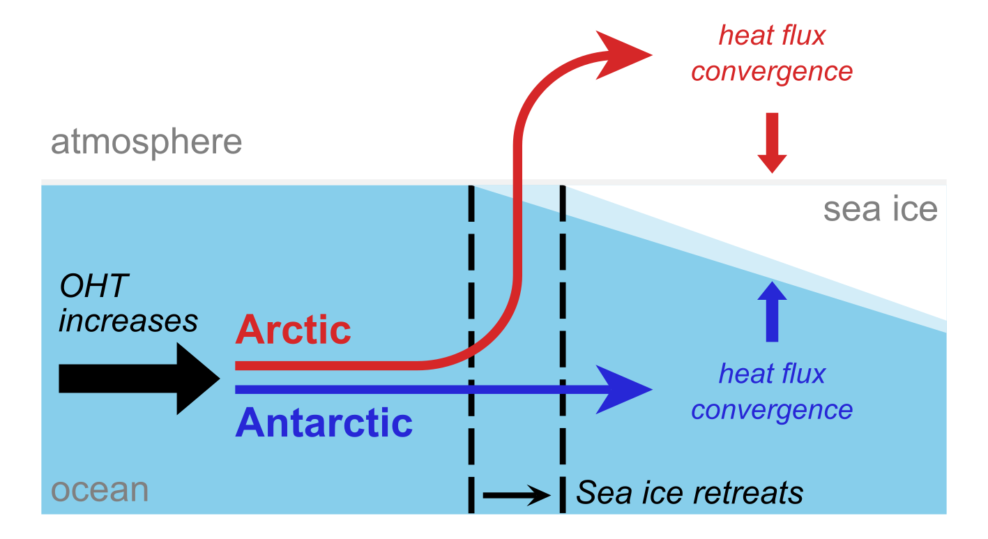
Figure 1: Different pathways by which extra ocean heat transport (OHT) reaches sea ice in the Arctic (red) where it is ‘bridged’ by the atmosphere to reach closer to north pole, compared to the Antarctic (dark blue), where it is simply released under the ice. Schematic adapted from Aylmer et al. (2022).

We can also explain how much sea ice retreat occurs per change in ocean heat transport using a simplified ‘toy model’ of the polar climate system, building on our earlier work developing theory underlying why sea ice is more sensitive to oceanic than atmospheric heat transport (Aylmer et al., 2020; Aylmer, 2021). This work, which is ongoing, accounts for the different pathways shown in Fig. 1, and we have shown it to quantitatively capture the climate model behaviour (Aylmer, 2021).

There is mounting evidence that the ocean plays a key role in the future evolution of Arctic and Antarctic sea ice, but questions remain open. For instance, what role does the ocean play in the sea ice sensitivity to global warming—something that is consistently underestimated by models (Rosenblum and Eisenman, 2017)? Our toy-model theory is currently unable to explore this because it is designed to understand the differences among models, not their offset from observations. As part of a new project due to start in 2023, we will adapt it for this purpose and include more detailed sea ice processes that we hypothesise could explain this bias. As more ocean observations become available, it is possible that our work could help to constrain future projections of the Arctic and Antarctic sea ice.

References

Aylmer, J. R., D. G. Ferreira, and D. L. Feltham, 2020: Impacts of oceanic and atmospheric heat transports on sea ice extent, J. Clim., 33, 7197–7215, doi:10.1175/JCLI-D-19-0761.1

Aylmer, J. R., 2021: Ocean heat transport and the latitude of the sea ice edge. Ph.D. thesis, University of Reading, UK

Aylmer, J. R., D. G. Ferreira, and D. L. Feltham, 2022: Different mechanisms of Arctic and Antarctic sea ice response to ocean heat transport, Clim. Dyn., 59, 315–329, doi:10.1007/s00382-021-06131-x

Docquier, D. and Koenigk, T., 2021: A review of interactions between ocean heat transport and Arctic sea ice, Environ. Res. Lett., 16, 123002, doi:10.1088/1748-9326/ac30be

Rosenblum, E. and Eisenman, I., 2017: Sea ice trends in climate models only accurate in runs with biased global warming, J. Clim., 30, 6265–6278, doi:10.1175/JCLI-D-16-0455.1

Posted in Antarctic, Arctic, Climate, Climate change, Climate modelling, Cryosphere, Oceans, Polar | Leave a comment

The Devil Is In The Details, Even Below Zero

By: Ivo Pasmans 

An anniversary is coming up in the family and I had decided to create a digital photo collage. In the process I was scanning a youth photo and noticed that the scan looked a lot less refined than the original. The resolution of my scanner, the number of pixels per square inch, is limited and since each pixel can record only one colour, details smaller than a pixel get lost in the digitization process. Now I doubt that the jubilees will really care that their collage isn’t of the highest quality possible, after all, it is the thought that counts. The story is probably different for a program manager of a million-dollar earth-observation satellite project.  


Figure 1: (A) original satellite photo of sea ice. (B) Same photo but after 99.7% reduction in resolution (source: NOAA/NASA). 

Just like my analogue youth photo, an image of sea-ice cover taken from space (Figure 1A) contains a lot of details. Clearly visible are cracks, also known as leads, dividing the ice into major ice floats. At higher zoom levels, smaller leads can be seen to emanate from the major leads, which in turn give rise to even smaller leads separating smaller floats, etc. This so-called fractal structure is partially lost on the current generation of sea-ice computer models. These models use a grid with grid cells and, like the pixels in my digitized youth photo, sea-ice quantities such as ice thickness, velocity or the water/ice-coverage ratio are assumed to be constant over the cells (Figure 1B). In particular, this means that if we want to use satellite observations to correct errors in the model output in a process called data assimilation (DA), we must average out all the subcell details in the observations that the model cannot resolve. Therefore, many features in the observations are lost.

Figure 2: schematic example of how model output is constructed in DG models. In each of the two shown grid cells (separated by the black vertical lines), the model output is the sum of a 0th order polynomial (red), 1st order polynomial (green) and 2nd order polynomial (blue). 

The aim of my research is to find a way to utilise these observations without losing details in the DA process for sea-ice models. Currently, a new sea-ice model is being developed as part the Scale-Aware Sea Ice Project (SASIP). In this model, sea-ice quantities in each grid cell are represented by a combination of polynomials (Figure 2) instead of as constant values. The higher the polynomial order, the more `wiggly` the polynomials become and the better small-scale details can be reproduced by the model. Moreover, the contribution of each polynomial to the model solution does not have to be the same across all of the model domain, a property that makes it possible to represent physical fields that vary very much over the domain. We are interested to make use of the new model’s ability to represent subcell details in the DA process and see if we can reduce the post-DA error in these new models by reducing the amount of averaging applied to the satellite observations.  

As an initial test, we have set up a model without equations. There are no sea-ice dynamics in this model, but it has the advantage that we can create an artificial field mimicking, for example, ice velocity with details at the scales we want and the order of polynomials we desire. For the purpose of this experiment, we set aside one of the artificial fields as our DA target, create artificial observations from this one and see if DA can reconstruct the ‘target’ from these observations. The outcome of this experiment has confirmed our assumptions: when using higher-order polynomials, the DA becomes better in reconstructing the ‘target’ as we reduce the width over which we average the observations. And it is not just the DA estimate of the `target` that is improved, but also the estimate of the slope of the `target`. This is very promising: Forces in the ice scale with the slope of the velocity. We cannot directly observe these forces, but we can observe velocities. So, with the aid of higher-order polynomials we might be able to use the velocities to detect any errors in the in sea-ice forces.  

High-resolution sea-ice observations definitely look better than their low-res counterparts, but to be able to use all details present in the observations DA has to be tweaked. Our preliminary results suggest that it is possible to incorporate scale dependency in the design of the DA scheme thus making it scale aware. We found that this allows us to take advantage of spatially dense observations and helps the DA scheme to deal with the wide range of scales present in the model errors. 

Posted in Arctic, Cryosphere, Numerical modelling | Tagged | Leave a comment