April Flowers – A story of bluebells and frosts

By: Pete Inness

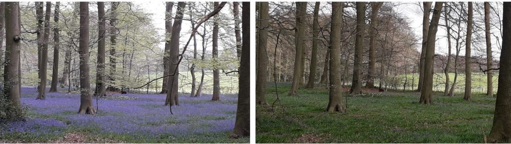
Figure 1: Bluebells in a wood near Reading on the 16th of April 2020 (left) and the same date in 2021 (right). In 2021 the flowers are yet to emerge and there are no leaves on the trees.

Bluebells regularly come out top in surveys of Britain’s favourite wildflower. From mid-April to mid-May they form carpets of lilac-coloured and strongly scented flowers in woodlands from Southern England to Scotland. Reading is particularly well placed for seeing these flowers with the beech woods of the Chilterns to the north of Reading being a favoured location for them. In fact, you don’t even need to leave the University campus as there are several good locations for them within a couple of minutes’ walk from the Meteorology Department.

Since I first came to Reading as a student in the late 80’s I’ve tried to get out into the countryside most years to see the bluebells at their best. This involves careful timing. Back in those early days I would have said that the May Day Bank Holiday weekend was the best time to catch them, but in the intervening 30 years that date has moved forward somewhat and I’d now say that going out a week or so earlier than this gives you a better chance of seeing them in their prime.

The main cause of year-to-year variations in the flowering date of bluebells is temperature variability. Whilst, like most woodland flowers, they are primed to get through much of their above-ground life cycle before the leaf canopy gets too thick and cuts down the sunlight reaching the forest floor, flowering can be accelerated or delayed by warmer or colder temperatures through the Spring months.

A few years ago, I decided to turn my interest in bluebells, and the annual cycle of nature in general, into something more productive by running undergraduate projects looking at relationships between weather patterns and the occurrence of events in the natural world.  This has been made possible by an excellent citizen science project called Nature’s Calendar which is run jointly by the Centre for Ecology and Hydrology and the Woodland Trust. This project encourages members of the public to report their sightings of a wide range of natural events such as first flowering of flowers and shrubs, first nest building of common birds, or first appearance of certain species of butterfly and other insects. Using the data recorded by this project, together with weather data such as the Met Office’s Central England Temperature record, students can explore relationships between weather and the annual cycle of the natural world and then relate them to specific weather events such as “the Beast from the East” in 2018 or longer-term changes in climate.

These studies by our students have shown that the flowering date of bluebells is sensitive to the average temperature through February and March – the months when the leaves emerge from the ground and the flower stalks and buds form. Every 1 degree Celsius rise in mean temperature across these months leads to bluebells flowering about 5 days earlier. The average temperature in April seems to have very little impact on the flowering date and this makes sense. Because bluebells produce their first flowers in mid-April (earlier in sheltered spots and in the south of the country), the temperature of the remainder of the month is immaterial to the flowering date.

2021 seems to be an exception to that rule. Whilst February 2021 was quite a bit colder than 2020, March 2021 was actually warmer than 2020. The differences in temperature between these 2 years in February and March are nowhere near large enough to explain the difference in the state of the bluebells in the pictures above, both taken on the 16th of April, in 2020 and 2021 respectively. April 2021 has been one of the coolest Aprils in recent years and in Reading has been the frostiest April since 1917. There have been 11 air frosts recorded at our Atmospheric Observatory through the month and only 5 nights in the month when there wasn’t a ground frost. To put these numbers in context, in a typical April in Reading we would expect 2 air frosts.

These frosts effectively slammed the brakes on the flowering process. Bluebells have evolved to avoid exposing the delicate reproductive parts of their flowers to frost and so during the first half of April the flower buds remained closed.  Even now, at the start of May, the bluebells in our local area are still some way behind the dense carpets of flowers that we saw in mid-April last year.

So, this year’s project students will be studying the effect of these exceptional frosts on UK wildlife and looking for their impacts on other plants, trees, birds and insects.

Posted in Climate, Phenology | Leave a comment

Some thoughts on future energy supply, such as an “Instantaneous Energy Market”

By: Peter Cook

We all know that it’s time to stop using fossil fuels, due to the greenhouse gasses emitted and the finite amount of these fuels.  Many renewable sources of energy are now being adopted but a lot of work and ingenuity will be needed for these to become the only sources of energy, and most people will need to be involved to make this happen.

A very different energy grid will be needed with multiple supplies (see figure), instead of the few large power companies at present, plus a lot of storage rather than just the National Grid balancing the load.  However, this should be seen as an opportunity not a problem.

There will be many opportunities for small companies and individuals to get involved, by generating their own electricity to sell, or by storing energy for other people, or by using energy in more efficient ways.  This could encourage a new entrepreneurial society, speeding up the adoption of new technology and the transition from fossil fuels to renewable energy.

A possible way to create the new energy grid would be to set up an “Instantaneous Energy Market”

Sources of renewable energy are often criticised for being intermittent, and their widespread adoption is dismissed as impractical because of the problems in matching energy supply to demand. These critics claim we need large-scale energy storage or backup sources of energy.  But is this way of thinking correct?  What about matching the demand to the supply instead?

Like other products, electricity can be priced according to supply and demand, and in many places, electricity is already cheaper at night than during the day.  Many of us make use of this, charging our storage heaters and running our washing machines and dishwashers at night, but this has the potential to be taken much further.  Prices could be adjusted second by second according to the instantaneous supply and demand.  Many uses such as heating, water heating and charging do not need to be on continuously and could be stopped for short periods, if demand (and price) became particularly high, without causing much inconvenience.

To do this the electricity supply would need to include a signal to show the price.  At present, the mains alternating current frequency is usually 60 Hz, but the frequency is reduced if the supply is low, so small changes to the frequency could be used to show the price.  There could also be information on how the supply, demand and price are changing in the short term, which would be used to predict the price in the very near future (minutes) to help people manage the changing price.  While on longer timescales (days) there could be electricity price forecasts, which would depend on the weather (sun and wind for supply, extra demand in cold weather), problems with supply, and large demands (during popular TV shows), which people could use to plan their electricity use and so reduce costs.

People who generate their own electricity (e.g. from solar panels) could sell their excess power, using large batteries to store electricity when it’s cheap and then sell it when the price increases.  Others could just have a large battery to buy electricity cheap and sell dear.  With this control of electricity demand and supply, adding new sources of energy would be easier, and energy suppliers would have less need for backup sources.

With many people adjusting their demand according to price, changes would be smoothed and variations in the price kept to a minimum.  When electricity is cheap, the resulting increase in energy use would lead to a price rise, whilst when electricity is expensive, the resulting drop in demand and increased electricity supply from people selling their own electricity would lead to a price fall.  People would also set their own thresholds of when to use electricity or not so that abrupt jumps in the overall demand would be avoided.  Attempts at profiteering (storing energy to raise the price) would be difficult because of the large amount of storage that would be needed.

The use of instantaneous energy pricing might work better at a local rather than at a national level, and modelling studies are required to see how it would work in practice, identify potential problems and to investigate the extent to which such a system could be scaled up.

Reference

The attached figure (but not any of the above text) is from the paper “Smart management system for improving the reliability and availability of substations in smart grid with distributed generation”, by Shady S. Refaat and Amira Mohamed, January 2019, The Journal of Engineering (17), DOI:10.1049/joe.2018.8215


Posted in Climate, Energy meteorology | Leave a comment

TerraMaris: Plans, Progress And Setbacks Of Atmospheric Research In Indonesia

By: Emma Howard 

To some of us weather enthusiasts, there’s nothing more exciting than a good tropical thunderstorm. For the best storms, you need a good source of humid air from a warm ocean and a hot land surface. If you can find some mountains to push air upwards and initiate convection (the intense vertical motion of air in updrafts and downdrafts which drive storms) all the better.

Figure 1: Development of convection offshore of West Papua. Photo credit: Megan Howard 

As a volcanic archipelago centred right on the equator, Indonesia has all of this and more. So it’s no surprise that Indonesia is the largest of the three major tropical convective hotspots on Earth. Local lore says that rain comes like clockwork during the wet season, occurring every day at the same time for weeks on end. This is borne out in quantitative rainfall observations, which show that after forming over mountains and land during the mid-afternoon and evening, storms tend to move offshore, with regular night-time and early-morning showers over the oceans and seas adjacent to islands. At present, most atmospheric forecast models (which parameterise atmospheric convection rather than resolving it) don’t represent these diurnally propagating systems very well. This makes it challenging to use these models to predict the timing and intensity of convection in Indonesia.

Unfortunately, some of the more intense thunderstorms can have severe impacts on local communities, particularly when associated with large-scale forcing such as Tropical Cyclone Seroja, which struck Timor-Leste and the Indonesian Nusa Tenggara provinces just two weeks ago. Beyond their immediate impact, these storms have subtle impacts further afield. By condensing water vapour into ice and liquid miles above the earth’s surface, intense storms cause latent heat to be released in the upper atmosphere. This heat source drives the Hadley and Walker cells, global scale atmospheric circulation systems which influence weather and climate across the world, including the UK. For these reasons, scientific research into the convection that occurs in thunderstorms in Indonesia is critical for our understanding of the Earth system and improving climate models.

TerraMaris is a large, collaborative research project that is furthering scientific understanding of atmospheric convection in the Indonesian region. The project involves researchers from three UK universities (East Anglia, Reading and Leeds), the UK Met Office and Indonesia’s weather and space agencies (BMKG and LAPAN). TerraMaris aims to transform our understanding of convective processes in Indonesia and their interactions with the largescale flow through an intensive observational and modelling campaign focussed on the circulation systems associated with the daily development and offshore propagation of convection.

Thankfully, the modelling component of our project hasn’t been so affected by the pandemic and is chugging away as normal. We’re generating a set of very high-resolution model simulations over the whole of Indonesia that are able to (at least partially) resolve the convective updrafts and downdrafts in the daily-repeating storms. Unlike many lower resolution models, these simulations are capable of accurately simulating offshore propagating convection. We intend to run 10 simulations, with one during the long-awaited field campaign season, covering the entire December – February rainy season. A wide range of weather conditions will be represented in this sample, and we’ll be able to study the simulated thunderstorms during all of them.

We are able to compare the role these storms play in heating the upper atmosphere to that in more conventional, lower resolution models, which aren’t able to resolve the updrafts and downdrafts and instead have to parameterise them. These models generally don’t represent Indonesian convection very well. It’s early days, but we’re finding that there’s a lot more variability in the height above the ground where heating occurs in the high-resolution models than the low resolution models. Our high-resolution models also simulate the daily formation of storms in the afternoon/evening and their overnight propagation into the oceans really well (see video).

Figure 2: Mean diurnal cycle of precipitation in early TerraMaris simulations.

Because interactions between the atmosphere and the warm tropical oceans are really important in this part of the world, we’re using a carefully designed coupled atmosphere-ocean model to run all these simulations. Full ocean models are very computationally expensive to run, so we’re using a multi-column KPP ocean model in order to simulate turbulent vertical mixing in the near-surface mixed layer. This is the oceanic process that interacts most strongly with the atmosphere, as it transports heat and freshwater fluxes from the atmosphere at the sea surface further down through the upper ocean. The role of ocean currents and other processes are represented by imposing “corrective” sources and sinks of heat and salt which ensure that in the long run, our simulated ocean matches up with observations of the real ocean.

We’re hoping that these simulations will be able to answer some really fundamental questions about how large-scale weather conditions modulate the vertical distribution of convective heating and how important the daily propagating systems are for providing the heat that drives global circulation. This will be useful for improving the representation of Indonesian convection in lower resolution models. If we can improve that, we hope that weather forecasts will improve both locally in Indonesia and globally through interactions with the Hadley and Walker cells. With any luck, by the time we finally step onto that plane, we’ll know a lot more about the storms that we’re trying to observe than we do now!


Posted in Atmospheric circulation, Climate, Convection, Thunder Storms, Tropical convection | Tagged | Leave a comment

Pacific and Atlantic Conversations

By: Daniel Hodson

The Earth is a world of water – oceans spread out across much of the planet and they exert a profound influence over the climate. Ascending from the Earth, the churning waves and surf shrink away and the oceans relax into seemingly silent, passive bodies of water. But this seeming passivity belies a complex network of currents and flows hidden beneath the surface, driven by heat at the equator flowing to the colder poles, but being frustrated in doing so by the spin of the Earth.

Figure 1: The Atlantic Meridional Overturning Circulation

In the Atlantic, an immense flow of water drives northwards towards Greenland and Iceland in the top kilometre of ocean, before plunging down kilometres and returning southwards at depth, towards Antarctica (Figure 1). This is the deep Atlantic Meridional Overturning Circulation (AMOC). This circulation involves such large flows of water that oceanographers had to invent a new unit of measurement to think about the volumes involved: the Sverdrup (Sv) is a million metres cubed per second – that’s a cube of water 100m on a side, flowing past every second. This northward flowing water carries heat with it, sometimes speeding up, sometimes slowing down – bringing more or less heat as it does so, leading to warming or a cooling of the surface of the ocean. This heat can then be carried away by the atmosphere leading to warmer air temperature, or perhaps driving changes in surface wind patterns.

If, whilst orbiting over the Pacific, you tuned your eyes away from the blue of the Pacific and into the infrared, you would see what the satellites see: a vast pattern of warm and cold spread out across the expanse of the Pacific Ocean. Over the years, you would see this pattern pulse warm and then cold; in the semi-regular cycle of El Nino: the heartbeat of the climate system which dominates the tropics.Figure 2: The Pacific Decadal Oscillation pattern

El Nino is driven by complex interactions between the winds blowing over the Pacific Ocean, and the waters sloshing between Asia and the Americas. It leads to a 3-6-year cycle of warming and cooling in the equatorial Pacific Ocean. In the warm phase, large pulses of heat are released from the ocean into the atmosphere, shifting climate patterns leading to droughts and deluges across the globe. Over many decades of watching, a more widespread pattern of warming and cooling emerges across the Pacific – a pattern known as the Pacific Decadal Oscillation (PDO) (Figure 2). The connection between the PDO and El Nino remains to be fully understood.

Both the AMOC and the PDO play a key role in storing and moving heat around; their variations over time, in turn, modulate our climate system, potentially in profound ways. The way these climate features respond to external factors like changing levels of greenhouse gases or industrial pollution may affect the medium-term trajectory of anthropogenic climate change.Figure 3: The Pacific and Atlantic Oceans

Figure 4: The Tropical Walker Circulation

For a long time, it was thought that these two siblings (AMOC and PDO) continued their existence in ignorance of the other; bounded by Africa and Eurasia but divided by the Americas (Figure 3). They may hear distant echoes of each other, mediated by the turbulent Southern Ocean around Antarctica, or the icy Arctic Ocean – but signals in the ocean are ponderous, slow and noisy. New simulations with modern complex climate models suggest that they hear and feel each other’s presence over, rather than around, the wall of the Americas; mediated by the atmosphere. The Walker circulation is the large-scale pattern of ascending and descending air one encounters when travelling around the equator (Figure 4). Air heated and pushed upwards by a warm ocean in one place, must be replaced by descending air elsewhere in the tropics. This circulation seems to allow the two oceans to talk to and influence each other. Climate model simulations [1][2] seem to show that, over many decades, a warmer Atlantic can nudge a cooler Pacific Ocean, whilst a Warmer Pacific ocean can lead to a warmer Atlantic.

Whilst we are seeing a clearer picture of how these two oceans coordinate their climate modulations, challenges remain. Many decades of observations are needed to understand the slow influences of these twin oceans – but whilst the 21st-century ocean is well observed, ocean observations before 1950 are much scarcer. Remarkable efforts are underway, however, to utilize the vast datasets buried in old ships logs. We also rely on climate models to tease apart the complex interactions in the climate system. Are the models we use accurate enough? Are we doing the right experiments with these models to understand how these features of climate interact? If we can begin to understand the conversation between these two oceans better, we may be better able to predict their future influences on climate and, in turn, on us.

References:

[1] Meehl, G.A., and Coauthors, 2021: Atlantic and Pacific tropics connected by mutually interactive decadal-timescale processes. Nat. Geosci. 14, 36–42 . https://doi.org/10.1038/s41561-020-00669-x

[2] Ruprich-Robert, Y., Msadek, R., Castruccio, F., Yeager, S., Delworth, T., & Danabasoglu, G., 2017: Assessing the Climate Impacts of the Observed Atlantic Multidecadal Variability Using the GFDL CM2.1 and NCAR CESM1 Global Coupled Models, Journal of Climate, 30(8), 2785-2810. https://doi.org/10.1175/JCLI-D-16-0127.1

Posted in Climate | Leave a comment

Satellite data used to provide life-saving weather forecasts in tropical Africa

By: Peter Hill

Much of the population of tropical Africa are vulnerable to severe weather, often caused by intense storms that can generate heavy rainfall, strong winds and flooding. For instance, thousands of fishermen drown each year in Lake Victoria as a result of accidents caused by storms. As a result, improved weather forecasting systems in tropical Africa could save lives and protect livelihoods.

The Global Challenges Research Fund (GCRF) African Science for Weather Information and Forecasting Techniques (SWIFT) project aims to enable African weather forecasting services to develop such improved weather forecasting systems. A partnership between meteorologists from Senegal, Ghana, Nigeria, Kenya and the UK, including several scientists at the University of Reading, SWIFT is striving to improve forecasts from timescales of a few hours to a few weeks ahead.

Much of my work in the SWIFT project involves very short-range predictions – from 0 to 12 hours ahead – based directly on observations, something meteorologists term “nowcasting”. The simplest nowcasts take weather observations and extrapolate them forwards in time, using the assumption that the weather will continue to develop along the same trajectory as the recent past. Nowcasts can be crucial for severe weather events, providing timely information to enable authorities and the public to respond appropriately to safeguard lives and livelihoods.

One of the major obstacles to nowcasting in tropical Africa is the lack of rainfall radar observations, which are used for nowcasting in other parts of the world, including the UK. Passive satellite observations, which measure the naturally occurring energy at the top of the atmosphere, provide a less direct measure of weather systems. Yet in the absence of other observations, this satellite data can provide vital information for nowcasting purposes.

To this end, the SWIFT project has made satellite-based nowcasts for tropical Africa freely available from a new website. Figure 1 provides examples of two such products. These nowcasts are based on software provided by the European Nowcasting Satellite Applications Facility (NWCSAF). However, these products have been calibrated and validated for mid-latitude European weather systems and it is therefore necessary to evaluate how well they perform for tropical Africa.

Figure 1: Examples of two NWCSAF products over tropical Africa. (a) shows the convective rainfall rate in different regions (b) shows the rapidly developing thunderstorms convection-warning product over the Guinea Coast region.

To understand the suitability of this NWCSAF software for tropical Africa, I compared the two products shown in Figure 1 to higher quality satellite rainfall estimates that incorporate data from multiple sources including direct rainfall estimates from rain gauges at the surface. This higher quality data cannot be used for nowcasting because it is not available sufficiently quickly.

The comparison demonstrates that both NWCSAF products provide useful information, despite some limitations. For instance, the convective rain rate product has valuable skill for predictions at least 90 minutes ahead (Figure 2). The rapidly developing thunderstorms product can also identify the occurrence of heavy precipitation, correctly identifying around 60% of strong (5 mm of rain per hour) events at least one hour before they occur. These products could be used to inform flood warnings, disaster response, or provide warnings to fishermen.

Figure 2: Skill metrics for the convective rainfall rate product, compared to predictions based on the historical occurrence of rainfall events. Hit rate means the proportion of true rainfall events that are successfully identified, and false alarm ratio means the proportion of the predicted rainfall events that do not occur in reality. “Retrieval” here is the skill of the satellite products, versus higher quality data. This higher quality data is regarded as “truth” but is not available sufficiently quickly to be useful for nowcasts. The “extrapolation” is the forecast made by projecting the observed storms forward in time. The “climatology” skill is skill from assuming today’s storms can be predicted using previous years storms on the same time of day and time of year.

This analysis is crucial in providing forecasters with confidence in the products which GCRF African SWIFT has made available to them to issue warnings. It has also highlighted some aspects of both the convective rain rate and rapidly developing thunderstorm – convection warning products that could be improved upon. Future work will aim to further develop these products to provide better nowcasts for tropical Africa.

Ongoing work within the African SWIFT project is also enabling African groups to generate these products locally, as well as supporting forecasters to understand and use these products effectively to minimise adverse impacts of severe weather on lives and livelihoods in Africa.

References:

Roberts, A.J., Fletcher, J.K., Groves, J., Marsham, J.H., Parker, D.J., Blyth, A.M., Adefisan, E.A., Ajayi, V.O., Barrette, R., de Coning, E., Dione, C., Diop, A.-L., Foamouhoue, A.K., Gijben, M., Hill, P.G., Lawal, K.A., Mutemi, J., Padi, M., Popoola, T.I., Rípodas, P., Stein, T.H.M., Woodhams, B.J. 2021. Nowcasting for Africa: advances, potential and value. Weather (In press).

Hill, P. G., Stein, T. H. M., Roberts, A. J., Fletcher, J. K., Marsham, J. H. & Groves, J. 2020. How skilful are Nowcasting Satellite Applications Facility products for tropical Africa? Meteorological Applications, 27(6). DOI: https://doi.org/10.1002/met.1966

Posted in Climate, Remote sensing | Tagged , | Leave a comment

Flood forecasting for the Negro River in the Amazon Basin

By: Amulya Chevuturi

Figure 1: Photograph of the Negro River and the Amazon rainforest.

The Amazon is the largest river basin in the world, with large free-flowing rivers, draining about one-sixth of global freshwater to the ocean. The Amazonian floodplains have been long settled and used by indigenous populations, providing essential ecosystem services and natural resources for human needs (Junk et al., 2014). Increasing frequency and magnitude of floods in the last two decades has caused considerable environmental and socio-economic losses in many regions of the Amazon basin (Marengo and Espinoza, 2016). Although some studies have estimated flood risk for the Amazon basin (de Andrade et al., 2017), most towns and cities in this region still lack operational flood forecasts and integrated flood risk management plans.

The main aim of the PEACFLOW (Predicting the Evolution of the Amazon Catchment to Forecast the Level Of Water) project was to develop skilful forecasting systems for high water levels of Amazonian rivers, at sufficiently long lead time, for effective implementation of disaster risk management actions. In this project, we focused on developing forecast models for annual maximum water level for the Negro River at Manaus, Brazil (Figure 1), as a pilot case study, using a multiple linear regression approach. We used various potential predictors from preceding months: rainfall, water level, Pacific and Atlantic Ocean conditions and linear trend, all of which strongly influence the water levels in the Amazon basin. Flood levels in the Negro River occur between May and July and are strongly influenced by the rainfall during November to February, as its large floodplains delay the flood wave by months (Schöngart and Junk, 2007). This delay and the regularity between the rainfall and peak water level allows for the development of skilful statistical forecast models that can issue forecasts by March or earlier.

Figure 2: The Negro, Solimões and Madeira Rivers (blue lines) and their catchment basins (regions bounded by black lines) contributing to the river water level at Manaus (yellow circle; 3.14°S, 60.03°W).

In collaboration with Brazilian scientists, from various partner institutes, our team developed forecast models of the annual maximum water level (flood level) for the Negro River at Manaus by finding the best model fit over the training period of 1903 to 2004. For our models, rainfall over the catchment of the Negro River as well as from the catchment of nearby Solimões and Madeira Rivers (Figure 2) is the predominant predictor. We developed three models in this project, which use observations as input and can be implemented operationally to provide flood forecasts for Manaus. We compared the models developed in this project against current operational forecasts, provided by Brazilian agencies (CPRM and INPA), for the period of 2005 to 2019. The three PEACFLOW models issue forecasts of flood levels in the middle of January, February and March each year, but the skill of the models increase with decreasing lead-time (Figure 3a). Our results show that the models developed in this study can provide forecasts with the same skill as existing operational models one month in advance.

We also gained an additional month of lead-time when we relaced the observed input data with the ECMWF seasonal ensemble forecast. We developed two operational models using this data, which provide probabilistic forecasts at the beginning of January and February (Figure 3b). The probabilistic forecasts for the maximum water level, using ECMWF input, show good skill for extreme flood likelihood.

Figure 3: Comparison of models developed in PEACFLOW project and existing models (CPRM and INPA) and observed values for annual maximum water level at Manaus for models using (a) observations and (b) seasonal forecasts as input.

The methods developed in this project can also be used to develop forecast models for flood and drought levels over other regions of the Amazon basin. We provide the fully automated PEACFLOW models in a GitHub repository at https://github.com/achevuturi/PEACFLOW_Manaus-flood-forecasting. We retrospectively forecasted the annual maximum water levels at Manaus for 2020, and we are actively forecasting for 2021 (Table 1). Our forecasts this year show the maximum water levels crossing 29m, which is the extreme flood threshold for Manaus, at which the government declares emergency conditions.

Table 1: Forecasts for 2020 and 2021 using PEACFLOW models at different lead-times. Observed annual maximum water level at Manaus for 2020 was 28.52m.


References:

de Andrade MMN et al. (2017) Flood risk mapping in the Amazon. Flood Risk Management, 41. DOI:  https://doi.org/10.5772/intechopen.68912

Junk WJ et al. (2014) Brazilian wetlands: their definition, delineation, and classification for research, sustainable management, and protection. Aquatic Conservation: marine and freshwater ecosystems, 24, 5–22. DOI: https://doi.org/10.1002/aqc.2386

Marengo JA and Espinoza JC (2016) Extreme seasonal droughts and floods in Amazonia: causes, trends and impacts. International Journal of Climatology, 36, 1033–1050. DOI: https://doi.org/10.1002/joc.4420

Schöngart J and Junk WJ (2007) Forecasting the flood-pulse in Central Amazonia by ENSO-indices. Journal of Hydrology, 335(1),124–132. DOI: https://doi.org/10.1016/j.jhydrol.2006.11.005

Posted in Amazon, Climate, Flooding | Leave a comment

Can We Use Artificial Intelligence To Improve Numerical Models Of The Climate?

By: Alberto Carrassi

Numerical models of the climate are made of many mathematical equations that describe our knowledge of the physical laws governing the atmosphere, the ocean, the sea-ice etc. These equations are solved using computers that “see” the Earth system at discrete points only, for instance at the vortexes of a grid where the physical quantities are defined. The density of the grid defines the model resolution: the denser the grid the higher the resolution and, in principle, the better the match between the simulated and the real climate.

Resolution is inevitably finite and to a large extent constrained by computer power. As a consequence, our numerical climate models do not see what occurs in between grid points and offer only a partial description of the reality. This source of model error is called “subgrid” or “unresolved scale” model error.  Reducing or correcting for this is a major endeavour of our scientific community, and a lot has been achieved in the past decades thanks to increased computational power and the improvement of our understanding of the subgrid processes and on their effects on the resolved scale.

Inspired by the astonishing success of artificial intelligence in so many different areas of science and social life, in our recent study (Brajard et al., 2021) we investigated whether artificial intelligence could also be used to improve current numerical climate models by estimating and correcting for the unresolved scale error. Artificial intelligence, and machine learning, in particular, extracts and emulates behavioural patterns from observed data. Being driven by data alone, the forecasts based on machine learning predict behaviour based on behaviour that has previously been observed. Therefore, the quality and completeness of the data used in the training is extremely important.

To overcome this limitation our approach relies on data assimilation, another key component of the nowadays operational weather or ocean prediction routine. Data assimilation is the process by which data are incorporated into models to get a more accurate description of reality. After many years of research and development, data assimilation now provides a range of methods that handle noisy and sparse data with great efficiency.

In our approach, we combine data assimilation and machine learning in the following way. First, we assimilate the raw (sparse and noisy) data into the physical model. This step outputs a sequence of pictures, like a “movie”, showing the climate over the given observed period, whose accuracy depends on the unresolved scale error in the model. The difference between this movie and the model contains information about the unresolved scale error that we wish to correct. In the machine learning step these differences are used to train a neural network to estimate the model error. At the end of the training, we have a neural network that has been optimised to produce an estimate of the model error given the model state as input. The final step consists of constructing a new, possibly more accurate, hybrid numerical model of the climate, made of the original physical model plus the data-driven model obtained using this method.

Figure 1: Shows the model prediction error as a function of time: the longer the time horizon (time length of the forecast) the larger the error. The dashed black line shows the original physical model. The solid lines refer to hybrid (physical plus data-driven) models based on a complete and perfect dataset (black) or on a different amount (p) of noisy observations. The hybrid models perform much better than the original model.  *MTU – Model Time Unit

The data assimilation-machine learning approach has been tested in idealised models and observational scenarios with very encouraging results. A key advantage of the method is that it relies on data assimilation methods that are already routinely applied in weather and ocean prediction centres: we expect this type of approach to be widely implemented operationally in the future.

References:

Brajard, J., A. Carrassi, M. Bocquet, and L. Bertino, 2021. Combining data assimilation and machine learning to infer unresolved scale parametrization. Philosophical Transactions of the Royal Society A379(2194), 20200086. doi: https://doi.org/10.1098/rsta.2020.0086 

Posted in Machine Learning | Tagged | Leave a comment

Putting a 120-Year-Old Barograph To The Test

By: Kieran Hunt

Cast your mind back to 1900. The World’s Fair. Great Britain has just won 48 medals at the Summer Olympics including a clean sweep in the steeplechase. Queen Victoria’s reign continues through an unprecedented 63rd year. British heroes, the Queen Mother and Douglas Jardine, are being born. At 43 Market Street, Manchester (now the home of a massive Urban Outfitters, apparently), an aging Italian immigrant, Joseph Casartelli, owns a workshop specialising in the construction of measuring instruments. Now, forward 120 years (I’ll spare you the scene-setting this time), and I was delighted to receive one such instrument, a barograph, as a Christmas gift from my convivial father-in-law.

Barographs of this era comprise two basic components. On one hand, there is an aneroid barometer – typically a stack of partially-evacuated alloy cells that expand and contract as the pressure decreases or increases. On the other, a clockwork drum is set to rotate about once per week. The two are connected by a scribing arm holding an ink nib. When operating, the nib rests against a paper chart wrapped around the drum, marking pressure changes with time. (Figures 1-3)

Figure 1: Close-up photos of the Casartelli & Son barograph. Top left: inside the clockwork drum. Top right: The spindle on which the drum sits. Bottom: the drum in place, with the scribing arm and ink bottle visible. The aneroid cells are conveniently sealed inside the oak casing and thus not shown here.

Figure 2: The barograph operational setup, showing the drum with paper affixed, scribing arm, and connection to the aneroid in the base.

Figure 3: A page from Percy Jameson’s “Weather and Weather Instruments”, published by Taylor in 1908, showing an engraving of a similar barograph. He’s also not happy about the “concealed works”.

The Storm

As luck would have it, the arrival of Storm Bella (Figure 4) on Christmas night meant that I could test the barograph immediately. With a coffee to steady the post-Christmas hangover (note: it did not steady my hands), I carefully filled the nib with ink, attached the paper to the drum, and woke the clockwork from its multi-decade slumber. It wasn’t that easy of course, it actually took me two hours to figure out that the clockwork wasn’t working, but increasingly firm shaking (the instructions called for “rotation about the horizontal plane”, make of that what you will) soon set it in motion.

Figure 4: Photo of Storm Bella irritating British residents, in this case the owner of a Rolls Royce. Credit: PavementsForThePeople via BBC.

The Results

Figure 5 shows the barograph trace from just after the initial fall in pressure associated with Storm Bella through its development, and eventual recovery by New Year’s Day. Now, a confession in two parts: Boxing Day was a Saturday and the log papers start on Mondays – not wanting to reset the equipment two days into the experiment, I took the liberty of adjusting the calendar. I also confused 12pm with 12am during the initial setup. Bearing these in mind, I overlaid pressure data from the atmospheric observatory at the University (shown in red in Figure 5).

So, how did it do? Well, there are two major differences compared with the observatory record – the first is an initial offset of about 5 hPa, the second is an overestimate of the minimum pressure: 979 hPa on the barograph compared with 963 hPa at the observatory (a difference of 11 hPa when accounting for the initial offset). I had hoped the initial offset was due to elevation differences, but the observatory is only 20 m higher than my house, accounting for just 2 hPa. The rest was almost certainly due to clumsy alignment, a regrettable by-product of my unsteady hands and a remarkably sensitive scribing arm lever. I suspect a similar alignment problem caused the overestimated pressure minimum – in setting the scribing arm position, too much force between the nib and drum results in friction that prevents the scribing arm from moving freely. If we adjust the observatory data to account for these issues (Figure 6), by shifting it up and squashing it a bit, the barograph does a clearly exceptional job of capturing the hour-to-hour pressure changes, keeping within 1 hPa of the observatory values for the whole week.

Figure 5: The barograph trace from Storm Bella (dark blue). Overlaid is the pressure reading from the automatic sensor at the University Observatory (red). If you look carefully at the beginning of the trace, you’ll see my various attempts to get the clockwork moving.

Figure 6: As Figure 5, but with the observatory data shifted and compressed to take into account various barograph calibration errors.

Conclusion

Calibration issues could probably be overcome with a bit of practice, but I probably wouldn’t recommend using it to land a plane. In the right hands, though, it probably could still be used operationally. Amazing.

References:

Science Museum Group 

Posted in Climate, History of Science, Measurements and instrumentation | Leave a comment

Using deep learning to observe river levels using river cameras

By: Sarah Dance

In recent times, machine learning is being increasingly used to make sense of digital data. In environmental science, we are only at the beginning of this journey (Blair et al 2021). However, we have already found one useful application, providing us with new observations of river levels.

We have successfully investigated novel deep learning approaches to extract quantitative river level information from CCTV cameras near a river (Vetra-Carvalho et al 2020, Vandaele et al 2020).  These provide a new, inexpensive, source of river-level observations.

Unlike river gauging stations, cameras are used to observe the overall environment instead of directly measuring the water level. The cameras are placed at a distance from the water body to ensure a large field of view, so they have a higher chance of withstanding floods. Many carry back-up batteries so that they can function even if the main power supply is disrupted.

Figure 1: (left) A river camera image. (right) An automated semantic segmentation mask for the same image. Flooded pixels are shown in white and unflooded pixels in black.

Figure 1 shows an example river camera image on the left. On the right we show the results of applying a deep learning technique (automated semantic segmentation using a convolutional neural network).  The deep learning method determines which pixels correspond to flooded areas (white) and unflooded areas (in black). Using this information and some extra information about the heights of the image pixels, we are able to work out the water level from the camera image in an automated way. This method could be used to provide invaluable new source of observations for flood monitoring and forecasting, emergency response and flood risk management.

References

Blair, G.S., Bassett, R., Bastin, L., Beevers, L., Borrajo, M.I., Brown, M., Dance, S.L., Dionescu, A., Edwards, L., Ferrario, M.A. and Fraser, R. et al., 2021: The role of digital technologies in responding to the grand challenges of the natural environment: the Windermere Accord. Patterns, 2(1), 100156. https://doi.org/10.1016/j.patter.2020.100156

Vandaele, R., Dance, S.L. and Ojha, V., 2020: Automated water segmentation and river level detection on camera images using transfer learning. In: 42nd German Conference on Pattern Recognition (DAGM GCPR 2020), 28 Sep – 1 Oct 2020. (In Press)

Vetra-Carvalho, S., Dance, S.L., Mason, D.C., Waller, J.A., Cooper, E.S., Smith, P.J. and Tabeart, J.M., 2020: Collection and extraction of water level information from a digital river camera image dataset, Data in Brief, 33,106338, https://doi.org/10.1016/j.dib.2020.106338.


Posted in Climate, Flooding, Machine Learning | Leave a comment

Why do clouds matter when we measure surface temperature from space?

By: Claire Bulgin

We can use satellites up in space to measure the surface temperature of the Earth over the land and sea.  Satellites have now been making measurements for 40+ years and these data are really helpful for understanding trends in surface temperature as our climate changes.  Measuring surface temperature from space is not without its challenges though, and one of the biggest of these is cloud.

So why do clouds matter?  Basically, they block the view of the Earth’s surface from the satellite.  If we try to measure the surface temperature and there is a cloud in the way, what we really measure is in part the temperature of the cloud.  How much it affects our temperature measurement depends on how transparent it is, and how high up in the atmosphere it is. 

So what do we do?  We really only want to measure the temperature when the sky is clear.  This means that we first screen our data for cloud, and then only use the clear-sky observations.  However, this screening process is not always 100% accurate.  Some clouds are difficult to spot even from space!  Consider cold, white cloud over a cold, bright snow surface as in the example of Figure 1.  This was the winter of 2010 where nearly the whole of the UK was covered in snow in early December.   Some clouds are very difficult to pick out above the snow surface.


Figure 1:  Snow and clouds over the UK on 08/12/10 in an image from the MODIS Terra satellite (NASA Earth Observatory, 2010). 

So what do we need to do in those cases where screening is difficult?  We need to understand what impact these clouds could have on our measured surface temperature.  In a recent study, we compared a number of different cloud screening approaches against a cloud screening done manually by an expert.  By looking at the differences between each cloud screening approach and the cloud screening done manually, and how these vary, we can build up a picture of how much getting the cloud screening wrong can introduce uncertainty in our measurement of land surface temperature.

Perhaps not surprisingly, we find that the uncertainty in land surface temperature is higher as the amount of clear-sky in the area we are looking at decreases.  This is shown in Figure 2.   The left hand plot shows that the uncertainty in land surface temperature is on average higher when only 20 % of the sky is cloud-free (2 °C) than when 90 % of the sky is cloud free (0.75 °C). This shows that near cloud edges (where a high fraction of the surface we are looking at is covered by cloud) the uncertainty in our measured surface temperature from cloud screening is higher than in areas with fewer clouds.  The uncertainties are larger at night because cloud screening is more difficult without observations at visible wavelengths.

Figure 2: Left: Uncertainty in measured land surface temperature from clouds as a function of the clear-sky fraction (left).  Right: The number of observations for each clear-sky fraction (Bulgin et al, 2018).

If we choose a consistent percentage of clear-sky pixels from our images, we can also assess how the uncertainty varies as a function of the underlying surface type.  In this study we were able to look at five land surface types: Cropland, evergreen forest, bare-soil, shifting-sand and permanent snow and ice.  We found that for a standardised clear-sky fraction of 74.2 %, uncertainties over snow and ice were largest at 1.95 °C, whilst for cropland they were much smaller, only 0.09  °C.  The other surfaces had uncertainties between these two extremes: 1.2 °C for forest, 0.9 °C for bare soil and 1 °C for shifting sand (Bulgin et al, 2018).

References:

Bulgin, C. E., Merchant, C. J., Ghent, D., Klüser, L., Popp, T., Poulsen, C. and Sogacheva, L. 2018.  Quantifying uncertainty in satellite-retrieved land surface temperature from cloud detection errors. Remote Sensing, 10, 616, doi:10.3390/rs10040616.

NASA Earth Observatory (2010).  Snow in Great Britain and Ireland.  Images courtesy of Jeff Schmaltz, MODIS Rapid Response Team.  Accessed 29/01/21.

Posted in Climate, Clouds, Remote sensing | Leave a comment