Department of Typography 2015

DSC_5232_crop

Photo taken the 8th of June.

Identifying CIDR
standing front left, yellow tunic: Josefina Bravo Burnier
sitting front row, fifth from left, orange cardigan: Jeanne-Louise Moys
sitting front row, third from right, brown jacket: Alison Black
standing third row, fourth from the right, light blue shirt: Sue Walker

… and the graduating BA students who have worked with us
standing second row, seventh from left, white top: Melissa Towriss
standing third row, seventh from right, white shirt: Peter Loveland
standing second row, sixth from left, black jacket: Liam Basford

… and (soon to be) graduating MA Information Design student
standing back row right, light blue shirt: Matt Standage

Posted in Uncategorized | Leave a comment

From the archive: A comparative evaluation to explore the effects of document design principles

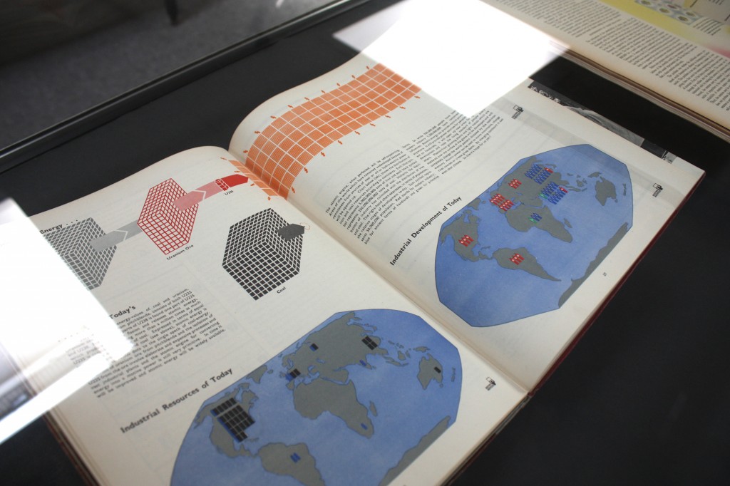
In our new section ‘From the archive’ we are highlighting papers that are ‘worth going back to’, that we hold in hard copy here in the Department but may be hard to come by in any other way. Some of them are relevant to our current research, and others are just interesting for us. Enjoy!


Redish1981


Redish, Janice, Daniel B. Felker, and Andrew M. Rose. 1981. ‘Evaluating the effects of document design principles.’ Information Design Journal 2 (3–4): 236–243

In this paper, the authors briefly present a model for document design comprising a sequence of stages of iterative design and user feedback. They then demonstrate the model’s effectiveness in a study of a Federal Communications Commission (FCC) manual of regulations for the use of radios in recreational boats. The study compared performance using the original version to a version revised according to document design principles, where the language, length, information structure and typographic presentation were adjusted. The original manual was 49 pages long and required an index to help users search for information; the new version covered the same topics as the original but was organised into 22 rules in an 11-page  booklet.

In the study, 53 people with boating experience and 52 without experience used the manual to answer questions about its content. Half the participants in each group were given the original manual, the other half the re-designed version.

The results suggested the re-designed version was significantly easier to use for both experienced and inexperienced boaters: participants with the new rules answered more questions correctly, identified more rules correctly, carrying out the task overall more quickly. Most interestingly, the difference in performance between experienced and inexperienced boaters disappeared with the new rules – that is inexperienced users benefited particularly from the document revision.

The approach used by Redish and colleagues in this study is frequently used in information design research. Particularly powerful effects of information design for people with lower levels of knowledge or confidence seems to be a common theme. For example, a study conducted by Loorbach, Karreman and Steehouder (2007) found the impact of re-design of a phone manual was felt more strongly by users who lacked experience and confidence; similarly Dickinson et al. (2010) found that people who were less confident readers and with lower education attainment benefited most from re-design of a patient information leaflet for medicines; Nielsen (2005)  has also found that, while revisions to web sites, such as  prioritising key content and simplifying page structure, benefit all users, these benefits are felt particularly by less proficient readers.

The lesson for researchers and practitioners is to include a range of participants, with different levels of expertise, reading abilities and confidence levels, in studies and tests of information design, in order to fully explore the impact of design changes.


Further reading

Loorbach, Nicole, Joyce Karreman, and Michaël Steehouder. 2007. ‘Adding motivational elements to an instruction manual for seniors: Effects on usability and motivation.’ Technical Communication 54 (3): 343–358.

Dickinson, David, Jane Teather, Suzy Gallina, and Emily Newsom-Davis. 2010. ‘Medicine package leaflets – does good design matter?  Information Design Journal 18 (3):225–240.

Nielsen, Jacob. 2005. Lower-Literacy Users: Writing for a Broad Consumer Audience. NN/g Article: http://www.nngroup.com/articles/writing-for-lower-literacy-users/, accessed 22 June 2015.

Posted in From the archive, Research | Leave a comment

Future & Fortune: the graphic design of information

FF_05

There is a visual treat in the current exhibit about Future and Fortune magazines, on display at the Department of Typography & Graphic Communication. Designed and produced by Mónica Oliveira as part of her postgraduate degree in book design, the exhibition presents and compares the graphic design of information in Future and Fortune, two important periodicals, produced, respectively in the UK and America, in the immediate post-was period.

This exhibition provides an overview of  the graphic influences, collaborations of notable printers and designers, and their innovative approach to the integration of graphic information in an editorial format. Future Magazine was produced by Adprint and incorporated work from the Isotype Institute until 1950; notable designers to have collaborated in Fortune magazine included renowned Czech émigré Ladislav Sutnar.

The items on display are from the Department’s Otto and Marie Neurath Isotype Collection and from private collections.


FF_01

‘Atomic energy’ by Richie Calder, Future Books, vol. II, ‘The stage is set’, 1946. Charts by the Isotype Institute. Lithography.


FF_04

‘Medicine from earth’, Fortune, July 1946. Design by Will Burtin. Photogravure.
In the background, ‘Music from the home’, Fortune, October 1946. Information graphic by [Ladislav] Sutnar + Hall. Photogravure.


The exhibition will be open to the public Monday to Saturday, between the 8 and 26 of June.

Opening times:
Monday to friday: 9am–5pm
Saturday: 9am–3pm

Department of Typography & Graphic Communication
University of Reading
2 Earley Gate
Reading RG6 6AU

futureandfortune.uk

Posted in Uncategorized | 1 Comment

Reading MA Show: Information design 2014–2015

MAID_Thale-G

Work by Thale Graffer


The final work of this year’s MAs in Information design is currently on display in the Department. Also exhibiting their work are this year’s MAs in Book design, as well as the BAs. Congratulations to everyone on such professionally presented material.

This year’s 13 information designers are displaying practical projects ranging across the design of instructions and illustrated explanations (the display shown above includes information graphics to encourage safe water usage to be applied to jerry cans in Haiti), information visualisation (the displays shown below include data visualisations of mobile phone usage in Africa and of global electricity production), complex typography and wayfinding design.

The students’ practical work is accompanied by a reflection on practice for each project. This documentation is also on display at the exhibition, in order to show the learning process and the development of each design project.

The exhibition is open to the public between the 9 and the 13 of June.

 MAID_aman-verma-1
Work by Aman Verma


MAID_Carina
Work by Carina Maelen


Opening times:
Monday to friday: 9am–5pm
Saturday: 9am–3pm

Department of Typography & Graphic Communication
University of Reading
2 Earley Gate
Reading RG6 6AU

finaldisplay.uk


Posted in Uncategorized | Leave a comment

New book on Information Design

Frascara Ed Information Design 133x200

We’re delighted to see the publication of Emeritus Professor Jorge Frascara’s new edited book ‘Information design as principled action: Making information accessible, relevant, understandable, and usable’, which adds to his many influential books and articles on information design. We’re looking forward to reading.

Posted in Announce | Leave a comment

Visual text structure: How does it help people find information?

In the month of June, we will be conducting a study that will look at visual structure on electronic texts. We are recruiting participants who are

  • 18 or over
  • who have English as their first language
  • and who have lived in the UK for the past 10 years or more.

The study takes between 30 and 45 minutes to complete, so if you are interested in participating, you can let us know by writing an email to j.bravo@reading.ac.uk

We will get in touch with you and we can arrange a time to meet you in the Department of Typography and Graphic Communication.

Come and take part!

Further details are available here


This study has been reviewed according to procedures specified by the University Research Ethics Committee and has been given a favourable opinion for conduct.
Posted in Research | Leave a comment

Weather forecasts and how people understand uncertainty

The results of the study on weather forecasts undertaken by undergraduate researchers, Matthew Standage, Rachel Bartlett and Shymali Abraham have been published in the latest issue of Meteorological Applications. The research explores how members of the public understand and interpret weather forecasts (rain probability and intensity) for their decision-making.

This project was a collaboration between the Reading’s Departments of Meteorology and Psycholology and the Centre for Information Design Research, funded by the University’s Undergraduate Research Opportunities Programme.

In their survey of 274 members of the public, the research team asked about the sources people used to get weather forecasts, and why they preferred the sources they used. They also asked the participants to make decisions based on forecasts for rainfall that included different probabilities (e.g. 30% chance of rain) and different intensities  (light, moderate, heavy rain). The forecasts were presented both in graphic and tabular formats.

Among its findings, the study showed that although people have some understanding of probabilistic forecasts, they can find them difficult to interpret  accurately. The results suggest that age and education affect the understanding of forecasts, and it might be that  exposure to the ideas behind probability and uncertainty (during school education, for example) eases the understanding of probabilistic forecasts.

The study found that traditional channels for communicating forecasts, such as newspapers, radio and television, were preferred by participants over 40 years old, whereas younger participants preferred narrow-cast channels such as websites and mobile phone applications. These provide information that is more specific and immediately updated. However the younger group, still used television forecasts so it seems website and mobile phone applications add to the amount of weather information they receive.

The study takes a look at the challenges of explaining probabilistic information, the limitations of visualisations of uncertainty. It appears that although people might not fully understand the information in probabilistic forecasts, they are able to extract key information from them, for example to avoid planning a barbecue at a time when there is a high probability of rain.

The paper is available here.


Image from Wellcome Library, London, Rare Books Collection. ‘Town with double church spire, nestled into the hillside.Large snow cloud above.’ by Conradus Lycosthenes From Prodigiorum ac ostentorum chronicon, 1557 , page 44. Copyrighted work available under Creative Commons Attribution only licence CC BY 4.0
Posted in Announce, Publication | Leave a comment

140 years of visitor maps for the V&A

Medieval_and_Renaissance_Galleries_at_the_Victoria_and_Albert_Museum_-_geograph.org.uk_-_1651929

image via Wikimedia Commons


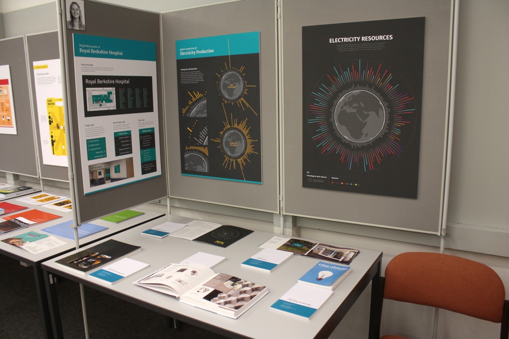
Postgraduate researcher, Andrew McIlwraith, is examining how the design of floorplans can aid  people visiting museums.

While conducting his research, Andrew has gained access to the archives of the Victoria & Albert museum and has been able to examine the floorplans produced over 140 years to aid navigation in the V&A.

A close look at the maps brings to the fore relevant challenges of wayfinding, and also shows interesting approaches taken by the designers when trying to guide what is essentially a physical and sensory experience through the use of an encoded flat illustration. Some of these include graphic ways to suggest routes to the visitor and ways to highlight the location of particular exhibits. Specially relevant to the V&A building (which can be complicated even for frequent visitors) are the ways to show the different floors, how they sit on top of each other, and how the visitor can move between them.

Read Andrew’s article here http://www.vam.ac.uk/blog/research-department/best-laid-plans-mapping-the-va-by-andrew-mcilwraith


Andrew is a PhD student in the Department of Typography and Graphic Communication, funded by the Design Star Centre for Doctoral Training.

Posted in Comment | Leave a comment

French ephemera exhibition in the Department

artdeco_invoice

 Art deco invoices, late 1920s and 1930s.


A stunning selection of ephemera from France is in exhibition in the Department of Typography and Graphic Communication.

The display, curated by Professor Michael Twyman, covers publicity items as well as documents of technical communication, such as invoices and forms, all printed between the seventeenth and mid-twentieth century.

The selection, which includes devotional cards, packaging, theatre posters and school maps, allows a close view of the changing typographic style through the years, and the uses of typography and colour in different printing methods such as colour lithography and letterpress.

Come have a look if you are near by. The exhibition will be on display until the 20 of May.

 forms
 Forms of the 18th and 19th centuries.


maps_copy
Wall maps for schools, first half of the 20th century.
Posted in Uncategorized | Leave a comment

Information design to improve care of acute kidney injury

reviews

Centre for Information Design has completed its collaborative project with Royal Berkshire Hospital (RBH), funded by Thames Valley Strategic Clinical Network, to use information design to increase implementation of the NICE care bundle for treatment of acute kidney injury (AKI). Many hospital inpatients develop AKI and, although it is treatable in most cases, it can have long term consequences for patients and places a huge financial burden on the NHS (estimated by NICE in 2013 to be more than the combined costs associated with breast, lung and skin cancer).

We listened to renal care specialists and other hospital staff describing the issues with AKI detection and care and the investigative team work that is required to treat it effectively. In response we designed documentation to guide clinicians through the process. Since AKI requires investigation and care over time, it was important to ensure that information was transferred efficiently from one team to the next.

The picture below shows original and revised versions of the care bundle documentation. The original was thought to be too technical and partly irrelevant to ward practice. Guidance was missing or obscured and the very important messages about when a patient might need to be referred for specialist care were not clear. The form also relied on traditional ‘sign off’ by doctors which in some cases might delay instigation of treatment, which could otherwise be initiated by other members of a multi-disciplinary team. The design response added a lot of clinical detail compared to the original but, guided by the hospital team, this detail was focused on ward practice. We organised detection and care procedures under three headings ‘Review, Respond, Refer’, in order to make the care processes more navigable and to build awareness of AKI treatment, through the ‘three Rs’ mnemonic.

We went through many iterations of design and feedback from the teams who would eventually use the bundle documentation, with the near-final version being tested against the original in the hospital’s medical simulation unit, led by Drs Matthew Brook and Michelle Goonasekera, and Professor Debbie Rosenoorn-Lanng. Nurses and trainee doctors reached diagnoses more rapidly with the redesigned documentation than with existing documentation and, hence, were able to initiate treatment more effectively .

IMG_8084_web

Our initial interviews revealed low awareness of the care bundle among staff and so, as well as working on the bundle documentation, we produced support materials to raise awareness of the impact of AKI and the importance of ‘Review, Respond, Refer’. And as a further development of the project we produced an information sheet for GPs, who might receive an indication of the development of AKI on routine blood results for patients in the community.

The new documentation is due to be launched, as part of a wider campaign to raise awareness of AKI at RBH and in the Reading West area. In the meantime, Dr Emma Vaux, Consultant Nephrologist and Quality Improvement Lead, who led the project from RBH, presented it at the Institute for Health Improvement/BMJ conference over Easter, receiving very positive feedback.

We are delighted to have been able to extend our work in information design for healthcare to clinician facing information, as well as patient information. The demands of clinical care are intense so it is very satisfying to be able to work on projects that contribute to clinical effectiveness.

Posted in Announce | Leave a comment