On the first day of term, Paul Luna and Jeanne-Louise Moys kicked off the part 2 book design project with an inspiring workshop using hand-drawn specifications from our collections. Highlights from the collections included: Paul Stiff’s exquisitely-detailed information design specifications and George Mackie’s book specifications.
The workshop examined the ways in which drawing can help students internalise typographic knowledge and empower them to effectively plan and implement designs. We explored different kinds of design drawings from quick sketches to wow clients in meetings, through sketches used in our own design planning and exploration, and finally to detailed specification layouts for communicating with typesetters and printers.
The students also had an opportunity to practice rendering type by hand in editorial specifications, using our Linotype type specimens.
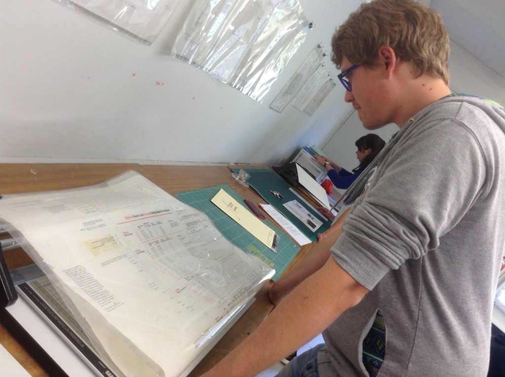
Prof Paul Luna engages our part 2 students with a Paul Stiff specification that effectively demonstrates how typographic hierarchy and detail can be encoded simply through variations in lines.
Visiting student from Ravensburg University, Severin Mantel studies Paul Stiff’s soil chart specification up close.
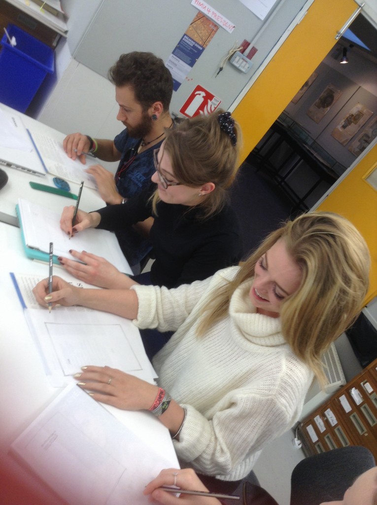
Part 2 students (from L to R) Ed Hendry, Jessie Webb and Phoebe Madden try out their drawing skills with our specifications and type specimens for inspiration.


