Adobe publishes Bickham Script Pro 3

Bickham Script Pro 3

After several years of development, Adobe published the updated version of Bickham Script Pro, a connecting script based on the examples in George Bickham’s The Universal Penman. The typeface captures the complexity of the style perfected in the eighteenth century by writing masters, making use of a substantial set of alternate letterforms, ligatures, and swashes. Additionally, Bickham Script Pro 3 provides an extended character set that supports the Cyrillic and Greek scripts, as well as pan-European Latin. The typeface makes use of the rich variety of alternate forms in all three scripts, providing an innovative approach to display typography for Greek and Cyrillic.

In a series of blog posts by Sally Kerrigan, Adobe Type introduces  the project, the design and technical challenges, and the international team that contributed. Gerry Leonidas and alumna Irene Vlachou contributed to the project.


Greek typography and typeface design in New York

GL critique 1 small

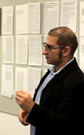
Five years after the first Greek Week-End in New York, Gerry Leonidas will return to the TDC. Already in 2007 Greek was becoming a central part of most large typeface projects, especially international branding applications. In the intervening years Greek has become a key aspect of professional designers’ skills, and a regular expectation in job postings. Just as importantly, Greek represents a particularly rewarding challenge for designers, combining a long and complex development with a relatively wide space for designers to experiment. The two-and-a-half day workshop will start with a hands-on research session, and include seminars on aspects of Greek typeface design, in-depth reviews of reference contemporary typefaces, and design critiques of work by the participants.

Gerry will also deliver a lecture at the TDC Salon on the deign of the forthcoming Greek-English Intermediate Lexicon, a major new publication by Cambridge University Press, now in its final stages. The Lexicon takes advantage of recent developments in typeface design, and offers insights into a particularly challenging typographic brief.

Researchers’ Night at Reading

The Department contributed speakers and events to the Univesity’s Researchers’ Night on the theme of Language, Text and Power.

Gerry Leonidas introduced visitors to the history of typography through an array of printed books and type specimens: he outlined how research in historical documents informs design decisions in contemporary environments. Using Greek as a case study, Gerry used original archival material to give examples of current design practice in areas as diverse as printed dictionaries, branded corporate material, and mobile device interfaces.

Paul Luna spoke at the Language, Text, and Power seminar on researching the past, designing the present. He looked at how analysing the layout of Johnson’s Dictionary of 1755 can help formulate approaches to contemporary dictionaries, and about design decisions for a scholarly edition of the Book of Common Prayer. You can read the text of his presentation, with some of his illustrations, here.

Anke Ueberberg offered a hands-on experience for visitors, explaining the workings of Gutenberg’s press using a full size working replica, hand-made by Alan May, formerly a lecturer in the Department. Based on research recently published in the Journal of the Printing Historical Society, Alan’s press supports the view that a Dürer drawing of an early printing press, long thought erroneous, may in fact be an accurate portrayal.