Reading at the ICA

ICA The MallReading’s new partnership with the ICA was launched tonight, as Typography and Art began a collaboration that will provide a London venue for both departments for teaching and public events, drawing on Reading’s strengths in both disciplines and on the ICA’s ability to connect with a young, vibrant audience. The launch event was preceded by workshop sessions in the ICA’s studio space for MA Book Design and BA students, run by John Morgan and Ruth Blacksell. Watch this space for more news.

ICA_Reading_2

ICA_Reading_3

Celebrating Ken Garland

ken

Designer, teacher, author, and photographer Ken Garland is celebrated in the current issue of Creative Review. Ken has been associated with the Department since its inception in the 1960s, and generations of students were inspired by his provocative teaching – learning how to think about the ‘why’ of design as well as the ‘how’.

Ken will talk at St Bride on Tuesday 12 February, followed by a panel discussion in which some of Ken’s Reading students – Anne Odling-Smee, Fraser Muggeridge – will take part in a panel discussion chaired by author Adrian Shaughnessy

Ken Garland: Structure and Substance 

Photograph of Ken Garland by Liam Lewis


‘Isotype revisited’ in Vienna

photo1

Members of the ‘Isotype revisited’ team, Christopher Burke, Eric Kindel, Michael Twyman and Sue Walker, participated in an interdisciplinary symposium and workshop at the invitation of the University of Vienna and the Institut Wiener Kreis.

The two-day symposium, ‘A tribute to Otto Neurath’, took place at Vienna’s Künstlerhaus gallery and coincided with its exhibition Zeit(lose) Zeichen (Time(less) Signs), featuring work made by artists and designers influenced by Isotype and Neurath. Christopher Burke was among the symposium’s speakers; his talk was on ‘The “Weiner Methode der Bildstatistik” (Isotype): between Art and Design’.

photo2

The one-day workshop that followed was hosted by the Institut Wiener Kreis and took place at the University of Vienna. Those from Reading contributed talks about teamwork in making Isotype charts, the children’s books series the ‘Visual History of Mankind’, the making of the public information films directed by Paul Rotha, the outcomes of the ‘Isotype revisited’ project and on-going initiatives at Reading associated with the Isotype Collection.

Typography graduate’s ‘Design of the Year’

image (crop)

Reading Typography graduate, John Morgan, has been nominated for the 2013 Designs of the year competition run by the Design Museum for his work on the visual identity for the 13th Architecture Biennale in Venice.

Read about his work on the Eye blog: Common ground: a designer’s letter from Venice.

John is currently teaching students on our MA Book Design course.

Railways under London

Railways-under-London-dust-jacket-cov

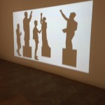
The London Underground celebrates 150 years today. One of the best representations of the London Underground was a book for children, Railways under London by Marie Neurath, published by Max Parrish in 1948.

This book explained to young readers how the Underground worked, including how escalators and lifts work, how platforms are built for speed and how machines print tickets and give change. Some of the illustrations in the book are straightforward and easy to understand; others are much more complex and require detailed study.

Much of the preparatory material for the book is in the Otto and Marie Neurath Isotype Collection held here in the Typography Department at Reading. Notes and sketches shows the care that was taken in making sure that the explanations were technically correct: the designers and artists often worked from engineering drawings supplied by London Transport, and final drawings were sent to experts for checking before they were produced in the book.


underground

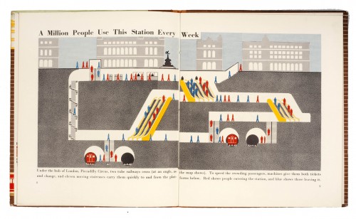
This cross-section diagram conveys depth by showing tunnels at different levels, and shows how people got to and away from the trains by stairs and escalators. The people pictograms take different forms: some represent people standing still; a shortened leg on the standing still pictogram represents people walking up and down stairs, and a side view configuration indicates people walking.


escalator

This diagram explains how escalators work. A full explanation requires the reader to engage with the text, which is written in a very child-friendly way. The pictures of the posters on the wall, albeit comprising Isotype images, and the people on the stair, in particular one holding the handrail and one walking off the escalator, adds contextual information relevant to the London Underground.


See  www.isotyperevisited.org


Reading graduate is ‘Penguin’s brightest star’

Penguin’s brightest star is not an author but illustrator (and Reading Typography graduate) Coralie Bickford-Smith, according to AbeBooks. The AbeBooks site features an interview and shows her brilliant covers for Penguin Classics, the Great Food series and her interpretation of a three-volume edition of the Arabian Nights. There is even more at Coralie’s own website, http://www.cb-smith.com