Our 2015 Chancellor’s Award winners

BA Graphic Communication 2015 Chancellor's Award function

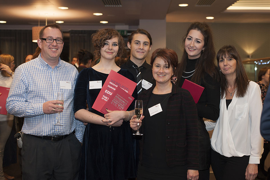
Congratulations to typography undergraduates Emma Cain and Anna Scully who are recipients of the prestigious 2015 Chancellor’s Awards. Celebrating their achievement at the awards ceremony were (from left) Rob Banham, Anna Scully, Joe Bannon, Jeanne-Louise Moys, Emma Cain and Elizabeth Cain.

In the Top Twenty – John Morgan

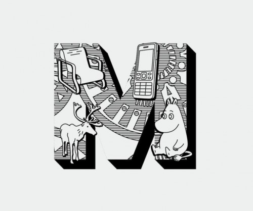
08_johnmorgan_aafiles-displayinitials
Lists and rankings are great fun, especially if you hit the upper reaches of the charts! That’s exactly what John Morgan, Reading alumnus and visiting teacher on our MA Book Design programme, has achieved in the Wallpaper* list of Top Twenty Graphic Designers. ‘Culture’s go-to art director’ is the way it describes John, picking up on his work for AAFiles, Tate Britain, the Venice Architecture Biennale, HMS Victory, and countless art-related publishing projects. Also cited by Wallpaper* as an ‘influential editorial designer’ is the external examiner for our BA programme, Simon Esterson.

Heritage and creativity: new lettering for HMS Victory

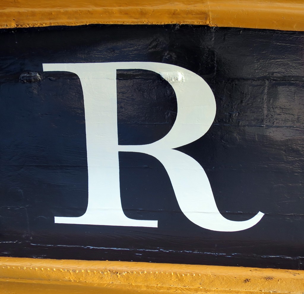
The name of HMS Victory, launched in 1765, the oldest ship of the Royal Navy that is still in commission, has been repainted. The name had been painted when the vessel was refurbished in 2005 for the two-hundredth anniversary of the battle of Trafalgar, but unfortunately the style used was Trajan, the Roman inscriptional letter that was quite unknown in England in 1805. Since the ship was being repainted during 2015 in a colour that is believed to be closer to that used in 1805, the opportunity was taken to repaint the name at the stern, using the ‘English vernacular’, the bold traditional style of lettering that is believed to have been in use at that date. The model for the style was engraved lettering by George Bickham. There was also guidance from contemporary paintings, and from scale models of 18th-century warships at the National Maritime Museum.

The letters were painted by Phil Surey from drawings by Adrien Vasquez of John Morgan Studios. Advice and historical research was by James Mosley.

Victory name - 2015-10-03 1 Victory name - 2015-10-03 2 - letter R

Reading in the US web standards

US web standards crop

Good typography is at the heart of government and public services: it enables access to information, builds trust, and ensures accessibility. This statement will not surprise anyone who appreciated the impact of the redesigned GOV.uk site, and similar efforts in other european countries. Well, now the US government has published its own comprehensive guidelines for the web, to “set a new bar for simplicity and consistency across government services”.

Dig down a bit, and the Reading connection is clear: the two typefaces recommended for all US government websites are Merriweather and Source Sans Pro. Merriweather was designed by MATD alumnus Eben Sorkin, and was based on his research at Reading for his typeface Arrotino. Source Sans Pro was designed by MATD alumnus Paul D. Hunt, as part of his work at Adobe.

It’s a nice thought that, through the work of graduates, a little bit of Reading’s methodology and attention to detail has found its way on sites that can impact so many lives.

Granshan hits the spot

Jae-joon Han at Granshan

Granshan is devoted to the development of typographic awareness in global scripts, through its annual competition and conference. This year Reading hosted the fourth conference, after Yeravan, Bangkok, and Munich. Over three days, the conference touched on the business of type design, training, support for minority and endangered scripts, the development of resources for complex scripts, and severals aspects of design for global scripts.

Victoria Sarapina

A tight schedule combined a dense pace punctuated by generous break times, to allow for new connections. To celebrate the fifteenth anniversary of the MATD, the first day was devoted to globally prominent speakers who were also graduates of programme.

Adi Stern

Lively discussions followed several presentations, and engaged gatherings continued long after each day’s talks had ended. Feedback for the event was overwhelmingly enthusiastic, creating combination of in-depth but accessible discourse in global typeface design:

The conference included two special events. The first celebrated the Murty Classical Library of India series by Harvard University Press, with a salutation by Tim Jones, and presentations by Fiona Ross, Rathna Ramanathan, and John Hudson. The second was a very special calligraphy duet with Timothy Donaldson representing Europe and Kang Byung-in representing Korea, in an impressively packed studio in Typography.

Granshan calliduel

The conference ended with an after-party organised by the current MATD students. More than twenty countries were represented by speakers, and many more by attendees, underlining the strength and extent of the current network of typeface design.An exceptional AV team produced a liveblog of the conference, and had uploaded most talks before even the end of the conference on the Granshan YouTube Channel.

The conference generated wide coverage and social media recorded very enthusiastic comments by attendees as well as speakers, exemplified by this tweet:

During the closing statements Boris Kochan announced that the 2016 Granshan will take place in Seoul. Follow @GranshanConf for updates!
 

Apple’s new system fonts

Antonio Cavedoni at WWDC


There is a good community of Typography graduates working at Apple, and in recent days we got a peek at what they’ve been working on. During the annual World Wide Developers Conference held in San Franscisco MATD graduate Antonio Cavedoni took to the stage to introduce the new system fonts for the Apple platforms.

The talk is an excellent overview of the work that typeface designers do “behind the scenes” to ensure the texts we read on our devices are readable and well-structured – and a superb introduction to the level of detail that typeface designers work every day.

Reading in Eye’s typography issue

Eye magazine cover

The latest issue of Eye magazine, the international review of graphic design, is dedicated to typography and typeface design. The Department is very well represented in the issue: it includes an extensive profile of Fred Smeijers, long-time collaborator of Eric Kindel on research in stencil letterforms, and past External Examiner for the MA Typeface Design programme. Our graduate Paul Barnes wrote a tribute to James Mosley’s contributions to scholarship in typography, and Gerry Leonidas led Beyond Latin, a panel article on typeface design for global scripts featuring John HudsonNeelakash KshetrimayumKamal Mansour, and Pascal Zoghbi.

Google PlayBooks have new typeface by Reading graduates

literata typeface

Google’s PlayBooks application features a new typeface family by Type-Together, which was founded by Reading alumni Veronika Burian and José Scaglione. The brief for the new typeface demanded an outstanding reading experience across a wide range of devices and high resolution screens utilising different rendering technologies. Furthermore, the new typeface family was expected to avoid conventions for e-Readers that have roots in the lower resolutions of earlier devices, and demonstrate how e-Readers could provide a typographic environment comparable to printed pages.
The typeface, called Literata, not only had to define a distinct visual identity for Google’s native app, but achieve this across the three scripts required for pan-european coverage. Fellow MATD alumna Irene Vlachou worked on the Greek character set, with support from Gerry Leonidas. Images of the typeface are available on Flickr.