We’re proud to be in the Guardian’s top 5 for undergraduate design courses in the UK. And even prouder that the same table places us at number 2 nationally for graduate employability in design. Find out more at our Open Days on 17 and 18 June.
Award-winning student banner design

Congratulations to Part 1 student Emmeline Hewstone whose exhibition stand and banner designs won third place in Design Wizard’s 2015/16 competition.
Emmeline’s minimalist design concept was inspired by the Swiss typographic design she studied in our history of graphic communication module. She says:
To appeal to prospective design students, I needed to create a consistent brand. I took inspiration from a design style that I have never experimented with before, but one that I absolutely adore – Swiss typography.
I wanted to represent the historical and educational aspects of the course, having been exposed to Swiss typography and its influential designers through lectures and seminars focusing on the history of graphic communication.
So, feeling inspired particularly by the likes of Josef Müller-Brockmann, I created a minimalist, primarily typographic design following a grid structure which is so commonly seen in Swiss typography.
We look forward to displaying Emmeline’s award-winning banner at our forthcoming open days.
Typography in Beijing
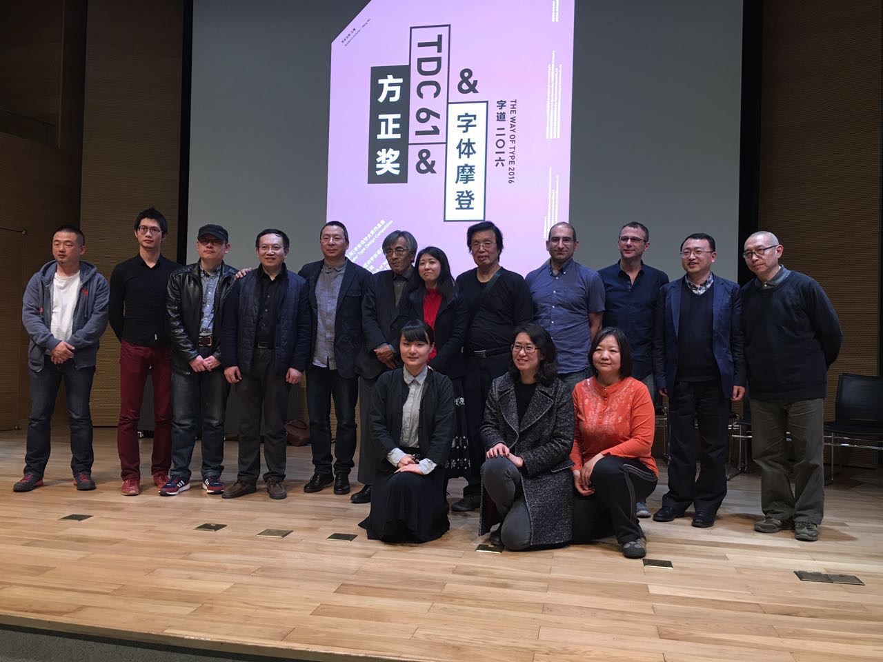
Soon after the conclusion of a successful visit by students from CAFA to Typography in 2015, we commenced working on a reciprocal visit to Beijing. As it happened, several strands of activity came together to make this an exceptionally productive visit. A short report follows below; the local organisers, led by CAFA teacher Liu Zhao, recorded all presentations for translation and reposting on the Chinese social networks, and microblogged almost every minute of the trip to a jaw-droppingly numerous online audience.
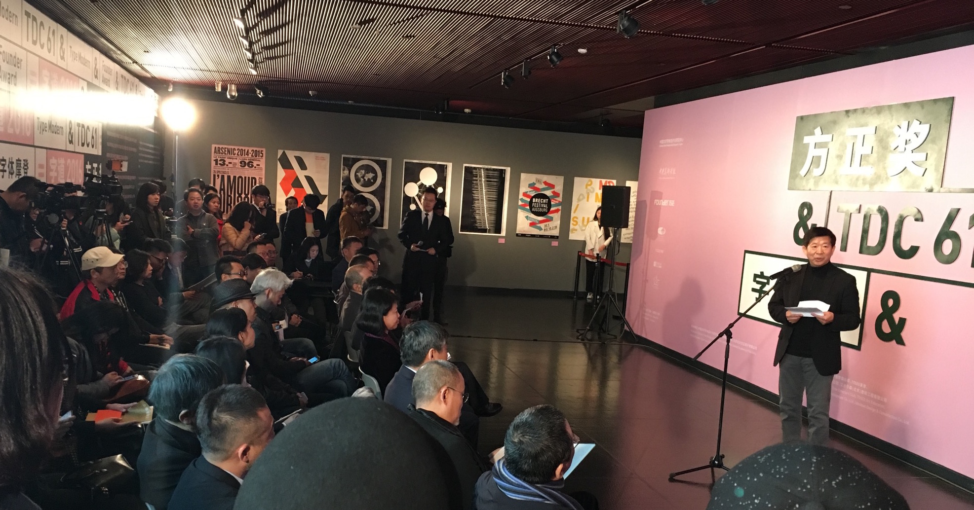
Opening the visit with a more formal occasion, Gerry Leonidas and José Scaglione (Reading alumnus and ATypI president) took part in the judging of the 8th Founder Type Design Competition. The event, held every two years, included for the first time Latin typefaces by Chinese designers. The next day, the winners were announced in the National Centre of the Performing Arts (the “Egg”), together with the opening of the TDC61 exhibition, the Chinese leg of the global tour of the annual design competition; and the opening of the “Chinese Type Modern 1919–1955” exhibition with material from the archives of Founder Electronics on the transition of Chinese type-making across technologies – with clear influence by Reading’s TDi 2015 course, in which Founder staff participated in.
Font Forum conference
The exhibition and competition awards served as the opening events for the two-day Font Forum, a conference on typeface design with speakers from China, Japan, and Europe, to packed auditoria. At the end of each day lively panel discussions demonstrated the interest of the student and professional audience, and the desire for stronger engagement with the international typographic community. (In the sidelines of the conference, plans were hatched to coordinate a BA module on typeface design between Reading and CAFA in 2016–17.)

CAFA workshop
The main part of the visit was taken over by a workshop on typeface design at CAFA. The interest in Latin typeface design is considerable, and the skills of many students impressive. This is a sign of the gradual globalisation of Chinese design education, and the demands by the local professional employers for skills that can serve markets across language and script regions. Although the workshop was primarily focused on typeface design, there was great interest in typographic design, and especially for mobile platforms.
Centre for Chinese Font Design and Research
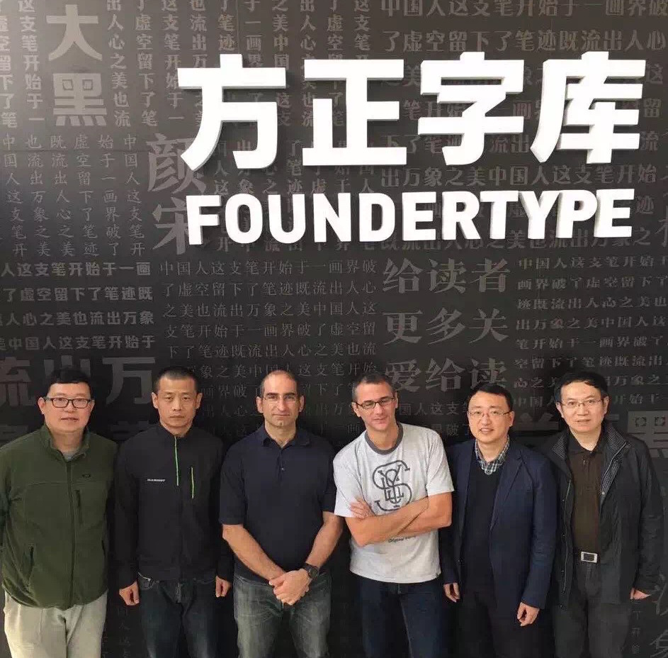
Two visits at the Centre for Chinese Font Design and Research, hosted in the offices of Founder Electronics, focused on design issues in fonts for Chinese, design tools and processes, and professional training for multi-script design. The second of the visits had very concrete aims, with Gerry orchestrating the localisation of Glyphs (the key font design application) into Simplified Chinese, to enable designers in China to experiment with new workflows.
CITIC publisher agreement
Starting in TDi 2015, Gerry Leonidas guided Liu Zhao to compile a list of books on typography and typeface design in English to be translated into Chinese by CITIC, one of the most prominent publishers in the country. The project is progressing well with many rights already secured, and schedules for the translations and launches in place. Gerry’s involvement in the curation of the series provides the opportunity for the University’s approach to typographic scholarship to be transplanted in a new market in a unique manner. This is part of a wider collaboration between the University, CITIC, and CAFA, with the aim of building up typeface design education in China.

Dongdao Design
Despite the timing on a Sunday evening, over 140 designers from Dongdao, one of the largest design agencies in China, turned up to listen to José and Gerry talk about typeface design solutions and studies. The presentations were followed by Q&A sessions and interviews, which will be posted on Chinese social media with subtitles.
p.s. ATypI in Beijing?
Seeing in person the typographically maturing environment in Beijing and particularly the concretely supportive attitude in CAFA convinced José and Gerry (president and vice-president of ATypI respectively) of the importance and timeliness of bringing the annual conference of the type design community to mainland China. They outlined the key parameters of a proposal with Dean Wang Min and Liu Zhao, and explored timing options. Look for announcements through ATypI!
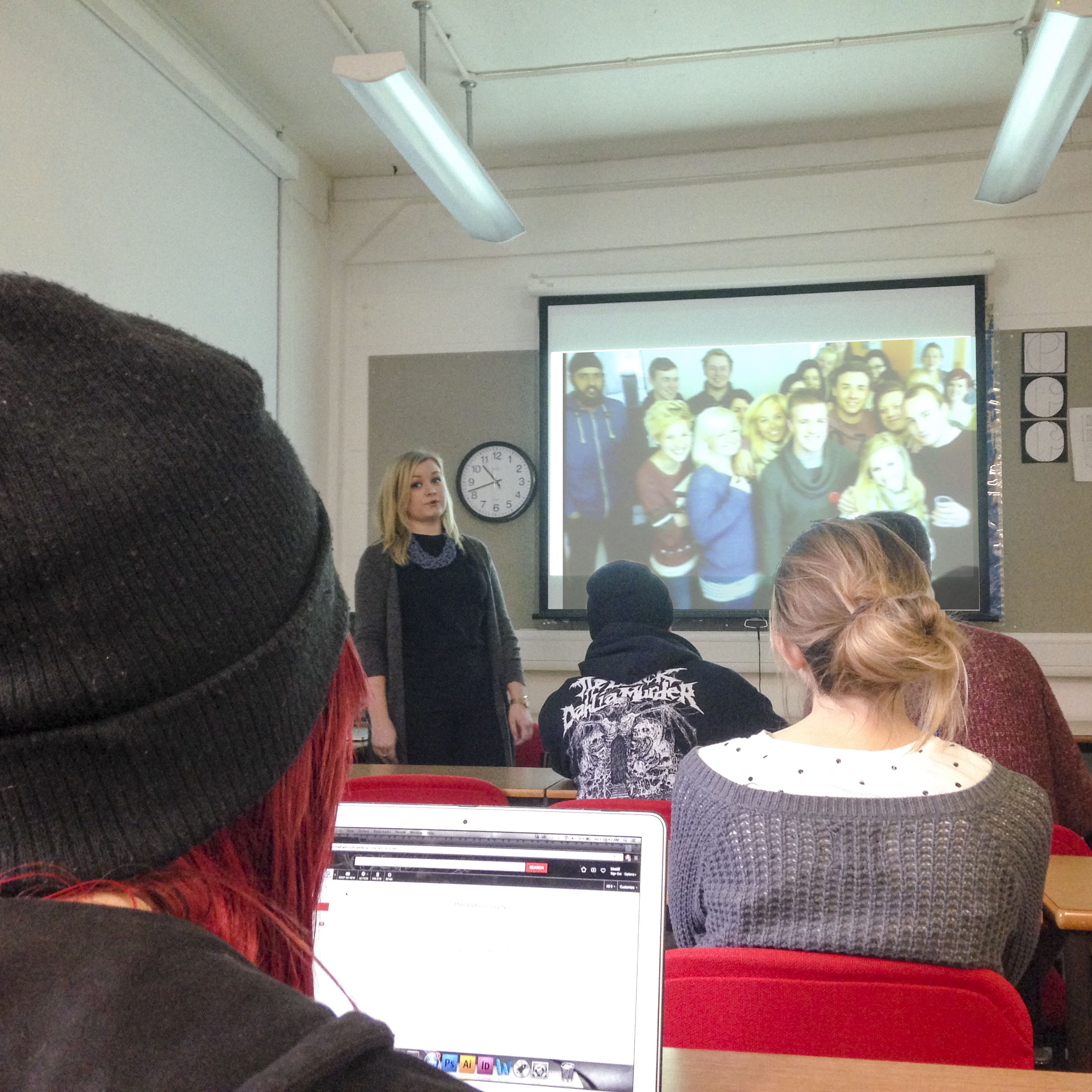
Alumni visit to help with data visualisation with Part 2s
We were very pleased to welcome alumni Craig Melvin to the Department during our recent Part 2 ‘Data Visualisation’ project.
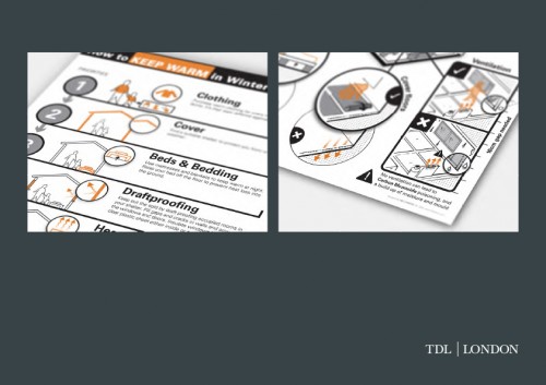
Craig Melvin from TDL London giving feedback to Part 2 Students
The Part 2 brief was to create an awareness-raising poster and short animation about some aspect of either ‘Climate Change’ or ‘The Refugee Crisis’. Students presented found data using a combination of graphs, charts, diagrams, tables, maps and infographics. The challenge was to tell a story and find ways of engaging interest whilst being accurate, factual and informative.
Craig graduated from our BA course in 2014 and went to work for TDL London, a design agency founded in 2005 by MA Information Design alumni, Oliver Tomlinson. TDL London specialise in using diagrams and design methods to transform information. They use a combination of Process Charts, Explanatory Diagrams, User Journeys, Illustrated Storyboards, Maps & Locations, Data Visualisation and Interactive Diagrams. Craig spent the day giving insightful feedback to small groups of students. He also showed some of his recent work for a refugee charity (pictured below), and told students about his experience of moving on from the Department into the world of work.
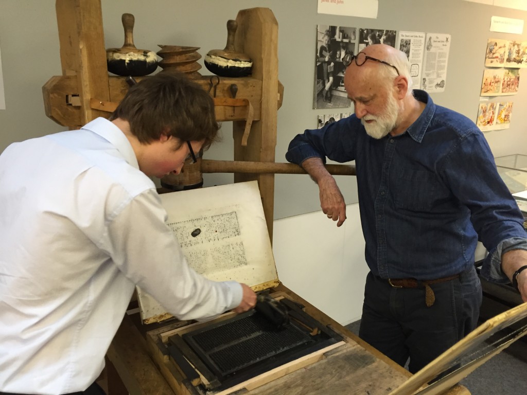
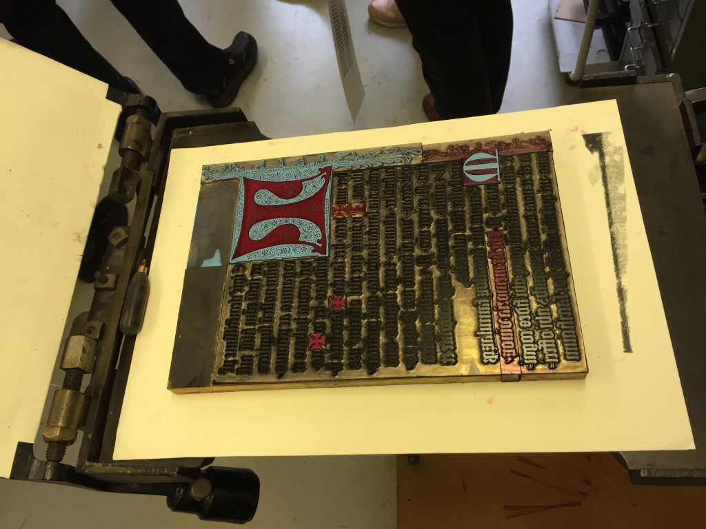
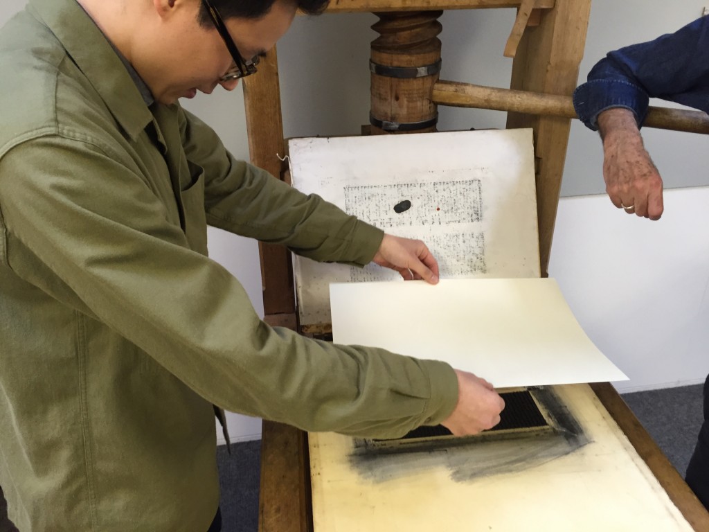
Making an impression: printing presses, type and colour
This workshop, based around the printing press collection in Typography, attracted postgraduate students, academic staff, museum and library professionals, and members of the public interested in the materiality of text, books and ephemeral documents.
Participants used the presses under craft supervision, and had a go at casting metal type.
They printed a page from the Gutenberg bible on a reconstructed one-pull wooden press that Gutenberg would have used, as well as 19th century woodblocks on another.
Alan May demonstrated printing of a Fust and Schoeffer 2-colour initial.
The workshop culminated in a fascinating talk by Dr Elizabeth Savage (British Academy Postdoctoral Fellow, Centre for Material Texts & Research Fellow, History of Art,Cambridge University) ‘Deciphering the First Colour-Printed Images in England: The Book of St Albans, 1486’

The typo-Reading student experience
Our final year BA Graphic Communication student Jess Lewis shared her Reading typography experience with online forum Creative Digest earlier this year. You can read her post here.
Final year typography students are busy gearing up for our 2016 degree show and you can follow them on Twitter @andreadingshow for more news and previews.
Typography alumni inspire the next generation
Five talented design graduates, five talks, and five very different approaches. Last week, our Graphic Communication BAs got an incredible insight into the range of career paths that might await them when they graduate.
Hannah Smith gets nostalgic for the Class of 2012
As part of #UoREnhancementWeek, we asked some of our alums to come back to the Department and give 20 minute talks about their experiences since graduation. With such an open brief we knew we’d see a range responses, but the diversity of what the students experienced couldn’t have been more marked. Our speakers covered such a range of visual approaches, client bases, budgets and presentational styles that it was hard to keep up. It was a great reminder that personal expression is at the core of what a designer has to offer, even if most their work is constrained (perhaps quite rightly) by client needs and practical realities.
I found the alumni talks really useful. It was great to see what people are doing now and how they got to where they are.
Sarah Carrington. Part 3 BA Graphic Communication
In offering advice and encouragement to the next generation of designers, the themes that emerged from the day were:
- Hard work and persistence pay off
- Play up a your genuine specialism in typography, it’s not that common in the industry.
- Make the most of the Real Jobs scheme, it’s your USP at interviews
- Think about what kind of specialism, sector, scale and working environment will really bring satisfaction at work (and at home).
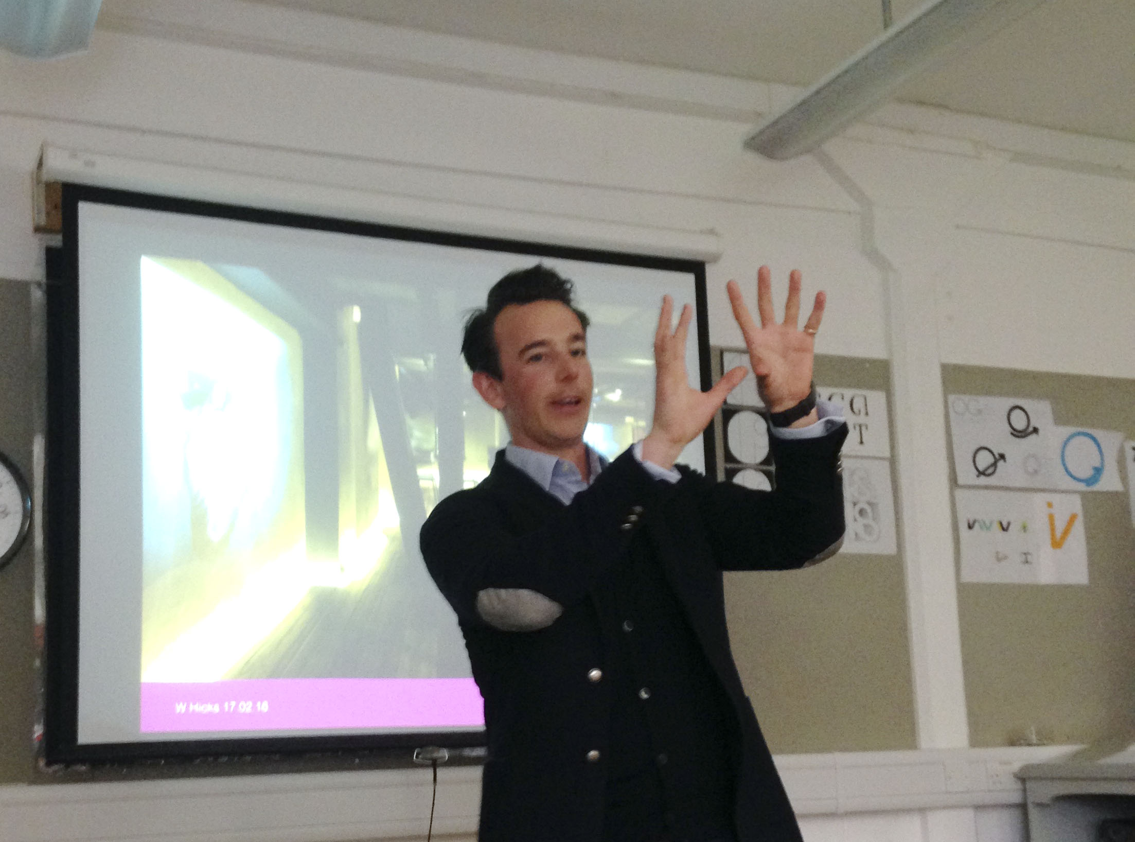
Will Hicks gets animated explaining how to keep his portfolio of Property clients happy (they’re always more interested in work you’ve done OUTSIDE their sector)
Will Hicks spoke about his transition from practising designer (at Penguin, DK and, later, his own firm, Graphicks) to sales director. He’s still passionate about design, but hasn’t touched Adobe software for year. By embracing delegation, playing to the strength of his team and taking on a stream of recent Reading grads, he’s found a balance that keeps his staff satisfied and his clients coming back for more.
Hannah stuck around to give advice on some current projects, too
Hannah Smith felt like a designer in full swing, relishing the constant revolution in technology that changes both what we design and how we design it. With no meme left untouched, she raced through an introduction to cutting edge UX design overloaded with practical tips (get feedback all the time, ditch Photoshop for Sketch, usepanda.com, mobile first!) and really focussed examples that explored the minutiae and impact of good design (look out for the new checkout at asos.com soon, UI design with an exceptionally clear goal). It felt like a distillation of a whole years’ thinking in one 30 minute chunk. Amazing.
Rob Coomber find the right place to talk signage
Rob Coomber managed to land his dream job as a wayfinder at Applied immediately after graduating, and he’s stayed there ever since. Rather than showing breadth in terms of graphic style or different kinds of design problem, Rob’s presentation demonstrated the breadth of experiences and scales that a wayfinding designer can enjoy. He’s pounded the rainy streets of the West End for the Legible London project, and sweltered in the heat of Dubai in the summer. In all instances, he’s looking at genuine user-focussed scenarios to identify and solve pinch points for tourists and locals alike. Rob is also an exemplar of the kind of calm, methodical, slightly droll approach that is often needed for success in this field.
Rebecca Kirby works in house as a senior designer for Scott Brownrigg, a large firm of architects. She painted a vivid picture of the kind of challenges that exist in convincing colleagues in a large organisation of the value of good design. By building great relationships and sticking to her guns on typographic detailing, she’s been able to ramp up the value that the firm places on graphic design. Taking on external commissions gives her the variety to counteract the brand consistency that flows through her standard project work (mainly proposals) and reaching out into environmental graphics has helped strengthen a connection with the studio’s architects.

Tom Derrett got the students moving around the Department in fresh ways
Our final speaker, Tom Derrett , co-founder of daughter.is, stunned the group with a practical demonstration of the notion that a leader is defined by whether or not anyone actually follows them. He tore around the department with students in train, captivating the group with a real heart-on-sleeve tale of what it means to run your own studio, and which sacrifices are actually worth it in the long run (short answer, not your integrity). Tom’s visceral way of presenting ideas is something we remembered from his student days and it was a brilliant lesson in how to command an audience, without hiding behind a PowerPoint. Our course has a real focus on presentation skills these days, but Tom brought something that can’t really be taught. It just needs to be experienced.
By the time Tom returned us all to the studio, he’d gained everyone’s respect and attention
Although we happen to be graphic communicators, we are, first and foremost, just communicators. Hearing this group of designers discuss how they found their feet in the industry was inspiring as much for the stories they told as for the work they shared.
Adobe publishes Bickham Script Pro 3

After several years of development, Adobe published the updated version of Bickham Script Pro, a connecting script based on the examples in George Bickham’s The Universal Penman. The typeface captures the complexity of the style perfected in the eighteenth century by writing masters, making use of a substantial set of alternate letterforms, ligatures, and swashes. Additionally, Bickham Script Pro 3 provides an extended character set that supports the Cyrillic and Greek scripts, as well as pan-European Latin. The typeface makes use of the rich variety of alternate forms in all three scripts, providing an innovative approach to display typography for Greek and Cyrillic.
In a series of blog posts by Sally Kerrigan, Adobe Type introduces the project, the design and technical challenges, and the international team that contributed. Gerry Leonidas and alumna Irene Vlachou contributed to the project.
Inclusive design workshops for print and digital design
This week our part 2 undergraduates participated in exciting inclusive design workshops as part of the Breaking down Barriers project. Students wore simulation gloves to discover how conditions such as arthritis may affect user experience across print and digital design. Read more about the inclusive workshops here.
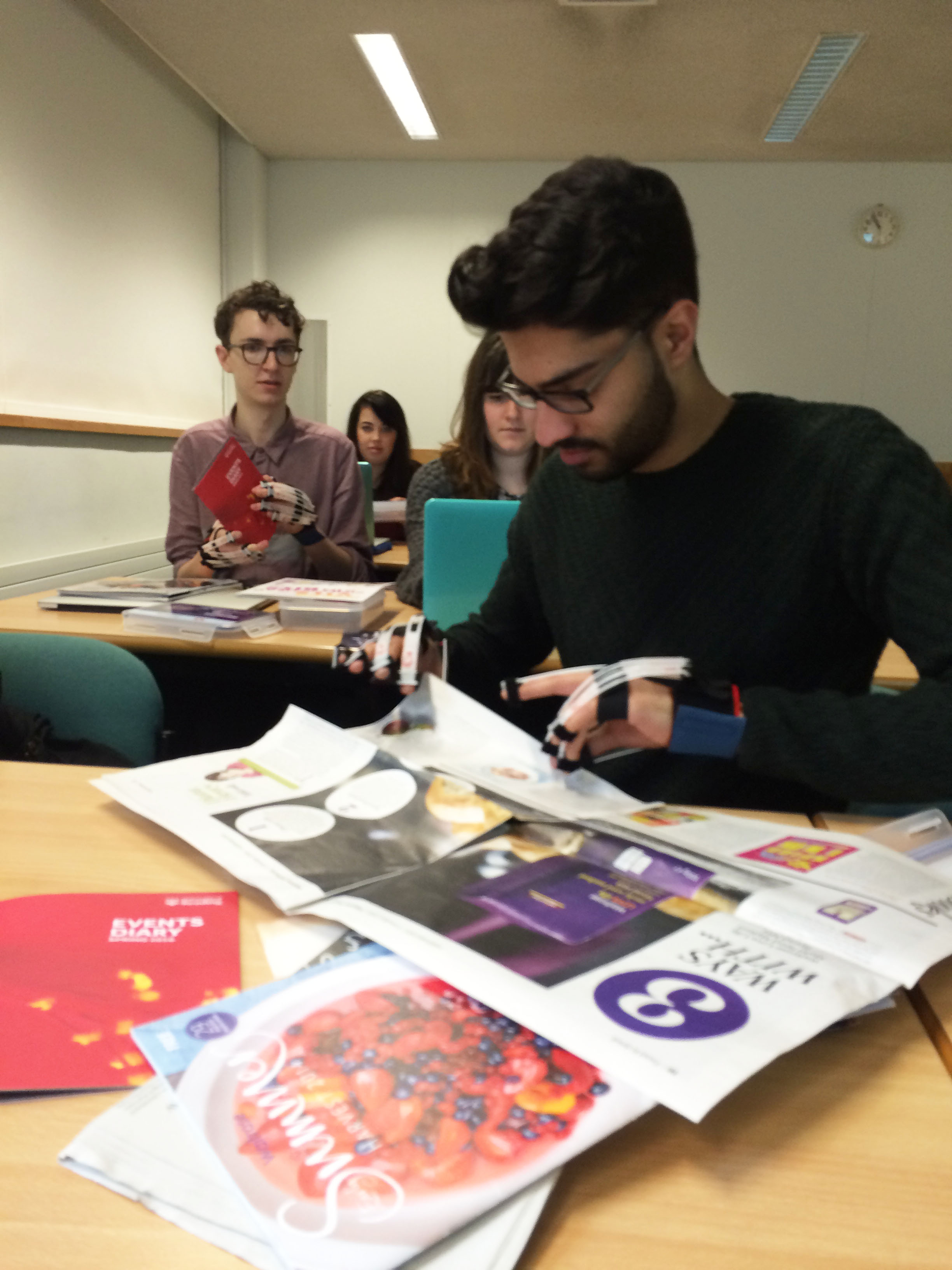
Rajan Dole exploring how paper stock can influence inclusive design
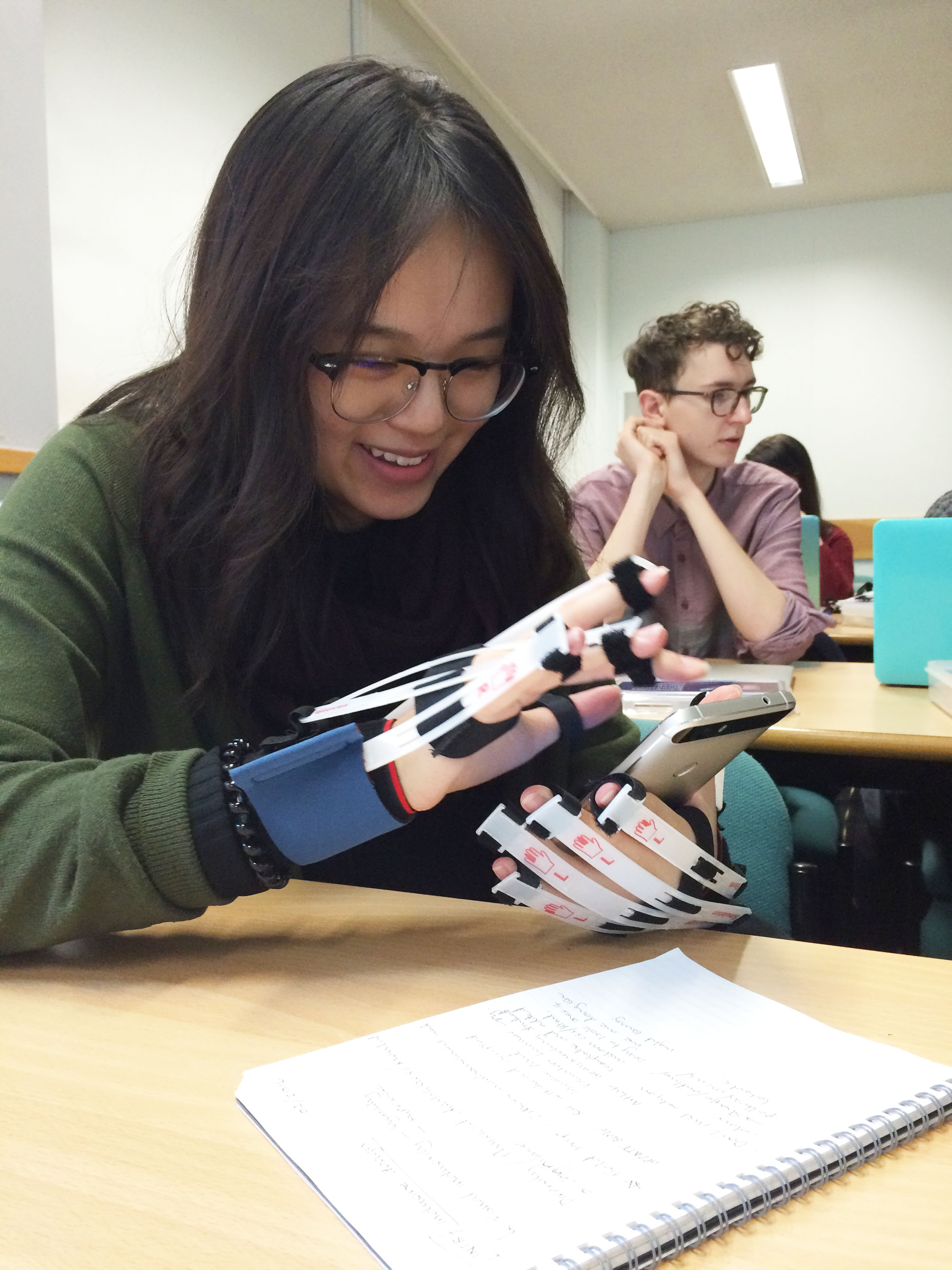
Louise Lee wearing simulation gloves to experience the challenges people with arthritis experience when interacting with mobile devices
Looking at children’s reading books
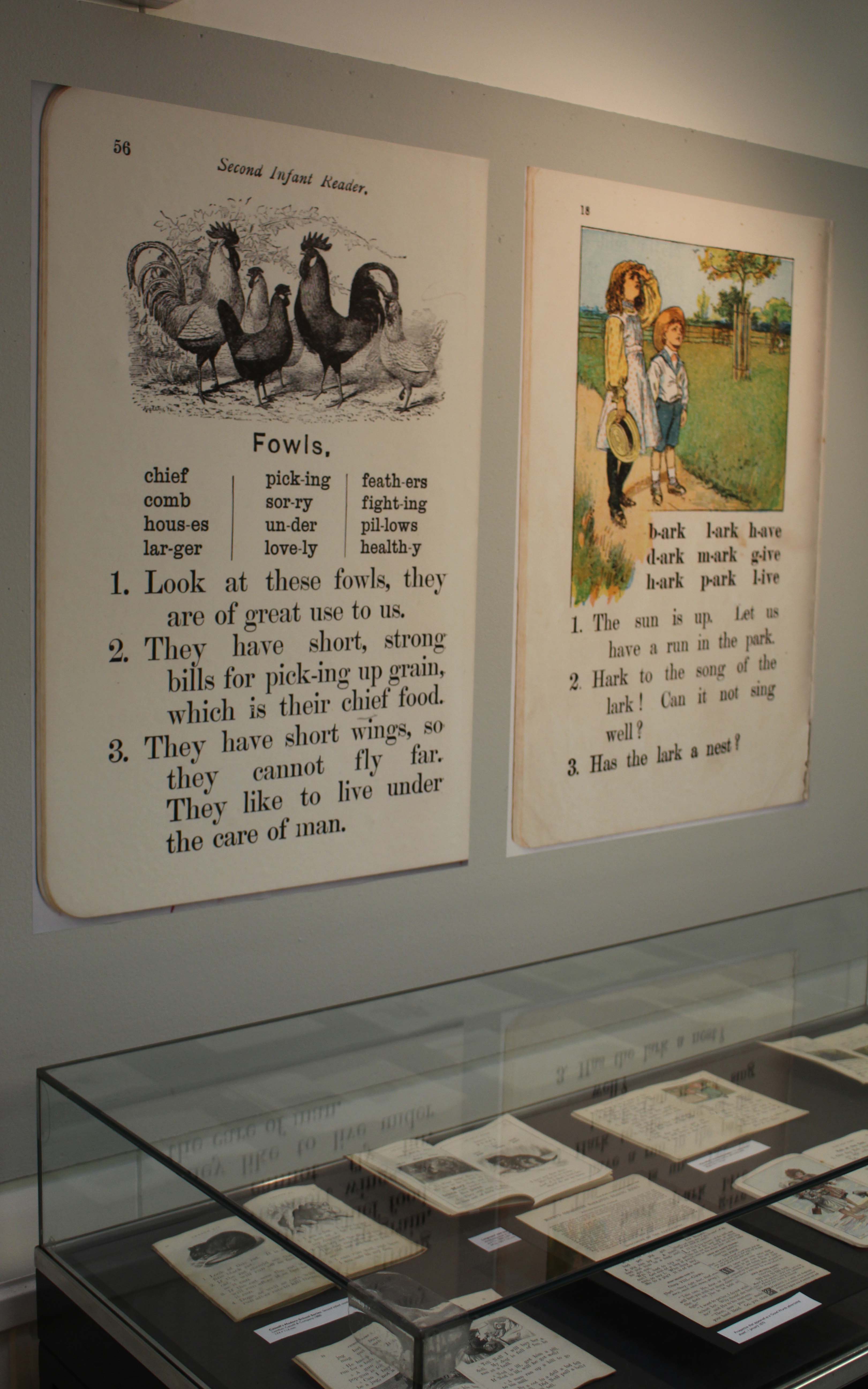
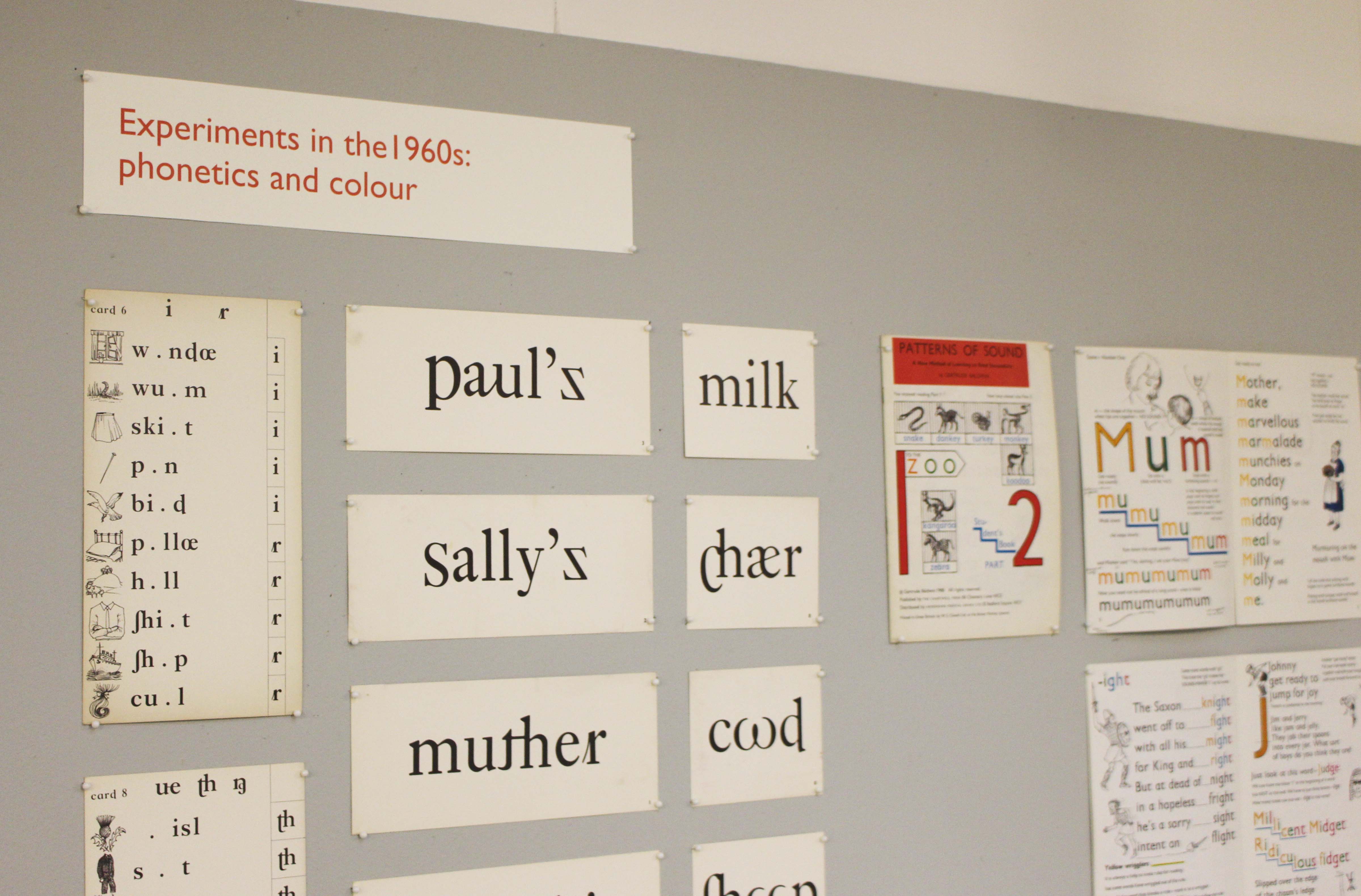
A collections-based research exhibition about typography and illustration in books for teaching reading from the 1880s to the 1960s.
Monday 11 January 2016 to Friday 18 March 2016
Open from 10.00 am to 4.00 pm, Monday to Friday
Department of Typography & Graphic Communication, ToB2, Earley Gate
More information from Laura Weill l.weill@reading.ac.uk
The use of typography and illustration in reading books for children has changed during the last hundred years. There has been a gradual shift from graphic conventions determined by printing and typesetting practice for adult readers to those more appropriate for beginning and emerging readers. Illustrations have become more important and many reading schemes used known artists to create the much-loved characters who featured in the narrative.