Science communication for children

A new AHRC-funded project begins today. Transforming science for young people: Marie Neurath and Isotype books for children aims to find new audiences for the approach to science communication taken by Marie Neurath in her books for children, produced in the 1940s and 1950s.  The illustrations in these books, in series such as the ‘Wonder world of nature’ and ‘Wonders of the modern world’, were innovative in their approach to the design of complex information.

Following on from Isotype revisited, the project will make extensive use of the materials in the Otto and Marie Neurath Isotype Collection, to identify approaches to science communication relevant to teaching in primary schools today. We will work with teachers and teacher educators as part of the design process to ensure that their ideas and needs are taken into account. Pilot schools will be involved in evaluating the effectiveness of the resources to ensure they are relevant and effective.

An exhibition at House of Illustration in London in summer 2019, Marie Neurath: Picturing Science, will display examples of Marie Neurath’s illustrations from the children’s books, as well as sketches, drawings and correspondence that show the iterative nature of the design process.

Project people and partners

Prof Sue Walker and Prof Eric Kindel, Department of Typography & Graphic Communication, University of Reading

Dr Andrew Happle, Institute of Education, University of Reading

Dr Emma Minns (Project Officer)

Partners:

Design Science

House of Illustration

Activity in Antwerp

Our use of the Lettering, Printing and Graphic Design Collections in the Typography Department, and our distinctive approach to collections-based research, was exceptionally well demonstrated at the 2018 ATypI conference in Antwerp. We enjoyed top quality presentations by Typography staff and PhD students. In a conference with over 550 international delegates, who repeatedly mentioned the ‘Reading’ influence in conversations and comments, it was humbling to realise just how influential and significant our work with collections has been in developing new knowledge about type and typography, and in inspiring people to undertake research.

Typography staff

Fiona Ross and Alice Savoie introduced their new Leverhulme-funded project: ‘Women in Type
Eric Kindel: ‘Objet-type: the French stencil letter

AHRC-funded Design Star PhD students

Riccardo Olocco: ‘The success of Jenson’s roman type
Borna Izadpanah: ‘Early Persian printing and typography in Europe

Recently graduated PhD student

Emanuela Conidi: ‘Uncovering Arabic type history, informing design

Information design, architecture and pharmacy: combating AMR

Competition

Calling small design practices, architects, information designers and pharmacists

Are you interested in how the design of space and information impacts on behavior and consumer choice? Do you want to work in public health and wellbeing? Do you want to develop research in practice? Are you up for the challenge of interdisciplinary work in the community?  

About our research project

How can architectural and information design help in the fight against anti-microbial resistance (AMR)?

Using principles of user-centred design, we are working with pharmacists and pharmacy workers to consider how to ‘improve the knowledge and understanding of antimicrobial resistance’. The AHRC-funded project ‘Information Design and Architecture in Persuasive Pharmacy Space: combating AMR’ (IDAPPS) aims to stimulate ideas for an engaging, inspirational, didactic information space to raise awareness of the dangers of anti-microbial resistance in a community pharmacy.

One of our research outputs is a competition and this is where we’d like your help. Competition teams will begin designing in our Ideas Lab, supported by a team of academics from information design, architecture, pharmacy, and human factors, as well as design and pharmacy practitioners.

Our pharmacy partner is Day Lewis and the winning design will be installed in a Day Lewis pharmacy for evaluation. Interested?

Get more information and how to enter a team for the competition here.


Become a Design Star PhD student

We are now open for applications for PhD studentships through Design Star, one of the Centres for Doctoral Training funded by the Arts and Humanities Research Council.

At Reading we have nine Design Star students working on a range of topics, including collections-based research on non-Latin typefaces and typography; maps and wayfinding in museums; the print industry and graphic design in the 20th century; decision-making for elderly care, and book design for people with early stage Alzheimer’s disease.

Design Star students benefit from working with other consortium students at Brighton, Loughborough, Goldsmiths and the OU, as well as external partners, to understand the ways in which design research interacts with many academic disciplines and walks of life. We aim to engage our doctoral researchers from the start and Rachel Warner commented on attending our induction event:

‘As a new student embarking on my research under the umbrella of Design Star, Friday’s Design Star event offered many opportunities to connect with fellow researchers and find out more about the diversity of experience and skills of all Design Star students. A workshop, organised by the student rep Jocelyn, culminated in group discussions about the range of research methods and research themes across our work, Design Star values and putting these in to practice, as well as Design Star current and future. New ideas and collaboration potential were evident from the animated conversations and wealth of ideas presented, exciting for a new researcher starting out, and providing huge potential for future collaborations’.

Find out how to apply:   www.designstar.org.uk

Celebrating with Coralie Bickford-Smith

We were delighted to see alumna Coralie Bickford-Smith receive an Honorary doctorate at last week’s graduation.

When she left Reading, Coralie worked for publishers on a freelance basis, and after a short stint with Quadrille Publishing, she went on to join Penguin where she made a name for herself as a highly-respected, award-winning book cover designer.

In her work at Penguin, Coralie has shown particular skill in creating covers for series of books, such as Penguin Pocket Classics, the Cloth-bound Classics and the Gothic Horror. Her skill lies in combining distinctive use of images and patterns, colours, and production processes that derive from understanding of traditional printing techniques. Through her work she has revived the tradition of the decorated cloth-bound book, but such that it has a modern-day feel.

Coralie has said that William Morris and William Blake have been inspired her work. However, it is William Blake –  with his immersive and integrative approach to book making –  that is best reflected in Coralie’s wonderful book that she authored and illustrated: The Fox and the Star. This compelling story and remarkable illustrations is thoroughly engaging for the reader and demonstrates book design skill at the highest level. For this work has won numerous awards including Waterstones Book of the Year in 2015 and The Academy of British Book Design prize in 2016.

We eagerly await the publication of her next book The worm and the bird.

A Partnership for Ephemera Studies

Typography is very pleased to announce an exciting new Goodwill Partnership between the Centre for Ephemera Studies (one of our research centres) and the John Johnson Collection at the Bodleian Library (University of Oxford). Commenting on this new initiative, Julie Anne Lambert, Librarian of the John Johnson Collection said:

The John Johnson Collection is delighted to partner the Centre for Ephemera Studies at the University of Reading. Our joint aim is to further the academic and popular potential of ephemera to cast light on the everyday lives of our forebears through the documents they themselves saw and handled. We are particularly excited to work with the Department of Typography & Graphic Communication in exploring the materiality of ephemera in their (often innovative) design and printing.

The Partnership will include working together on exhibitions, symposia, funding applications, projects with postgraduate and undergraduate students, and sharing of expertise on cataloguing, conservation, and print identification and conservation. It will reinforce the potential of ephemera to engage academics from a wide range of disciplines as well as the public.

Professor Roberta Gilchrist, Research Dean for Heritage and Creativity at Reading supports the collaboration:

The University of Reading warmly welcomes the new partnership between the Centre for Ephemera Studies and the Bodleian Library, John Johnson Collection. The collaboration will highlight the rich potential of ephemera to illuminate the history of everyday life and to inspire new approaches to  printing and design.

The examples below are from the Rickards Collection and the John Johnson Collection.

Entertainment_16jjedu

Have you thought about doing a PhD in Typography?

DS ind JB ws thinking TK DB LH

Our experienced supervisors welcome applications in the history, theory and practice of design for reading. Here are some of our recent and current PhD topics

If you have any ideas do get in touch with Sue Walker for an informal chat, and to discuss funding opportunities.

Why not join us as an AHRC-funded Design Star student?

Our Graduate School at Reading is excellent, and provides a stimulating environment.

And the experience we provide in Typography is world leading, not least because much of our PhD work is supported by our outstanding collections and archives, and the research training we provide.

Information Design at DRS 2016

Sue Walker and Alison Black attended the Design Research Society 2016 conference in Brighton. They organised a session, Effective Information Design, to raise the profile of the history, theory and practice of information design.

Support for health care is an area where information designers have undertaken research projects ranging from health promotion, through clinical practice, to medicines safety. The session included three health related papers. Jenny Darzentas reported her team’s work on patient information leaflets for mobile devices, with reference to Fentanyl patches, affirming that conventions for the organisation of patient information on paper are not directly transferable to mobile devices. A team from the Helen Hamlyn Centre for Design at the Royal College of Art and British Red Cross present their project about a smartphone app that helps to raise the awareness of ‘balance health’ as an aid to prevent falls in people over the age of 65. David Craib discussed approaches to creating and understanding meaning in communication design, working with the Canadian Institutes of Health Research.

Maxwell Roberts talked about work that compared objective measures of performance and subjective ratings of design effectiveness in two variants of the London Underground map. Continuing the visualization theme, Joanna Boehnert presented her Mapping Climate Communication project which introduces discussion around impact and power in data visualisation. Eden Potter identified some of skills and personal qualities that information designers need to successfully undertake a project reinforcing that information design is as much about process as it is about artefact.

The papers can be found in the proceedings following the introduction:

Walker, S., Black, A. (2016). Introduction: Effective information design. in: P. Lloyd & E. Bohemia, eds., Proceedings of DRS2016: Design + Research + Society – Future-Focused Thinking, Volume 6, pp 2303–2308, DOI 10.21606/drs.2016.603

Making an impression: printing presses, type and colour


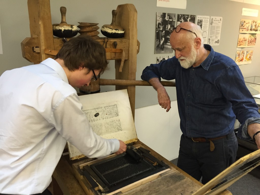
This workshop, based around the printing press collection in Typography, attracted postgraduate students, academic staff, museum and library professionals, and members of the public interested in the materiality of text, books and ephemeral documents.

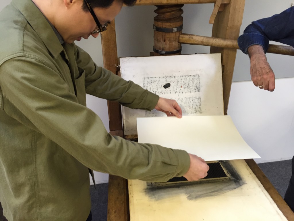
Participants used the presses under craft supervision, and had a go at casting metal type.

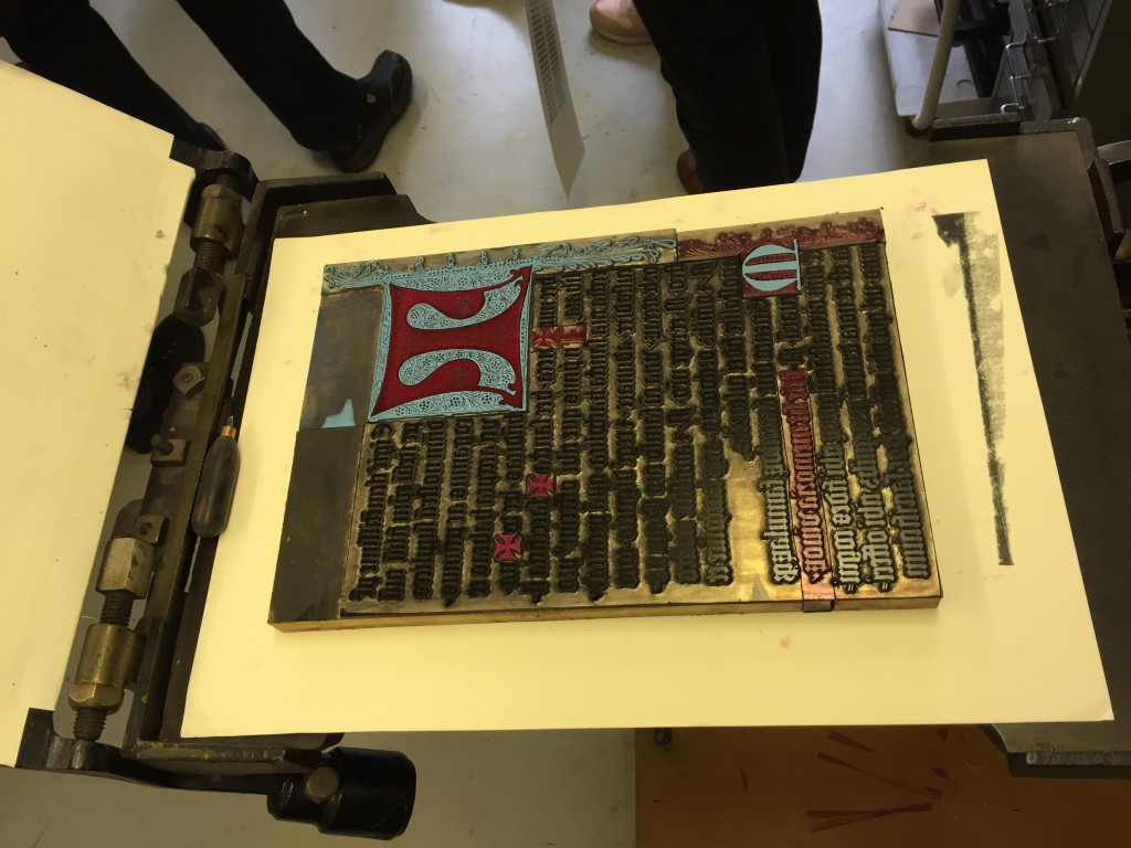
They printed a page from the Gutenberg bible on a reconstructed one-pull wooden press that Gutenberg would have used, as well as 19th century woodblocks on another.

Alan May demonstrated printing of a Fust and Schoeffer 2-colour initial.

The workshop culminated in a fascinating talk by Dr Elizabeth Savage (British Academy Postdoctoral Fellow, Centre for Material Texts & Research Fellow, History of Art,Cambridge University) ‘Deciphering the First Colour-Printed Images in England: The Book of St Albans, 1486’

IMG_1474 IMG_1475 IMG_1479 IMG_1481

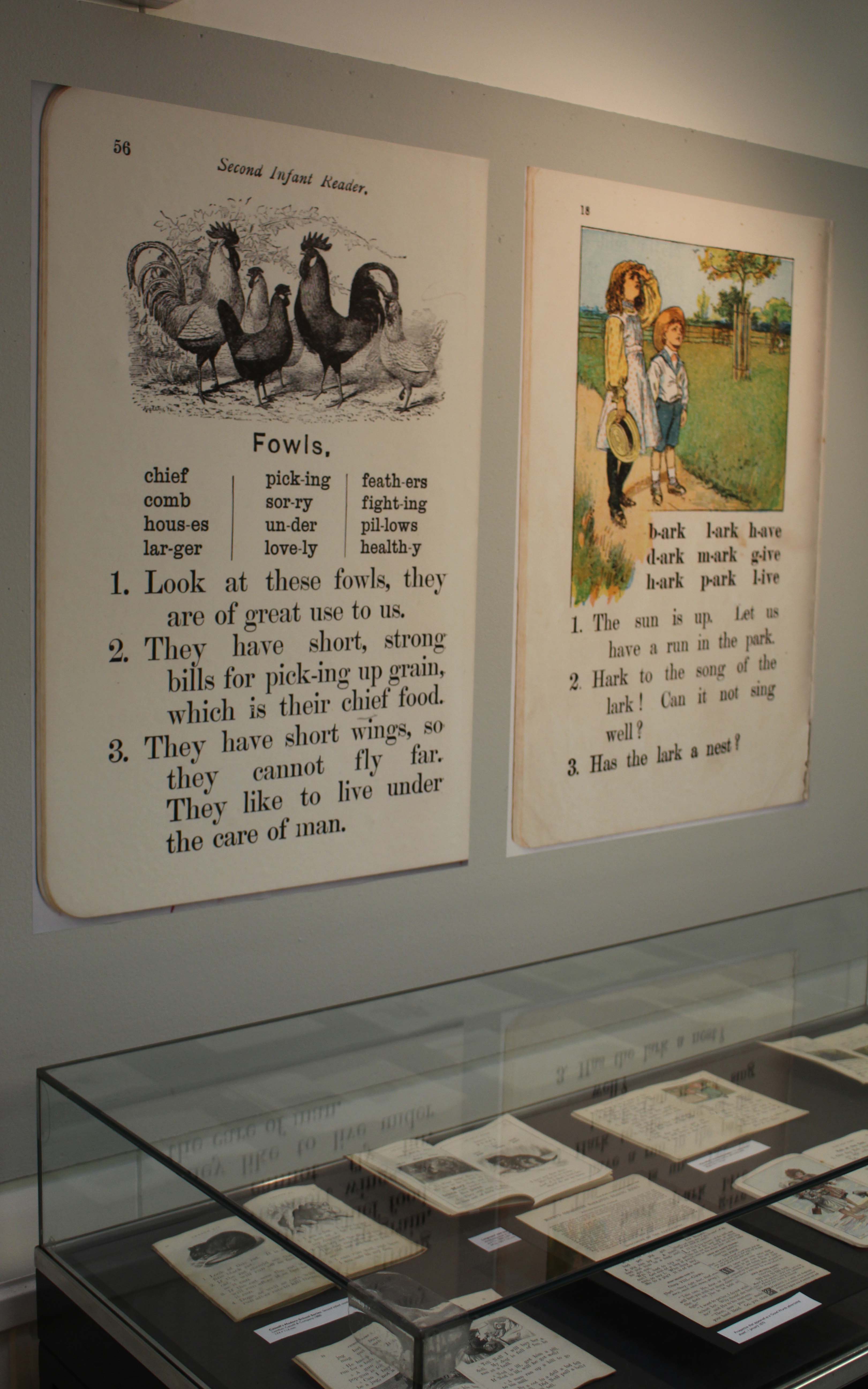
Looking at children’s reading books

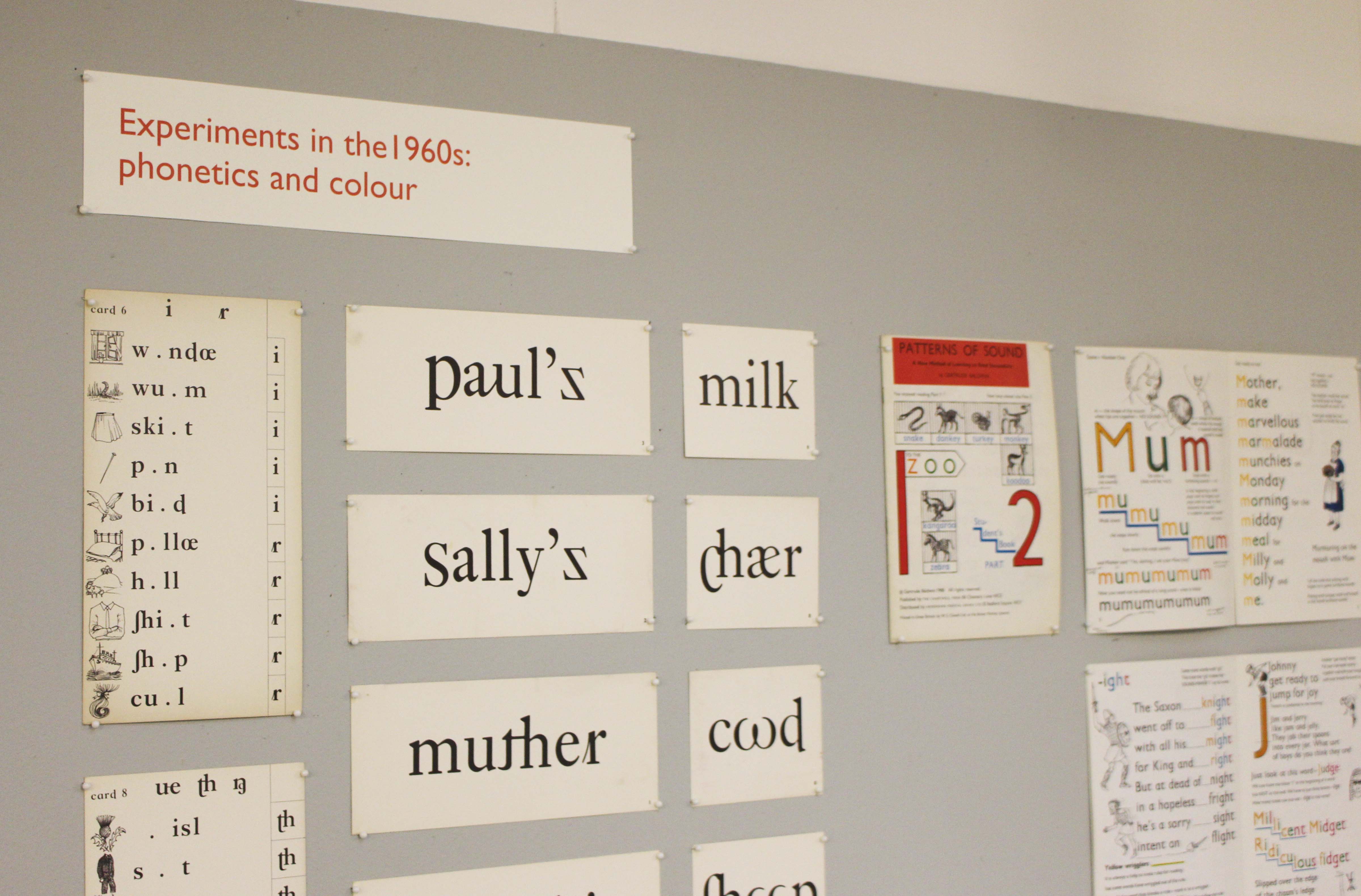
A collections-based research exhibition about typography and illustration in books for teaching reading from the 1880s to the 1960s.


kidsex2

Monday 11 January 2016 to Friday 18 March 2016

Open from 10.00 am to 4.00 pm, Monday to Friday

Department of Typography & Graphic Communication, ToB2, Earley Gate

More information from Laura Weill l.weill@reading.ac.uk

The use of typography and illustration in reading books for children has changed during the last hundred years. There has been a gradual shift from graphic conventions determined by printing and typesetting practice for adult readers to those more appropriate for beginning and emerging readers. Illustrations have become more important and many reading schemes used known artists to create the much-loved characters who featured in the narrative.

kidsex