The Queen’s Resolve: Queen Victoria in the Special Collections

Following the 200th anniversary of Queen Victoria’s birth, Liaison Librarian Bethan Davies takes a closer look at our Special Collections and the surprising connections with the famous monarch.

Housed in the red brick building designed by Alfred Waterhouse for Alfred Palmer, it is hard not to see the connection between the Victorians and Special Collections. Our Children’s Collection is particularly strong in 19th Century titles, and many of our business archives cover the Victorian period (including Huntley & Palmers, De La Rue, Chatto & Windus). We hold an entire collection focused on The Great Exhibition of 1851, patronised by Prince Albert, and the Spellman Collection focuses entirely on Victorian piano hall music covers. Several of our archives hold documents on Victorian illustrators and authors including Audrey Beardsley, Pearl Craigie, and Violet Fane.

Therefore, it is not surprising that Queen Victoria herself makes appearances throughout our Collections, especially around moments of change and commemoration. The breadth and age of our Collections also allow us to view Victoria throughout history, and chart the various changes throughout her life.
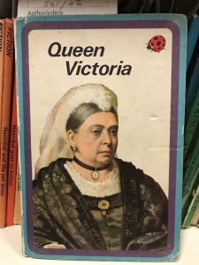
A children's book with a white background, and the text Queen Victoria. An older woman is on the cover, wearing black clothes and a white veil.

Queen Victoria (1976), part of our Ladybird Collection

Changing Faces

When we think of Victoria, we often think of the image we see on the cover of the 1976 Ladybird title Queen Victoria (see above). This depiction is from Victoria’s later years. However, we can see images of Victoria’s youth from the children’s book The Queen’s resolve : “I will be good” and her “doubly royal” reign (1897), written by Charles Bullock. The front cover depicts two oval images of Victoria facing each other, one a child, the other the elder Queen (see below). Bullock notes in his title that whilst the book is intended for younger readers, it might also be of interest to “Old England,” looking back to the beginning of the Queen’s reign and the “boundless enthusiasm” which accompanied her coronation. The title refers to a popular story that upon discovering that she was heir to the throne, Victoria exclaimed, “I will be good!” Written in commemoration of the Queen’s Silver Jubilee, Bullock not only celebrates her rule, but her role as a mother and wife, which he calls her “double rule”.

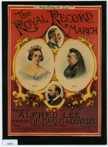
The Spellman Collection, which offers fascinating depictions of Victoria throughout her reign, is equally interested in both Victoria’s personal life. A key example of this can be seen in The Royal Record March (1897), composed by Alfred Lee, and the notorious Marquis de Leuvilles in celebration of Victoria’s Silver Jubilee. Similar to The Queen’s Resolve, two images (one younger, one older) of Victoria face each other, although the younger Victoria is shown just before she took the throne. The cover also depicts her husband, the late Prince Albert, explicitly denoting his continuing importance in her life, even after his death.


Coronation and Childhood

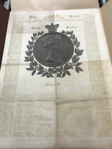
The “boundless enthusiasm” noted by Bullock regarding the Queen’s coronation in 1838, can be seen in a rare special edition of The Sun held in our Printing Collection (not connected to the modern newspaper of the same name). Created with the “special exertion of M. De La Rue”, the edition is noted for using gold ink rather than black, and includes a poem to mark the occasion created by the editor Murdo Young. Through both items, the general excitement of a new monarch can be felt, alongside the youth of the new Queen, who was then only 18 years old. Young’s “Sketch” of the new Queen makes note of her childhood, future reforms which needed to be made to the monarchy, and in particular her short stature.

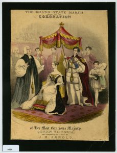
The coronation was also commemorated by composer J.B. Arnold with The Grand state march: composed for the coronation of her most gracious majesty Queen Victoria (1837). Our copy from the Spellman Collection depicts an image of the young Queen on the front cover, enthroned and about to be crowned.


Change and Exhibition

The image of the younger Victoria is also present in the Stenton Coin Collection. Although the collection focuses on coins from the Anglo-Saxon and Norman period, it also includes this 1839 copper halfpenny, from the Isle of Man. At the time, the Isle of Man had separate coinage issued compared to the rest of the country. This was overturned in the Act of 1839, which aligned the Isle of Man with the United Kingdom’s currency. The 1839 coinage, updated to include Victoria’s face, was the last update to the Isle of Man’s currency, until the introduction of decimal coinage in 1971.

One of the most well-known examples of Victoria’s legacy was in the creation of the Great Exhibition of 1851, housed in the Crystal Palace. The moment was commemorated by the lithographers the Leighton Brothers, with The Queen’s March (1851). Now part of our Great Exhibition Collection, this stately march shows the Queen, alongside Prince Albert, who was the patron of the Great Exhibition. Our Collection includes the official Catalogue and reports on the Great Exhibition and its influence upon the British Society, alongside ephemera and souvenirs!


This is only a glimpse into all our holdings on Queen Victoria. Click the links to find out more about our Collections! Want more information? Contact Special Collections at specialcollections@reading.ac.uk


Baskerville’s marbled papers

by Anna Murdoch, Graduate Trainee Library Assistant.


The Department of Typography & Graphic Communications’ teaching sessions always involve a swath of fascinating material from early medical texts to astronomy. One day I was setting up a large volume on some foam rests for students to peruse. Upon opening it up, I saw an endpaper quite unlike anything I had seen before. It had a much softer, lighter appearance than the richer, denser-looking examples found elsewhere within our collections.

The book in which these endpapers reside is Baskerville’s celebrated edition of The Holy Bible. This volume is part of the Overstone Library, a collection which has been held by the university for 99 years, having been bequeathed it by Lady Wantage. She was the daughter of the 1st Baron Overstone, who bought political economist John Ramsay McCulloch’s library after his death in 1864. Being the private library of a gentleman, many of the bindings are very fine. McCulloch, for his part, wrote in his preface to his library’s catalogue that he “acknowledge[d] myself to be an ardent admirer of well-printed handsome volumes […] I also confess to such a folly, if such it be, of being no less an admirer of well-bound than of well-printed books”. It is clear that not all of these bindings were executed during their lifetimes. 

In his introduction to Anne Chambers’ The principal antique patterns of marbled paper, Bernard Middleton relates that marbling began to develop in England in the second half of the eighteenth century, which is the period Baskerville was active in. Diana Patterson relates the tale of his involvement in a competition for a premium offered by the Society for the Encouragement of Arts, Manufactures and Commerce, which is now the Royal Society of Arts.


McCulloch describes the volume as being bound in “old red morocco, gilt leaves ; a magnificent book”. Baron Overstone describes it as “Baskerville’s beautiful edition […] old red morocco extra, richly tooled, gilt edges”. In the latter catalogue there is a shelfmark written in pencil in the right hand margin: 11. A, and a note: “Marks. 1930” and additionally “£12 calf”. The shelfmark can be found in the book, but it is crossed out, as the book now sits at Overstone–Shelf 32J/04, and is deemed “Large”.

Both the catalogues and bookplates reveal this was a book Overstone bought from McCulloch. In Contributions towards a dictionary of English book-collectors, James Bonar writes that “the collection is not now traceable”. An inscription on the rear of the endpaper reads: 3/7. 38 453. This could be an acquisition date, or auction lot number. I have not been able to gather any more details on former owners prior to McCulloch.

One has to agree with McCulloch – it is a magnificent book. The binding is unsigned, but not without clues. One, on the exterior, is the leather label with the title on it in gilt. It certainly looks akin to Baskerville’s type. Philip Gaskell, writing of another binding, writes “what links it with Baskerville is the leather label on the spine… apparently with sorts of his own Double Pica roman and italic caps”. Gerry Leonidas, of the Department of Typography and Graphic Communiation, told me that he is not so sure about the lettering seen above as it “looks a bit heavy and with different proportions for the bowls of the B. The E and L have much more curved strokes leading into the serifs.” Another, also on the exterior, is the presence of an acorn tool, which according to Aurelie Martin in “The ‘Baskerville bindings'” is a finishing tool found on some of the 31 volumes she surveyed.

The third clue, when one opens the book, is the endpaper. Gaskell, in his Baskerville bibliography, describes an example of it as “rather striking […] marbled to represent blended washes of water colour”. Intriguingly, if one looks closely, you can see that two pieces of paper have been stuck together before being marbled. Diana Patterson asserts Baskerville did marble at least a ream of paper, which suggests there is more out there to be found.

This certainly is a very exciting discovery for us. Known examples of this marbled paper reside in Birmingham, the British Library, Harvard, and in private collections. 

This is by no means the only example of this marbled paper we hold in our collections, but it is far and away the best. The second is in a rebound copy of Paradise Lost from the Printing Collection which only possesses its front endpaper.

Interestingly, this volume boasts a feature that the Bible doesn’t: marbled edges, revealing how watery Baskerville’s marbling was.

It is much less vibrant than, for example, this volume from the Overstone library:

There are many, many examples of different kinds of endpapers to be found in our rare books collection:

This slideshow requires JavaScript.

Sources:


A catalogue of books, the property of the author of the commercial dictionary,  MDCCCLVI, London : [privately printed], 1856.

Bonar, James, ‘John Ramsay McCulloch’, Contributions towards a dictionary of English book- collectors, Bernard Quaritch, 1892-1921.

Catalogue of the library, Overstone Park, [s.l. : s.n.], 1867.

Chambers, Ann, The principal antique patterns of marbled paper, The Cygnet Press, 1984.

Martin, Aurelie, “‘The Baskerville bindings'”, John Baskerville : art and industry of the Enlightenment, Liverpool University Press, 2017, pp. 166-184.

Gaskell, Philip, John Baskerville: a bibliography, 1959.

Patterson, Diana, ‘John Baskerville, Marbler’, The Library, Volume 6-12, Issue 3, 1 September 1990, p. 212–221.

Pearson, David, English bookbinding styles, 1450-1800 : a handbook, London : British Library ; New Castle, Del. : Oak Knoll Press, 2005.

Book Covers and Robinsonades: Exploring the Crusoe Collection

This month’s blog post was written by Chloe Wallaker, a final year BA English Literature and Film student at the University of Reading. Chloe has been researching our Crusoe Collection as part of her Spring Term academic placement based at Special Collections. 

Today marks the 299th anniversary of the publication of one of our favourite novels – Daniel Defoe’s Robinson Crusoe. It is one of the most popular and widely published books today. The University of Reading Special Collections holds hundreds of editions and imitations of the novel as part of their Crusoe Collection, so I decided to visit and explore what the archives have to offer.

For a novel that was intended for adult readers, it was striking to discover the vast number of publications of Robinson Crusoe that were aimed at children. Different editions emphasise different aspects within the story and aim at children of different ages. I have chosen to showcase some of my favourite modern editions of the text that are aimed at children and published in the twentieth century.

A red book cover including pirates, dragons, Alice in Wonderland and a Knight.

The Rand-McNally edition of Life and adventures of Robinson Crusoe (1954)– CRUSOE COLLECTION–A1954.

I came across the edition published by Mcnally and Company (above), which includes the modernised text of Robinson Crusoe, with minor abridgements. The cover includes different illustrations referencing classical children’s literature, including Lewis Caroll’s Alice in Wonderland, that was also published in the eighteenth century and forms a part of popular culture today. The edition categorized Robinson Crusoe amongst famous children’s fairy tales and recognised it as an adventure story for young readers.

A book cover showing an island and the sea, with Robinson Crusoe and Man Friday sat together.

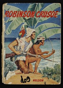
Nelson (1960), Robinson Crusoe – CRUSOE COLLECTION–A1960

There are many adaptations of the novel that are shortened for younger children. I discovered Nelson’s adaption of the text. The edition is published to be told to children by adults, demonstrating how the story is constructed for very young readers as well as older children. This edition stood out to me as the cover focuses on the more mature and violent themes of the novel, including slavery and death, than the covers intended for older children. This made me question the appropriateness of the story in challenging its young children

The adaptation published by Hunia (above, left) encourages young children to read the story for themselves, instead of being read to. The cover suggests the story focuses on the relationship between Crusoe and Friday, as opposed to focusing on the adventure story which most of the publications adopt to appeal to children. This demonstrates how Robinson Crusoe not only appeals to children through entertainment, but teaches moral lessons, highlighting the pedagogical value of the novel.

Most of the children’s adaptations use illustrations to appeal to children. Wilkes’s edition (above, right) seems to construct the text to resemble a picture book. As well as focusing on the adventure aspects of the text, the publication focuses on the spiritual themes embedded within the novel, with its cover illustration resembling the biblical story of Noah’s Ark.

The publications I found most interesting were the imitations of the text, commonly described as ‘Robinsonades’, which reveal how Robinson Crusoe was not just a popular novel, but became an identifiable piece of popular culture. Crocket’s imitation of the text constructs Crusoe as a child figure, creating an identifiable protagonist for children. The edition takes the themes of adventure from the original text and constructs a version of the novel that is perhaps more suitable for children.

Perhaps the most interesting imitation of the novel is Ballantyne’s edition. This edition focuses on the relationship between a dog and his master, resembling the relationship between Crusoe and his man Friday. The edition removes the mature and violent themes of slavery, which could be considered inappropriate aspects of the novel, and constructs a pet-master relationship, which would appeal to children and in terms they could understand.

Some of the editions that stayed more true to the novel seemed to present problematic themes for children. This made me question the appropriateness of a novel that was intended for adults, being read by children. I found it interesting how each edition focused on different aspects and themes of the novel, demonstrating the number of ways in which the novel can be read and used to educate and entertain children. This investigation into the children’s editions of Robinson Crusoe has reminded me why the novel has remained a favourite read for people of all ages and continues to be published today.

For more information on our Crusoe Collection, visit the Special Collections website, or email us at specialcollections@reading.ac.uk.  

References:


Ballantyne, R.M (1970), The dog Crusoe, London: Abbey Classics, CRUSOE COLLECTION–A1942-2013 [BOX].

Crockett, S.R (1905), Sir Toady Crusoe, London: Wells Gardner, Darton & Co. Ltd, CRUSOE COLLECTION–A1905.

Defoe, Daniel (1954), Life and adventures of Robinson Crusoe, New York: Rand McNally & Company, CRUSOE COLLECTION–A1954.

Defoe, Daniel (196-), Robinson Crusoe, London : Thomas Nelson and Sons Ltd., CRUSOE COLLECTION–A1960

Hunia, Fran (1978), Robinson Crusoe, London: Collins, CRUSOE COLLECTION–A1954.

Wilkes, Angela (1981), The adventures of Robinson Crusoe, London: Usborne Publishing, CRUSOE COLLECTION–A1981.

New Exhibition: The John and Griselda Lewis Printing Collection

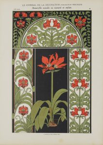
The John and Griselda Lewis Printing Collection consists of over 20,000 examples of printed documents covering several centuries and a wide variety of research subjects –from Fifteenth Century religious texts, Nineteenth Century love tokens to Twentieth Century book design. It complements other important printing and publishing collections held at the University’s Special Collections Service and the Department of Typography and Graphic Communication. A selection of favourite items from the collection is currently on display here at the Museum of English Rural Life.

A page from a journal article, decorated with red flowers.

An Illustration from Le Journal de la Decoration c.1906 (JGL 23 23)

John Lewis and His Chance Find

John Lewis spent many years as a lecturer in graphic design at the Royal College of Art, and wrote several publications on printing and book design. His 1962 publication Printed Ephemera: The Changing Uses of Type and Letterforms in English and American Printing is considered pivotal in giving credence to the notion of paper ephemera as a subject for academic study.

His interest in ephemera began as a young man. Lewis started his career as a printer for the firm of Cowells in Ipswich. While working here in the mid-1950s Lewis found a large scrapbook in a secondhand bookshop. The book contained an assortment of printed matter including printer’s marks, specimens of typefaces, tradesman’s bills and public notices. The scrapbook had been compiled in the 1820s by a Dr Lodge, at one time the librarian of the University of Cambridge. The exact purpose of the scrapbook remains a mystery, but John Lewis was compelled to purchase the book and study its contents. This original volume, which he later dissembled, formed the starting point of Lewis’s fascination with paper ephemera. In his collecting he was joined by his wife, the noted ceramicist Griselda Lewis. They believed that such temporary documents contain a wealth of evidence of everyday life in the past, as well as charting the development of printing techniques in the UK.

Wolpe and Weinreb

In addition to John and Griselda’s original collection, a proportion of the archive was originally collected by the typographer and illustrator Berthold Wolpe, a fellow lecturer at the Royal College of Art. The collection was further added to by Ben Weinreb, a London-based dealer in rare books who purchased the collection sometime around 1990. What survives today is an amalgamation of the collecting interests of these various parties. The result is a rare and diverse collection of printed ephemera incorporating early printing specimens, newspaper advertisements, street literature, book covers and trade cards, plus specimens of calligraphy, lithography and fine art printing. As such, material in this collection can support the research of many aspects of social history, as well as students of graphic design and the visual arts.

A black and white magazine cover of a woman, with the words Wendingen on the cover.

Cover from a 1924 edition of Wendingen magazine of art and architecture (JGL 29-4 -15)

During his ownership of the collection, Weinreb arranged the documents into various categories. Roughly the first half of the collection is organised by document type. These include Early Manuscripts and Printed Books, Prospectuses, and Trade Cards, Letterheads and Catalogues. Much of the latter half is arranged by themes, such as Religion, Maritime, Agriculture, and so on, each of which contain a broad mixture of documents. The majority of documents were glued and mounted onto around 1,900 light cardboard sheets, presumably as an aid to displaying and discussing the collection.


 Our Project

The collection is now fully catalogued, and is to be made available via our online catalogue. Each cardboard sheet has been digitally photographed. In addition, we are mid-way through a programme of conservation, as the glues used to mount the documents are harmful to their long term preservation. Documents are being carefully removed from their mounts and placed in archive-quality folders. This not only creates a better preservation environment, but also makes them easier for visitors to access in our reading room. In the short term parts of the collection are unavailable to researchers, but archive staff can advise enquirers as to specifics of availability.

The John and Griselda Lewis Printing Collection is being celebrated with an exhibition here at our Special Collections Service, housed at the Museum of English Rural Life. This exhibition showcases a range of attractive and unusual documents from the collection, and runs until Sunday 11th February.

Image of the Exhibition space.

A snapshot of our John and Griselda Lewis Exhibition.

Finding one of the oldest examples of printing in Britain: the story of the Caxton leaf

Written by Erika Delbecque, UMASCS Librarian, as part of the 2017 Being Human festival: Lost and Found.

The leaf on my desk was stained, torn in places, and fairly unremarkable. Unlike other loose leaves from the fifteenth century that I had been working on, which mostly contained standard texts that circulated widely at the time, the text proved difficult to identify. My secondary school Latin enabled me to, slowly, make some sense of the heavily abbreviated lines.

I read sentences such as

Feria iij. de sancto Augustino. et memoria sub silencio. de martiribus et de trinitate

On the third weekday, [hold a service] about Saint Augustine. And a remembrance in silence of the saints and the Trinity.

The Caxton leaf that was discovered at the University of Reading (detail)

It became clear that this was a page from a practical book aimed at clergy: an ordinal. Research into the publication history of this type of book led me to a version of the ordinal written by Clement Maydeston, a medieval priest from Middlesex. His text became the standard ordinal in the late fifteenth century.

However, the font and the layout of the text on the leaf did not match any known editions of Maydeston’s work. By chance, I read that an earlier version of the ordinal had been printed by William Caxton in 1477, which survived only in two fragments of eight damaged pages each. These had been discovered in the binding of a book in the library of the Grammar School at St Albans in 1858. Describing the pages, William Blades, the scholar who made the discovery, noted:

The lines are not spaced out to one length. A full page has 22 lines (cited in Wordsworth 1894)

The Caxton leaf that was discovered at the University of Reading

Sure enough, the leaf in my hands had 22 lines, which were not spaced out to one length. Could it be…? The surviving fragments that Blades had discovered, which are now kept at the British Library, are available digitally through Early English Books Online.

The font matched. The layout matched. The page measurements matched.

The unassuming leaf that had been in our collections for almost twenty years turned out to be a unique survivor from a long lost William Caxton book.

Late hym come to Westmonester

Having learned how to print in the Low Countries, Caxton arrived in London to set up the first British printing press about a year before this ordinal was printed. He was a shrewd businessman, seeking out texts to print that would appeal to a large audience. An ordinal would have been a safe bet in Catholic Britain: there was a steady demand for liturgical handbooks from the clergy.

To advertise his ordinal, Caxton printed notices that were pasted on walls and doors in London, in which he urged customers to head to his shop in Westminster to buy the book because it is “wel and truly correct” and “good chepe”. Incidentally, it is oldest surviving printed advertisement in the English language.

Advertisement for Sarum Pie [‘Ordinale ad usum Sarum’] ([Westminster: William Caxton, c.1476-7]) ©Bodleian Libraries

A perilous journey

What happened between the time when the freshly printed leaf left Caxton’s presses and the moment it was discovered in our collections over 500 years later? The leaf contains clues that offer tantalising glimpses into the journey it made before it ended up on our shelves.

Detail of the Caxton leaf showing the red paraph marks

The first of these are the red marks on the page, so-called “paraph marks” which indicate the start of new sections. Unlike the letters on the page these were not printed, but added by hand. Books from the fifteenth century were modelled on medieval manuscripts, and specialised scribes called “rubricators” would add page numbers and paraph marks in coloured ink. Although it was common for customers to take their printed book to a rubricator themselves, evidence from surviving books printed by Caxton suggests that he employed in-house rubricators in his workshop (Tokunaga, 2012). Their work would have turned our book into a finished product, ready to be sold in Caxton’s shop at the “almonesrye  at the reed pale” in Westminster.

Detail of the Caxton leaf showing the offsets from a leather binding

At some point in the following centuries, its fortunes changed. The Reformation, which raged across Britain and the rest of Europe in the sixteenth century, eliminated the need for Catholic ordinals. Dark offsets from leather towards the edges of the leaf hint at what happened next: the leaf was folded and used to reinforce the cover of a later book. Rather than wasting new paper, which was a relatively expensive commodity at the time, bookbinders often recycled leaves from earlier documents for this purpose. So, we largely owe the survival of the Caxton leaf to the thriftiness of these craftsmen!

Portrait of William Caxton from a proof illustration to John Johnson’s ‘Typographia or the Printers Instructor’. 1824 ©British Museum

What happened next is shrouded in mystery. At one point, someone must have taken the leaf out of the binding, although it is unlikely that they realised its significance. The leaf may have changed hands several times, until the late typographer John Lewis purchased it as part of a collection of loose early printed leaves in the 1950s. Lewis suggests that these leaves may have slumbered in bindings of rare books at Cambridge University Library, until they were removed by a diligent sticky-fingered librarian:

A dozen years or so ago, I bought from a bookseller in Ipswich, Suffolk, an album compiled about the year 1820 by a Dr Lodge, sometime librarian to the University Library at Cambridge. […] As librarian to a great library, Dr Lodge’s opportunities for collecting pages from damaged books and packings from broken bindings were extensive (1990, pp. 9-10).

In this way, unbeknown to Lewis himself, a unique Caxton leaf made its way into his collection of historical examples of printing and graphic design. In 1997, this collection was purchased by the University of Reading, where it would sit on the shelves awaiting detailed cataloguing for the next twenty years.

Libraries within libraries

We will probably never know what detours and stops our Caxton leaf made on its five-century long journey from London to Reading via Cambridge and Ipswich. When I identified the leaf as an early example of Caxton’s printing, I realised that what I held in my hands was a unique witness of the introduction of what is perhaps the most significant invention of the modern age. This small, humble leaf has now assumed its rightful place amongst the treasures of our collection. Who knows what other treasures are lurking hidden in bindings on library shelves, libraries within libraries waiting to be discovered?

References

Lewis, John 1990, Printed Ephemera. 2nd ed, Woodbridge: Antique collectors’ club.

Wordsworth, Christopher (ed.) 1894, The Tracts of Clement Maydeston: With the Remains of Caxton’s Ordinale, London: Harrison and Sons, 1894.

Tokunaga, Satako 2012, Rubrication in Caxton’s early English books, c.1476–1478. Transactions of the Cambridge Bibliographical Society, 15.1 59-78.

Recent acquisition: a 1908 fine printed edition of ‘The Romaunt of the Rose’


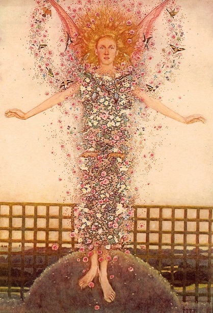
‘The God of Love’, illustration by Norman Wilkinson of Four Oaks from ‘The Romaunt of the Rose’ (1908)


Written by Fiona Melhuish (UMASCS Librarian)

One of the most significant additions to our rare book collections in recent years has been a copy of a 1908 edition of The Romaunt of the Rose, which was purchased with assistance from Arts Council England/Victoria and Albert Museum Purchase Grant Fund and the Friends of the National Libraries.

This publication was the first book to be printed by the Florence Press, which was founded by the publisher Chatto & Windus to produce books of similar beauty to classic private presses, but in larger editions and at more accessible prices. Other fine quality editions produced under the Florence Press imprint included editions of Keats, Blake, Boccaccio and St Francis of Assisi.

This important acquisition complements the numerous examples of private press books and other fine printing in our rare book collections, and the Chatto & Windus archive, in which the book is mentioned specifically in correspondence and other records.


‘Love Pursuing’, illustration by Keith Henderson from ‘The Romaunt of the Rose’ (1908)


Due to differences between catalogue records, it is difficult to tell how many copies of the book exist in this country, but there appear to be only a small number. This copy is no. 7 of a limited edition of 12 printed on vellum. The Florence Press also produced an edition of 500 copies of the Romaunt printed on hand-made Aldwych paper, and we were pleased to acquire copy no. 129 of this paper edition as part of the purchase.


‘Mynstrales’,  illustration by Norman Wilkinson of Four Oaks from ‘The Romaunt of the Rose’ (1908)


The Romaunt was one of the most important and influential poems of the Middle Ages, and is a partial translation into Middle English of a French allegorical poem, Le Roman de la Rose. It was first thought to have been the work of the English poet Geoffrey Chaucer, and while it is now questioned how much of the work is attributable to Chaucer, it is generally agreed that the first part was translated by him and that the poem influenced the poet’s later work.

Le Roman de la Rose was begun by the French scholar and poet Guillaume de Lorris in about 1230 in Old French and was continued forty years later by the author Jean de Meun. The poem begins with a description of an allegorical dream of courtly love, set in a walled garden, in which a courtier (the narrator) seeks to gain the affection of his beloved, a woman represented as the allegorical ‘Rose’, with its dual meaning as both a woman’s name and a flower. The courtier encounters other allegorical figures such as ‘Lady Reason’, ‘Daunger’ and ‘the God of Love’ who offer him advice on courtly love.


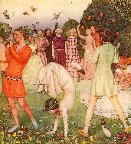
‘The Daunce’, illustration by Keith Henderson from ‘The Romaunt of the Rose’ (1908)


In the second fragment written by Meun, the poem takes on a more philosophical, satirical and sexual tone, as, in the story of the two lovers, ‘Rose’ is represented as less of an abstract ideal and becomes a real woman with sexual and physical reality. There are satirical attacks on women and marriage, courtly love and religious hypocrisy, represented by the allegorical figure of Fals-Semblant (False-seeming).

The publication features twenty exquisite colour plate illustrations, with ten by the Scottish painter, illustrator and war artist Keith Henderson (1883–1982) and ten by the artist, illustrator and theatre designer Norman Wilkinson of Four Oaks (1882 – 1934). Wilkinson adopted the suffix “of Four Oaks” to distinguish himself from a contemporary marine artist of the same name.

The illustrations are reminiscent in style of the early Pre-Raphaelites with their intense detail, colour and realism. Features and figures such as the striking image of the God of Love [see image above], wreathed and clothed in a swarm of tiny flowers, animals and birds, and the unusual compositions and poses of the figures in ‘The Daunce’ [see image above] give the images an intriguing, ethereal quality that perfectly illustrates, and brings to life, the dream world of the poem.


‘The End’, illustration by Keith Henderson from ‘The Romaunt of the Rose’ (1908)


The two copies of The Romaunt of the Rose (PRINTING COLLECTION FOLIO–841.18-GUI) are available to view on request in the Special Collections Service reading room.

Images reproduced with permission from The Random House Group Ltd.


References and further reading

The Roman de la Rose Digital Library: http://romandelarose.org/ [accessed 10.02.2017]

The Romaunt of the Rose manuscript and digitisation project at the University of Glasgow Library: http://www.memss.arts.gla.ac.uk/html/pilot.htm [accessed 10.02.2017]

An A-Z of the University’s Museums and Collections

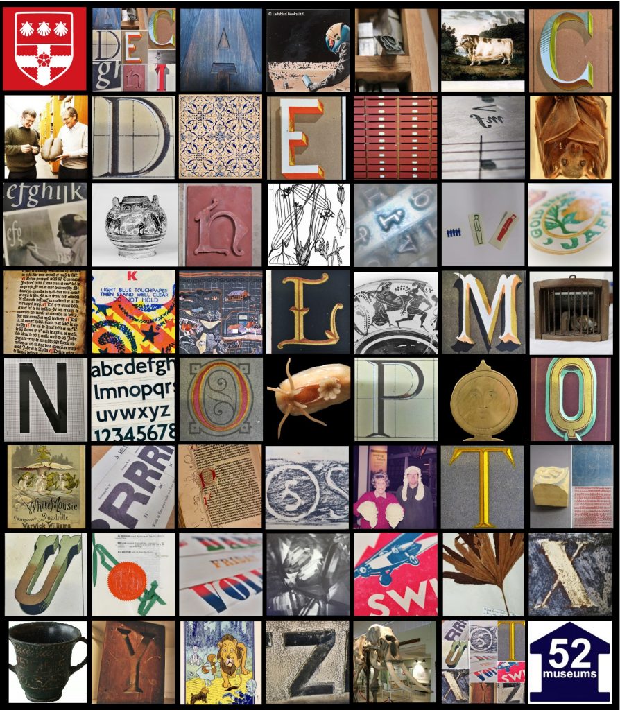
@52Museums Instaphabet

@52Museums Instaphabet

Earlier this month the University of Reading’s Museums and Collections collaborated on an exciting project for @52Museums on Instagram.  The 52 Museums programme, which began in January 2016, sees a new museum taking over the running of the 52 Museums Instagram and Twitter page each week in order to share their collections, exhibitions, achievements and more with the world.

To best showcase our fantastic range of collections we produced an A-Z guide or ‘instaphabet’ featuring lettering from our Typography collection and Special Collections Library alongside art, artefacts and anecdotes from the Museum of English Rural Life, Cole Museum of Zoology, URE Museum of Greek Archaeology, our Herbarium, Art collection and Volunteers.

Some of the highlights from the Special Collections Library and Archive include:

Di - De la RueD is for De la Rue
The De la Rue printing firm was founded in Bunhill Row, London in 1837. It manufactured Christmas and other social stationery, playing cards, stamps and railway tickets, and undertook security printing.
Our collection consists of correspondence, financial papers, designs and specimens from the period 1837-1965; including designs for Reading’s famous Huntley and Palmers Biscuit Company.


Ri - Ruralia commoda - Ptrus de CrescentiusR is for Ruralia Commoda
The Ruralia commoda is the oldest printed book in our rare book collections. Written by Petrus de Crescentius in 1471, it is an early agricultural manual, and is said by some to have been the most important original medieval work on agriculture, husbandry and horticulture.


Yi - Yellow Brick RoadY is for Yellow Brick Road
This beautiful illustration of the Yellow Brick Road by W.W. Denslow is from our 1st edition copy of ‘The wonderful wizard of Oz’ by L. Frank Baum (1900). Our Special Collections Library is home to a fantastic Wizard of Oz collection, comprising around 800 volumes, including many editions and translations of The Wizard of Oz, and other associated items.


See our full #instaphabet in all its glory on Instagram!

Memoir on the Dodo

Written by Louise Cowan, Trainee Liaison Librarian

One of the interesting finds from our cataloguing and reclassification of the Cole Library Collection is ‘Memoir on the Dodo’ by Sir Richard Owen, an eminent English biologist and palaeontologist.

The initial discovery of Dodo remains in the mid nineteenth century led to some controversy in the scientific community.  Owen, who was somewhat notorious for his ruthless behaviour, is said to have intercepted material intended for another researcher, Alfred Newton.  Owen then argued that, “possession of the best material was a prerequisite for publication priority, which provided him with a complete monopoly,” (Hume, Cheke & McOran-Campbell, 2009).  With the success of his application as a Professor in danger of being side-tracked by Owen, Newton was unable to complain and was forced not only to, “relinquish access to the best Dodo bones promised to him, but he also had to withdraw the Dodo manuscript that had already been submitted,” (Hume, Cheke & McOran-Campbell, 2009).

Despite the circumstances surrounding its author, Owen’s work remains a significant contribution to the Zoological sciences.

Author dedication to the Bishop of Mauritius

Author dedication to the Bishop of Mauritius

The book consists of a historical introduction by naturalist William John Broderip; an explanation from Owen on how he came to be in possession of the collection of bones discovered on Mauritius by George Clark in 1865, and finally a description of these bones alongside several illustrative lithographic plates.  According to Hume, Cheke & McOran-Campbell (2009), the book had a limited run of only 100 copies with 20 intended for presentation to Owen’s supporters.  Our volume is dedicated by the author to the Bishop of Mauritius; the friendship between the two having played a key role in Owen’s receipt of the Dodo remains.

Broderip’s introductory history focuses on both written and pictorial evidence for the existence of the Dodo.  He examines first-hand accounts from travellers to Mauritius from as early as 1598, quoting their descriptions of the bird.  The following is from  Jacob van Neck and Wybrand van Warwijk’s

Drawing of a Dodo by Jacob van Neck and Wybrand van Warwijk

voyage in 1598:

As large as our swans, with large heads, and a kind of hood thereon; no wings, but, in place of them, three or four black little pens (penekens), and their tails consisting of four of five curled plumelets (Pluymkens) of a greyish colour.


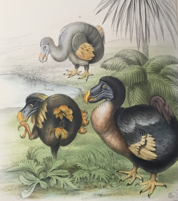
Broderip also makes mention of the Dodo remains held in Oxford and the remains of a leg that had been held by the British Museum.  Following Broderip’s death, Owen took up the narrative, describing other museum artefacts as well as art works featuring the Dodo.  All three Dodos depicted in this beautifully coloured plate (below), taken from the front of the book, are from paintings by Roelandt Savery, a Flemish-born Dutch Painter.  Owen combined the figures to create an ‘Ideal scene in the island of Mauritius before its discovery in 1598.’

Composite picture of Roelandt Savery's Dodos

Composite picture of Roelandt Savery’s Dodos

However, Owen’s belief that Savery’s paintings were drawn from a living bird, caused him to make a serious mistake in his reconstruction of the creature.  Owen recreated the bird’s image by fitting the skeleton into an outline traced around Savery’s Dodo image but, “this produced an unnatural, squat and overly obese Dodo,” (Hume, Cheke & McOran-Campbell, 2009).  While Owen rectified his error in a later publication, the original image stuck and remains a common misconception.


Outline of a Dodo skeleton using a tracing from Roelandt Savery's Dodo paintings

Outline of a Dodo skeleton using a tracing from Roelandt Savery’s Dodo paintings


Sources:

 Owen, R. (1866) Memoir of the Dodo. London: Taylor and Francis [COLE 196F/103 – available on request]

  • A scan of ‘Memoir of the Dodo’ is available here.
  • P. Hume, A.S. Cheke & A. McOran-Campbell (2009) How Owen ‘stole’ the Dodo: academic rivalry and disputed rights to a newly-discovered subfossil deposit in nineteenth century Mauritius, Historical Biology, 21:1-2, 33-49

College Song No. 1, “The Song of the Shield”

Written by Guy Baxter, Archivist

The Song of the Shield

The Song of the Shield

Since the University celebrated the 90th anniversary of the granting of its Royal Charter last Thursday, many people have been asking for the words of College Song No. 1, “The Song of the Shield”, which was performed with gusto by the University Chamber Choir that evening under the direction of Samuel Evans. It was discovered in the University Archive just a few months ago.

The music was written by J.C.B. Tirbutt (1857-1908), who lectured at Reading and who was the organist at All Saints church. The words are by the then

Sheet music for 'The Song of the Shield'

Sheet music for ‘The Song of the Shield’

Principal (and later Vice-Chancellor) W.M. Childs (1869-1939). More about the

inspiration for the song, the Coat of Arms, may be found here, and it is fitting that the original Grant of Arms from 1896 was on display last Thursday as well.  As for the style: well, it’s unlikely to be covered by will.i.am any time soon, but it’s very jolly and evokes a strong sense of the College in its early days when everyone would have known each other. Rumours of compulsory singing of the song before every lecture next term are thought to be unfounded.

Lyrics for 'The Song of the Shield'

Lyrics for ‘The Song of the Shield’

Congratulations to all involved in bringing this hidden piece of our past to light. The other music performed at the meeting of the University Court on 17 March included Prelude and fugue in C minor BWV 549 by J.S. Bach, which was also performed at the inaugural organ recital in the Great hall in 1911; I Vow to Thee, My Country by Gustav Holst (words by Cecil Spring-Rice) – Holst taught at the College from 1920-1923; and My Spirit Sang All Day, No.3 from Seven Part Songs op.17 by Gerald Finzi, whose literary collection is held here

Special Collections will continue to support the 90th Anniversary events with a series of displays during the Summer and Autumn.

A relic of an 18th century poet to mark World Poetry Day

Written by Fiona Melhuish, UMASCS Librarian

Tucked away in one of our archive boxes is an envelope which contains a small, folded piece of paper which, when opened carefully, reveals a tiny fragment of netting, woven from fine string (University of Reading Special Collections MS 12) [see image below]. It is attached to the paper by four pieces of red sealing wax. The paper has been folded and addressed To Mrs Jenning(?) With most affectionate and grateful regard.

Cowper netting1


Beneath the netting, a slip of paper has been attached upon which is written the line  – ‘Thus, all their plan adjusted, diff’rent ways/They took,’. Beneath this, in another, perhaps later, maybe nineteenth-century, hand, is written the following:

This netting was made by the Poet Cowper, his ‘The Task’ – “Weaving nets for bird-alluring fruit &” – The hand writing is also The Poet’s, being a part of his Homer.

Attested by Maria D. Johnson – widow of The Poet’s beloved kinsman – Dr Johnson. The seal, of which these hares are the impression, was the gift of the Princess Elizabeth to the late Lady Hesketh, and bequeathed by her in her will to the late Dr Johnson’.

Cowper netting2


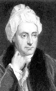
William Cowper (pronounced “Cooper”) (1731–1800) [see portrait below]  was one of the most popular poets of his time. He was influential in the development of eighteenth-century nature poetry, drawing on scenes from everyday life and the English countryside, and was admired by other poets including Coleridge, Wordsworth and Blake.

Cowper portrait


His most substantial poetic work was The Task, a poem in blank verse which begins by focusing on the origins of the sofa, but develops into a meditation on a wide variety of subjects, including nature, the retired life and religious faith, and includes attacks on slavery, the clergy and blood sports. However, he regarded his translations of Homer’s Iliad and Odyssey into blank verse as his greatest achievement. The handwritten line on the slip of paper beneath the netting is from Cowper’s translation of Homer’s Odyssey, and, according to the inscription, was written in Cowper’s hand. I have not yet investigated what link the line from Homer might have with the piece of netting.

Cowper suffered from bouts of severe depression throughout his life, and was institutionalised for insanity in the period 1763–65. However, he had close friendships with his cousins, the writer John Johnson and Lady Harriett Hesketh (both mentioned in the inscription). According to Thomas Wright, one of Cowper’s biographers, Lady Hesketh stayed with the poet during one of his periods of mental illness in 1794/95. During this time she wrote in a letter that during the winter of 1794/95 he seemed to improve, and that she was “able to get him to employ himself with “little avocations, such as netting, putting maps together, playing with the solitary board, &c.” Perhaps this little piece of netting was produced by Cowper as a therapeutic pastime to distract him during this period? As an appendix to his biography of Cowper, Wright includes a list of ‘Some relics of Cowper and their present owners (1892)’ which includes some ‘netting done by Cowper’, owned by the Rev. W. Cowper Johnson, junior, which, along with other relics of Cowper including his cap (worn by the poet when writing), was ‘exhibited in the Guelph Exhibition, 1891.’ It is not known if this piece of netting is the same as ours.

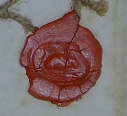
On closer examination, three of the four seals appear to feature a tiny image of a hare as mentioned in the inscription. The seal fob which is likely to have made these seal impressions is held by the Cowper and Newton Museum in Olney in Buckinghamshire. As Nicola Durbridge notes in an article about the seal fob on the Museum’s website, “the seals are carved with representations of Cowper’s three tame hares. Cowper nurtured these hares whilst he lived at Orchard Side, Olney and they were a great source of entertainment and companionship. Their names are incised on the seals: Puss, Bess and Tiney. Cowper published a long letter about his hare-keeping which gives us such a vivid picture of their characters and habits …”.


Cowper seal hare

One of the seals featuring an image of a hare


Durbridge also mentions that the seal fob “originally belonged to Lady Hesketh who had been given it by Princess Elizabeth, the daughter of George III and Queen Charlotte. Harriot moved in courtly circles and apparently met Princess Elizabeth whilst at Weymouth. For such a gift to have been made, Harriot must have become quite well acquainted with the Princess and regaled her at some point with stories of Cowper’s domesticated hares”. This confirms the information given in the inscription under the piece of netting. I cannot see any names above the images of the hares, but the creatures themselves can quite clearly be seen in three of the examples.

This piece of netting was one of our earliest archive acquisitions, but its provenance is unknown. I will be contacting the Cowper and Newton Museum to let them know about our curious little piece of Cowper memorabilia, and also to see if they can shed any light on the identity of the writer of the explanatory inscription, who Mrs Jenning(?) was and what link, if any, they had with William Cowper …

With thanks to Verity Andrews and Nancy Fulford, former members of the Special Collections archives team, for making this ‘discovery’ in the archive collections!

References 

Durbridge, Nicola. Lady Hesketh’s seal fob : a material world. (Olney : The Cowper and Newton Museum, 2012. (Accessed 16.03.2016).

King, James. William Cowper : a biography. (Durham, N.C. : Duke University Press, 1986). University Library STACK–821.65-KIN

Wright, Thomas. The life of William Cowper. (London : T. Fisher Unwin, 1892). University Library STORE–57796