By Helen Dacre
Last Monday morning I got so wet on my cycle to work that I had to spend 10 minutes under the hand dryer in the toilets to stop myself looking like a drowned rat. Being the keen meteorologist that I am, however, my next steps took me to the coffee room to look at the synoptic charts to find out exactly why I’d got so wet. A fairly cursory glance at the chart for 00 UTC on Monday 20 June (Figure 1) showed me an occluding low-pressure system sitting to the north-west of the UK with a long trailing front extending over the entire length of the country (so I doubt I was the only person standing under the hand dryer that morning).

You don’t need to have studied meteorology to know that fronts mean clouds: and clouds, more often than not, mean rain – particularly those associated with an active low-pressure system like that passing through on Monday morning. For most of the morning we sat under low cloud in the warm sector (that’s the bit between the warm front and the cold front) and I was glad for once to be stuck at my desk with no need to trek through the wilderness to a meeting on the other side of campus.
Having experienced the passage of a low-pressure system over the UK many times over the last 30+ years (and taught Introduction to Weather Systems often enough), I knew things were about to change and sure enough around 12 o’clock the cloud began to lift, the rain stopped, the sunshine broke through and by the time I left work to cycle home (wearing my soggy shoes from the morning) there were glorious blue skies overhead with no trace of a cloud to be seen.
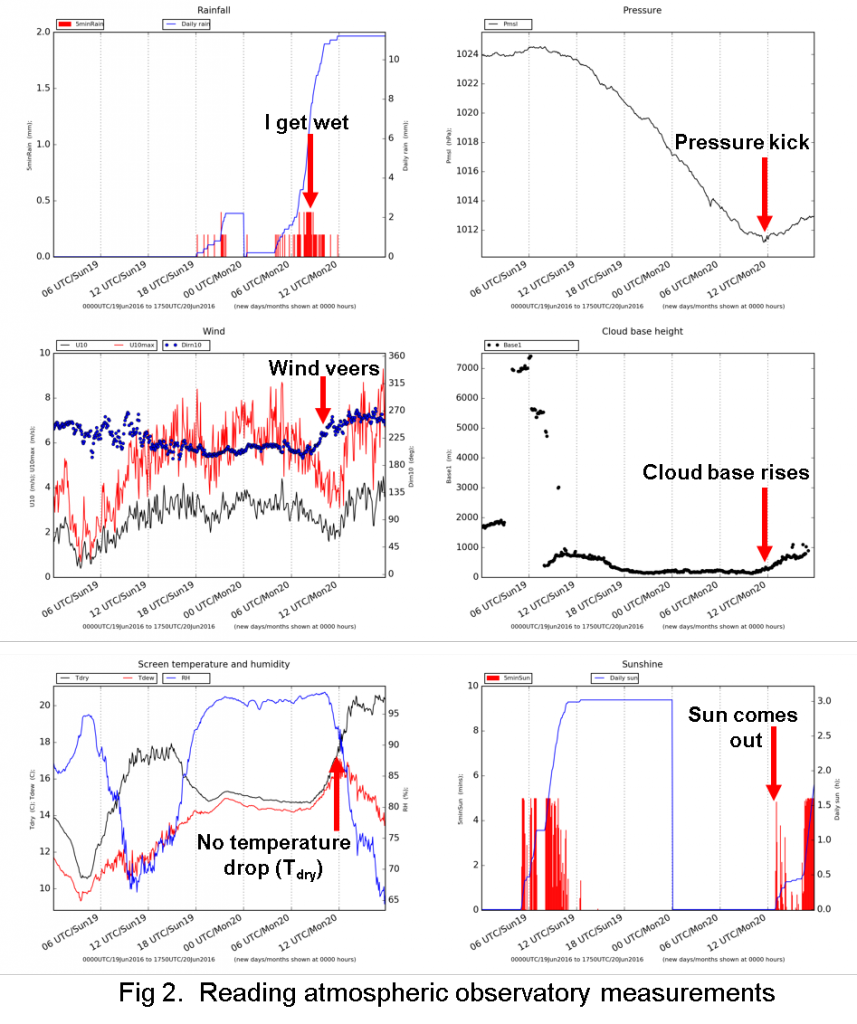
A quick look at the Reading atmospheric observatory measurements in the foyer as I left the Department confirmed the passage of the cold front at 12:00 (Figure 2), marked by an increase in pressure (known as a pressure kick), a wind shift from southerly to westerly (known as a wind veer), lifting of the cloud base (measured by our ground-based lidar) but no expected decrease in temperature. Why not? Probably due to the decrease in cloud cover allowing the solar radiation to reach the surface and warm the air above. Other than that, a pretty classic frontal passage.

This all got me thinking on my cycle home about the demise of the synoptic chart. In an age where text based postcode forecasts are growing in popularity, my phone can tell me, hour by hour, the chance of rain in my backyard. But it doesn’t tell me at a glance why it’s raining or why it’s going to stop, or if it’s raining in Reading is it also raining in Liverpool? It’s like the Indian proverb of trying to describe an elephant blindfold whilst only touching its leg, trunk or tail. It’s very difficult to explain the weather in my backyard without knowing what’s going on elsewhere.
So, whilst I continue to use my phone to find out whether to pack my waterproofs, please lets keep the tried and tested synoptic chart so we can understand at a glance why the weather is doing what it’s doing. Forget the cloud appreciation society (sorry Gavin Pretor-Pinney), how about a synoptic chart appreciation society – because a picture really does tell 1000 words (well 571 words according to my word count).
