Sunshine, cracks, fly-tipping, aphids: Phew, what a May!

By: Roger Brugge

Those spending more time in their gardens and in local parks and woods in and around Reading due to the current lockdown situation will have noticed how the ground surface had been resembling the look and feel of a badly-laid concrete patio – grey in colour, very hard, somewhat uneven and with some rather large cracks. It has very definitely dried out since I was sliding around in the mud in my local woods while walking my dogs this past winter.

Cracks in the ground in the Maidenhead Thicket woods.

Indeed, in my home location of Boyn Hill in west Maidenhead, May 2020 was the second driest May since before 1859.

Monthly rainfall totals during May for the Boyn Hill area of Maidenhead, 1859-2020.

Compared to an average May rainfall of 53 mm, just 2.7 mm fell this year on two days. In fact, the rainfall spells lasted barely 40 minutes in total. If we go back to 1990, we find our driest May when 2.1 mm fell – while in 1979 we had our wettest May with 126 mm of precipitation.

In Reading, May 2020 has been even drier, with just 1 mm of rainfall – the driest May in a record back to 1901, with other dry Mays having occurred in 1990 (3.1 mm), 1956 (5.1 mm) and 1919 (5.9 mm). However, go into Oxfordshire and the weather station at RAF Benson recorded just a ‘trace’ – i.e. no measurable rainfall – during May 2020. This lack of rain to wash away pests has led to an abundance of black fly on my broad beans and aphids in the garden!

Locals may remember how the River Pang (which flows through nearby Pangbourne) ran dry as the summer months of 1990 brought a summer heatwave. In Windsor, people were encouraged to share their bath water (after use) with trees in the Castle gardens. Hosepipe bans, tarmac turning to treacle and poisonous blue-green algae at Dinton Pastures Country Park were other features of the summer along with a maximum temperature of 35.5 °C on 3 August – still the fourth highest maximum temperature of all time in the Reading record. One wonders what lies ahead for this summer.

But, be warned. The summer of 1956, in contrast, was rather poor – in Reading only six days in July and one in September reached 25 °C. In 1919, 30 °C was reached on a total of three days at the University (but as late as August and on 11 September – one of the warmest September days in the Reading record). Looking back further, the very dry May of 1895 was followed by a wet second half to the year in Berkshire, with similar features to the rainfall distribution occurring in 1896 after another very dry May.

In Reading, one of the measurements made at 0900 UTC each day by our weather observers is that of the state of the ground, using the code shown in this table (assuming that there is no lying snow):Codes used to describe the state of ground (without lying snow) in the UK.

During late spring and summer in Reading the state of the ground at 0900 UTC is usually described as dry or moist; it might be wet following a heavy downpour within the previous 24 hours or be described as being ‘dry with cracks’ after a warm, sunny, dry spell lasting (say) 7-10 days.

May 2020 has seen our observers noting that the soil was moist (code 5/1, on the 1st due mainly to some rainfall at the end of April), dry (code 5/0, on the 2nd-4th) but extremely dry with cracks thereafter – so 27 days with cracked soil). A typical year has about 12 days when a code of 5/9 is recorded – and we had 25 such mornings in April 2020 also!

Following the wet spell from late September 2019 to early March 2020, such a ground state is quite surprising. But then spring 2020 has also been the sunniest on record in Reading (in a record back to 1956) and across the wider area of Central Southern and South-East England since before 1929:

Spring sunshine totals in Cent S and SE England (black, 1929-2019, data courtesy of the Met Office) and at the University of Reading (red, 1958-2020).

Monthly sunshine totals this spring (as measured by a Campbell-Stokes sunshine recorder) in Reading have been as follows:

  • March 2020 – 170.2 h (seventh sunniest March on record; the sunniest was 178.7 h in 2007)
  • April 2020 – 250.9 h (the sunniest April on record; previous record was 234.0 h in 1984)
  • May 2020 – 345.1 h (the sunniest month of any name on record; previous record 305.6 h in June 1975)

This makes a spring total of 766.5 hours – the sunniest spring on record at the University, while only three summers have been sunnier than spring 2020 in Reading.

The University’s Campbell-Stokes sunshine recorder. A glass sphere focuses the sun’s rays on to a graduated card and the length of the burn trace on the card corresponds to the duration of sunshine.

Daily mean sea level pressure at 0900 UTC during spring 2020 at the University of Reading.

These sunny conditions are not unrelated to the generally high pressure we have had for much of spring. At 0900 UTC the mean sea level pressure in Reading has often been in the range 1020-1040 hPa, except for two notable cyclonic spells in early March and at the end of April/beginning of May. Winds have also often been between the drier north-east and south-east, rather than the more usual south-westerly quadrant of the compass. High pressure, associated with generally descending air, often helps to reduce cloud cover in the spring/summer, leading to a reduction in precipitation and, hence, sunnier conditions.

Daily wind direction at 0900 UTC during spring 2020 at the University of Reading.

In May 2020, the average pressure at 0900 UTC was 1022.1 hPa – the third highest May value (after May 1991 and May 1944) in the Reading record since 1908.

Clear skies can sometimes lead to cool nights as well as warm days. In fact, during a cool northerly flow of air in mid-May the grass minimum temperature in Reading fell to -9.3 °C on the 15th, thereby doing severe damage to delicate crops such as potatoes. My potatoes suffered too – although meteorological foresight did allow me to carry out what looked like a bad case of fly-tipping on my allotments in a successful attempt to minimise the damage by covering most of the early crop:

Anti-frost measures on the author’s allotments in Maidenhead, mid-May 2020.

This spring in Reading the mean daily maximum temperature has been 2.5°C above average, while nights have been slightly cooler than normal overall, with the mean daily minimum temperature 0.2°C below average, with 50 ground frosts (compared to the 38 we would normally expect in spring). Overall, it was the warmest spring since 2017.

In summary, provided that we have been willing to water our gardens and allotments, the weather conditions have generally been quite conducive to enduring the prevailing lockdown conditions – indeed, my dogs have often picked up the whiff of evening barbeques!

Posted in Climate | Tagged , | Leave a comment

Predicting the impacts of tropical cyclones – when should we trust the forecasts, and when should we not?

By: Rebecca Emerton

Between September 2018 and May 2019, a record-breaking 15 tropical storms moved through the southern Indian Ocean. This marked the first season where two intense tropical cyclones, Idai and Kenneth*, made landfall in Mozambique, causing devastating flooding and affecting more than 3 million people, with over a thousand fatalities. As I write this, Cyclone Amphan, the strongest tropical cyclone on record in the Bay of Bengal, is heading towards the coast of India and Bangladesh, causing significant concerns due to extreme winds, rainfall and flooding from storm surge – all while also trying to prevent the spread of COVID-19. The anticipation and forecasting of natural hazards such as tropical cyclones and the flooding they cause, is crucial to preparing for their impacts. But it’s important to understand how well forecast models are able to predict these events, and the limitations of the forecasts – this information informs decision-making by national meteorological agencies, humanitarian organisations and the forecast-based financing community on how best to interpret forecasts of tropical cyclones. When should disaster management agencies trust a forecast for a landfalling tropical cyclone, and when should they not?

Satellite image of intense tropical cyclone Idai, 12th March 2019, overlaid with the ECMWF (European Weather Centre) forecasts of the tropical cyclone’s track towards central Mozambique.

I’m currently working on a research project called PICSEA** (Predicting the Impacts of Cyclones in South-East Africa), which aims to provide insight into how well different forecast models are able to predict tropical cyclones and their associated hazards in the south-west Indian Ocean. In this blog post, I’ll talk about our visits to the national meteorological services we’re working with in south-east Africa, and highlight some of our key results so far, for how well we’re able to predict tropical cyclones in the region.

Working with national meteorological services in south-east Africa

We’re working with the Mozambique, Madagascar and Seychelles national meteorological services and the Red Cross Climate Centre on research that we hope will be of use to forecasters faced with providing warnings for tropical cyclones, and humanitarian organisations tasked with taking early action ahead of and during these events. In 2019, we were able to visit all three meteorological services, to meet the forecasters and researchers, to learn about their methods and learn from their local knowledge and experience. We were also able to discuss our research plans to gain their perspective and ideas on what questions were most important to tackle, and how best to collaborate on answering those questions.

Left: visiting the Limpopo River in Mozambique, discussing flooding from cyclones and spotting wild crocodiles. Right: at a cyclone discussion meeting at the Technical University of Mozambique (UDM) in Maputo, organised by the Universities of Reading, Bristol and Oxford, in collaboration with the national and regional hydrological services, the national meteorological and disaster management agencies, the Red Cross (Cruz Vermelha Moçambique) and UDM.

I came away from these visits with a much better understanding of the procedures around forecasting tropical cyclones in each country and the challenges faced (ranging from which forecasts to trust, to communicating forecasts and warnings in areas where many different local languages are spoken), alongside some great ideas for our research – which models to focus on, which questions would be the most useful to answer (and which would be less useful!), and how best to communicate and visualise our results. A further trip to Mozambique also gave us the opportunity to meet with representatives from the national meteorological, hydrological and disaster management institutes, the Red Cross, and academics from the Technical University of Mozambique, to discuss experiences of forecasting and responding to Cyclones Idai and Kenneth, and furthering the collaborations between the various national and international organisations. I also took a little time off to explore a part of the world I’ve been wanting to visit for a very long time!

Taking some time off to go hiking in the Seychelles (top left) and explore Madagascar’s rainforests, mountains, deserts and beaches, spotting lemurs (top right & bottom left) and baobabs (bottom right).

What does the research show?

Our research has focussed on evaluating how well the UK Met Office and European Centre for Medium-Range Weather Forecasts (ECMWF) ensemble and high-resolution deterministic models are able to predict tropical cyclones in the south-west Indian Ocean. We’re looking into how closely the models are able to predict the path the tropical cyclones will take, the amount of rain they’ll produce, and whether the models correctly capture the strength of the tropical cyclones. In the next couple of paragraphs, I’ll briefly discuss some highlights from our results for the UK Met Office forecasts (while we continue to process data for ECMWF!).

We’ve been looking at forecasts of tropical cyclones over the past 10 years, and we’ve seen significant improvements in the accuracy of the forecasts over that time, for both the path/track of the storms, and also the intensity/strength. We know that forecast models in general can often struggle to predict the intensity of tropical cyclones, typically under-estimating their strength, but it’s encouraging to see significant improvements in the forecasts of pressure and wind speed as the models are upgraded.

Change in track error over the past 10 years, for an example predicted storm. If, 3 days in advance, you were to predict a tropical cyclone to be in the centre of the circle, then based on the typical errors across many forecasts, the actual position of the storm in 3 days’ time could end up being anywhere within the blue circles. The left map shows the UK Met Office deterministic forecast model from 10+ years ago (July 2006 – March 2010), the right map shows the current version of the model (running since July 2017). The dark shaded circle indicates the average track error, and the lighter circle indicates the error for the worst forecast of any storm using that model.

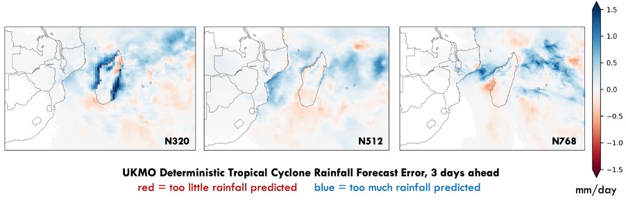
Errors in UK Met Office deterministic forecasts of tropical cyclone rainfall, in three different versions of the model from N320 (July 2006 – March 2010), N512 (March 2010 – July 2014) and N768 (July 2014 – July 2017). Significant over-estimations of the rainfall around Madagascar in the N320 version of the model are improved in later versions of the model, but results vary by region, with the forecasts predicting too much rainfall in some areas, too little in other areas.

We’ve also been looking into whether certain background tropical conditions impact the accuracy of tropical cyclone forecasts. We’ve found that there are certain phases of the Madden-Julian Oscillation (which is the eastward movement of a large region of enhanced and suppressed tropical convection, and the different phases describe the location) during which forecasts of tropical cyclone intensity are improved (phases 1 and 2  for forecasts up to 4 days ahead) compared to other phases. With further research, we hope to identify other such potential ‘windows of opportunity’ for more accurate forecasts, and also highlight times when forecasts may be less accurate than usual – information that is also key for forecasters and decision-makers.

What’s next?

While there’s always plenty more research to be done, we also plan to work with the Red Cross Climate Centre and our project partners in Mozambique, Madagascar and the Seychelles, to produce forecast guidance documents and infographics. These could be used to communicate the outcomes of the research alongside other key information, in a way that can be used by the forecasters who are monitoring, predicting and providing warnings for tropical cyclones in the region. As well as looking at forecast models, national meteorological services also receive regional forecasts and warning bulletins for tropical cyclones from the Regional Specialised Meteorological Centre, which for the south-west Indian Ocean is Météo-France in La Réunion.

While the current pandemic situation may have sadly changed our plans to host visiting scientists here at the University of Reading for two months to work together on this (we had the pleasure of working with Hezron Andang’o and Lelo Tayob from the Seychelles and Mozambique meteorological services before their time in Reading was cut short back in March), I look forward to continuing our work remotely with all of our partners for now, and hopefully to visiting each weather service again in the future!

* Read more about the forecasts and response to Cyclones Idai and Kenneth in this presentation and keep an eye out for our upcoming paper:

Emerton, R., Cloke, H., Ficchi, A., Hawker, L., de Wit, S., Speight, L., Prudhomme, C., Rundell, P., West, R., Neal, J., Cuna, J., Harrigan, S., Titley, H., Magnusson, L., Pappenberger, F., Klingaman, N. and Stephens, E., 2020: Emergency flood bulletins for Cyclones Idai and Kenneth: the use of global flood forecasts for international humanitarian preparedness and response, under review

**PICSEA is a SHEAR Catalyst project funded by NERC and DFID, led by Nick Klingaman with Kevin Hodges, Pier Luigi Vidale and Liz Stephens, and international project partners Mussa Mustafa (INAM, Mozambique), Zo Rakotamavo (Météo Madagascar), Vincent Amelie (SMA, Seychelles) and Erin Coughlan de Perez (Red Cross Climate Centre). Oh, and I do the data analysis!

Posted in Tropical cyclones, Weather forecasting | Tagged | Leave a comment

Sea Surface Temperature Climate Data Record

By: Owen Embury

Oceans cover over 70% of the Earth’s surface and knowing its temperature is crucial for understanding both weather and climate. Historically, sea surface temperatures (SSTs) have been measured in situ – from ships and automated buoys – however, in recent decades we have also been able to use satellites to make observations of the Earth system. While satellites make indirect observations of the SST by measuring the thermal radiation emitted by the sea, they can provide significantly more coverage than in situ observations as a single satellite can see the whole Earth over a day or so. We now have a global, gap-free, 38-year time-series of SST generated as part of the European Space Agency (ESA) Climate Change Initiative (CCI) for SST and continued under the Copernicus Climate Change Service (C3S).

Our SST data are generated from infra-red sensors flown on-board polar orbiting satellites. These satellites circle the Earth in a low orbit (around 800 km) travelling in a north/south direction passing over each pole and taking about 100 minutes for each orbit. Each satellite will be able to see the whole of the Earth’s surface over a day or so as the Earth rotates. We use two main types of infra-red sensors to measure the SST. The first are the Advanced Very High Resolution Radiometers (AVHRRs) – a series of meteorological instruments which have been in use since the late 1970s. By modern standards, these instruments are no longer advanced or high resolution! The second set of instruments are the Along Track Scanning Radiometers (ATSRs) and Sea and Land Surface Temperature Radiometers (SLSTRs). The instruments were specifically designed to make high accuracy climate observations of the surface temperature and can be used to improve the accuracy of the AVHRR observations.

Figure 1: Global mean diurnal cycle of daily SST anomalies from drifting buoys for different wind speeds. The annual mean diurnal cycle is displayed in black, Northern Hemisphere winter (DJF) in blue, spring (MAM) in green, summer (JJA) in red and autumn (SON) in orange. The bars in the top left corner show the associated uncertainties. Reproduced from Morak-Bozzo et al. 2016.

When generating a climate data record, we are interested in how the SST changes over long time periods (years and decades); however, the SST changes throughout the day as the ocean warms during the day and then cools again overnight (the diurnal cycle). In order to separate these two effects, we provide the satellite-based temperature at a standardised time of day of 10:30 am or 10:30 pm local time (which is a good estimate of the daily average temperature). Figure 1 shows how the SST changes through the day at different wind speeds. The cycle is largest at low wind speeds where the surface warms rapidly from dawn to mid-afternoon. The cycle becomes smaller as the wind speed increases, because the wind causes the surface water to mix with lower water resulting in a more constant temperature.

Figure 2: – SST product levels. L2P data are the original satellite viewing geometry with gaps due to cloud cover and land. These are gridded to L3U, and then combined to produce daily L3C. Data from multiple sensors are combined and interpolated to produce a gap-free L4 SST.

SST data are provided on multiple “levels”, each adding a bit more processing to make the data more convenient for users. The lowest level data containing SST is known as L2P which contains the full resolution imagery as observed by the satellite. When displayed as an image, it forms a long rectangle along the satellite’s direction of travel. To make the data easier for users, we first grid it onto a global 0.05° latitude-longitude grid (L3U), where we can see the satellites orbit around the Earth. Next, all the data from one day is collated to produce L3C at which point we have near-global coverage apart from gaps due to clouds. Finally, we produce a gap-filled estimate of the daily-mean SST which combines data from multiple satellites and interpolates into the gaps to give a Level 4 analysis product. These SST product levels are shown in Figure 2.

Data and References:

Our SST data are available from the ESA Open Data Portal and Copernicus Climate Change Service

Merchant, C. J., and Coauthors, 2019: Satellite-based time-series of sea-surface temperature since 1981 for climate applications. Sci. Data, 6. 223. ISSN 2052-4463 doi: https://doi.org/10.1038/s41597-019-0236-x

Morak-Bozzo, S., C. J. Merchant, E. C. Kent, D. I. Berry, and G. Carella, 2016: Climatological diurnal variability in sea surface temperature characterized from drifting buoy data. Geosci. Data J., 3 (1). pp. 20-28. ISSN 2049-6060 doi: https://doi.org/10.1002/gdj3.35

Posted in Climate, Oceans, Remote sensing | Leave a comment

Measuring Lake Water Temperature From Space

by: Laura Carrea

‘Climate change’, and ‘global warming’: these have been two of the most referenced terms in the media in the past few years.  These words sometimes generate controversy and discussion not only on social media or between friends, but also among politicians. Those that do not support climate change measures often state that they “do not believe in it”.

In order to form an opinion on what to ‘believe’ it is crucial to refer to factual evidence from the natural world. Measurements are a clear and objective reflection of what happens in nature and, by definition, they should not create debates. You would be unlikely to hear discussions on whether the temperature this morning was 15°C if it was measured with a reliable thermometer.

My work is on measuring temperatures of inland water, which means lakes, reservoirs, lagoons and rivers, and I try my best to cover lakes all around the world in the most diverse environments. Currently, I am monitoring more than 1,000 lakes throughout the world.

How do I measure temperatures for such a wide range of lakes?

I mainly use satellites, but also the kindness of many people and institutions around the world who measure the temperature of the water directly on the lake.

Satellites are a “modern” way to record temperatures of the whole globe over a day or so.  However, they cannot ‘see’ through clouds, leaving some very cloudy areas unrecorded. The satellites I am using have been designed and launched by the European Space Agency (ESA) and by the National Oceanic and Atmospheric Administration (NOAA) with the purpose of monitoring the temperature of the sea and, in general, the surface of our planet.

Given the measurements, my question is: ‘Is the temperature of the water in lakes, reservoirs, lagoons and rivers increasing or decreasing?’

First, I calculated what is called a climatology – a 20-year average of the data (in this case, for 1996 to 2015) of the temperatures for each lake I have investigated. This average value constitutes what it is called ‘the reference’ or ‘baseline’.

I have then collated temperature measurements from 1995 until 2019 and calculated the difference between the temperature of the lake and the climatology during the hottest months. In this way, I have a precise idea whether for example in 2016 a particular lake was warmer or cooler than the 20-year average. This difference is called an anomaly.

I have studied more than 900 lakes across the globe, of which 127 were in Europe. I report here some of my findings for the year 2018 (Carrea L. et al., 2019), but I contribute every year to reports on the state of the climate.

I have looked at the 2018 anomalies for all the lakes I have studied and for the European lakes only. Figure 1 below shows coloured circles in locations that are approximately the position of the lakes I have investigated on the globe. For some areas, like North America and Tibet, the dots in the figure are aligned rather than overlapped. This is a way to display all the lakes in areas where the density of the lakes is very high.  A blue dot indicates a negative anomaly, which means that the lake was cooler than the 20-year average while a red dot indicates a positive anomaly which means that the lake was warmer.

This is what I have found:

  • In 2018, lakes in Europe, Tibet, New Zealand and mainly the east of the United States were warmer than the 20-year average while the rest of the lakes were cooler or had similar temperature to the 20-year average.
  • In 2018 in Europe, the vast majority of lakes were warmer than the 20-year average where the warmest lake was in Germany (lake Constance being 1.68°C warmer than average) and the least warm lake was in Iceland (0.66°C cooler than average).

Figure 1: 2018 lake average temperature anomalies in the warm season. Source:  Carrea et al. (2019)

To understand the thermal behaviour of the lakes through the years, I have plotted for each year the value of the anomaly for the European lakes only, and for all the lakes together. The plot can be seen in Figure 2 and from it we can deduce the following:

  • In 2018 the European lakes were overall 0.83°C above the 20-year average. This is the highest value since 1995 at least.
  • Putting together all the lakes I have investigated (European and non-European), overall in 2018 they were 0.17°C above the 20-year average.
  • Excluding the European lakes, I found that the rest (800 lakes) were only 0.06°C above the 20-year average, which is much less than the anomaly for European lakes.
  • Since 1995 the overall temperature of the lakes is increasing, and I have found that the European lakes are warming faster than all lakes globally.

Figure 2: Average lake surface water temperature anomalies per year for 923 lakes worldwide and or 127 European lakes. Source: European State of the Climate in 2018.

For Europe, 2018 was a very hot year, which was also confirmed by other sources of data (Toreti et al. 2019), but clearly, lakes are warming and some of them at a very worrying pace.

What is the problem with warming lakes? The temperature of the water has a strong impact on the lake ecosystem and can, among other things, lead to an increase in the development of toxic cyanobacteria blooms. The resulting poor water quality endangers the ecosystem and therefore the life that it supports, including human life.

Data and References:

 The data used here are from the GloboLakes (Carrea L. et al. (2019)) and Copernicus Climate Change Service projects. The findings reported here are part of the State of the Climate Report for the Bulletin of the Meteorological American Society (Carrea et al. 2019) and for the European State of the Climate of the Copernicus programme (https://climate.copernicus.eu/european-state-of-the-climate.)

Carrea, L.; Merchant, C.J. (2019): GloboLakes: Lake Surface Water Temperature (LSWT) v4.0 (1995-2016). Centre for Environmental Data Analysis, 29 March 2019. https://doi.org/10.5285/76a29c5b55204b66a40308fc2ba9cdb3.

Carrea, L.; Embury, O.; Merchant, C.J. (2015): GloboLakes: high-resolution global limnology dataset v1. Centre for Environmental Data Analysis, 21 July 2015. https://doi.org/10.5285/6be871bc-9572-4345-bb9a-2c42d9d85ceb.

Carrea, L., Woolway, R. I., Merchant, C., Dokulil, M. T., de Eyto, E., DeGasperi, C. L., Korhonen, J., Marszelewski, W., May, L., Paterson, A. M., Rusak, J. A., Schladow, S. G., Schmid, M., Verburg, P., Watanabe, S. and Weyhenmeye, G. A. (2019) Lake surface temperature [in “State of the Climate in 2018”]. Bulletin of the American Meteorological Society, 100 (9). pp. 13-14. ISSN 1520-0477 doi: https://doi.org/10.1175/2019BAMSStateoftheClimate.1.

Toreti A., Belward A., Perez-Dominguez I., Naumann G., Luterbacher J., Cronie O., Seguini L., Manfron G., Lopez-Lozano R., Baruth B. et al. 2019. The exceptional 2018 European water seesaw calls for action on adaptation. Earth’s Future. 7(6):652–663. https://doi.org/10.1029/2019EF001170.

Posted in Climate, Climate change, earth observation, Remote sensing | Leave a comment

Do cuts in particle pollution accelerate climate change?

By: Richard Allan 

Glorious weather over much of the UK in April 2020 replaced the seemingly relentless winter rain, sodden ground and flooding, making the lockdown bearable for those lucky enough to be able to enjoy time outside. I was struck by the vivid, brilliance of the blue skies and the uncharacteristically pristine air (at least before I was engulfed by smoke wafting up from my neighbour’s barbeque).  Improvements in air quality globally (also seen locally in Reading) resulting from the temporary suppression of economic activity from COVID-19 lockdowns (Figure 1) offer a tantalising glimpse of a cleaner, healthier world possible in a low-carbon future. While human-caused CO2 emissions will temporarily be suppressed there will be no respite from warming of climate – and less particle pollution haze can in fact increase warming as more sunlight reaches the surface.

Figure 1: Reduced column amount of NO2 air pollution over Europe in March/April 2020 compared with 2019 is also a good indicator of changes in harmful particle pollution or aerosols which shade the surface from the sun (Image: © European Space Agency/Copernicus Sentinel-5P satellite data processed by KNMI/ESA)

The effect of longer-term changes in particulate matter (or aerosols) on the atmosphere can already be detected in observations over Europe and China (Figure 2). Measurements show decreasing sunlight reaching the surface (a “dimming”) up to the 1980s as increased particle pollution blocked out the sun. However, cuts in pollution, first in Europe and later in China, can explain a reversal of this trend (a “brightening” at the surface). Aerosols particles act as mirrors by reflecting sunlight back to space but this research also finds changes are linked with how much sunlight is captured (absorbed) by aerosol in the air aloft. These altered heating patterns through the atmosphere and from region to region can further influence rainfall patterns as well as surface temperature.

Figure 2: A schematic depicting measurements of sunlight reaching the surface and intercepted by the atmosphere (compared with 2000-2015 averages shown as horizontal lines) over Europe and China (based on Schwarz et al. 2020 Nature Geosci. Fig. 2).

The extent of regional changes in particle pollution are also evident from satellite imagery since 2010 showing declining pollution in parts of China yet increases across India (Figure 3). And continued rapid cuts to air pollution in Europe and Asia can potentially lead to a short-term acceleration in climate change. Computer simulations show a more rapid increase in European and Asian heatwaves by 2050 associated with sharp cuts in air pollution across parts of Asia. The worst-case-scenario indicates that the hottest day of the year may be up to 4°C hotter by 2050, compared to the present day, with 30-40% of this increase due to air pollution cuts. Research under review also predicts more rapid increases in rainfall during the tropical monsoon seasons in response to dramatic cuts in Asian air pollution. However, it confirms that acceleration of climate change is limited to the next few decades, after which the effect is swamped by the dominant response to greenhouse gas increases. Continuing to emit greenhouse gases into the atmosphere at the current rate will drive far larger and more sustained temperature rises that along with changes in the global water cycle will cause serious impacts for our societies and the ecosystems upon which we depend. This underlines the importance of rapidly reducing greenhouse gas emissions and expanding upon the Paris Agreement targets in the postponed Glasgow COP26 meeting.

Figure 3: Satellite data suggests that aerosol pollution was already declining in China but increasing in India (from Samset et al. 2019 Nature Geosci. Fig. 1)

The recent improvements in air quality and temporary slowing of CO2 emissions resulting from the COVID-19 lockdowns is no silver lining to the awful damage from the pandemic on families and societies. Yet there is an opportunity to re-evaluate what is important for life and society, changing how we work and live to follow a less dangerous and healthier lower carbon path. It may even offer a unique natural laboratory to better understand how pollutant particles affect weather systems and climate. Although reducing particle pollution can temporarily accelerate climate change, moving rapidly to a cleaner, low carbon future by reducing greenhouse gas emissions and other air pollution is essential in avoiding dangerous climate change and improving quality of life. And how will populations cope when the next pandemic strikes if countries are crippled by the effects of climate change?

References

Allan RP, M Barlow, MP Byrne, A Cherchi, H Douville, HJ Fowler, TY Gan, AG Pendergrass, D Rosenfeld, ALS Swann, LJ Wilcox and O Zolina (2020) Advances in understanding large-scale responses of the water cycle to climate change, Annals of the New York Academy of Sciences, in press, doi: 10.1111/nyas.14337

Luo, F., Wilcox, L. J., Dong, B., Su, Q., Chen, W., Dunstone, N., Li, S. and Gao, Y. (2020) Projected near-term changes of temperature extremes in Europe and China under different aerosol emissions. Environmental Research Letters, 15 (3). 034013. doi: 10.1088/1748-9326/ab6b34

Samset, B. H., Lund, M. T., Bollasina, M. A., Myhre, G. and Wilcox, L. (2019) Emerging Asian aerosol patterns. Nature Geoscience, 12. pp. 582-584. doi: 10.1038/s41561-019-0424-5

Schwarz M, D Folini, S Yang, RP Allan, M Wild (2020) Changes in atmospheric shortwave absorption as important driver of dimming and brightening, Nature Geoscience, 13, 110-115, doi: 10.1038/s41561-019-0528-y

Wilcox, L. J., Liu, Z., Samset, B. H., Hawkins, E., Lund, M. T., Nordling, K., Undorf, S., Bollasina, M., Ekman, A. M. L., Krishnan, S., Merikanto, J. and Turner, A. G. (2020) Accelerated increases in global and Asian summer monsoon precipitation from future aerosol reductions. Atmospheric Chemistry and Physics Discussions. ISSN 1680-7375 doi: 10.5194/acp-2019-1188

Posted in Aerosols, Air quality, Climate, Climate change | Leave a comment

Weather in Cameroon and Adaptation Plan for Climate Change

By: Chimene Daleu

The Republic of Cameroon is a country in central Africa. The country extends from the coast of the Gulf of Guinea and the Atlantic Ocean through west-central Africa to Lake Chad. The majority of Cameroon has a tropical climate with two seasons: the rainy and dry seasons.

Figure 1: Mean monthly precipitation across Cameroon (1961-2001). Plot taken from Ernest Molua, 2006

The geography of Cameroon is highly diverse. The country contains highlands in central and western regions, plains in the north, and tropical forests in the south and along the coast. Its topographic features superimpose climatic variations on this north‐south gradient. The low‐lying coastal plain rises rapidly to the inland regions of high plateaus and mountain ranges. The Cameroon mountain range stretches along the country’s northern border with Nigeria, with peaks in excess of 13,000 ft. This diversity in the geography of Cameroon causes its weather to vary markedly from one region to the other. Overall, the southern regions of Cameroon are generally humid and equatorial, while the climate becomes semi‐arid toward the northern regions. The rainy season is from May to November with most precipitation falling on coastal regions (e.g., Douala, see Figure 1). The wettest months – which should be avoided if you are not a fan of rain – are between July and October (see Figure 1). The climate is pleasant in the dry season between November and February; the “Harmattan”-season between December and February is characterized by the dry and dusty north-easterly trade wind, which blows from the Sahara Desert over West and Central Africa into the Gulf of Guinea.

Figure 2: Mean monthly temperature across Cameroon (1961-2001). Plot taken from Ernest Molua, 2006

The semi‐arid north of Cameroon (Maroua, see Figure 2) is the hottest and driest part of the country. That region experiences average temperatures between 22‐27°C in the cooler seasons (SON, DJF), and 26‐31°C in the warmer seasons (MAM, JJA). On the other hand, temperatures in the southern regions are largely dependent on altitude, ranging between 20-25°C, and varying little with season. Annual rainfall is highest in the coastal and mountainous regions of Cameroon (e.g., Douala; see Figure 1). The driest season is in December, January and February. The main wet season lasts between May and November for most of the country, when the West African Monsoon winds blow from the southwest, bringing moist air from the ocean. Rainfall can exceed  600 mm per month in the wettest regions (e.g., Douala and Kribi; see Figure 1), while in the semi‐arid northern regions of Cameroon the peak monthly rainfall does not exceed 400 mm (e.g., Maroua; see Figure 1). The southern plateau region has two shorter rainy seasons, occurring between May and June and between September and October (e.g., Yaounde).

When it comes to climate change impacts, Cameroon is particularly exposed because of its territories in the Sahelian zone, which are hit hard by desertification, and its territories in coastal areas that are threatened by rising sea levels. Due to the great geographic diversity in Cameroon, the nature of climate change and its impacts vary widely from one region to another. However, all agroecological zones will be affected in one way or another as well as all the sectors. The Cameroonian people must, therefore, face an important challenge, as their economic and social well-being are largely dependent on the viability of the main development sectors.

Cameroon is already facing consequences of climate change, including an abnormal recurrence of extreme weather phenomena such as high temperatures, violent winds, and heavy rainfall, which endanger communities’ ecosystems and the services they provide. The most recent extreme weather phenomena occurred over the first two weeks of October 2019, when heavy rains poured ceaselessly, destroying farms, crops and houses. This left 70,000 homeless in the northern part of Cameroon and 30,000 homeless across the border in Chad, where the Logone River broke its banks on October 1st. It was the worst flooding in northern Cameroon since 2012 when heavy rainfall persisted in the area for over a month and claimed 60 lives.

Photo by Raphael Mwadime

The economy of Cameroon depends strongly on agriculture. Therefore, the effects of global warming and climate change are likely to threaten both the welfare of the population and the economic development. For instance, the aforementioned heavy rainfall and flooding have undermined Cameroon’s efforts to reduce poverty and develop a strong, diversified, and competitive economy. Agricultural policy should, therefore, prepare for changing climate hazards. As a result, the National Adaptation Plan for Climate Change (NAPCC) was created to assist the Cameroonian people in facing such important challenges in accordance with the United Nations Framework Convention on Climate Change (UNFCCC). In 2016, within the framework of strengthening their partnership for effective fundraising for the NAPCC implementation, the Ministry of Environment, Nature Protection and Sustainable Development (MINEPDED) and Global Weather Partnership (GWP) Cameroon initiated the process of the development of a National Investment Plan for Adaptation on Climate Change (NIPACC).

The approach, taken for preparing the NAPCC, was participatory, multidisciplinary, and systematic. The NAPCC was built on 4 strategic axes:

  • improving knowledge on climate change
  • educating the population to climate change adaptation
  • reduce the country’s vulnerability to the impacts of climate change and strengthen its capacity for adaptation and resilience
  • facilitate the coherent integration of climate change adaptation in relevant policies and programs, especially in development planning processes and strategies

References

Some of this information was found in Wikipedia. Figures 1 and 2 were found in Molua, 2006, and Figure 3 was found online.

Ernest L. Molua (2006) Climatic trends in Cameroon: implications for agricultural management. Clim. Res., 30, 255-262. https://doi.org/10.3354/cr030255.

Banseka H. and L. C. T. Levesque (2018) Cameroon: Preparing the National Adaptation Plan for Climate Change (NAPCC) and its Investment Strategy. 

Posted in Climate, Climate change | Tagged | Leave a comment

Air Quality in Reading during COVID-19

By Helen Dacre

I’ve been working from home for exactly a month now and like everyone else have been adapting to a new routine.  This involves taking a daily shuffle around Caversham to get some exercise. There’s been a noticeable lack of traffic on the roads which makes my daily shuffle a lot more enjoyable.  This got me thinking about the effect of the current travel restrictions on air pollution. If there are fewer cars on the road emitting pollutants, then perhaps air quality may have changed?

Air pollution measurements are taken routinely at a network of over 100 monitoring sites across the UK. One of these sites is located in the centre of Reading at Cemetery Junction which sits between 2 busy roads, Wokingham Road and London Road.  It’s been taking measurements since 2003.  The data from this station (Reading New Town) is freely available from the Defra website.

Figure 1: Hourly measured Ozone concentrations at Reading New Town from 1 March 2020 to 15 April 2020.  Date of social distancing implementation on 16 March 2020 (magenta dashed) and non-essential travel restrictions on 23 March 2020 (black dashed). Data from www.uk-air.defra.gov.uk.

So, my first port of call was to take a look at the data from the Reading New Town monitoring station.  Figure 1 shows the hourly ozone measurements between 1 March and 15 April 2020.   The magenta dashed line shows the date on which social distancing was recommended (16 March) and the black dashed line shows the date on which non-essential travel restrictions were enforced, the so-called “lockdown” (23 March).  As you can see, there’s lots of variability in the data including a strong diurnal cycle.  There does appear to be an increase in ozone towards the end of the timeseries but it’s difficult to say whether this is due to changes in emissions of ozone precursors or due to changes in the meteorology.

The amount of ozone formed depends on the concentrations of other substances present in the air, such nitrogen oxides (NOx) and hydrocarbons. The concentration of these substances tends to be higher in polluted air, so we expect ozone concentrations to be lower when NOx is higher. However, NOx concentrations also tend to be higher when meteorological conditions are such that atmospheric dispersion is less efficient. These conditions are often associated with sunny high pressure, such as that we experienced last week. Therefore, meteorology plays a large role in determining the concentration of ozone, which is one of the research topics that I’m interested in.

So, if we want to find out what’s driving the increase in ozone, we need to work out how to remove the variations that are due to changes in the weather.  The best way to do this is to build a statistical model to predict the ozone concentrations using meteorological variables and other inputs. So that’s what I’ve done.  As inputs to my model, I used 12 years of data (2008-2020) including wind speed, wind direction, temperature, time of day, day of the week, Julian day and the date. My model predicts what we might expect ozone concentrations to be during the current meteorological conditions.

Figure 2: Hourly measured Ozone concentrations (grey), 24-hour moving averaged measured Ozone concentrations (blue) and predicted Ozone concentrations (red) at Reading New Town from 1 March 2020 to 15 April 2020.

Figure 2 shows the observations, with a 24-hour moving average applied (blue) and my model predictions for the same period (red).  Surprisingly, my simple model captures the ozone variability in the period prior to lockdown quite well. After lockdown it appears that the measured ozone is higher than my model predictions, possibly indicating the effect of reduced NOx emissions?

Figure 3: Accumulated difference between measured concentrations and predicted concentrations from 1 March 2020. Ozone (left) and NOx (right)

To emphasise the differences, I also plotted the accumulated difference between my model prediction and the observed ozone concentrations from the 1 March, shown in Figure 3 (left).  The accumulated difference is initially small since the over or underestimations predicted by my model (which is far from perfect) cancel each other out.  However, after lockdown there’s a steep increase in the difference indicating that ozone is above that expected, possibly due to a reduction in NOx.

To see if this increase in ozone is due to a reduction in NOx emissions, I also built a statistical model to predict NOx concentrations. My model for NOx isn’t quite as good as that for ozone because NOx has much larger extremes.  But the accumulated difference plot shown in Figure 3 (right), does show the opposite behaviour to that for ozone; i.e. that my model overpredicts the observed NOx after the 16 March 2020, when social distancing was introduced.

NOx contains NO2 which is bad for human health, particularly for those with asthma. It increases the likelihood of respiratory problems and can cause wheezing, coughing and bronchitis.  So, the evidence suggests that NOx emissions have been decreasing during the COVID-19 travel restriction period which is good news for my daily shuffle. There’s plenty of analysis still to be done to see if these results are robust across other sites in the UK, but for now enjoy the peace and quiet on the roads and stay safe and well.

Posted in Air quality, Boundary layer, Climate | Leave a comment

Understanding the role of climate change in the 2018 Kerala floods.

By: Kieran Hunt & Arathy Menon

These days, when a weather-related catastrophe occurs, one of the first questions raised in the aftermath is “did this happen because of climate change?”. Because of the stochastic and chaotic nature of weather, it is all but impossible to determine whether a single event was caused by climate change. There are, however, experiments that we can do to figure out whether climate change makes a certain type of event more likely, or for a given case, to what extent it has modified the impacts.

Our study explores the second of these options in the context of the devastating Kerala floods of 2018. During mid-August of that year, a monsoon depression passed unusually far south over the Indian subcontinent. This, in turn, excited the moist monsoonal westerlies, causing very heavy rainfall when they struck the mountain range that runs along the southwest Indian coast – the Western Ghats. The deluge fell mostly over Kerala, which had been saturated just several weeks earlier from rains associated with another low-pressure system. The reservoirs rapidly hit capacity, dams were opened state-wide, and the resulting flooding killed 483 people and displaced over a million more.

Figure 1: Average rainfall over 15-17 August 2018 (computed using data from NCMRWF). Also shown are the tracks of the precursor low-pressure system (6-9 August) and monsoon depression (13-17 August). The border of Kerala is shown in thick black.

Kerala lies mostly over the ecologically fragile Western Ghats and has a complex topography with the Arabian Sea to the west and mountains to the east. It also receives a large amount of rain with an average of about 300 cm during the monsoon season. About 50 major dams in Kerala provide water for agriculture and hydro-electric power generation. As a result of the torrential rains in August 2018, the authorities had to open the sluices of 35 of these major dams as they reached maximum capacity.

Figure 2: A photo showing the flooded Periyar river, submerging the surrounding areas during the August 2018 flood (Source: The Hindu).

So, how do we probe the role of climate change in all this? We set up three experiments, using a technique called “pseudo global warming”.The first, a control, is a simulation of the 2018 Kerala floods as they happened using a regional weather model (WRF, with coupled hydrology to allow river simulation) forced at the boundaries with ERA-Interim reanalysis data. We use the control experiment to verify the model is working correctly (for example, by checking the simulated rainfall looks close to observations) and as a benchmark against which we can judge our other two experiments. For the first of our two perturbation experiments, we “subtract” the effect of observed global warming by using output from the CMIP5 pre-industrial experiments to adjust our boundary conditions – in essence keeping the high-frequency information responsible for the floods and modulating the low-frequency information that describes the background climate (e.g. large-scale changes in temperature and humidity). The second perturbation experiment uses the same method to “add” projected global warming in 2100 from the CMIP5 RCP8.5 experiments. Thus, our three experiments describe how the floods would look like in the current climate (control), a climate where no human-induced global warming takes place (pre-industrial), and a climate where much more global warming takes place (RCP8.5).

Results show that the rainfall affecting Kerala during August 2018 would have been 18% greater had human-induced climate change never occurred; in contrast, it would be 36% higher in the 2100 future climate. The first result seems counterintuitive at first glance: the world has warmed considerably since the pre-industrial era, and that warming brings with it a lot of additional moisture, so we would naively expect more rainfall, not less. What’s going on? Well, another result of climate change (both observed and projected) is a weakening of monsoon depressions – and in this case, that weakening has a stronger effect on the rainfall than the increase in humidity. This tug-of-war changes hands, dramatically, in the future climate experiment as the moisture increase easily overwhelms the weakened dynamics, which you can see in Figure 3.

Figure 3. Relative contributions to changes in moisture flux from changes in moisture (left column) and winds (right column).

How would this change in rainfall have affected the reservoirs and rivers? To answer this, we need to use a hydrological model that takes information from our weather model (e.g. rainfall, winds, temperature) and computes the response of local rivers and groundwater. Perhaps unsurprisingly, changes in the average river discharge over Kerala are almost identical to the changes in precipitation. However, given the highly variable Keralan topography, local responses to the climate perturbations can vary significantly. It’s beyond the scope of a blog post to go through each reservoir individually, so let’s focus on the largest one: Idukki. Built from nearly 500,000 cubic metres of concrete, the Idukki reservoir is responsible for over a quarter of Kerala’s total freshwater capacity. Figure 4 shows the modelled inflow rate and storage for the three experiments, with observational data for comparison. The model performs well, with simulated storage closely matching observations (phew!), at least until authorities opened the floodgates in mid-August. The most interesting take-away, however, is the gap between the respective orange lines and the dashed grey line – this represents the additional capacity that the reservoir would’ve needed to prevent flooding, and the minimum amount of water that would end up inundating downstream parts of Kerala. In the control experiment, this excess amounts to 589 million cubic metres of water in the control experiment, but 852 million in the future climate experiment, an increase of 45%. Other major dams show broadly similar patterns, although the effect of the future climate worsens significantly towards the south of the state.

Figure 4: Modelled inflow (blue:control; grey:pre-industrial; red:future) and storage (orange solid:control; dashed:pre-industrial; dotted:future) for the Idukki reservoir system. For comparison, black crosses show the daily observations of storage, and the grey dashed line shows the stated maximum capacity of the reservoir.

Summarising, the 2018 Kerala floods were likely made less damaging by climate change, as global warming has weakened monsoon depressions. However, if they were to happen again in a future climate (RCP8.5) scenario at the end of this century, the effect of increased tropical humidity would far outweigh the weakened depressions, likely resulting in a significantly more catastrophic scenario.

References:

Dash, S. K., J. R. Kumar, & M. S. Shekhar, (2004). On the decreasing frequency of monsoon depressions over the Indian region. Curr. Sci., 86, 1404-1411, https://www.jstor.org/stable/24109213?seq=1

Dee, D. P., and Coauthors, (2011). The ERA‐Interim reanalysis: Configuration and performance of the data assimilation system. Quart. J. Roy. Meteor. Soc., 137(656), 553-597, https://rmets.onlinelibrary.wiley.com/doi/full/10.1002/qj.828

Gochis D. J., Yu W. & Yates D. N. (2014) The WRF-Hydro model technical description and user’s guide, version 2.0. Tech. rep., NCAR

Hunt, K. M. R., & A. Menon, A. (2020). The 2018 Kerala floods: a climate change perspective. Climate Dynamics, 54, 2433-2446, https://doi.org/10.1007/s00382-020-05123-7

Mitra, A. K., I. M. Momin, E. N. Rajagopal, S. Basu, M. N. Rajeevan, & T.N. Krishnamurti, (2013) Gridded daily Indian monsoon rainfall for 14 seasons: Merged TRMM and IMD gauge analyzed values. J. Earth Syst. Sci., 122(5), 1173-1182, https://www.ias.ac.in/describe/article/jess/122/05/1173-1182

Prein, A., R. M. Rasmussen, K. Ikeda, C. Liu, M. P. Clark & G. J. Holland, (2017) The future intensification of hourly precipitation extremes. Nat. Climate Change, 7, 48–52, https://doi.org/10.1038/nclimate3168

Sandeep, S., R. S. Ajayamohan, W. R. Boos, T. P. Sabin, & V. Praveen, (2018). Decline and poleward shift in Indian summer monsoon synoptic activity in a warming climate., Proc. Natl. Acad. Sci. U.S.A., 115(11), 2681-2686, https://doi.org/10.1073/pnas.1709031115


Posted in Climate, Flooding, Monsoons | Tagged | Leave a comment

An overview of a dataset digitized by citizen science volunteers – the 1900-1910 Daily Weather Reports

By: Philip Craig

Two years ago the citizen science project Weather Rescue was used to digitize hand-written weather observations from the Met Office’s Daily Weather Reports from the years 1900-1910 (Figure 1). These were, as the name suggests, daily documents that published weather observations from various locations around Great Britain and Ireland, plus some countries in western Europe (Figure 2). This was the second phase of Weather Rescue and was based on a very successful effort to digitize hourly observations at the Ben Nevis observatory and two stations in Fort William.

The Daily Weather Reports were digitized by 2148 volunteers between December 2017 and July 2018 with five volunteers asked to transcribe each observation of pressure, temperature and rainfall. If the volunteers entered the same value it would be stored in a spreadsheet for the appropriate day, but if enough volunteers disagreed on a value it would be flagged as an error in the spreadsheet and subjected to quality control.

Figure 1: the top half of page 1 of the Daily Weather Report from Wednesday 1st July 1903.

This is where I came in. For six months beginning in July 2018 I conducted the quality control on the entire dataset of observations recovered from the Daily Weather Reports. That was 4017 spreadsheets with a growing number of stations each year. To quality control the dataset, I compared every flagged error to the entry in the original documents (available online from the Met Office’s National Meteorological Library and Archive). Any values that were illegible I deleted from the spreadsheet, but I had confidence in some of the values so replaced the error in the spreadsheet with the value from the original document. Using multiple volunteers for each observation helped to avoid transcription errors such as confusing a 3 for an 8 or typing the wrong number, which are easy mistakes to make but this method removes the obvious errors by volunteers.

It’s fair to say that processing 4017 daily spreadsheets for six months was a pretty tedious task.  I mostly identified the errors by eye but also used a simple Python script to show any errors I had missed. Most spreadsheets only had a small number of errors, but some spreadsheets required substantially more work. For example, there were some spreadsheets with lots of errors that may have been caused by some misaligned images from the scanned documents. Although this was a tedious task it was generally very straightforward, and since I’d just spent months writing my PhD thesis it was a nice change! I also learned to understand the old Imperial units for pressure and temperature for the first time after having only ever used metric units!

The new data recovered from the Daily Weather Reports has filled some gaps and corrected errors in the existing observational records. For example, in the International Surface Pressure Databank version 4.7 (ISPDv4.7) there are no stations in England and Wales for 1900-1910, with four in Scotland, three in Ireland and one in the Channel Islands. Weather Rescue has provided new pressure observations from 28 stations in Great Britain, Ireland and the Channel Islands (Figure 2) – data from Stornoway, Aberdeen and Valentia are already in ISPDv4.7. The new pressure data will help to constrain the ensemble of the Twentieth Century Reanalysis (20CR). The lack of pressure observations means that there is often large uncertainty of the atmospheric circulation across the 80 realizations in 20CR version 3 (20CRv3), particularly for high impact weather events such as cyclones!

Figure 2: map of stations in the 1900-1910 Daily Weather Reports. The country boundaries are the modern day borders.

The full observations dataset is available from the Centre for Environmental Data Analysis. It contains 1,832,926 observations of pressure, temperature and rainfall from 72 stations in Great Britain, Ireland and Western Europe (Figure 2). The data are stored in daily spreadsheets and in the Station Exchange Format (SEF), which is to be the international standard for exchanging historical weather data. In the daily spreadsheets, the data are stored in their original Imperial units: pressure in inches of mercury (in Hg), temperature in degrees Fahrenheit (°F) and rainfall in inches (in). These were converted into SI units for the SEF files: pressure in hectopascals (hPa), temperature in degrees Celsius (°C) and rainfall in millimetres (mm).

Please also keep an eye out for my paper coming up in Geoscience Data Journal that describes the dataset and quality control process in more detail. I also compare the recovered observations to 20CRv3 and the Met Office’s gridded precipitation dataset.

References

Compo, G. P., and Coauthors, 2019: The International Surface Pressure Databank version 4. Research Data Archive at the National Center for Atmospheric Research, Computational and Information Systems Laboratory, accessed 30 March 2020, http://rda.ucar.edu/datasets/ds132.2/

Craig, P.M. and Hawkins, E. (2019) Met Office daily weather reports 1900-1910. Centre for Environmental Data Analysis, accessed 30 March 2020, https://catalogue.ceda.ac.uk/uuid/235ff4a040854dcd8dfb754bbb898479

Craig,P.M. and Hawkins, E., 2020; Digitising observations from the Met Office Daily Weather Reports for 1900-1910 using citizen scientist volunteers. submitted to Geoscience Data J.

Hawkins,E., S. Burt, P. Brohan, M. Lockwood, H. Richardson, M. Roy, and S. Thomas, 2019; Hourly weather observations from the Scottish Highlands (1883–1904) rescued by volunteer citizen scientists. Geosci Data J., 6, 160-173. https://doi.org/10.1002/gdj3.79  

Hollis, D., M. McCarthy, M. Kendon, T. Legg, and I. Simpson, 2019; HadUKGrid: A new UK dataset of gridded climate observations. Geosci. Data J., 6, 151-159. https://doi.org/10.1002/gdj3.78

Le Blancq, F., 2010; Rescuing old meteorological data. Weather., 65, 277-280. https://doi.org/10.1002/wea.510

Slivinski, L.C., and Coauthors, 2019; Towards a more reliable historical reanalysis: Improvements for version 3 of the Twentieth century Reanalysis system. Quart. J. Roy. Meteor. Soc., 145, 2876-2908. https://doi.org/10.1002/qj.3598

Posted in Climate, Data collection | Leave a comment

The Atmospheres of Two Exoplanets

By: Peter Cook

One of the big discoveries of recent decades has been the finding of thousands of exoplanets, and it now seems that most stars have planets.  Remarkably, detailed measurements have now been made of some of these despite the huge distances involved.  The first two exoplanets to have their atmospheres studied in detail, and their spectra directly observed, are HD209458b (also called Osiris) at a distance of 159 light years and HD189733b (having no other name at present) at a distance of 64.5 light years.  Both are large planets, similar in size to Jupiter and mostly composed of hydrogen and helium.  They orbit very close to their stars so are referred to as being “Hot Jupiters” (many of the exoplanets found so far are Hot Jupiters, though this is probably a selection effect as such planets are the easiest to find).

Osiris was first found using the motion of its star (as both go around a mutual centre of gravity) which revealed its mass, and then again when it transited its star (revealing its size).  Osiris is only 0.047 astronomical units (AU) from its star (one AU is the average distance between the Earth and Sun) and orbits in only 3.5 days.  While roughly similar in mass and radius to Jupiter it has a very low density (0.37 times that of water), and since its star is slightly more massive and brighter than the Sun Osiris has probably been inflated by violent heating of its outer atmosphere.  By studying changes in the total infrared emission from the planet and star, as Osiris hides part of the star during transit and is then eclipsed by the star, the temperature of the atmosphere was revealed to be around 1400 K by the Spitzer Space Telescope.  The spectra obtained seems to show a dry atmosphere containing sodium atoms and silicate particles, while high-precision observations by the European Southern Observatory’s (ESO) Very Large Telescope and the CRyogenic high-resolution InfraRed Echelle Spectrograph (CRIRES) measured gasses streaming from the day to night side at a speed of around 7000 km/hour (Osiris must be tidally locked and so keep the same side facing its star).  Further measurements imply that Osiris is very dark in colour, reflecting less than 10% of visible light, and has patchy high-altitude hot clouds composed of metal oxides.  Osiris is surrounded by an envelope of hydrogen, carbon and oxygen, more than twice the size of the planet, with a significant tail pointing away from the star.  This was discovered by the Hubble Space Telescope Imaging Spectrometer by measuring star light passing thorugh it and shows mass lost from the planet and blown away by its star.  Osiris has probably lost a few percent of its mass over its lifetime.

HD189733b was also found using both the transit and radial velocity methods, only 0.031 AU from its star and orbits in 2.2 days (though is not quite as hot as Osiris since its star is less massive and fainter than the Sun).  Observations by the Spitzer Space Telescope over 33 hours were used to create a temperature map (see figure).  These are in the range 973-1212 K with the peak offset 30 degrees east of the sub-stellar point (again the planet must be tidally locked) showing that absorbed energy is distributed fairly evenly through the atmosphere and hence wind speeds would be of order 8700 km/hour.  Again, the atmosphere seems to be fairly dry; sodium has been detected (3 times the concentration as at Osiris) and carbon dioxide.  Visible light polarimetry shows that HD189733b is blue in colour (unlike the very dark Osiris), probably due to Rayleigh scattering of blue light in the atmosphere and the absorption of red light by molecules.  An X-ray spectrum of the planet’s transit (H1 Lyman-Alpha) shows an extended exosphere of hydrogen and hence a slow evaporation.  Some further measurements indicated the presence of water vapour and methane in the atmosphere (though these should quickly react together in the high temperatures to form carbon monoxide), and silicate particles (in which case, HD189733b could have rain consisting of molten glass!).

This information is from Wikipedia, and the Spitzer Space Telescope map was also found online.

Posted in Climate, Space | Leave a comment