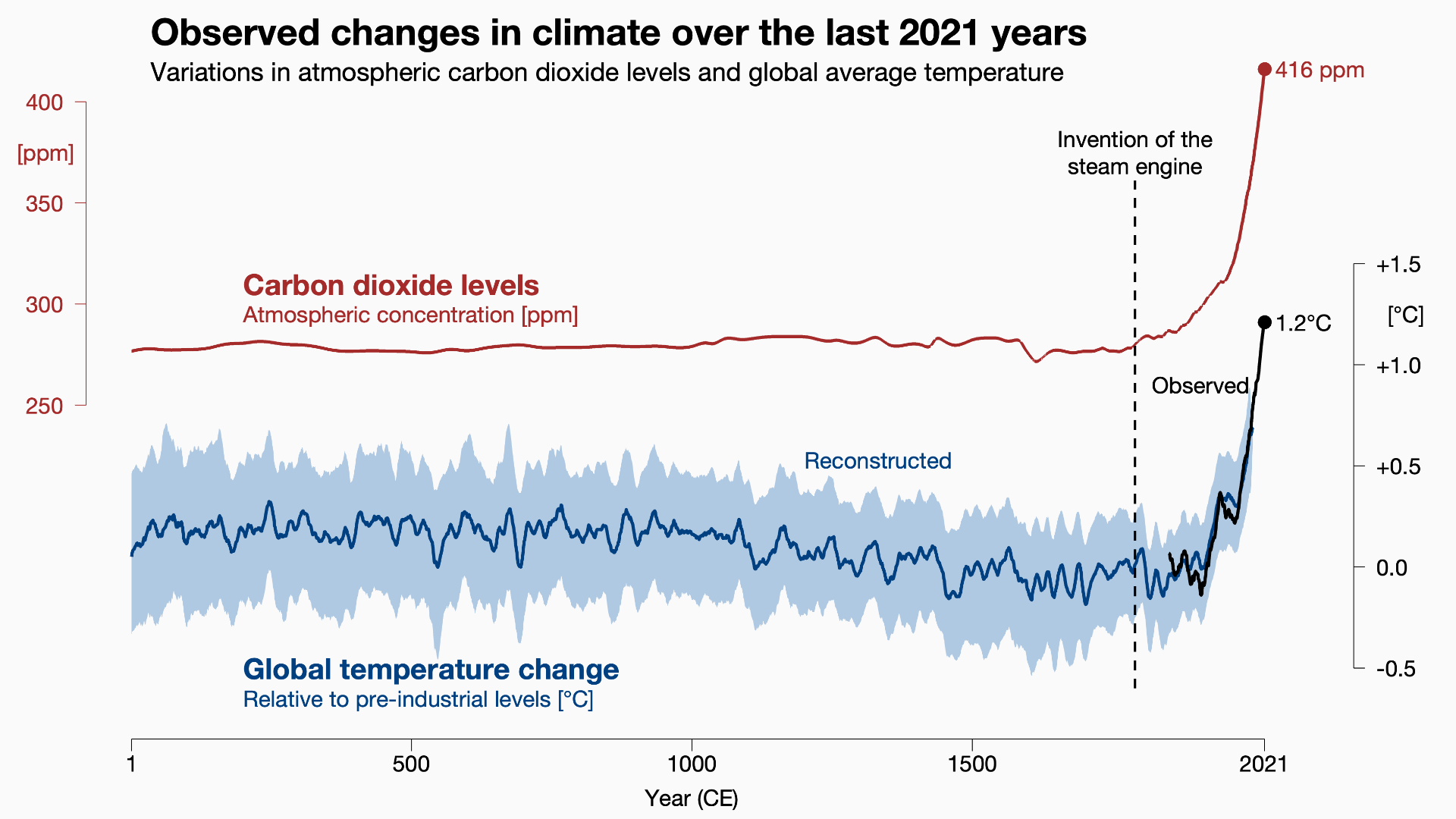
Climate Change 2021—The Physical Science Basis

By: Jonathan Gregory, Ed Hawkins, Matt Palmer

This document is a short summary of key points that are of current relevance to society from the physical science of climate change. It is based on the headline statements of the report published in 2021 by the Intergovernmental Panel on Climate Change (IPCC). The IPCC is a United Nations body responsible for providing impartial assessments of climate science. Its reports inform international negotiations on tackling climate change.

How and why has the climate changed?

Widespread and rapid changes have taken place in the atmosphere, in the ocean and on land. There is no doubt that the climate has warmed because human activities have increased the amounts of greenhouse gases in the atmosphere, especially CO2 (carbon dioxide) and CH4 (methane) (Fig. 1). Greenhouse gases warm the climate by making it harder for the atmosphere to radiate heat into the surrounding universe (space). They insulate the atmosphere against losing heat, rather like making it warmer inside a house by insulating the roof. The physics of this greenhouse effect has been understood for more than a century. The largest human-caused greenhouse effect on climate is due to the build-up of CO2, mostly from burning fossil fuels (coal, oil and gas).

Figure 1: Changes since the year 1 (of the Common Era, or AD) in the amount of CO2 in the atmosphere and in the global-average surface temperature. The industrial revolution and the burning of fossil fuels to produce energy began with the invention of the steam engine.

The warming causes changes in many other aspects of climate. The size and speed of recent changes in many aspects of the climate system exceed any seen for hundreds or thousands of years (Fig. 1). Many extreme events of weather and climate in every region across the globe have already become more severe or more frequent due to human-caused climate change (Fig. 2).

What climate change will happen in future?

Improved scientific knowledge has narrowed the range of warming expected as a result of increasing the amount of CO2 in the atmosphere.

Global-average surface temperature will continue to get warmer until at least the 2050s. Before 2100 it will be over 2°C warmer than it was before the industrial revolution, unless human-caused emissions of CO2 and other greenhouse gases into the atmosphere are greatly reduced in the coming decades.

Many aspects of climate change will grow larger as global-average temperature becomes warmer. Heatwaves, heavy rainfall and droughts will become more severe or more frequent (Fig. 2). Arctic sea ice, snow cover and permafrost will decrease.

Figure 2: This diagram depicts how much more often extremely high temperatures occur as the climate gets warmer. As an example, it considers the temperature which was reached only once in 50 years on average at any given place in the climate before the industrial revolution. This extreme happens more frequently in today’s climate, and will become still more common in warmer climates.

Rainfall over land will become more variable as global-average surface temperature becomes warmer. Wet and dry episodes will both become more severe. Rainfall will increase on average in monsoons and at high latitudes, but decrease in some regions at low latitudes.

If CO2 emissions increase, a larger proportion of the extra CO2 will remain in the atmosphere. This is because the proportion absorbed by the ocean, plants and soil will decline.

It would take hundreds to thousands of years to reverse many of the changes due to past and future greenhouse gas emissions. This especially applies to changes in the ocean, sea level and the ice sheets of Greenland and Antarctica. For some changes, there could be “no going back” in practice, because they would take far longer to reverse than the timescales relevant to society.

Information relevant to assessing the risks from climate change and adapting to its effects

Normal variations in climate between years and decades will continue on top of human-caused climate change. These variations are important to consider in planning for the full range of possible changes, especially on regional scales in the near future. However, they have little effect on long-term trends.

Every region will experience impactful changes in climate and weather as global-average surface temperature gets warmer, such as more frequent or severe extreme events. These effects will be worse because impactful events of more than one type will occur together increasingly often. The greater the warming, the greater and more widespread the changes.

In assessing the risks of climate change, it is important to consider some even larger changes which we cannot rule out. These include collapse of ice sheets, abrupt changes in ocean currents, combinations of extreme events, and very large increases in global-average surface temperature.

Information relevant to limiting future climate change

To limit human-caused global warming, net CO2 emissions must be reduced to zero or below. Large reductions in emissions of other greenhouse gases are required as well. “Net zero emissions” of CO2 over a given period means that the amount of CO2 removed from the atmosphere during the period is equal to the amount added to the atmosphere during the period. Net negative emissions means that more is removed than added, so the amount in the atmosphere goes down.

Air pollution would reduce and air quality would improve within a few years after large reductions in emissions of greenhouse gases. We would see differences in trends of global-average surface warming after about 20 years. It would take longer for differences to become apparent in other impactful aspects of climate change.

Reference:

IPCC, 2021: Summary for Policymakers. In: Climate Change 2021: The Physical Science Basis. Contribution of Working Group I to the Sixth Assessment Report of the Intergovernmental Panel on Climate Change [MassonDelmotte, V., P. Zhai, A. Pirani, S.L. Connors, C. Péan, S. Berger, N. Caud, Y. Chen, L. Goldfarb, M.I. Gomis, M. Huang, K. Leitzell, E. Lonnoy, J.B.R. Matthews, T.K. Maycock, T. Waterfield, O. Yelekçi, R. Yu, and B. Zhou (eds.)]. Cambridge University Press. https://www.ipcc.ch/report/ar6/wg1/#SPM

Posted in Climate, Climate change, Climate modelling, Environmental physics, Greenhouse gases, IPCC | Leave a comment

Where Do All My Balloons Go?

By: Andrew K. Mirza

Turbulence! If you have ever travelled by aeroplane, then you may have experienced atmospheric turbulence during the flight: It is when the captain switches on the seat-belt sign; requests all passengers return to their seats and buckle up; the flight attendants pause their dispensing of refreshments and stow away their trollies.  Then the aeroplane encounters turbulence that may range from a slight judder to something more intense.  As quick as it is encountered it passes.  The seat belt sign is switched off, the flight attendants resume their duties, and you are free to roam the cabin; the event is reduced to a passing remark such as “… it was a bumpy ride …” But what you experienced, however briefly, may have important implications for climate change.  Not so much because of the flight you’ve taken but in a more subtle way of accounting for how much of the greenhouse gases in the atmosphere can be attributed to a particular country.

This requires not only the simulation of the atmosphere but also the subsequent dispersion of greenhouse gases emitted from various processes of nature and human activity.  The DARE-UK project aims to detect and measure regional greenhouse gas emissions and estimate the fraction of those measurements that can be attributed to the UK.  Thus sophisticated computer models have been developed that can model dispersion which, when coupled with weather forecast models, aim to estimate where, when and how much of the greenhouse gases have come from or come to the UK.

One such computer model is called the Numerical Atmospheric dispersion ModEl – NAME. This model was originally developed by the Met Office in response to the Chernobyl nuclear accident and has since been put to use in many other applications: air quality forecasts,  emergency response to accidental chemical releases, and it is routinely used to model the dispersion of volcanic ash, e.g., the eruption of the Icelandic volcano Eyjafjallajökull.  NAME models the dispersion by releasing virtual particles within a virtual atmosphere, such as a weather forecasting model.

If you imagine these virtual particles as being balloons; hundreds or thousands of them are released from your garden every day.  Each balloon carries a package representing a fraction of your daily contribution to the global emissions of greenhouse gases.  They ascend and travel wherever the weather forecast modelled wind takes them.  Some will only travel a short distance while others may travel a long way.  However, whether your balloons travel a short or long distance will depend on atmospheric turbulence.  In particular, whether turbulence pushes your balloon through the interface between the boundary layer and the free atmosphere or causes it to bounce back downwards.  The boundary layer is the lower part of the atmosphere that is subject to friction due to the earth’s surface whereas the free atmosphere is the upper part of the atmosphere where surface friction has a very small effect.  Therefore, how we represent turbulence in the dispersion model is important.

Currently in NAME turbulence in the free atmosphere is assumed to have a fixed intensity that does not vary in space or time.  But we know from our experience in an aircraft this is not the case, turbulence varies in where it happens when it happens and in its intensity.  So my contribution to the DARE-UK project is to investigate and evaluate how varying the representation of free atmosphere turbulence in space and time may impact atmospheric dispersion.

Figure 1: Shows two plots which are vertical slices from near the surface up to 3~km. Figure 1(a) shows the current scheme for representing turbulence in the free atmosphere (light blue regions) which uses a fixed value whereas figure 1(b) shows the new scheme (yellows and pale blues) which varies according to how the wind speed changes in space and time.  Both models use the same scheme for turbulence in the boundary layer (dark blues).

Figure 2: Shows a horizontal slice just above the surface.  It is clear from these two figures that the turbulence due to the new scheme varies in space and intensity (yellow is low, pale blue is moderate).

Figure 3: shows the averaged difference between the fixed and variable schemes during a day, showing how the turbulence using the new scheme not only varies in time but also how its intensity evolves (areas in red).  The intensity will determine whether your balloon remains within the boundary layer, and is likely to remain in the UK, or it passes into the free atmosphere and is likely to travel beyond the UK.

My work now is to identify what impact this space-time varying turbulence has on the dispersion of your balloons, i.e., what weather regimes enhance or diminish turbulence in the free atmosphere.  To do this a tracer gas, Radon, will be attached to the balloons and allowed to disperse within the model atmosphere.  At the end of the modelling period, we compare the amount of Radon that reaches the monitoring sites that measure actual Radon.  This comparison will help us understand whether our new variable turbulence scheme is an improvement over the fixed turbulence scheme. If not then we can investigate why there is no improvement.  Knowing this will help us understand where your contribution to greenhouse gases ends up, i.e., whether your balloons stay mostly in the UK or travel to Europe, and, of course, vice-versa.  So that bumpy ride in the aircraft may help us to understand more clearly where all your balloons go.

If you’d like more information about the DARE-UK Project why not visit their website.

References: 

Brown, A., S. Milton, M. Cullen, B. Golding, J. Mitchell and A. Shelly, 2012: Unified Modeling and Prediction of Weather and Climate: A 25-Year Journey. Bulletin of the American Meteorological Society 93, 12, 1865-1877, https://doi.org/10.1175/BAMS-D-12-00018.1.

Dacre, H. F., A. L. M. Grant, N. J. Harvey, D. J. Thomson, H. N. Webster and F. Marenco, 2015: Volcanic ash layer depth: Processes and mechanisms, Geophys. Res. Lett.42, 637–645, https://doi.org/10.1002/2014GL062454.

Jones, A., D. Thomson, M. Hort and B. Devenish, 2007: The U.K. Met Office’s Next-Generation Atmospheric Dispersion Model, NAME III. In Air Pollution Modeling and its Application XVII (Proceedings of the 27th NATO/CCMS International Technical Meeting on Air Pollution Modelling and its Application) (pp. 580–589). Springer. https://doi.org/10.1007/978-0-387-68854-1_62, (https://www.researchgate.net/publication/226303857_The_UK_Met_Office%27s_Next-Generation_Atmospheric_Dispersion_Model_NAME_III).

Manning, A. J., D. B. Ryall, R. G. Derwent, P. G. Simmonds and S. O’Doherty, 2003: Estimating European emissions of ozone-depleting and greenhouse gases using observations and a modeling back-attribution technique, J. Geophys. Res.108, 4405, D14, https://doi.org/10.1029/2002JD002312.

Thomson, D. J., W. L. Physick and R. H. Maryon, 1997: Treatment of Interfaces in Random Walk Dispersion Models. Journal of Applied Meteorology, 36, 9, 1284-1295, https://doi.org/10.1175/1520-0450(1997)036<1284:TOIIRW>2.0.CO;2.

Wada, A. and Coauthors, 2013: Quantification of emission estimates of CO2, CH4 and CO for East Asia derived from atmospheric radon-222 measurements over the western North Pacific, Tellus B: Chemical and Physical Meteorology65,1, https://doi.org/10.3402/tellusb.v65i0.18037.

White, E. D. and Co-authors, 2019: Quantifying the UK’s carbon dioxide flux: an atmospheric inverse modelling approach using a regional measurement network, Atmos. Chem. Phys.19, 4345–4365, https://doi.org/10.5194/acp-19-4345-2019.

Posted in Atmospheric dispersion, Boundary layer, Greenhouse gases, Numerical modelling, Turbulence, Wind | Leave a comment

Why should we care about sea ice floes?

By: Adam Bateson

One of the most frequently used visual devices to illustrate climate change is that of a polar bear on sea ice surrounded by open ocean (Fig. 1). Polar bears are today identified as a vulnerable species, with sea ice decline the primary reason for this assessment. This is one of several reasons why we need to understand how the Arctic sea ice cover is likely to change in future. Sea ice is also of relevance to meteorology and climatology since the sea ice cover acts as a barrier to the exchange of heat, moisture, and momentum at high latitudes. Furthermore, the retreat of sea ice is a positive feedback in our climate system. Sea ice reflects over 50% of the incident solar radiation (snow-covered sea ice can reflect 90% of this radiation) whereas open ocean reflects only about 6%. The replacement of sea ice cover with open ocean therefore enhances any warming effect. This effect is referred to as the ice-ocean albedo feedback (or the ice-albedo feedback, a more general term).

Figure 1: Polar bears have been described as the ‘poster animal’ of climate change. Photo credit: Hans-Jurgen Mager at Unsplash.com.

It is therefore important to ensure that we have reasonable confidence in how the sea ice is likely to change in the future. However, a recent analysis of climate model performance in simulating the Arctic sea ice found that models generally underestimated the sensitivity of September sea ice area to a given amount of global warming (Notz et al., 2020). Why are climate models failing to adequately capture the sensitivity of sea ice area to warming? This could be due to an inadequate representation of the model forcing that drives changes in the sea ice cover e.g. wind speed, surface temperature. Alternatively, or in addition, it could be due to missing or poorly captured sea ice physics.

My own research focuses on improving the representation of sea ice physics within models of sea ice. Sea ice and its interaction with the ocean and atmosphere is complicated (Fig. 2). It is not possible to accurately represent all processes whilst maintaining computational efficiency within sea ice and climate models. Instead, we must identify and develop aspects of the model physics that will best enable us to answer research questions of interest.

Figure 2: A cartoon schematic to illustrate several important processes that determine the evolution of sea ice and its interactions with the atmosphere and ocean. Note this figure just gives an example of the complexity of the sea ice-ocean-atmosphere system and is far from exclusive in highlighting important physical processes. Figure is a reproduction of Fig. 2 from Lee et al. (2012).

Sea ice is made up of individual pieces of ice that we call floes. Observations of these floes show that they can range in size from scales of just metres to tens of kilometres (Fig. 3). However, sea ice models have historically assumed floes adopt a constant size if they explicitly consider the size of individual floes at all. The size distribution of a set of floes is generally referred to as the Floe Size Distribution, or FSD. Floe size can impact several processes within sea ice including the volume of melt from the side of floes (lateral melt) and momentum exchange between the sea ice and the atmosphere and ocean. A recent study found that sea ice extent can reduce by about 20% for a distribution of floes with a diameter of 3 m compared to floes with a diameter of 300 m (the standard value used in the Los Alamos Sea Ice model, more commonly referred to as CICE) just by accounting for the impact of floe size on lateral melt rate (Smith et al., 2022). This therefore makes the improved representation of floe size a potential target to improve sea ice model performance.

Figure 3: Sea ice is made up of individual pieces of ice called floes. These floes can vary in size from just metres to tens of kilometres. Figure is a reproduction of Fig. 3 from Williams et al. (2016) under CC BY 3.0 (https://creativecommons.org/licenses/by/3.0/us/).

There are several processes thought to influence floe size including lateral melting, wave break-up, brittle fracture, and floes welding together. Several recent studies have proposed models of the FSD: some prioritise physical fidelity by allowing the shape of the FSD to emerge from the model (e.g. Roach et al., 2018, 2019); whereas others prioritise computational efficiency and make assumptions about FSD shape (e.g. Bateson et al., 2020). A recently submitted study compared these different approaches to modelling the FSD and considered the advantages of disadvantages of each (Bateson et al., 2021). In practice, the better approach depends on both the research question at hand and the resources available. To return to the research question under consideration here, the study found that, when optimised against observations of floe size, neither FSD model produced a significant improvement in simulating sea ice area. However, this study also highlighted several limitations in this conclusion such as impacts of floe size not considered in the study e.g. on the rheology of sea ice.

It is unlikely that there is going to be a single ‘silver bullet’ to improve the representation of Arctic sea ice in climate models. Progress will be incremental as we improve our understanding of relevant physical processes in sea ice and better capture atmospheric and oceanic forcing of sea ice.

References

Bateson, A. W., Feltham, D. L., Schröder, D., Hosekova, L., Ridley, J. K. and Aksenov, Y, 2020: Impact of sea ice floe size distribution on seasonal fragmentation and melt of Arctic sea ice, Cryosphere, 14, 403–428, https://doi.org/10.5194/tc-14-403-2020.

Bateson, A. W., Feltham, D. L., Schröder, D., Wang, Y., Hwang, B., Ridley, J. K., and Aksenov, Y, 2021: Sea ice floe size: its impact on pan-Arctic and local ice mass, and required model complexity, preprint, The Cryosphere Discuss.https://doi.org/10.5194/tc-2021-217 (in review).

Lee, C. M., and Coauthors, 2012: Marginal Ice Zone (MIZ) Program: Science and Experiment Plan, APL-UW 1201 October 2012, 51 pp, https://apl.uw.edu/research/downloads/publications/tr_1201.pdf

Notz, D., and Coauthors, 2020: Arctic sea ice in CMIP6, Geophys. Res. Lett., 47, https://doi.org/10.1029/2019GL086749.

Roach, L. A., Horvat, C., Dean, S. M. and Bitz, C. M, 2018: An Emergent Sea Ice Floe Size Distribution in a Global Coupled Ocean-Sea Ice Model, J. Geophys. Res. Ocean., 123, 4322-4337, https://doi.org/10.1029/2017JC013692.

Roach, L. A., Bitz, C. M., Horvat, C. and Dean, S. M., 2019: Advances in Modeling Interactions Between Sea Ice and Ocean Surface Waves, J. Adv. Model. Earth Syst., 11, 4167–4181, https://doi.org/10.1029/2019MS001836.

Smith, M. M., Holland, M., and Light, B, 2022: Arctic sea ice sensitivity to lateral melting representation in a coupled climate model, The Cryosphere, 16, 419–434, https://doi.org/10.5194/tc-16-419-2022.

Williams, G. D., and Coauthors, 2016: Drones in a cold climate, Eos, 97, 1-6,  https://doi.org/10.1029/2016eo043673.

Posted in Arctic, Climate, Climate modelling, Cryosphere, Numerical modelling, Polar | Leave a comment

Atmospheric CO2, fossil fuel emissions, Shared Socioeconomic Pathways and the Paris Agreement.

By: Tristan Quaife

The Paris Agreement, which is signed by 193 countries belonging to the United Nations Framework Convention on Climate Change, aims to limit the rise in global mean temperature to 2°C, and ideally 1.5°C, above pre-industrial levels. To achieve either of these goals will require a significant slowdown in the rate of increase of the concentration of greenhouse gases in the atmosphere. In particular, this means reducing carbon dioxide (CO2) emissions caused by burning fossil fuels, the production of cement and land use changes such as forest clearance. There are also methods proposed for removing CO2 from the atmosphere, such as increasing tree planting, but it is highly unlikely that we can meet the Paris targets without also making significant reductions in our emissions. This blog post explains some of the context.

The current atmospheric carbon dioxide concentration is around 420 parts per million (ppm), compared to a preindustrial level of around 280ppm. Since the late 1950’s there have been regular, high-quality measurements made of atmospheric carbon dioxide concentration at the Mauna Loa Observatory in Hawaii. A plot of these data is shown in Figure 1. By comparison with other observations taken around the world we know that the Mauna Loa record is representative of the global concentration. Note that at the start of the time series the data are not far off the pre-industrial level, hence the majority of the increase takes place in the last 60 years of human history.

Scientists also have a good understanding of the sinks and sources of this atmospheric carbon. There are reliable estimates of emissions from fossil fuel burning and cement production which are acquired from a variety of sources, including economic data. Emissions from land use change are far less certain, but represent a smaller, albeit still significant contribution. We also have a high level of confidence from different observational data sets and modelling studies, of how much carbon is being taken up by the oceans and land.

Figure 1: The Keeling curve; atmospheric CO2 concentration measured at Muana Loa, Hawaii. Image produced by the Scripps CO2 programme

Climate models are a key tool for helping us interpret what the likely impact increased CO2 levels will have on global temperatures, and what the onward impacts of that will be (such as, for example, the associated increase in sea level rise due to melting of ice sheets). In a recent study, led by Ranjini Swaminathan from the University of Reading and the UK National Centre for Earth Observation, we examined the data from a large number of climate models, run under different socio-economic scenarios (the “Shared Socio-economic Pathways” or SSPs for short) to see in which years different global temperature thresholds would be crossed by the models. The results are shown in Figure 2. It’s a complex plot but contains lots of useful information. The temperature thresholds are on the y-axis, and the different SSPs are indicated by the different coloured bars. Each dot represents the year at which an individual climate model passes the corresponding temperature threshold for a given SSP. The white boxes show the median year of threshold exceedance based on all the models running that scenario. The column on the right explains how many models (if any) do not exceed the threshold.

Figure 2: Year of threshold exceedance for CMIP6 models (individual dots), for different Shared Socioeconomic Pathways (indicated by colours). The number of models that stay below the given threshold is shown on the right-hand side. Taken from Swaninathan et al. (2022).

Focusing on the 1.5°C and 2°C thresholds, we can see some interesting outcomes of this exercise:

  1. Under all SSP scenarios we tested there are some models that exceed 2°C.
  2. The majority of models predict we will exceed 1.5°C even under SSP1-1.9.
  3. It is only SSP1-1.9 where the majority of models don’t exceed 2°C.
  4. Other than for the two SSP1 scenarios all models exceed 2°C.

The significance of this is that the SSP1 scenarios, which carry the subtitle “Sustainability – Taking the Green Road”, all represent significant reductions in fossil fuel emissions, a transition toward greater use of renewables and rapid increases in technology for mitigation and adaptation. SSP1-1.9 is the most optimistic of all scenarios and sees the world moving to net-zero carbon emissions by mid-century.  There is an excellent explainer of the different SSPs here if you want to read more here.

An important question to ask, then, is where our knowledge of the actual CO2 concentration from the Mauna Loa observations, and other data, puts us in relation to the different SSP scenarios. This is illustrated in Figure 3, which shows the CO2 concentrations corresponding to the different SSPs with the Mauna Loa CO2 observations overlayed. The observation data are the same as in Figure 1, but with the seasonal cycle removed to make the comparison with the SSPs clearer. In one sense, there is not much to see here – the SSPs start in 2015, and so they haven’t diverged greatly yet and the CO2 observations sit nicely on top. But this means we are still in control of whether or not we take the route implied by SSP1-1.9, and have a fighting chance of avoiding a 2°C rise (and maybe even a 1.5°C rise). But if we want to do this so we must reduce the rate of emissions quickly over the next 30 years.   

Figure 3: Atmospheric CO2 concentrations for the different SSPs and from the Muana Loa observations. SSP data from Meinshausen et al. (2020) and observational data from here.

References:

Meinshausen, M., Nicholls, Z. R. J., Lewis, J., Gidden, M. J., Vogel, E., Freund, M., Beyerle, U., Gessner, C., Nauels, A., Bauer, N., Canadell, J. G., Daniel, J. S., John, A., Krummel, P. B., Luderer, G., Meinshausen, N., Montzka, S. A., Rayner, P. J., Reimann, S., Smith, S. J., van den Berg, M., Velders, G. J. M., Vollmer, M. K., and Wang, R. H. J. 2020: The shared socio-economic pathway (SSP) greenhouse gas concentrations and their extensions to 2500, Geosci. Model Dev.13, 3571–3605,
Swaminathan, R., Parker, R. J., Jones, C. G., Allan, R. P., Quaife, T., Kelley, D. I., de Mora, L., and Walton, J. 2022: The Physical Climate at Global Warming Thresholds as Seen in the U.K. Earth System Model, Journal of Climate35(1), 29-48.

Posted in Climate, Climate change, Climate modelling, Greenhouse gases | Leave a comment

How To Find A Planet

By Jochen Broecker

To make this clear straight away: this entry will only marginally touch upon weather and climate, but it will not be entirely unrelated altogether. Since you are reading this blog you must be interested in the natural sciences in general, and this makes it likely that you are (or have been at some point in your life) interested in stars and planets. You will know the difference between stars and planets. You will also know that that some of our planets were known already in antiquity whist others were not, but rather were discovered only after “science” took hold in the 18th century. These were Uranus and Neptune (and Pluto if you count it as a planet), while Mercury, Venus, Mars, Jupiter, and Saturn were known to all civilisations with a recorded history. They appear, for instance, in what is known as the “mul.apin”, an astronomical compendium compiled around 1000BCE in Babylonia.

But what exactly do we mean by “known”? It is probably safe to assume that already in the paleolithic age people were aware of the fact that while most stars appear to have a fixed position relative to one another, some travel across the sky, faster or slower, in a stately progression along a relatively narrow path which the sun and the moon also take. Clearly, the key insight though is that these are actually just a few stars that reappear periodically. As a more specific example, that the morning star and the evening star are in fact the same object is a result which for me ranks high on the list of important scientific achievements. It bears all the hallmarks of great science: it relies on careful collection of long-term observations, requires a certain level of abstraction and creativity, and lacks any immediate practical use. This last point is important because it says something about the society if it sees value in such results nonetheless. Identifying the five classical planets may thus be seen as the starting point of astronomy as a science, or even science as a whole.

One way to appreciate scientific progress is to try and retrace the steps of the scientists. Clearly, this is not always feasible especially with regards to more recent scientific breakthroughs like nuclear fission or the Higgs boson (one might also easily forget that for each step science takes in the right direction there correspond numerous turns in the wrong direction). But with regards to early astronomy, nothing but clear skies and the naked eye are needed (and here is one overlap with meteorology). With a reasonably good set of binoculars, we are already in the same position as Galileo.

As with so many other things, I came to realise this through talking to my children. In late December we went through a period with Jupiter and Saturn standing low in the west just after the (early) sunset. For a year or so they had been fairly close to one another, so their relative movement became apparent. They also provided a point of reference for the Moon and for realising the big leaps the Moon makes across the sky from night to night. There’s a lot to explain and make sense of here.

Figure 1: An elaborate geometric construction explaining the apparent motion of Mercury from Earth by Ibn Al-Shatir (1304-1375). Similar epicycles were already present in Ptolemy’s model but Al-Shatir’s model had far better predictive power. Epicycles still appear in Copernicus’ heliocentric model and were rendered obsolete only by Kepler’s laws.

And that’s when I found that I had seen only four of the five planets in my life so far, with Mercury being the missing one. If you would like to try this yourself, use an interactive star map on the web such as stellarium-web.org. (Unfortunately we are entering a few months where only Jupiter can be seen in the first half of the night; but Venus currently appears at around six o’clock in the morning and can be seen even during the day if you know where to look.) Mercury is surprisingly hard to observe as it always stays close to the Sun. As it is usually completely drowned by the glare of the sun, it can only be observed during a short period either just after sunset or just before sunrise. Light pollution strongly affects the sky close to the horizon which makes the problem even harder.

But it is possible even in a place like Reading. Here’s what I did. Firstly, a small pair of binoculars will help. Find a place with a clear view of the western horizon where the sun sets; a high building is good since even trees or houses might obstruct the relevant area in the sky. Now two things have to come together: Mercury has to be maximally far away from the sun, and the western horizon has to be clear of any clouds. The first condition will be met again at the end of April this year. The second condition is fairly hard to predict even on the day. The skies might have been the bluest of blue during the day, yet even a small puff of steam in the wrong place might spoil it, since once the sun is down, atmospheric boundary layer activity will come to a rest, meaning that the cloud might remain there for a very long time (here’s another overlap with meteorology). I was unlucky on two days but on the third I was successful (I now know how it feels when the “launch window” of a space mission starts to close). Deep on the western horizon, which still had a tint of orange, I saw a bright white spot, brighter and whiter than Saturn which was close by. Mercury is more or less like a supersized version of our Moon; I can confirm that the light it reflects is very similar.

Having ticked off the classical planets, the next one on my list is Uranus. It is visible to the naked eye (without light pollution) and had made its way into star catalogues long before W. Herschel peeked at it through his telescope. Yet when I said earlier that “knowing” an object in the sky does not mean we recognise it as a planet, Uranus is a case in point. Uranus is a faint spot that moves very slowly in front of an ocean of other faint spots. Even Herschel did not recognise Uranus’ motion. Thanks to his magnificent homemade telescope, he realised that it was an extended disc, whilst stars appear as spots even in modern telescopes. The insight that it was actually a planet came only after more astronomers started looking at it. So I don’t expect to see more than a faint spot, and if it was only for my own skills and observations, rather than for the insights of our forefathers, I’d never know that Uranus is a planet, nor even what a planet is, probably.

Posted in Astronomy, Climate, History of Science | Leave a comment

2021 Weather Ups and Downs In Reading

By Roger Brugge

Averages and anomalies mentioned in this report refer to the climatological period 1991-2020. Historical records date back to 1901 for rainfall, 1956 for sunshine and to 1908 for most other weather elements.

2021 seemed to be a year in which the weather seemed to be always on the move in Reading, both up and down – a cool beginning, a warm spell in late March, a very cold and sunny April, slight snowfall in early May, a very wet June, a cool August, a mild September and October, and finally a very mild and rather dull December.

The end of winter 2020/21

Daily maximum/minimum air and grass minimum temperatures, January 2021.

The year started with a January that was wet, dull and cooler than normal. It was the coolest month of the year and the equal coolest January since 2017 – there were 14 air frosts but none of them severe. It was the wettest January since 2016 with over half the precipitation falling in the final week, leading to some flooding of fields and roads around the town. The total duration of 31.7 hours of sunshine made it the fourth dullest January on record, while there were 3 mornings with at least half the ground covered by snow at 9 a.m., but never deeper than 3 cm (on the 24th).

February was slightly milder than normal, but on the 8th the temperature failed to rise above freezing. The 11th saw the lowest temperature of the year. It was a February that gave wintry conditions before mid-month and spring-like conditions thereafter. The wettest day, the 4th, saw only 6.4 mm falling while there were three days on which fog persisted until after 9 a.m.

Spring

Daily maximum/minimum air and grass minimum temperatures, March 2021.

March was a dry month, with sunshine amounts and temperatures overall close to normal, although the final three days were quite warm. The 30th saw the temperature climbing to 22.5 °C, the second highest March temperature on record; this followed an overnight minimum temperature of 1.3 °C, giving an unusually large daily temperature range. Temperatures of 20 °C and above in March are rare. There was no sleet or snow during the month, but ground frosts were recorded on 20 mornings.

Daily maximum/minimum air and grass minimum temperatures, April 2021.

 April was more than 2.5 degC colder than normal, had the sharpest ground frost of the year (on the 17th) and was unusually dry – but had four days with snow/sleet falling. It was also the sunniest month of the year and the fifth sunniest April in our records. These conditions can be explained by high pressure and winds blowing from the east or north-east during the month. Snow lay 1 cm deep on the morning of the 12th – an unusually late spring occurrence of lying snow these days. Since 1908 there have only been five colder Aprils in Reading – the previous one being in 1986 – while the clear skies that led to cold nights (11 of which had an air frost and 25 a ground frost).

Daily sunshine and accumulation during April 2021.

Daily maximum/minimum air and grass minimum temperatures, May 2021.

Cold conditions continued in May, a month in which temperatures only rose above 20C during the final five days. The month was almost 2 degC colder than normal (helping to make it the coldest spring since 2013) and had an air frost on the 6th. There were 17 nights with a ground frost, while equally unusual was the fall of snow on the 5th. May was almost twice as wet as normal and, consequently, rather dull. May was as cold as May 2013, the wettest since 2007 and the dullest since 2006.

Summer

Daily rainfall and accumulation during June 2021.

June was 1 degC warmer than normal but was the second consecutive month to have a rainfall total that was almost twice the expected amount. The month was duller than normal – it was sunnier than the preceding May but still duller than April 2021. The first half of the month was warm and dry while in the second half temperatures barely rose above 20 °C. The second half was wet, largely due to the 17th with 29.9 mm being the wettest day of the year – and this was followed by a fall of 21.1 mm the next day. Another 21.6 mm fell on the 27th. In the second half of the month eight days each recorded no more than 1 hour of bright sunshine.

Daily maximum/minimum air and grass minimum temperatures, July 2021.

July was easily the warmest month of the year with the highest temperature of the year, 30.5 °C, recorded on the 20th. Rainfall was slightly less than average, and over 200 hours of bright sunshine were observed – but the month was still duller than April. After most of the month’s rain had fallen in the first 11 days, the 16th-23rd was a warm and sunny period.

Daily maximum/minimum air and grass minimum temperatures, August 2021.

August was a relatively cool month, being 1.7 degC cooler than July. The wet conditions of July continued for the first nine days of the month with little rainfall thereafter. The temperature only reached 23.9 °C – just marginally higher than the peak temperature of March and the coldest ‘hottest day’ in August since 1986. It was a dull month compared to normal – the dullest August since 2015 – and winds from the north-east were unusually prevalent. Persistent cloud led to cool days.

Autumn

Daily maximum/minimum air and grass minimum temperatures, September 2021.

Despite it being part of the meteorological autumn, summery conditions returned during September, which was the fourth mildest on record, but still about 1 degC cooler than in 1929, 1949 and 2006. Indeed, September was 0.1 degC milder than June and just 0.1 degC cooler than August. The highest temperature during the month of 28.7 °C was the highest in September since 2016 (29.2 °C) and 2006 (29.6 °C). Most of the rain fell during a final wet week, but the month overall was drier than average.

Daily rainfall and accumulation during October 2021.

October was warmer than average by about 1 degC with several very mild nights. It was the wettest month of the year (not surprisingly given our climatology), with wet spells around the 1st-4th, 15th-20th and 28th-31st. Over half the rain fell on just three days. But there were long, dry spells in between the days with rain and this helped to keep the sunshine total close to normal for the month. Winds from the south and south-west tended to dominate and there were no air frosts.

Daily rainfall and accumulation during November 2021.

November was the third driest on record with only 13.3 mm of precipitation, behind 4.7 mm in 1945 and 11.2 mm in 1901. It was also the driest month of 2021 in Reading, but one morning (the 29th) had slight lying snow after a heavy snowfall the previous night. November was colder than usual due to some cool nights and was also slightly sunnier than normal.

The start of winter 2021/22

Daily sunshine and accumulation during December 2021.

December was an unusually warm month, being 2 degC warmer than average overall and the warmest December since 2015. Nights were particularly mild and there were only 3 with an air frost. From the 24th onwards it turned unusually mild with 15.1 °C on the 29th making the day the equal sixth warmest in the records for December. The night of the 30th-31st was the equal fifth warmest December night on record with the temperature failing to drop below 11.9 °C. The 10th-23rd was almost without any rain, while the 11th to 30th was a remarkably dull spell with only 2.4 hours of sunshine in these 20 days. As a result, December was the dullest month of the year and the fourth dullest December on record.

Overall, the year was average temperature-wise, slightly drier than normal and the dullest since 2000. It was the coolest year (with 2016) since 2013 – reflecting the recent trend towards rising temperatures. Thunder was only heard on 6 days and none of these thunderstorms were noteworthy.

This blog was compiled using the daily weather observations made at the University of Reading climatological station – most of these being made by our chief observers Cahyo Leksmono and Ashley Dobie.

Posted in Climate, Historical climatology, Sunshine, Temperature | Tagged , | Leave a comment

The Sun’s Magnetic Field: From Minutes To Millennia

By: Mathew Owens

The Sun’s magnetic field varies on all observed time scales. Knowing how the solar magnetic field has changed in the past helps us plan for hazardous conditions in the space environment in the future. It is also important for modelling the Earth’s climate system. In order to reconstruct past solar variability, we must call on a diverse range of data sources.

Over minutes to days, changes in the solar field can be directly observed by space-based telescopes and in situ monitoring spacecraft. Variability on these short time scales is referred to as “space weather” as it can adversely affect space- and ground-based technologies, as well as posing a health hazard to astronauts and passengers/crew on high-altitude flights [1]. To help mitigate the worst effects, the UK Met Office routinely issues a space-weather forecast for the next few days.

A near-continuous record of spacecraft observations back to the mid 1960s shows that the solar magnetic field also has strong periodic behaviour in the form of the approximately 11-year solar cycle. As shown in Figure 1, total solar irradiance (TSI) — the Sun’s energy input to the Earth’s climate system — varies closely with the Sun’s magnetic field and hence the solar cycle. The amplitude of the solar-cycle variation in TSI, however, is only around 0.1%, meaning it has a very small contribution to terrestrial global temperature variations, even on decadal time scales.

Figure 1: Total solar irradiance variations from the PMOD composite (Dudok de Wit, Kopp, Fröhlich, & Schöll, 2017). White and red lines show 27-day and 1-year average values, respectively. The solar cycle is indicated by the black-shaded area, which shows sunspot number, arbitrarily scaled. Figure taken from [2]

Space weather is also strongly linked with the solar cycle, at least in a probabilistic sense. This is best seen in geomagnetic records, which measure the disturbance of the Earth’s own magnetic field down at ground level, which in turn can be directly related to the strength of the solar magnetic field driving the disturbance. Geomagnetic records from sufficiently sensitive compass observations extend back around 160 years. Figure 2 shows that severe space-weather events roughly follow the 11-year solar cycle.

Figure 2:. Annual occurrence of space-weather storms of different magnitudes, with red, blue, and white indicating moderate (top 5% of all days in the study), severe (top 1%), and extreme (top 0.1%), respectively. The black shaded background shows sunspot number, arbitrarily scaled. Note the logarithmic scale and that zero occurrence has been set to 0.1 for plotting purposes. Figure taken from [2].

The solar cycle was first discovered  in the number of visible sunspots on the solar surface. This property can be reconstructed back over 400 years using records extending all the way back to Galileo’s first telescopic experiments in 1610.  Large variations in the magnitude of solar cycles suggest that “space climate” can also vary significantly. Reconstructing the solar magnetic field (and hence TSI) on time scales longer than a few centuries requires the use of even more indirect proxies.

One such proxy is galactic cosmic rays (GCRs), near relativistic charged particles which originate outside of the solar system, at astrophysical objects such as supernovae. As charged particles are deflected by magnetic fields, the Sun’s magnetic field partially shields Earth from GCRs. When GCRs do enter the Earth’s atmosphere, they collide with air molecules and create a shower of exotic decay products. These include isotopes which do not naturally occur, such as Carbon-14 and Beryllium-10. Such “cosmogenic” isotopes are removed from the atmosphere and deposited in biomass and ice sheets, respectively, providing natural records of GCR intensity, and hence the Sun’s magnetic field, over the last 9,400 years or so.

Figure 3: A summary of the long-term variations in the Sun’s magnetic field (HMF). Top: Millennial-scale reconstructions of total HMF from cosmogenic radionuclide data (Wu et al., 2018), scaled to match values in the bottom panel. Bottom: Sunspot (red), geomagnetic (blue), and spacecraft (pink) estimates of total HMF. Figure taken from [2].

Figure 3 shows a comparison of the different methods of reconstructing the Sun’s magnetic field. While the data sources differ wildly (state-of-the-art spacecraft, Victorian-era compasses, 17th-century telescope observations, tree trunks and ice sheets), the agreement is remarkably good. The Maunder minimum, from 1650-1715, is the period of weakest solar magnetic field in the 9,400 year reconstruction, while the 1960s were the strongest. Thus the sunspot record spans the full range of recent solar magnetic variability, making it invaluable for understanding space weather and solar forcing of terrestrial climate.

(There’s also a movie of Figure 3 available here: https://twitter.com/mathewjowens/status/1392074668199354372)

References:

[1] Cannon et al., 2013, “Extreme space weather: impacts on engineered systems and infrastructure”, Royal Academy of Engineering Report https://www.raeng.org.uk/publications/reports/space-weather-summary-report

[2] van Driel-Gesztelyi and Owens, 2020, Solar Cycle, Oxford Research Encyclopedia of Physics, doi:10.1093/acrefore/9780190871994.013.9

Posted in Climate, Climate modelling, Solar radiation, Space | Tagged | Leave a comment

The Climate Feedback: More Than The Sum Of Its Parts

By: Jonah Bloch-Johnson

One of the main numbers that climate scientists use to predict global warming is the “climate feedback,” which measures how effective warming is at countering the effects of CO2. CO2 reduces how much energy the planet sheds to space. That causes that energy to build up, which warms the planet. Warming causes more energy to be shed to space, countering CO2’s effect. The climate feedback measures how much more energy gets shed to space for each degree of warming. The bigger the feedback is, the less the planet needs to warm.

To talk about the climate feedback, I’m going to use a metaphor. Imagine that we have a newspaper, with a newsroom full of reporters typing away at their laptops, trying to finish enough stories to fill that day’s issue. If the reporters are hardworking, then they won’t need that much time to finish all their stories, just as a big climate feedback leads to not needing that much warming to counter the effect of a CO2 increase. On the other hand, if the reporters are lazy, chitchatting with each other, staring off into space, etc., it will take a lot longer for them to fill the paper. They’re not very efficient, which is like having a very weak climate feedback, which leads to a lot of warming.

Of course, reporters are all quite different to each other – some are more efficient, others much less so – and the same is true of different regions of the Earth: some, like the parts of the Tropics where air ascends, have very strong climate feedbacks, while other areas have a very weak feedback. It’s as if we had two reporters, Trisha and Evan; Trisha is an ace reporter able to write perfect copy at a moment’s notice, while Evan takes forever to finish even the most basic assignments.

Recent climate studies (e.g., Andrews et al. 2015, Zhou et al. 2017, Dong et al. 2019, Bloch-Johnson et al. 2020) have noticed that the climate feedback seems to get weaker over time. There’s a logic to this – early on, your newsroom has both Trisha and Evan working, but Trisha finishes her assignment quickly and goes home early (that is, the ascending tropics finish much of their warming relatively quickly) while Evan takes longer. By the end of the night, your newsroom’s efficiency reflects Evan’s efforts rather than your two reporters combined, so that the newspaper ends up taking longer to finish than you would initially expect. In the same way, the amount of warming we end up with can be larger than we would initially have expected since at first more warming occurs in the ascending Tropics.

In order to understand this changing feedback, a new field of study has emerged in which the effects of warming in each region of the Earth are estimated in isolation, and the combined effect is assumed to be the sum of the contributions from each region. This is a bit like guessing the consequences of hiring both Trisha and Evan for your newsroom by considering how they work in isolation. But of course, if we then put them in a room together, it seems quite likely that they will influence each other – they might encourage each other, or distract each other, or drive each other up the wall, and generally do things we would never have guessed from seeing them on their own. In other words, the newsroom’s efficiency will be different than just taking the sum of its parts.

Figure 1: In this figure, we have taken the HadCM3 climate model and abruptly doubled its CO2 concentration. As it warms in response, its climate feedback gets weaker with time (black line). We can try to recreate this behavior by reducing the Earth to just two different places: the part of the tropics where air ascends, and everywhere else. If we measure the feedback associated with each region in isolation, we would estimate the feedback to evolve as in the blue line. But if we instead look at how the feedbacks in these two regions interact at different temperatures, we get the red line, which more closely estimates the true feedback reduction.

In the last few months, I’ve been doing some research that suggests that this same principle might hold for regional climate feedbacks. I have taken a computer model of the climate called “HadCM3” and subjected it to a sudden doubling of its CO2 concentration (figure 1). As the climate responds, its feedback gets less strong (black line in figure 1), leading to more warming than we would initially expect: ~4.2ºC of globally averaged warming in total. If we try to model this response by estimating the feedback strength associated with both the ascending Tropical region and the rest of the world, each considered in isolation from the other, we would greatly underestimate the reduction in feedback strength over time (blue line), and as a result, underestimate the long-term warming, projecting it to be ~2ºC. If we instead study how the feedback associated with each region can depend on the state of the other region, by allowing there to be “cross terms” between the warming in the two regions – that is, if we first measure Trisha’s behaviour when Evan acts in different ways, and vice versa, before guessing how they will collaborate in the newsroom – then we get a much better estimate of the feedback, its change over time, and the resulting warming (red line).

In conclusion, climate feedbacks, like teams of people, can interact, behaving in more complicated ways than the sum of their isolated parts. Understanding these interactions is key to forecasting global warming.

References

Andrews et al., 2015 https://doi.org/10.1175/JCLI-D-14-00545.1; Zhou et al. 2017 https://doi.org/10.1002/2017MS001096;

Dong et al. 2019 https://doi.org/10.1175/JCLI-D-18-0843.1; Bloch-Johnson et al., 2020 https://doi.org/10.1175/JCLI-D-19-0396.1

Posted in Climate, Climate change, Energy budget | Leave a comment

Forecast West Africa by Dr. Bunny Rabbit

By: Paul-Arthur Monerie

References:

*“Forecast” stands here for the projection of changes in precipitation at the end of the 21st century (a 40-year period average, between 2060 and 2099) relative to the end of the 20th century (1960-1999), in summer (JAS) and for an ensemble of CMIP6 simulations.

(1*) Monerie, P.-A., Wainwright, C. M., Sidibe, M. & Akinsanola, A. A. Model uncertainties in climate change impacts on Sahel precipitation in ensembles of CMIP5 and CMIP6 simulations. Clim. Dyn. 55, 1385–1401 (2020). https://doi.org/10.1007/s00382-020-05332-0

(2*) Eyring, V. et al. Overview of the Coupled Model Intercomparison Project Phase 6 (CMIP6) experimental design and organization. Geosci. Model Dev. 9, 1937–1958 (2016). https://doi.org/10.5194/gmd-9-1937-2016 2016

(3*) Monerie, P.-A., Sanchez-Gomez, E., Gaetani, M., Mohino, E. & Dong, B. Future evolution of the Sahel precipitation zonal contrast in CESM1. Clim. Dyn. (2020). https://doi.org/10.1007/s00382-020-05417

(4*) Monerie, P.-A., Pohl, B. & Gaetani, M. The fast response of Sahel precipitation to climate change allows effective mitigation action. npj Clim. Atmos. Sci. 4, 24 (2021). https://doi.org/10.1038/s41612-021-00179-6

Posted in Atmospheric circulation, Climate, Climate change, Monsoons | Tagged | Leave a comment

Metrology, Earth Observation and Climate Data

By: Jonathan Mittaz 

Metrology is the science of measurement which both defines the System International (SI, The International System of Units, 2019) as well as mathematical frameworks for measurement uncertainties (for example see the GUM: Guide to the expression of Uncertainty in Measurement, 2008). In an ideal world all measurements would be linked back to the SI and hence to a fixed, unchanging reference. Such traceability would, of course, also be the gold standard for satellite climate data records but we are yet to attain this.

Over the past 10-15 years there has been a move to incorporate metrological principles into Earth Observation data. At first there were the QA4EO principles (Quality Assurance Framework for Earth Observation: Principles 2010) leading to an initial principle that:

Data and derived products shall have associated with them a fully traceable indicator of their quality

Fully traceable quality was not fully defined but it basically means that all data needs information to help users determine how good the data is in a way that traces back to a reference, ideally to the SI. Since then, a number of initiatives have started to fill in the details of how to provide quality information for climate data. For example, the ESA Climate Change Initiative (ESA CCI) now has a requirement on providing uncertainties (something that was generally lacking in previous data), and projects such as the Copernicus Climate Change Service (C3S) Data Store provides quality information for some datasets including independent quality assessments. From a metrological perspective, however, what is needed is proper traceability where all uncertainties are traced from their physical origins through to the final signal in a bottom-up manner. In the case of earth observation (EO) data this means tracing errors from both the instrumentation (which measures the incoming signals) as well as fully understanding the errors associated with any retrieval process (where instrument measurements (such as radiances) are converted into the particular geophysical parameter of interest (such as a temperature)).

Work is now in progress to provide metrological traceability to earth observation data. For example, the Horizon 2020 FIDUCEO project has defined metrological methods for satellite data (see the FIDUCEO web site and Mittaz, Merchant & Woolliams 2019) and the Horizon 2020 GAIA-CLIM project (see the GAIA-CLIM website) looked at applying metrological principles to non-satellite measurements such as in-situ reference data. What these projects have shown is that uncertainties are, in fact, complex with both space and time variable uncertainties which also have a range of error correlations (which arise when parts of the errors used to determine the uncertainties are correlated over time or space and which must to be taken into account when propagating uncertainties see Mittaz, Merchant & Woolliams 2019). Some examples of the complexity of error in a sensor are shown in Figure 1 and Figure 2. Figure 1 provides an example of a FIDUCEO uncertainty tree for the SLSTR instrument (Sea and Land Surface Temperature Radiometer, Smith et al. 2021) which demonstrates that the uncertainties are invariably complex because the fundamental sources of error (the outer parts of the uncertainty tree in black text) are many. Figure 2 shows different uncertainties (independent, structured and common) from the Advanced Very High Resolution Radiometer (AVHRR) sensor and shows that different components of uncertainty can also have very different temporal characteristics which are also very different between different versions of the same instrument.

Figure 1: An uncertainty tree diagram for the SLSTR sensor (taken from Smith et al. 2021

Figure 2: Plots showing three different types of uncertainty (independent (red), structured (blue) and common (green)) for an infrared channel (10.8µm) of selected AVHRRs as a function of time.

The metrological community through the National Metrological Institutes (NMIs, of which the National Physical Laboratory is the UKs) have also been leading initiatives. These include the MetEOC projects (Metrology for Earth Observation and Climate), which aims to contribute to the establishment of a metrology infrastructure tailored to climate needs in readiness for its use in climate observing systems. At a European level there is also the European Metrology Network (EMN) for Climate and Ocean Observation, which is a network of European NMIs and affiliated partners to support the application of metrology to climate and ocean observations. Both these projects aim to continue applying metrological techniques to new instrumentation, new models, improved in-situ reference data and an improved understanding of satellite uncertainties.

Finally, there is the question of linking EO and climate data to the SI. Some in-situ references are already in the process of being traced to the SI (such the GCOS Reference Upper-Air Network (GRUAN) and the ESA Fiducial Reference Measurements for validation of Surface Temperatures data (FRM4STS)). But for satellite data there is currently no way do this as there are no in-orbit SI traceable references. But this is about to change. The upcoming TRUTHS mission (to be launched around 2028) and the similarly specified CLARREO Pathfinder mission (due for deployment in 2024) both aim to provide in-orbit SI traceable references in the reflectance (visible) domain. Therefore, within the next 10 years we should have the capability of providing satellite climate data which are traced to the SI, have metrologically based uncertainties and provide, for the first time, the best climate data records possible.

References

BIPM, 2008: The Guide to the Expression of Measurement, First Edition 2008, https://www.bipm.org/en/publications/guides

BIPM, 2019: The International System of Units, 9th Edition,  https://www.bipm.org/en/publications/si-brochure

C3S Data Store, 2021: Copernicus Climate Change Service Data Store, Accessed Nov. 2021, https://cds.climate.copernicus.eu

CCI web site, 2021: Climate Change Initiative, Accessed Nov. 2021, https://climate.esa.int/en/

CLARREO web site, 2021: Climate Absolute Radiance and Refractivity Observatory, Accessed Nov. 2021, https://clarreo-pathfinder.larc.nasa.gov

Euramet for Climate and Oceans web site, 2021: Euramet for Climate and Oceans, Accessed Nov. 2021, https://www.euramet.org/climate-and-ocean-observation

FIDUCEO web site, 2019: FIDUCEO Fidelity and uncertainty in climate data records from Earth Observations, Accessed Nov. 2021, https://research.reading.ac.uk/fiduceo

GAIA-CLIM web site, 2018: GAIA-CLIM Gap Analysis for Integrated Atmospheric ECV CLImate Monitoring, Accessed No. 2021, www.gaia-clim.eu

MetEOC web site, 2021: Metrology for Earth Observation and Climate, Accessed Nov. 2021, http://www.meteoc.org

Mittaz, J., Merchant, C., and Woolliams, E., 2019: Applying principles of metrology to historical Earth observations from satellites, Metrologia56, 032002, https://doi.org/10.1088/1681-7575/ab1705

QA4EO Task Team, 2010: Quality Assurance for Earth Observations, Accessed Nov. 2021, http://www.qa4eo.org/docs/QA4EO_Principles_v4.0.pdf

Smith, D., Hunt, S., Etzaluza, M., Peters, D., Nightingale, T., Mittaz, J., Wooliams, E., Polehampton, E., 2021: Traceability of the Sentinel-3 SLSTR Level-1 Infrared Radiometric Processing, Remote Sensing13, 374, https://doi.org/10.3390/rs13030374

TRUTHS web site, 2021: Traceable Radiometry Underpinning Terrestrial- and Helio- Studies, Accessed Nov. 2021, https://www.npl.co.uk/earth-observation/truths

Posted in Climate, Climate change, earth observation, Measurements and instrumentation, Remote sensing | Leave a comment