Building a predictive framework for studying causality in complex systems

By: Nachiketa Chakraborty

I’m Nachiketa Chakraborty, a postdoctoral researcher working on the ERC project CUNDA (Causality under Non-linear Data Assimilation) led by Peter Jan van Leeuwen. My central goal is to come up with a Bayesian framework for studying causal relations within complex systems that are higher dimensional and have non-linear, coupled processes. My background is in astrophysics, with a special interest in using mathematical techniques (like time-series analyses) to study the origin of variability in emissions from astrophysical sources involving black holes at their center [1,2,3]. It is fascinating to note that these methods are in fact highly relevant in building this causal framework for the processes in the Earth sciences, such as for the inter-ocean exchange problem in Indian, the South Atlantic and the Southern Ocean – a critical ingredient of the climate system [4].

Study of cause and effect is central to every science. It is what allows us to identify processes that are instrumental in giving rise to the phenomena we observe. For instance, it is the force of gravity that causes objects in air to fall back towards the Earth. In geosciences, this relationship between causes and effects plays out in more complex ways. For one, this is because there are multiple competing causes for every effect. Furthermore, this relationship is highly nonlinear; in other words, amplifying or increasing the strength of the causal process does not simply increase or decrease the observed effect proportionally. Finally, the different processes are interdependent. Therefore, it is not possible to decouple different effects and study them independently building up our understanding from simpler models. 

All these aspects come into play in the longstanding inter-ocean exchange problem in oceanography. We wish to know if exchange between the Indian, the South Atlantic and Southern Ocean is caused predominantly by local effects (namely, the highly turbulent eddying south of the African continent), or is in fact due to global scale dynamics (such as large scale modes of the Southern Ocean). What is known currently is that processes ranging from the very local to very global are plausible drivers. Disentangling these requires development of sophisticated methods building from existing methods [5].

As a person from a physics background using mathematical techniques to analyse data, causality represents a perfect area to blend these two. In both mathematics and physics, causality is a key concept. Within physics, central to the concept of causality is the existence of a plausible mechanism that causes the effects we observe and time ordering. This is quantified through equations which can be used to predict observations.

Mathematically, causality as a concept has many components. First, we need a set of conditions defining the presence of a causal connection or cause and effect. The most popular way of using data to do this is by establishing statistical dependencies between the variables observed. This brings us to the next key mathematical aspect of causality which is the mathematical measure quantifying causation. Shannon’s information theory measures are the most popular and best studied of the measures quantifying causality. This is the strategy that is used to establish causality in systems or areas where we do not have known plausible mechanisms (such as econometrics) or it is too complex to have one (as in biological systems). Finally, in order to properly quantify causality within processes in systems, we need to provide the uncertainty on the estimates. In order to do that, we wish to adopt a Bayesian approach to causality. Combining the physical and the mathematical, data-driven approach, we hope to build towards solutions for complex systems.

References:

[1] Ait Benkhali, F., W. Hofmann, F. M.Rieger, and N. Chakraborty, 2019: Evaluating Quasi-Periodic Variations in the γ-ray Lightcurves of Fermi-LAT Blazars, Astron. Astrophys., DOI: https://doi.org/10.1051/0004-6361/201935117, available at https://arxiv.org/abs/1901.10246   

[2] Morris, P., N. Chakraborty, and G. Cotter, 2017: Deviations from normal distributions in artificial and real time series: A false positive prescription, Mon. Not. R. Astron. Soc., 2, 2117–2129, https://doi.org/10.1093/mnras/stz2259

[3] Chakraborty, N., 2020: Investigating Multiwavelength Lognormality with Simulations: Case of Mrk 421, Galaxies 2020, 8(1), 7, https://doi.org/10.3390/galaxies8010007

[4]  de Ruijter, W. P. M., A. Biastoch S. S. Drijfhout J. R. E. Lutjeharms R. P. Matano T. Pichevin P. J. van Leeuwen W. Weijer, 1999: Indian‐Atlantic interocean exchange: Dynamics, estimation and impact, J. Geophys. Res.104, C9, 20885– 20910, doi:10.1029/1998JC900099.

[5] Amblard, P.-O., and O. Michel, 2012: The Relation between Granger Causality and Directed Information Theory: A Review. Entropy15, 113–143, doi:10.3390/e15010113. http://dx.doi.org/10.3390/e15010113.

Posted in Climate, data assimilation, Oceans | Leave a comment

Rainfall decline over Eastern Africa linked to shorter wet seasons

By: Caroline Wainwright

2019 was a year of extremes for East Africa. The long rains (March-May) started late and low rainfall during the season exacerbated the drought conditions following the dry short rains (October-December) in 2018. Conversely, the short rains in 2019 were extremely wet, with reports of floods and landslides from across the region, and over 2.8 million affected by the heavy rainfall.

High dependence upon climate for subsistence means that East Africa is particularly vulnerable to climate extremes and climate variability. Recently, the HyCRISTAL project has been working to develop new understanding of East African climate variability and change and its impacts, and working with regional decision makers to support the use of climate information in long-term decision making in the region.

Since the mid-1980s rainfall during the long rains (the dominant of the two East African wet seasons) has declined, bringing major socio-economic consequences. However, future climate projections from climate models show long rains rainfall increasing in the future. This inconsistency has been termed the “East Africa Climate Change Paradox” and has limited the use of climate change projections in decision making in the region.  In our recent study, completed as part of the HyCRISTAL project, we examine the causes and implications of this apparent paradox.

Figure 1: a) Long Rains rainfall anomaly over Eastern Africa 1985–2018 from 3 satellite-based rainfall products (CHIRPS, TAMSAT and GPCP). The bars represent the anomaly for each year (CHIRPS); the lines are smoothed using a 3 year moving average. b) Mean seasonal cycle over Eastern Africa from CHIRPS over the 3 periods of study. The schematic on the right shows the position of the stronger Arabian Heat Low and stronger Somali.

Analysis of satellite-based rainfall datasets shows that the decline in rainfall during the long rains was associated with a later start to the season (later onset) and earlier end of the season (earlier cessation, Figure 1). We found that since the late 2000s there has been some recovery of the long rains, although with high year to year variability.

Concurrently with the rainfall decline over Eastern Africa is a decrease in the surface pressure over Arabia in May. This indicates a strengthening of the Arabian Heat Low. We previously discovered a similar strengthening of the Sahara Heat Low was linked with later wet seasons over West Africa (Dunning et al., 2018). The Arabian Heat Low is a dominant feature over the Arabian Peninsula in spring and summer, that interacts with local weather phenomena including the Somali Jet and the Indian Monsoon. The southerly winds, forming part of the Somali Jet, are also found to strengthen in May. Furthermore, over the period of the decline, May sea surface temperatures increased more over the very north Arabian Sea than further south in the Indian Ocean.

The increase in wind speed, strengthening of the Arabian Heat Low (Figure 1), and change in sea surface temperature gradient across the Arabian Sea act to draw the rain-band northwards faster and further, away from Eastern Africa, consistent with the decline in rainfall and earlier end to the long rains.

Considering the later onset, warming sea surface temperatures south of Madagascar are associated with reduced March rainfall and later onsets, as warmer temperatures to the south delay the northward progression of the rain-band.

The next challenge is to identify the role of natural variability and the role of anthropogenic carbon emissions on this mechanism, to ascertain whether the recent decline is part of natural variability or part of a climate change signal. Other studies have linked natural variability in Indian Ocean sea surface temperatures with multi-decadal climate variability over East Africa (Tierney et al., 2013). Understanding the response of the mechanism identified here to rising greenhouse gas concentrations will contribute more information on the current uncertain future rainfall changes over East Africa.

Read more and download the paper “‘Eastern African Paradox’ rainfall decline due to shorter not less intense Long Rains” here.

The key findings from the HyCristal project (so far!) on climate change are summarised here.

References:

Dunning, C.M., Black, E. and Allan, R.P. (2018) Later Wet Seasons with More Intense Rainfall over Africa under Future Climate Change, Journal of Climate, 31, 9719–9738, doi: https://doi.org/10.1175/JCLI-D-18-0102.1

Finney, D., Marsham, J., Rowell, D., Way, C., Evans, B., Cornforth, R., … & Anyah, R. (2019). Scientific Understanding of East African climate change from the HyCRISTAL project., https://doi.org/10.5518/100/19

Tierney, J., Smerdon, J., Anchukaitis, K. et al. (2013). Multidecadal variability in East African hydroclimate controlled by the Indian Ocean. Nature 493, 389–392 https://doi.org/10.1038/nature11785

Wainwright, C. M., Marsham, J. H., Keane, R. J., Rowell, D. P., Finney, D. L., Black, E., & Allan, R. P. (2019). ‘Eastern African Paradox’ rainfall decline due to shorter not less intense Long Rains. npj Climate and Atmospheric Science2, 34 https://doi.org/10.1038/s41612-019-0091-7

Online material:

Laura Harrison, Juliet Way-Henthorne, and Chris Funk (2019) Climate Hazards Center Early Estimates and the East Africa March-to-May 2019 Drought

OCHA, EASTERN AFRICA REGION Regional Floods Snapshot (2019) 


Posted in Climate, Climate change | Tagged , | Leave a comment

From Indonesia to the British Isles: using El Niño and weather patterns in the tropics to help predict North Atlantic and European weather

By: Robert Lee

The winter weather in the UK and Europe can be split into different patterns based on the large-scale flow in the atmosphere. A commonly used method is to use a type of machine learning algorithm – a clustering algorithm – to partition the weather into distinct categories, known as ‘regimes’. Weather regimes can persist for a number of days or even weeks, before transitioning to another regime. Using large-scale weather regimes such as these are useful when considering the ‘subseasonal’ forecasting period, approximately 10–20 days ahead since they give an approximate indication about the average weather covering many countries for many days, without focusing on precise differences on a local and hour-by-hour scale, which cannot be forecasted well due to the inherent chaos.

For the combined North Atlantic and European region, it turns out that the optimal number of large-scale weather regimes is four [1]. These regimes are often called the (1) NAO− (a.k.a. Greenland Blocking), (2) NAO+ (a.k.a. Zonal), (3) Atlantic Ridge, and (4) Scandinavian Blocking. As a side note, the NAO− and NAO+ weather regimes are similar, but not identical, to the North Atlantic Oscillation index. Figure 1 illustrates the differing winter weather conditions under each regime. For example, NAO− brings colder and calmer conditions to the UK and North Sea region, while NAO+ brings milder, windier and wetter conditions.

Figure 1: Anomalies of temperature, wind, and rainfall (precipitation) during the extended winter season during each of the four weather regimes.

Subseasonal forecasts of weather regimes can help authorities and businesses to plan ahead in sectors such as agriculture, energy, health, aviation and transportation, water, and retail. In the energy sector, for example, if NAO− weather is forecasted, then the energy industry can plan for a ‘shortfall’ in electricity [2]. A shortfall is caused when the demand exceeds the supply, due to increased electricity used for heating in the colder weather. A (growing) proportion of the electricity supply comes from wind generation: during NAO− days the winds are much calmer. Similarly in the health sector [3], a heads-up about an upcoming period of NAO− can aid preparations for an increase in average and peak (extreme 5-year return interval) hospital admissions and mortality in the UK, associated with the colder conditions.

Remote atmospheric links from other regions, known as ‘teleconnections’, provide a way of getting an advanced warning for upcoming weather, thereby improving the potential for predictions on subseasonal timescales. For over 30 years there has been a known link between weather in the tropics and weather in the North Atlantic and European region that exists on these subseasonal timescales [4]. These links are primarily driven by a weather phenomenon in the tropics known as the Madden-Julian Oscillation (MJO), which is an eastward moving ‘pulse’ of suppressed and enhanced cloud and rainfall near the equator which typically recurs every 30 to 60 days during the boreal winter (although the MJO is not active about one third of the time). An important study in 2008 [5] showed how these teleconnections from the MJO in the tropics influence the weather regimes in the North Atlantic and European region. The study also showed how packets of energy, known as ‘Rossby waves’, can travel eastwards from the Pacific to the North Atlantic in the jet streams of the atmosphere, revealing some of the physics involved in these teleconnections.  

At the inception of our study [6], the El Niño–Southern Oscillation (ENSO) was hypothesised to also play a role in altering these teleconnections. ENSO characterises the periodic variation of sea surface temperatures and accompanying atmospheric circulation over the tropical Pacific Ocean. The warm phase is known as ‘El Niño’, and the cool phase as ‘La Niña’, reaching peak intensity during boreal winter. The Pacific sea surface temperature is commonly split into three categories: (1) El Niño, (2) neutral, and (3) La Niña, as shown in Figure 2.

Figure 2: Sea surface temperature anomalies in the tropical Pacific during the extended North Hemisphere winter season, under El Niño, neutral, and La Niña conditions.

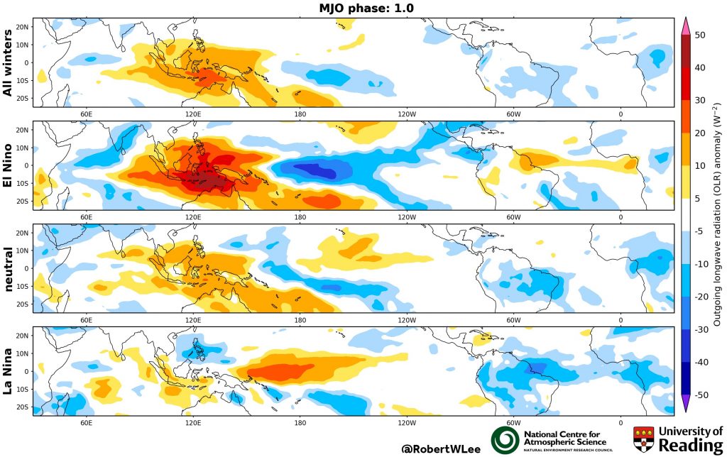
ENSO conditions change on a longer (slower) timescale than the MJO, and so from a subseasonal perspective, ENSO conditions remain approximately constant. We find that ENSO modifies the MJO [6], making these regions of wet and dry weather narrower or broader in longitude (Figure 3).

Figure 3: The classic animation of the MJO (top row), here shown as an Outgoing Longwave Radiation (OLR) anomaly (to represent the clouds); and during El Niño, neutral, and La Niña conditions (lower three rows). The phase of the MJO is labelled at the top.

This ENSO modification of the MJO then has a consequence on the type of teleconnection that is triggered and the path that it takes. Our study [6] shows that during El Niño winters the teleconnection from MJO phases 1–3 makes the NAO+ regime occur twice as often as the full climatology, with the signal travelling along the jet streams (Figure 4). Whereas during La Niña this MJO phases 1–3 teleconnection is absent and there is no increase in NAO+ regime occurrence. During La Niña years we also find the teleconnection from the MJO phases 6–8 makes the NAO– regime occur up to 2.5 times as often as the full climatology – this signal travels via the stratosphere, warming it and slowing the stratospheric polar vortex (Figure 4), with the total pathway taking around 20 days. There is a strong subseasonal link between the stratospheric polar vortex and the weather regimes throughout all winters [7], however, it is during La Niña years when there is the strongest subseasonal link between the MJO and the stratosphere [6].

Figure 5: Simplified schematic of teleconnection from MJO phases 3 and 7, to the North Atlantic and European region during El Niño and La Niña conditions, respectively. Schematic adapted from: [6].

This statistical method, using the ENSO and MJO conditions, indicates which weather regimes we might expect 10-20 days in advance. By combining this with dynamical models, which can forecast the MJO up to 10 days ahead, we may improve the weather outlook for up to 30 days ahead. These results have important implications, including for the achievable skill in predicting these weather regimes on subseasonal timescales. In addition, this dependence of the teleconnections on the ENSO state should be well represented in weather and climate models. Finally, long term changes (both past and future) in MJO amplitude and in ENSO strength, may alter the proportions of time in each the weather regimes experienced overall.

This work [6 & 7] is part of the InterDec project, connecting scientists from 6 countries, researching inter-regional linkages on subseasonal-to-decadal timescales, and has been funded by NERC via the 2015 joint call from the Belmont Forum and JPI Climate.

References:
  1. Michelangeli, P.-A., R. Vautard, and B. Legras, 1995: Weather Regimes: Recurrence and Quasi Stationarity. Atmos. Sci., 52, 1237–1256, https://doi.org/10.1175/1520-0469(1995)052<1237:WRRAQS>2.0.CO;2
  2. Wiel, K. Van Der, H. C. Bloom, R. W. Lee, L. P. Stoop, R. Blackport, J. A. Screen, and F. M. Selten, 2019: The influence of weather regimes on European renewable energy production and demand. Res. Lett., 14, 094010, https://doi.org/10.1088/1748-9326/ab38d3
  3. Charlton-Perez, A. J., R. W. Aldridge, C. M. Grams, and R. Lee, 2019: Winter pressures on the UK health system dominated by the Greenland Blocking weather regime. Weather Clim. Extrem., 25, 100218, https://doi.org/10.1016/j.wace.2019.100218
  4. Ferranti, L., T. N. Palmer, F. Molteni, and E. Klinker, 1990: Tropical-Extratropical Interaction Associated with the 30–60 Day Oscillation and Its Impact on Medium and Extended Range Prediction. Atmos. Sci., 47, 2177–2199, https://doi.org/10.1175/1520-0469(1990)047<2177:TEIAWT>2.0.CO;2
  5. Cassou, C., 2008: Intraseasonal interaction between the Madden–Julian Oscillation and the North Atlantic Oscillation. Nature, 455, 523–527, https://doi.org/10.1038/nature07286
  6. Lee, R. W., S. J. Woolnough, A. J. Charlton‐Perez, and F. Vitart, 2019: ENSO modulation of MJO teleconnections to the North Atlantic and Europe. Res. Lett., 46, 13535– 13545, https://doi.org/10.1029/2019GL084683
  7. Charlton-Perez, A. J., L. Ferranti, and R. W. Lee, 2018: The influence of the Stratospheric state on North Atlantic Weather Regimes. J. R. Meteorol. Soc., 144, 1140– 1151, https://doi.org/10.1002/qj.3280


Posted in Climate, ENSO, Madden-Julian Oscillation (MJO), Predictability, subseasonal forecasting | Leave a comment

Desert Dust in the Atmosphere: Giant Particles, Giant Consequences?

By: Claire Ryder

As I write, storm Gloria decays over the Mediterranean Sea, while large amounts of desert dust whipped up by strong winds over the Sahara desert have been whirled in to action by Gloria and remain in the atmosphere. This dust is now being blown northwards across Europe and may travel as far as the UK. Dust reaching the UK is usually so dispersed that it’s often only noticeable by producing pretty red sunsets and dirty red rain on our cars, sometimes referred to as ‘blood rain.’ Did you notice any the weekend before last?

Figure 1: Dust forecast for 12:00 on 23rd January 2020 from the Barcelona Dust Forecast Centre (https://dust.aemet.es/forecast) showing Saharan dust being transported across Europe by storm Gloria

Most Saharan dust in the atmosphere is transported westwards across the Atlantic Ocean. Unlike dust reaching the UK, the Atlantic dust plume is present throughout the year, at varying latitudes, altitudes and intensities. It is important for climate models to be able to accurately predict dust in our atmosphere. This is because dust particles interact with sunlight (which causes an overall cooling effect) as well as thermal radiation (heat) from the Earth (which causes an overall warming effect). The balance of these two effects is the decider on whether dust in our atmosphere warms or cools the planet, and usually, scientists estimate that the cooling effect wins.

Figure 2: Satellite image for 1st August 2013 of dust stretching all the way across the Atlantic Ocean (from Suomi NPP VIIRS instrument)

However, the balance of cooling versus warming from dust is strongly sensitive to how big the dust particles actually are. Larger particles shift the impact of dust from more cooling towards more warming, as a result of how they interact with radiation.

Previously, scientists didn’t think that ‘giant’ particles, larger than about 20 microns – half the width of a human hair – could travel very far, or impact climate very much, so giant dust was excluded from climate models. However, new research shows that this is not the case (Ryder et al., 2019). Scientists have been flying aircraft over deserts and dusty oceans, taking new measurements of dust which can properly measure the giant particles.

Figure 3: The UK FAAM research aircraft flies through dusty air taking measurements near the Cape Verde Islands in the tropical Eastern Atlantic during the AER-D fieldwork

The results clearly demonstrate that even after more than a week in the air, the largest dust particles remain doggedly present. We would expect these particles to be falling to the ground much more quickly than this, certainly within a few days, so some additional mechanism which we don’t yet understand must be keeping them airborne.

Figure 4: Dust size measurements from aircraft flights sampling dust at different points during transport over and away from the Sahara (from Ryder et al., 2019), showing that dust particle size drops rapidly in new dust storms, but doesn’t change much during longer range transport.

Our new research estimated the warming/cooling impact of the excluded giant dust particles. Over the Sahara, climate models miss 18-26% of the interactions between dust and radiation. This means that climate models are underestimating the warming impacts of dust on the Earth-atmosphere system. This may have important effects in the future – for example, if our world becomes dustier due to desertification, dust may cause additional warming which is being missed by climate models.

References

Ryder, C. L., Highwood, E. J., Walser, A., Seibert, P., Philipp, A., and Weinzierl, B.: Coarse and giant particles are ubiquitous in Saharan dust export regions and are radiatively significant over the Sahara, Atmos. Chem. Phys., 19, 15353–15376, https://doi.org/10.5194/acp-19-15353-2019, 2019.

Posted in Aerosols, Climate, Climate modelling | Leave a comment

How can we provide accurate and useful weather forecasts to Tropical African countries?

By: Carlo Cafaro 

Probabilistic weather forecasts contain useful information that could save lives by issuing early and accurate warnings. This is especially true in Africa, where the livelihoods of people rely significantly on agricultural activities. These, in turn, depend on weather conditions – particularly rainfall. Every year, droughts and floods pose a serious threat by altering the levels of food security.

In the last months of 2019, for instance, unusually heavy rains battered East Africa, causing landslides and flooding with over 2.8 million people affected, according to the UN and at least 137 people dead in Kenya and Uganda.

Most of the annual rainfall of tropical East Africa comes from deep convective systems.  This is true also for West Africa, where 90% of the annual rainfall in the Sahelian is produced by a small number (12% of the total) of organized mesoscale convective systems (see [2] for details).

For example, convective storms usually hit Lake Victoria overnight. The lake is crucial for the local fisheries and for providing a means of transport between the local communities. However, according to the World Bank, every year up to 5000 thousand fishermen die by drowning in the lake. Sudden strong winds caused by nocturnal thunderstorms can capsize their boats, which often are overloaded or are not properly safe to use.

Figure 1: The UK and African partners of the SWIFT project. Courtesy: P. Hill

This is why there is urgent need of accurate and useful weather forecasts, from hourly to seasonal timescales. This is the overarching aim of the GCRF African SWIFT project, which I am working on. It kicked off in November 2017 and brings together UK and African scientists, operational forecasters and users to improve the weather forecasting capability of the African partners (see Figure 1 for a summary of the different partners of the project).

Numerical weather prediction (NWP) global deterministic models have too coarse a grid spacing to realistically represent convection. Hence they use parametrization techniques, which are found to be not so skillful.

This is because they tend to produce too much light rain and miss the most intense events. Another well known problem is that they cannot reproduce well the diurnal cycle of precipitation, with the peak of rainfall too early with respect to observations.

There are thus two options (not mutually exclusive) to try to improve the skill of rainfall predictions: run an ensemble of forecasts, hence producing probabilistic weather forecasts and/or decrease the size of the grid spacing down to kilometer-scale, thus allowing the convection to be explicitly represented and not parametrized (the so-called convection-permitting models, CP).

When considering an ensemble of coarse grid-box global models, the results are not so encouraging [4].

The Met Office has thus been running, since 2011, a finer deterministic grid size model over East Africa (4.4 km grid spacing). Although CP models have been shown to be more skillful than the respective coarser grid models (e.g. [1, 5]) for the Lake Victoria region, the skill is still fairly poor and so there is still room for improvement.

Hence the motivation to combine the two options previously discussed, to generate convection-permitting ensemble prediction systems (CP-EPSs). These are usually run on limited areas, with boundary and initial conditions provided by the global ensembles.

These models are fairly novel (~10 years) and have been run only in extra-tropical regions by several forecasting and research centres.

Figure 2: SWIFT news

In April 2019, the Met Office, as part of the SWIFT project, ran CP-EPSs for the tropical Africa domain for the first time. These were tested in real time during the forecast testbed hosted by the Kenya Meteorological Department (KMD) in Nairobi between 23rd April and 6 May 2019 (in Figure 2 a group picture of some of the participants).

Scientists and operational forecasters gathered in the same room, working in shifts for 24 hours. We were using nowcasting and CP ensembles forecasts to predict convective storms over West and East Africa up to 72 hours ahead. One of the morning tasks was the ‘subjective’ evaluation of these forecasts.

Participating in this real-time experiment allowed me to see the task of verifying CP-EPSs, part of my PhD work as well, from a completely different perspective.

This is because speaking directly with the local forecasters and the users in Kenya helped me shape my activities, making me think in a more user-friendly way.

First of all, it is important to be able to extract the information from the “big data” produced by the CP-EPSs. Then to communicate and verify them.

For example, over Lake Victoria, one piece of forecast information could be the probability of rainfall exceeding a threshold over a certain accumulation period. The shorter this period is, the more useful the information. Another option could be to detect the location and timing of the peak of rainfall.

Figure 3: Convective-scale probabilistic forecast map of rainfall exceeding 10 mm accumulated on 03/05/2019 between 00 and 06 UTC. Courtesy of Stuart Webster.

An appealing graphic, which can be understood by a local forecaster could then be used to communicate this information.

Figure 3 shows the map produced during the testbed of the probabilistic forecast of rainfall accumulation exceeding 10 mm over 6 hours.

Also, a map displaying the location of initiation of a thunderstorm, along with the trajectory paths of its propagation, is another possibility.

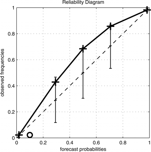
The last step, forecast verification, consists of two aspects, as stated by WMO: assessing the technical skill of a forecast (for example by producing the reliability diagram as explained  in this blog post by Jochen Broecker) and to ascertain whether the forecasts issued help the user to take decisions. This was stated in other terms also by [3] in terms of quality and value of the forecasts.

Even computing the forecast skill can be done in a user-oriented way: WMO issued a challenge to find the best way to do that [2].

In light of this, an important activity carried by the KMD was the collection of feedback of forecasts users.

This feedback will certainly help all of us involved in this project to reach our goals: make a positive impact into the lives of the African people by providing skillful weather forecasts.

References:

[1] Chamberlain, J.M., Bain, C.L., Boyd, D.F.A., McCourt, K., Butcher, T. and Palmer, S., 2014, Forecasting storms over Lake Victoria using a high resolution model. Met. Apps, 21: 419-430. doi:10.1002/met.1403

[2] Ebert, E., Brown, B. G., Göber, M., Haiden, T., Mittermaier, M., Nurmi, P., … Schuster, D.,2018. The WMO challenge to develop and demonstrate the best new user-oriented forecast verification metric. Meteorologische Zeitschrift, 27, 435-440. doi:10.1127/metz/2018/0892

[3] Lebel, T., Diedhiou, A., and Laurent, H. ( 2003), Seasonal cycle and interannual variability of the Sahelian rainfall at hydrological scales, J. Geophys. Res., 108, 8389, doi:10.1029/2001JD001580.

[4] Murphy, A.H., 1993: What Is a Good Forecast? An Essay on the Nature of Goodness in Weather Forecasting. Wea. Forecasting, 8, 281–293, doi:10.1175/1520-0434(1993)008<0281:WIAGFA>2.0.CO;2

[5] Vogel, P., P. Knippertz, A.H. Fink, A. Schlueter, and T. Gneiting, 2018: Skill of Global Raw and Postprocessed Ensemble Predictions of Rainfall over Northern Tropical Africa. Wea. Forecasting, 33, 369–388, doi:10.1175/WAF-D-17-0127.1

[6] Woodhams, B.J., C.E. Birch, J.H. Marsham, C.L. Bain, N.M. Roberts, and D.F. Boyd, 2018: What Is the Added Value of a Convection-Permitting Model for Forecasting Extreme Rainfall over Tropical East Africa?. Mon. Wea. Rev., 146, 2757–2780, doi:10.1175/MWR-D-17-0396.1

Posted in Climate, Convection, Weather forecasting | Tagged | Leave a comment

A Tipsy Earth?

By: Jonah Bloch-Johnson

Hi. I’m Jonah, a scientist here at the UoR, and I study whether global warming will be more like drinking water, soda, or beer.

What do I mean by that? Let me explain.

Both thirst and the Earth’s climate are feedback systems – they react to an external nudge by either undoing or amplifying that initial push. A reaction that undoes the push is called a negative feedback, and an amplifying one a positive feedback.

For example, we all have experience being thirsty – in fact, you might be thirsty right now. How might you react? Perhaps you reach for a cold glass of water (Fig. 1). Drinking the water quenches your thirst. The initial nudge – your thirstiness – prompted you to react by doing something that got rid of your thirstiness; or put another way, the quenching nature of water provided a negative feedback.

Figure 1:  A glass of water: an absolute classic beverage.

But what if, instead, you reached for something sweet, like soda, or juice? Sweet drinks taste good, so that while they quench your thirst, they also stimulate you, making you want to drink more. The sweetness adds a positive feedback. The combined result is that drinking a sweet drink lessens your thirst, but not as much as just drinking water; the overall negative feedback is weaker. So you might find yourself drinking more soda than you would water. Fig. 2 shows a drink called a “Big Gulp” which is popular back in my home of the USA and contains about a litre of soda. Big Gulps of water are few and far between.


Figure 2: A Big Gulp: finally, enough soda.

Ah, but what if instead of a sweet drink, you decided to go for something with a bit of a kick? Some beer, cider, or whisky, for example (Fig. 3)? Depending on the drink, it may be more or less tasty – at first! But after a few drinks, the idea of getting another may become more appealing. In other words, with alcohol, the “tastiness” of the substance can depend on how much of it you’ve already consumed. What might start as a simple thirst can run away into a  bender, as your overall feedback goes from negative to positive.

Figure 3: Beer: another round, please!

What does any of this have to do with global warming? First, a bit of science. You might have heard that energy is conserved – it can be moved around, or change forms, but is never created or destroyed. One of the ways energy moves around is as light, which carries energy from the place it is radiated to the place it is absorbed. You may be used to light as something you can see, but there are actually many colours of light beyond the range our eyes can capture. Everything is constantly giving off light, invisible and/or visible, including you and me (doesn’t that give you a bit of glow?). And I’m not talking about reflecting visible light – you give off your own light, even in the dark, which is how some snakes are able to find you in the night (!).

The hotter you are, the more light you give off – and so the more energy you radiate away. The Sun is so hot (and huge) that even though it is quite far away, a substantial amount of the light it gives off reaches us here on Earth, where we gain the energy it carries. As a result, the Earth warms up – and gives off light of its own. The additional carbon dioxide we have been adding to the air for the past century or two intercepts some of the Earth’s light that was destined for space. As a result, the Earth doesn’t lose some of the energy it would otherwise have lost. This is kind of like us getting thirsty – it is a nudge, a push to a system that was previously in balance.

How does the Earth react? That excess energy warms the Earth’s surface, and as a result, it gives off more light, offsetting the carbon dioxide’s effect. In other words, we have a negative feedback, which we call the “Planck” feedback. This warming continues until the amount of light leaving the Earth once more balances the amount entering, and the planet is no longer thirsty. If the Planck feedback was the only one in the Earth’s climate, global warming would be less of an issue, because we’d only need to warm a little to restore balance (blue line in Fig. 4).

But like with soda, there’s a sweetness to warming that keeps the Earth going further: warming also causes more water vapor to be evaporated into the atmosphere. Water vapor also intercepts some of the Earth’s light destined for space, so it causes still more energy to stick around as excess. In other words, it is a positive feedback. It is not so strong as the Planck feedback, so that warming still manages to offset the initial carbon dioxide nudge; but instead of a little warming, we get more of a Big Gulp (red line in Fig. 4). And in addition to the water vapor feedback, there are others, positive and negative, associated with changes to ice, clouds, and the vertical structure of the atmosphere.

But here’s the twist: the water vapor feedback gets stronger the more you warm. In other words, it’s more like beer than soda. And the result is that too much of a push can send your planet on a bender. That’s what happened to Venus in the distant past, when the Sun’s increasing warmth caused its climate to enter a “runaway greenhouse,” evaporating its oceans and giving it a surface temperature of around 500ºC (gray line in Fig. 4).


Figure 4: Will global warming be more like water, soda, beer, … or vodka? Here we have four scenarios for future warming, assuming we just keep digging up fossil fuels, burning them, and leaving the released carbon dioxide in the atmosphere. In the first, the only feedback operating in the climate is the strongly negative “Planck” feedback (“hotter things give off more light”), which like a quenching glass of water simply satisfies your pang of thirst; just a little warming closes the imbalance between inflows and outflows of energy (blue line). In the second, the positive water vapor feedback (“hotter planets evaporate more water, which is itself a greenhouse gas”) and others makes warming more like soda, and you might end up drinking quite a Big Gulp to satisfy your thirst (red line). In the third, the deliciousness of the water vapor feedback gets amplified the more you warm, giving your drink a kick like a nice glass (or two, or three…) of beer (tan line). This state of affairs seems to describe the response of the CanESM5 model, which warms more than if its feedbacks stayed constant (green line). Finally, a climate with a higher feedback temperature dependence – a higher alcohol content? – can end up on quite a bender (gray line). Looking at past climates suggests that we are not at risk for this particular scenario. Figure credit: Jonah Bloch-Johnson, Maria Rugenstein, Martin Stolpe, Tim Rohrschneider, Yiyu Zheng, and Jonathan Gregory.

 Is the addictive nature of the water vapor feedback important for global warming? Evidence from records of the past and computer models of the future suggest the Earth is likely not close to a runaway greenhouse. However, even if we are not at risk of “drinking” away our oceans, the road to warming may be paved with tipsiness. The green line in Fig. 4 shows the warming of the Canadian Earth System Model, Version 5 (CanESM5) if we continue to increase the carbon dioxide concentration until it reaches eight times the preindustrial level in 2250, which assumes that we continue to grow using mostly fossil fuels. Using the feedbacks and feedback temperature dependence of CanESM5, we can extrapolate warming out even further (tan line). The difference between the red and tan lines – between the soda and the beer – gives you additional warming that continues to increase with time.

While scientists have long appreciated the importance of understanding how “sweet” warming is for forecasting climate change in the coming century, it is becoming clear that after 2100, climate change will also depend on the booziness of warming. While 2100 once seemed like the unimaginable future, it will soon be within the lifetime of most of the newest humans. In the meantime, we keep spewing out CO2. In response, we may find that the Earth doesn’t just warm – it might also develop a taste for it.

Reference:

Bloch-Johnson J, Pierrehumbert RT, Abbot DS (2015) Feedback temperature dependence determines the risk of high warming. Geophysical Research Letters 42:4973-4980. https://doi.org/10.1002/2015EA000154

Posted in Climate, Climate change, Climate modelling | Leave a comment

How to analyse your forecast diary properly

By: Jochen Broecker

As you are reading a science blog, I am sure you are interested in science, and either as a parent or during your childhood you will have seen these books aimed at children interested in the natural world. I’m thinking of colourful books with busy layouts and named along the lines of “100 Science Experiments For Little Explorers”, “365 Activities For Young Scientists” or “50 Cool Experiments For Rainy Days”.

A staple of these books is suggesting to start a weather diary as an activity. Depending on the targeted age groups, these might simply involve putting dashes next to a smily sun or a bubbly rain cloud, or be more challenging by asking to record more details and even write little reports.

Suggestions as to what to do with these records are much harder to find. This article suggests to make your weather diary even more interesting by recording not only what has actually happened but also what weather centres (such as the MetOffice) predicted to happen. Further, we will discuss how to do something useful with your records, namely subject them to a proper statistical analysis, thereby checking the quality of the forecasts in some sense.

The challenge is that your forecast diary will most likely not be amenable to the standard statistical tools that are taught in those moderately popular statistics courses for natural scientists. The data instances in your forecast diary will not be temporally independent, which renders the whole analysis a lot more interesting.

The forecast diary

The diary we have in mind records not only the actual event (say “rain” or “no rain” today) but also the corresponding forecast from some weather centre of your choice, let’s say the Met Office. Rain is interesting because the Met Office issues probability of precipitation, or PoP forecasts. These represent the propability of seeing rain during a specific time interval (at a given location). The Met Office uses hourly intervals, but presumably you don’t want to enter records into your diary with such high frequency. As an alternative, you can consult the Dutch or the US Weather Service as they provide daily PoP’s but only for their respective countries. But at least the latter seems to be taking the maximum of the hourly PoP’s as a daily PoP (whatever the theoretical justification). This is something you could apply to the Met Office hourly PoP’s to get daily PoP’s for the UK.

The forecast is expressed in percent, rounded to the nearest multiple of ten. In fact, there are several forecasts available that apply to any given event, namely forecasts with different horizon, also called lead time. You may record forecasts for several lead times in your diary, a typical page of which might look like this:

Forecast Diary
Date Rain L = 1 L = 2 L = 3
01.01.20 Yes 20 10 10
02.01.20 No 10 10 10
03.01.20 No 10 0 5
04.01.20 Yes 50 40 60
05.01.20 No 20 10 10
06.01.20 Yes 60 60 70
07.01.20   50 40 50
08.01.20     10 0
09.01.20       10
09.01.20        
:        

This is how your forecast diary might look like on 6th of Jan, 2020. Here, Probability of Precipitation forecasts (in percent) up to a lead time of three days are recorded in separate columns with headings L = 1, L = 2 and L = 3.

Reliability

Focussing on forecasts for a fixed lead time (say three days), a forecast diary can be used to check the reliability of the forecasting system. In the present situation, this means that if the forecast probability is p, then it should indeed rain with probability p. More precisely, considering all rows in the diary where the relevant forecast was p, we should see rain for a fraction p of those rows; and this needs to be checked for all values of p that can possibly occur. In our case, there are eleven values: 0, 0.1, 0.2, \ldots, 0.9, 1.

In general, assume the forecasts take the values \pi_1, \ldots, \pi_K. Assume we recorded N days in total, and for each k = 1, \ldots, K let R_k (or N_k, respectively) be the number of days where the forecast was equal to \pi_k and there was rain (or no rain, respectively). Following our discussion, we expect that

\frac{R_k}{ R_k + N_k} \cong \pi_k.

You can plot the left hand side (the observed frequencies) vs the right hand side (the forecast probabilities) and check if you get something close to the diagonal; this is called a reliability diagram. Here’s an example of a reliability diagram, taken from Bröcker and Smith, 2007:

A diagram showing the observed relative frequencies vs the forecast probabilities

Rearranging the previous equation, we find

(1 - \pi_k) R_k + \pi_k N_k \cong 0 \qquad \mbox{for } k = 1, \ldots, K. \qquad (*)

Of course, if you compute the left hand side for your forecast diary, due to random fluctuations it won’t equal to zero even if the forecasting system was reliable.
Working out how large these deviations typically are and whether a given deviation is still acceptable is what happens in a statistical test, which is what we will discuss next. For more about reliability diagrams and graphical ways of representing the expected random fluctuations see Bröcker and Smith, 2007.

The central limit theorem

We abbreviate the left hand side of Equation (*) as Z_k, k = 1, \ldots, K and realise that if the rows in the diary were stochastically independent, we could apply the central limit theorem and obtain as an immediate consequence that the quantity

t := \frac{1}{N}\sum_{k, j} Z_k Z_j C^{-1}_{k, j}

would have a \chi^2-distribution with K degrees of freedom (where C is the covariance matrix of the Z_1, \ldots, Z_K). Note that t represents the sum squared deviations we encounter in Equation (*) but in a weighted metric defined by the covariance matrix C.

The rows of the diary are not independent though. In fact the whole point of weather forecasting is that the weather today tells us something about the weather tomorrow. Fortunately, this does not preclude the use of the statistical methodology outlined above. The central limit theorem is still applicable provided the correlations between the relevant terms in the sum decay fast enough. That this is indeed the case is shown in Bröcker, 2018 (in a slightly different situation, but the basic idea carries over).

This decay is not due to any (assumed) decay in the temporal correlations of the weather due to chaotic dynamics but follows from the assumption that the forecasts are reliable. Remember, we want to know if the deviations in Equation (*) are large provided the forecasts are reliable; if they are, the assumption of
reliability is untenable.

It needs mentioning though that the covariance matrix C is not what you would get if the rows in your diary were independent. This matrix has to be estimated from the data. How to do this is beyond this article but python code implementing the methodology can be found here. Look at the comments in rainscript.py and apply it to raindataL2.csv or, of course, your own forecast diary.

References

Jochen Bröcker.
Assessing the reliability of ensemble forecasting systems under serial dependence.
Quarterly Journal of the Royal Meteorological Society, 144(717), 2018. https://doi.org/10.1002/qj.3379

Jochen Bröcker and Leonard A. Smith.
Increasing the reliability of reliability diagrams.
Weather and Forecasting, 22(3):651–661, June 2007.https://doi.org/10.1175/WAF993.1

Posted in Predictability, Statistics, Uncategorized, Weather forecasting | Leave a comment

Our changing energy system: what happens at times of high demand?

 By: Hannah Bloomfield

It is getting near to Christmas, which means the decorations are coming out, the nights are drawing in, and even Scrooge has conceded that it’s probably time to put the heating on. In winter the UK has a significantly higher electricity demand than it does in summer, due to our increased need for heating and lighting. In past decades meeting this increased demand was relatively easy, as our generation was supplied from a more “traditional” fleet of coal, gas, and oil-fired power stations. These are relatively easy to control when they are on or off and can turn on very rapidly to meet a sudden peak in demand if the EastEnders Christmas special comes on. In order to meet the government’s proposed carbon reduction targets, the type of generators that are used to meet demand are rapidly changing. A transition is underway to more renewable sources such as wind, solar and hydro power. The operation of the renewable generation depends on the present weather conditions, as opposed to the TV scheduling (although perhaps online streaming services are helping the national grid by reducing TV viewership). It is therefore important to understand how the weather sensitivity of the current power system is likely to change when more renewable generation is introduced.

 Recent research from the energy-meteorology research group has investigated various aspects of this problem using weather-dependent models of demand, wind power generation and solar power generation (available here if you’d like to have a play with the data). A problem with using measured demand and renewable generation data for this type of analysis is that there are large trends in the data due to the rapid expansion of renewable capacity, or due to changes in economic factors, human behaviour and the energy efficiency of every-day products. We therefore build reconstructions of a fixed power system configuration (i.e. taking the amount of installed renewable generation and level of demand in 2017) and then use a reanalysis dataset to reconstruct what the present day power system would have looked like with the last 40 years of weather. With these long datasets we can look at the meteorological drivers of power systems [1,2] and investigate thoroughly the changing weather conditions associated with extreme power system events as we put more renewables on the system [3,4,5]. Some examples of this are discussed below.


Figure 1: Anomaly composites of the mean of the ten most extreme peak loads from the 1980–2015 winter-mean. These are given for for 2 m temperature (first column) and 10 m wind speed (2nd column) for a UK power system with no renewables (NO-WIND) and one with 45GW of installed wind power. Mean-sea-level-pressure contours for the events are overlaid in black with a 4 hPa interval. The thick contour represents 1016 hPa. The ’H’ represents the location of the centre of the region of high pressure. Adapted from [3]

Figure 1 shows composites of the ten highest demand events experienced in the UK from 1980-2016 (using the synthetic time series discussed previously). We see that if there is no renewable generation installed on the system then peak demand events are associated with very cold near-surface temperatures and moderately low winds. The key ingredient here is the location of a high pressure system, with a strong pressure gradient over the UK bringing cold continental air from central Europe. If we were to look forward to planned future power systems including 45GW of wind power generation (around twice the amount currently installed) then the weather conditions causing largest system stress are likely to change. Figure 1 shows peak load events (i.e. the demand minus all available wind power generation) are still associated with high pressure, but there is a shift to high pressure events centered over the UK now being most important. These events lead to both a reduction in the magnitude of the temperature anomaly and an increase in the wind speed anomaly over the UK.

 It is relatively easy to forecast the broad characteristics of energy demand, as we all tend to go to work and take holiday at certain times of the day/year. It is however challenging to forecast the type of events shown in Figure 1 at timescales greater than a few days. If information was available at timescales of 1 week to 1 month ahead (sub-seasonal timescales) then this would allow for planning decisions to be made about where power is going to be sourced from to meet high demand events [6]. Studies have shown that at these longer lead times, there is relatively more skill at forecasting large-scale weather conditions, rather than local anomalies at the surface. Because of this, some current work as part of the S2S4E project has investigated the potential for two types of large scale patterns to be used to provide information at sub-seasonal timescales for energy system resource planning.

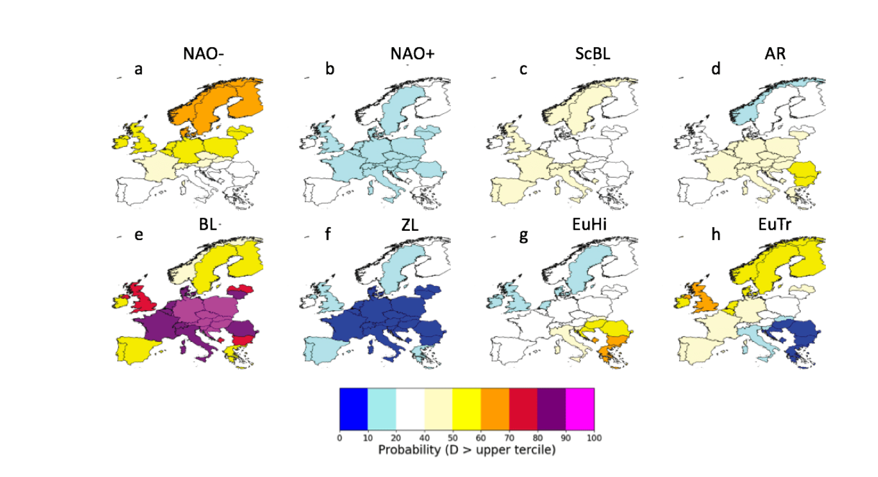
 The first pattern-based method is weather regimes. These are patterns defined based on large scale meteorological conditions (daily anomalies of 500hPa geopotential height). Each day during the extended winter season can be assigned into one of the patterns: the positive and negative phase of the North Atlantic Oscillation (NAO+, NAO-), Scandinavian Blocking (ScBL) and the Atlantic Ridge (AR). Rather than clustering on a large-scale field, the second method, newly developed for the project is called Targeted Circulation Types. This assigns each day into one of four patterns based on national energy data (using 28 countries across Europe). These patterns are: Blocked (BL), Zonal (ZL), a European High (EuHi) and the European Trough (EuTr).


Figure 2: Probability of each country’s demand being in the upper climatological tercile of demand in each weather regime (top) and Targeted Circulation Type (bottom). The TCT patterns used are constructed from normalised demand. See [1] for more details.

Each of these 8 weather patterns can be associated with a set of surface meteorological impacts (e.g., a set of demand, wind power or solar power anomalies). Figure 2 shows the probability of demand being in the upper tercile (top 30%) while each of the patterns has occurred (again using our reanalysis-based power system data to get a longer record for analysis). This shows that particular patterns are more likely to be associated to high demand events, especially those associated with European Blocking. Some patterns do not have a particularly strong link to European demand (e.g. the Atlantic Ridge). As well as this, the link to the impacted system is not as strong using weather regimes as using the Targeted Circulation Types. Current work is investigating if there is a tradeoff in the levels of predictability associated with the two different types of patterns. For further details see [1] and the S2S4E website.

References:

[1] Bloomfield, H. C., Brayshaw, D. J. and Charlton-Perez, A. (2019) Characterising the winter meteorological drivers of the European electricity system using Targeted Circulation Types. Meteorological Applications. (2019) https://doi.org/10.1002/met.1858

 [2] van der Wiel, K., Bloomfield, H., Lee, R. W., Stoop, L., Blackport, R., Screen, J. and Selten, F. M. (2019) The influence of weather regimes on European renewable energy production and demand. Environmental Research Letters, 14. 094010. https://doi.org/10.1088/1748-9326/ab38d3

 [3] Bloomfield, H., Brayshaw, D. J., Shaffrey, L., Coker, P. J. and Thornton, H. E. (2018) The changing sensitivity of power systems to meteorological drivers: a case study of Great Britain. Environmental Research Letters, 13 (5). 054028. https://doi.org/10.1088/1748-9326/aabff9 

[4] Bloomfield, H. C., Brayshaw, D. J., Shaffrey, L. C., Coker, P. J. and Thornton, H. E. (2016) Quantifying the increasing sensitivity of power systems to climate variability. Environmental Research Letters, 11 (12). 124025. https://doi.org/10.1088/1748-9326/aabff9

 [5] Drew, D. R., Coker, P. J., Bloomfield, H. C., Brayshaw, D. J., Barlow, J. F. and Richards, A. (2019) Sunny windy Sundays. Renewable Energy, 138. pp. 870-875. https://doi.org/10.1016/j.renene.2019.02.029

 [6] White, C. J., Carlsen, H., Robertson, A. W., Klein, R. J., Lazo, J. K., Kumar, A., … & Bharwani, S. (2017). Potential applications of subseasonal‐to‐seasonal (S2S) predictions. Meteorological applications, 24(3), 315-325.  https://doi.org/10.1002/met.1654

Posted in Climate, Energy meteorology, Wind | Leave a comment

Climate change increases the “perfect storm” coastal flood potential

By Emanuele Bevacqua

Some of the European low-lying coastal areas and river estuaries may see a future increase in flooding caused not only by sea-level rise but also by more frequent concurrent storm surge and heavy precipitation, we show in a new study published in Science Advances [1].

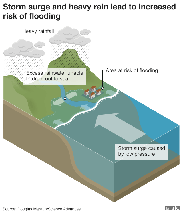
Figure 1: Compound flooding caused by the interaction between storm surge and heavy rainfall. A moderate storm surge can obstruct the gravity-feed drainage of pluvial or fluvial water into the sea. Or, rainfall on top of a storm surge inundated area can worsen the overall flooding. Image originally published on the BBC.

Coastal flood risk is usually calculated based on storm surge and extreme rainfall hazards separately. However, ignoring compound flooding arising from the local interaction between these two hazards may cause severe underestimation of the actual flooding risk in some areas.

The importance of considering compound flooding for planning coastal defences is shown, for example, by the past flooding management in Lymington [3], a port town in the southern UK. In December 1989, a storm surge led to widespread flooding in the town, causing damages to houses and the railway line. As a result, an extensive upgrade of the coastal defences took place; however, the potential for flooding resulting from the interaction of storm surge and pluvial flooding was not considered at that time. Ten years later in 1999, the Christmas Eve in Lymington was stormy: a cyclone not only caused a storm surge but, simultaneously, also very heavy rainfall leading to high discharge in the Lymington River. The new raised defences were activated and protected the town from the storm surge well; however, the prolonged storm surge did not allow the sea defences to be deactivated, thus trapping the water discharge of the Lymington River on the upstream side of the sea defences. This combination of events resulted in very deep flooding over the railway line and into residential and commercial development in Lymington.

Figure 2: Flooding around Lymington (UK) on December 24, 1999. Photo from The New Forest LIFE Projects.

Similar compound flooding happened, for example, in 2012 in The Netherlands [4], and in 2015 in Ravenna (Italy) [2] due to the cyclone Norbert causing concurring heavy rainfall and storm surge. In fact, coastal heavy rain often coincides with a storm surge because these two hazards frequently result from the passage of a cyclone. Thus, considering only one of the two hazards at a time, or assuming that they are independent, can result in a substantial underestimation of the flooding risk.

It is clear that in low-lying coastal areas and river estuaries, compound flooding should be considered to avoid underestimating the flooding risk. However, the need for considering the multiple flooding drivers simultaneously makes compound flooding risk assessment a rather complicated task. In addition, as climate changes, we need to understand how the compound flooding risk will change in the future, which is vital for adapting to flooding changes through – when necessary – building or upgrading flood defences. Thus, also future changes in sea level and precipitation need to be taken into account when assessing the flooding risk, making a compound flooding assessment extremely challenging.

In a new study, colleagues and I investigated, for the first time, how compound flooding may change in the future due to sea-level rise and changes in precipitation, storm surge, and their interaction.

Focussing on the European and North African coasts, we found that not only sea-level rise will cause an increase in the potential for compound flooding everywhere, but additional changes in compound flooding will be caused by changes in storms. In particular, the potential for compound flooding is projected to increase in northern Europe due to increasing precipitation intensities, mainly caused by a future warmer atmosphere that allows storms to carry more moisture.

The results of the study cannot be interpreted as a precise assessment of the local flooding risk, though it is evident that compound flooding will become more likely in the future if we do not take any action against climate change. The study aims at offering a large-scale view of the present and future potential for the compound flooding hazard. Identifying European regions potentially facing compound flooding in a warmer climate, it provides a basis for follow-up local compound flooding risk assessments and adaptation planning.

In locations prone to compound flooding, adapting to sea-level rise only might be insufficient, and additional changes in precipitation, storm surges, and their interaction should be considered to avoid too optimistic adaptation planning.

References

 [1] Bevacqua, E., D. Maraun, M. I. Vousdoukas, E. Voukouvalas, M. Vrac, L. Mentaschi, and M. Widmann, 2019: Higher probability of compound flooding from precipitation and storm surge in Europe under anthropogenic climate change. Science Advances, 5, no. 9, eaaw5531, https://doi.org/10.1126/sciadv.aaw5531.

[2] Bevacqua, E., D. Maraun, I. Hobæk Haff, M. Widmann, and M. Vrac, 2017: Multivariate statistical modelling of compound events via pair-copula constructions: analysis of floods in Ravenna (Italy). Hydrology and Earth System Sciences, 21, no. 6, 2701-2723, https://doi.org/10.5194/hess-21-2701-2017.

 [3] Hendry, A., I. Haigh, R. Nicholls, H. Winter, R. Neal, T. Wahl, A. Joly-Laugel, and S. Darby, 2019: Assessing the characteristics and drivers of compound flooding events around the UK coast. Hydrology and Earth System Sciences, 23, 3117-3139, https://doi.org/10.5194/hess-23-3117-2019.

[4] van den Hurk, Bart, Erik van Meijgaard, Paul de Valk, Klaas-Jan van Heeringen, and Jan Gooijer, 2015: Analysis of a compounding surge and precipitation event in the Netherlands. Environmental Research Letters, 10, no. 3, 035001,  https://doi.org/10.1088/1748-9326/10/3/035001.

Posted in Climate, Climate change, Flooding | Leave a comment

The giant space plasma waves that can destroy our satellites

By: Sarah Bentley

Everyday life is becoming more and more dependent on satellite services. From critical communications to forecasting and GPS, we would feel the impact of these lost services quickly. The location and accurate time provided by GPS is vital for navigation, the power grid, computers, phones, financial transactions… even the food we eat in the UK relies on timely transport.  (The BBC recently published an article on the impact of GPS which you can read here.) However, satellites are susceptible to several types of damage through space weather.

The region of space near Earth that is dominated by our planet’s magnetic field is known as the magnetosphere. This provides us and our satellites significant protection from the fast-moving and highly charged solar wind streaming out from the Sun. However, this barrier is highly dynamic as the solar wind constantly buffets us on its way through the solar system. This buffeting causes giant large-scale waves that can bounce around inside the magnetosphere, energising and transporting trapped electrons and posing a hazard to satellites that reside in the radiation belt region. The radiation belts are doughnut-shaped regions that contain many charged particles, trapped by the magnetic field and continually travelling around the Earth.

Figure 1: The Van Allen probes spent seven years observing the radiation belts, the region of energetic trapped particles that are hazardous to satellites. Credits: NASA Goddard’s Scientific Visualization Studio

Actually, there are multiple ways in which space weather can threaten satellite services. High energy particles such as “killer electrons” can penetrate and ionise individual components. Electrostatic charging and the sudden discharges can develop on internal or external surfaces, and communications through the ionosphere can be severely disrupted. However, only some of these are directly related to the giant plasma waves I study – ultra-low frequency or ULF waves. These waves affect the energisation and transport of high-energy electrons. Since satellite operators don’t like to advertise when they have spacecraft failures or the details of those failures, it’s difficult to pinpoint many occasions where these waves were the dominant factor. One well-known example is the failure of the two Telesat spacecraft in 1994, Anik-E1 and E2 [Lam et al, 2012]. We’re aware of this because of the sheer amount of disruption caused; these satellites carried virtually all Canadian television and a significant amount of communications capability. Energetic electrons accelerated by ULF waves damaged the satellites such that it took over six months to regain full services and a hundred thousand customers had to manually re-orient their satellite dishes towards the recovered spacecraft.

Figure 2: Perturbations at the magnetopause can drive waves that propagate inwards, disturbing Earth’s magnetic field. These ULF waves can reflect, bounce or form standing waves that can be measured at the ground. Credit: Sarah Bentley

Technically, we classify “ultra-low frequency” to be below 30 Hz, but I’m mostly interested in the 2-10 mHz range of waves. ULF waves are plasma waves, which means that as well as involving density compressions like a sound (or fluid) wave, they can also incorporate oscillations in the electric and magnetic field. All these oscillations are so large that we measure their period in minutes or hours and their wavelengths in thousands of kilometres – comparable to the radius of the Earth. These waves have their strongest effects when we see sustained wave activity. In this case, repeated electric field pulses can coincide with the motion of the multitude of electrons zipping around the Earth. The electric field exerts a force on the trapped electrons, accelerating them or moving them to different areas of the magnetosphere. So, predicting the occurrence, amplitude and extent of these, is an important aspect of forecasting the radiation belt environment. This would enable satellite operators to take steps to protect their spacecraft, for example by moving the satellite or shutting down vulnerable components.

Unfortunately, predicting the extent of these waves isn’t always that easy. Because they are so big, it’s more computationally feasible to simulate them numerically than other aspects of the magnetosphere. But it’s still very time-consuming, and we can’t run simulations that correspond to a given time in real life because we would need to know what the boundary of the magnetosphere looks like and what the driving solar wind is doing. Typically, we only have a single point measurement in the solar wind near the Earth, which is just not enough to fully describe an environment hundreds of thousands of kilometres wide. An easier approximation we have been making is to simply use an empirical, statistical model which gives median ULF wave power under different solar wind conditions [Bentley et al, 2019]. To our surprise, just using solar wind properties predicted the ULF wave power better than if we assume that we would see the same power from one hour to the next – our model was much more successful than anticipated! We found that the amount of energy seen in these waves changes with different solar wind properties to those we expected. This suggests that the driving of these waves is slightly more complicated than previously realised and that the processing of the magnetosphere may be more important. 

Eventually, we expect that a model like this will improve radiation belt forecasting. This is becoming more important than ever – while the last decade or so has been particularly quiet for the radiation belts, there’s no guarantee this will last. In this time, we have become ever more dependent on satellites, and the way that we use them has made them more susceptible to radiation damage. Spacecraft now often use off-the-shelf rather than custom radiation hard components, and cheaper methods of getting into orbit means that they spend even longer in the radiation belts. So, we hope to understand and predict these giant waves better and discover more about the complex and weird behaviour in the area dominated by the Earth’s magnetic field.


References:

Bentley, S. N., Watt, C. E. J., Rae, I. J., Owens, M. J., Murphy, K., Lockwood, M., & Sandhu, J. K. ( 2019). Capturing uncertainty in magnetospheric ultralow frequency wave models. Space Weather, 17, 599– 618. https://doi.org/10.1029/2018SW002102

Lam, H.‐L., Boteler, D. H., Burlton, B., and Evans, J. ( 2012), Anik‐E1 and E2 satellite failures of January 1994 revisited, Space Weather, 10, S10003, doi:10.1029/2012SW000811.

Horne, R.B., Glauert, S.A., Meredith, N.P., Koskinen, H., Vainio, R., Afanasiev, A., Ganushkina, N.Y., Amariutei, O.A., Boscher, D., Sicard, A., Maget, V., Poedts, S., Jacobs, C., Sanahuja, B., Aran, A., Heynderickx D., and Pitchford, D., (2013), Forecasting the Earth’s radiation belts and modelling solar energetic particle events: Recent results from SPACECAST, J. Space Weather Space Clim., 3 (2013) A20, doi: 10.1051/swsc/2013042

Posted in Climate | Tagged | Leave a comment