Wavenumber-4 in the Southern Hemisphere: How does it generate? Why does it matter?

By: Dr. Balaji Senapati

Understanding climate variability on regional and global scales has always been a challenge. The year-to-year and long-term variations in climate are consistently linked to tropical oceans, spanning the region between 23.5°S and 23.5°N. However, the influence of the subtropical and mid-latitude oceans in the Southern Hemisphere (the region between 55°S and 20°S, often referred to as the subtropical) has drawn more attention in the 21st century. The state of the southern subtropical oceans is intrinsically linked to precipitation and temperatures in the region, impacting agriculture, economies, and people’s well-being. The sea surface temperatures (SSTs) of the southern subtropics play a key role, influencing regional rainfall and global climate patterns like El Niño-Southern Oscillation and the Indian Ocean Dipole, as well as the Indian Summer Monsoon. They can affect global weather extremes and more, including the climate and weather of the Antarctic. However, our understanding of the drivers (or mechanisms) of subtropical SST variability, and associated events witnessed recently is still lacking. 

Unknown links of climate events: 

  1. South African flood in January 2013 linked to wavenumber-4 pattern in the atmosphere 
  2. Tasman Sea heatwaves and cool spells associated with oceanic and atmospheric wavenumber-4 pattern  
  3. Australian heat waves occur due to a wavenumber-4 atmospheric/oceanic wave 
  4. Atmospheric wavenumber-4 pattern influencing the co-variability of subtropical dipoles in the Indian-Atlantic basin 
  5. A wavenumber-4 pattern is often seen in SST anomalies over the subtropical Southern Hemisphere (during 1992, 1995, 1998, 2006, 2007). 

Generally, a wave is a disturbance that travels through a medium, transferring energy without transporting matter. Both the ocean and the atmosphere possess waves. The wavenumer-4 pattern (W4) refers to four positive loading centres located in the South-central Pacific, South-western Atlantic, South-western Indian Ocean, and South of Australia and negative loading centres South-eastern Pacific, South-eastern Atlantic, South-eastern Indian Ocean, and South-western Pacific Ocean. These are observed in pressure, SSTs, and other physical variables across longitudes. For example, SST wavenumber-4 pattern looks like Figure 1. 

Understanding this new oceanic/atmospheric pattern can enhance worldwide weather and climate forecasts, especially for the long term. 

Figure 1: SST Wavenumber-4 pattern in the Southern Hemisphere.

How does it generate in SST?  

The southern subtropics witness a stationary zonal wavenumber-4 pattern in SST anomalies (a deviation from the normal) during the austral summer (December-February), as seen in Figure 1. Prior to the evolution of SST pattern, a similar pattern generates in the atmosphere first. So, let’s discuss about the atmospheric W4 first.  

In essence, the atmospheric W4 pattern responds to warm SST over the southwestern subtropical Pacific (hereafter SWSP) region. This warming effect extends to the air above, fostering upward motion as lighter air rises. With decreasing pressure at higher altitudes, the air cools, initiating condensation and rainfall, releasing heat into the surrounding atmosphere. The localized heating propels the wind south-eastward at higher altitudes, creating a disturbance. 
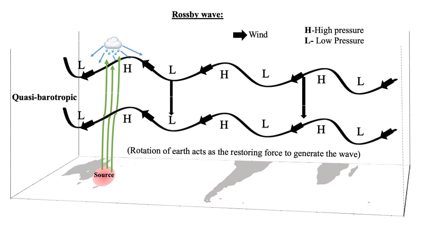
Figure 2: Illustration of the generation of the atmospheric W4 pattern. Warm SST over the SWSP force local air to rise and diverge in the upper atmosphere. This air, entrapped in the wave guide/jet, circumnavigates the entire globe, forming the atmospheric W4 pattern in the subsequent months.

The Earth has multiple jet streams – fast flowing, narrow air currents – one of which lies in the southern subtropics. It is useful to initially envision these as a closed chain of fluid parcels aligned along a latitude circle. As the disturbance (generated due to local heating) continuously propels this chain south-eastward over the SWSP region, the air current heads poleward. Earth’s rotation, however, compels the air current to return towards the equator, conserving angular momentum and hindering its poleward progress. Following this, it overshoots the normal latitude and eventually moves towards the equator. Over time, an undulation forms in the jet stream. The unbounded westerlies in the southern subtropics serve as a wave guide, allowing this signal to travel globally. Upon the disturbance’s arrival near the subtropical westerly jet, it becomes entrapped in the wave guide, circumnavigating the entire globe in subsequent months (refer to Figure 2). Consequently, an anomalous atmospheric barotropic wavenumber-4 pattern emerges by December (refer to Video 1). 

Video 1: Evolution of atmospheric W4. Composite of daily geopotential height anomaly (filled in meter) and wind anomaly (vector in m s-1) at 250 hPa during Positive years.

Hereafter, the atmosphere kicks the ocean to form a corresponding SST pattern through mechanisms involving to meridional wind-evaporation-SST and/or meridional wind-evaporation-mixed layer-SST.  

Variation in wind cause evaporative cooling to deviate from the normal values. For instance, wind can either enhance or supress evaporation, resulting in a cooler or warmer sea surface. This cooling effect, driven by wind-induced evaporation, can influence the pattern of sea surface temperatures and is known as the wind-evaporation-SST mechanism (it is essentially a mechanically driven mechanism). 

However, the meridional wind can transport warm and moist (or cool and dry) air moving from the equator (pole). This process creates humidity differences at the air-sea interface, either facilitating or suppressing evaporation. SST become Cool/warm due to more/less evaporation than usual following the meridional wind, referred to here as the meridional wind-evaporation-SST mechanism. This mechanism proves to be valuable in generating the SST-W4 pattern (see Figure 3).
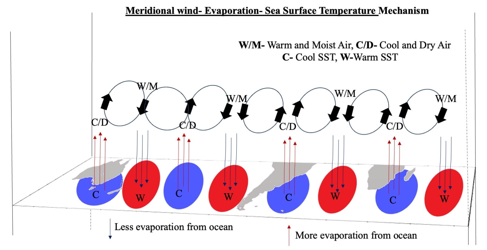
Figure 3: Illustration of the Meridional Wind-Evaporation-SST Mechanism. Sequences for understanding: (1) Air circulation – warm and moist (or cool and dry) air moving from the equator (pole). (2) Differences in humidity at the air-sea interface, either facilitating or suppressing evaporation. (3) Sea surface temperature variations due to more or less evaporation than usual.

A layer in the upper ocean with relatively homogenous values (such as temperature or density) is called a well-mixed, or more commonly, a mixed layer. It is mostly generated by winds, surface heat fluxes, or processes such as evaporation or sea ice formation, which result in an increase in salinity. Following the humidity difference at the air-sea interface, less/more evaporation suppresses/enhances mixing in the upper ocean due to lighter/heavier surface water compared to the water below (referred to as negative/positive buoyancy). Then, a constant solar energy distribution in less/more volume of upper ocean mixed water generates warm/cool sea surface temperatures (see Figure 4). 

Figure 4: Illustration of the Meridional Wind-Evaporation- Mixed Layer- SST Mechanism. Sequences for understanding: (1) Air circulation: warm and moist (cool and dry) air movement from equator (Pole). (2) Humidity difference between at the air-sea interface facilitating/suppressing evaporation. (3) less/more evaporation suppresses/enhances mixing in the upper ocean due to light/heavy surface water compared to the water below (called negative/positive buoyancy). (4) Constant solar energy distribution in less/more volume of upper ocean mixed water generates warm/cool sea surface temperature.

However, the atmosphere is unable to maintain the signal after a few months over the region. In this context, the MLD-SST feedback processes come into play, extending the duration of the pattern until April-May, because of memory of the ocean. 

Long term variability of SST-W4 pattern: 

Apart from year-to-year variation, this W4 pattern also exhibits a decadal cycle. The primary reason behind this is closely linked to the decadal variation of the South Pacific Meridional Mode (SPMM). When the SPMM decays, it leaves behind some SST signals over the South Pacific Ocean, particularly in the SWSP region, which persist for an extended period. Due to this SST anomaly over SWSP, the entire mechanism repeats, leading to the SST-W4 pattern having more positive/negative events in one decade compared to the next/previous. The decadal variation in rainfall over Southern Continents, associated with the decadal variability of the SST-W4 pattern (explained in the next section), adds an extra dimension to understanding the source of regional SST anomalies and their impact on rainfall. 

Southern Continental rainfall controlled by wavenumber-4 pattern: 

Since the SST-W4 pattern covers the globe, it potentially influences decadal rainfall variability over Southern Continents by modulating local atmospheric circulation. Anomalous SSTs near South America, Australia, and Southern Africa force the wind to move on-/offshore and converge/diverge the moisture into/out of the landmass. As a result, specific humidity changes and alters rainfall over Southern Continents on a decadal timescale. A similar process is also observed on the inter-annual timescale, impacting Australian rainfall (refer to Figure 5).  

Figure 5: Illustration of the impact of SST-W4 on Australian rainfall on an inter-annual scale. Anomalous SSTs close to Australia force the wind to move on-/offshore, converging/diverging moisture into/out of the landmass. As a result, specific humidity changes and alter the rainfall.

The atmospheric W4 pattern also significantly impacts precipitation patterns in South America and Australia through upper-level divergence, influencing descending and ascending air motions, and subsequently affecting regional rainfall. The complete story of the wavenumber-4 pattern is illustrated in Figure 6. 

Figure 6: Schematic illustration of the various mechanisms involved in the growth and decay of SST and atmospheric W4 pattern on both inter-annual and decadal time scales, along with their teleconnections to Southern Continental rainfall.

Future Perspectives:  

Given its worldwide climate influence as a new mode, there is ample room for extensive future research. The interaction of SST and atmospheric wavenumber-4 with the south Indian-Atlantic wave, mid-tropospheric semi-permanent anticyclones, Southern Annular Mode, Pacific South American Patterns, subtropical highs, marine heatwaves/cold surges are still unknown. Southern subtropical SST variability has the potential to impact both tropical and the climate of Antarctica. The role of SST and atmospheric W4 in the extra-subtropical region are open for future studies.

Further reading:  

Senapati, B., Dash, M. K., & Behera, S. K. (2021). Global wave number-4 pattern in the southern subtropical sea surface temperature. Scientific Reports, 11(1), 142. https://doi.org/10.1038/s41598-020-80492-x 

Senapati, B., Deb, P., Dash, M. K., & Behera, S. K. (2022). Origin and dynamics of global atmospheric wavenumber-4 in the Southern mid-latitude during austral summer. Climate Dynamics, 59(5–6), 1309–1322. https://doi.org/10.1007/s00382-021-06040-z 

Senapati, B., Dash, M. K., & Behera, S. K. (2022). Decadal variability of Southern subtropical SST wavenumber‐4 pattern and its impact. Geophysical Research Letters. https://doi.org/10.1029/2022GL099046

Posted in Climate | Leave a comment

Machine learning enhanced gap filling in global land surface temperature analysis

By: Dr. Shaerdan Shataer

Land Surface Temperature (LST) data, an essential component of climate change indicators (CCI), often suffers from data gaps due to various reasons such as cloud coverage, sensor limitations, or data processing issues. These gaps can hinder the accurate monitoring of the impact of climate change and environmental trends, especially its impact on human lives, vegetation, and agriculture in general.  

To address this, LST data cloud gap-filling plays a crucial role. Cloud gap-filling involves using advanced algorithms and techniques to estimate and fill in the missing LST data, ensuring a continuous and complete dataset. One of the primary methods for filling these gaps is through the use of statistical interpolation techniques, such as Kriging, also called Inverse Distance Weighting (IDW). Empirical Orthogonal Functions (EOF) is another popular method in this category, which estimate the missing data based on the spatial and temporal relationships of the available data. Another approach is the application of machine learning algorithms, which can learn from the patterns in the existing data to predict the missing values accurately. These algorithms might include neural networks, decision trees, or support vector machines, tailored to handle the specific characteristics of LST data. Additionally, satellite data from different sources or times can be merged to fill in the gaps. This method, known as data fusion, leverages the strengths of multiple datasets to create a more comprehensive and robust dataset. For instance, if one satellite fails to capture certain data due to cloud cover, data from another satellite or from a different time frame can be used to compensate for the missing information.   

The importance of cloud gap-filling in LST data for climate change indicators cannot be overstated. Accurate and complete LST datasets are vital for monitoring the Earth’s surface temperature, assessing environmental changes, and developing strategies to mitigate the impacts of climate change. By ensuring the integrity and continuity of LST data, researchers and policymakers can make more informed decisions and better understand the dynamics of our changing planet. This is particularly crucial in the context of global efforts to track climate change and its effects on ecosystems, weather patterns, and long-term environmental shifts. 

In our recent work, we have focused on addressing the challenge of cloud gap-filling for Land Surface Temperature (LST) datasets, specifically targeting three distinct areas in the United Kingdom: Reading, the Lake District, and Bristol. Our approach has been to implement and analyze two innovative methods: DINEOF (Data Interpolating Empirical Orthogonal Functions) and DINCAE (Data-Interpolating Convolutional Auto-Encoder). The DINEOF method is grounded in Singular Value Decomposition (SVD) which decomposes a given data matrix into three constituent matrices: U, Σ, and V. In this decomposition, U and V are orthogonal matrices containing the left and right singular vectors, respectively, while Σ is a diagonal matrix of singular values. The singular vectors in U and V encapsulate the spatial and temporal patterns within the dataset, respectively. Specifically, the columns of U represent the spatial patterns (EOFs), and the columns of V represent the temporal patterns. This separation of spatial and temporal components is a defining characteristic of DINEOF. 

The strength of DINEOF lies in its ability to identify and retain the most significant modes (EOFs) from the data. This selection is based on the singular values in Σ, where higher values indicate modes that capture more variance in the dataset. By focusing on these principal modes, DINEOF effectively filters out noise, leading to a regularization effect that reduces the likelihood of overfitting. This aspect is particularly beneficial in environmental datasets, where the presence of noise and the risk of overfitting are common concerns. 

Moreover, DINEOF’s iterative approach to filling missing data adds to its robustness. Starting with an initial guess for missing values, the method iteratively updates these estimates by projecting the data onto the retained EOFs and back. This iterative cycle continues until convergence, ensuring that the reconstructed data align well with the dominant spatial and temporal patterns identified by the EOFs.  

On the other hand, DINCAE leverages the power of Deep Neural Networks (DNN), specifically utilizing an autoencoder architecture, to reconstruct the missing data points. Application of DINCAE in gap filling is an example of the broader capabilities of Deep Neural Networks (DNN) in environmental data analysis. A DNN is a type of architecture, it consists of layers of interconnected nodes or ‘neurons,’ each capable of performing simple computations. By passing data through these layers and minimizing a loss function based on the last output of these layers, a DNN can learn complex patterns and relationships within the data. DINCAE uses a specific type of architecture of DNN known as convolutional autoencoder, it is trained to recognize and predict the spatial and temporal patterns in environmental data sets like SST (Sea Surface Temperature) or LST. What makes DINCAE and similar DNN models particularly effective for this task is their ability to handle the high variability and complexity often present in environmental data. Traditional methods might struggle with such variability, especially in the presence of non-linear relationships or when the data contains a significant amount of noise. DNNs, however, can adapt to these complexities, offering more nuanced and accurate gap filling. 

A schematic of DINCAE by Yan et al. (2023)

The DNN within DINCAE is trained on sections of data that are complete (this is sometimes referred to as the observation), allowing it to extract spatial and temporal patterns. The weights of the whole neural net will adjust according to the minimization of a loss function which informs the network about the goal. In the case of DINCAE, the network should maximize the Gaussian likelihood of complete data/observations, the likelihood is conditioned on the missing part. When dealing with incomplete/missing data segments, the network applies the weights associated with these learned patterns to reconstruct the missing values, a process which is more sophisticated than traditional interpolation methods. 

The efficacy of DINCAE in handling environmental data lies in its ability to adapt to the inherent variability and non-linear characteristics of these datasets. Conventional gap-filling techniques often falter in such complex scenarios, particularly when dealing with irregularities or noise. However, DNNs, with their capacity for high-dimensional data processing and pattern recognition, offer nuanced and accurate predictions, even in data-rich environments. 

The convolutional auto-encoder architecture of DINCAE is essential to its effectiveness. The convolutional layers specialize in extracting spatial features, crucial for geospatial data analysis. These layers systematically identify localized patterns within the data, which is integral for spatially coherent gap filling. The auto-encoder component of DINCAE aids in compressing the dataset into an efficient representation, highlighting essential features, and subsequently reconstructing the data with an emphasis on accuracy and detail. One notable drawback is the intensive tuning required during the training process. The effectiveness of DINCAE is contingent upon the careful calibration of numerous hyperparameters, including the number of layers, the number of neurons in each layer, learning rates, and regularization techniques. This tuning process is critical to ensure that the model accurately captures the underlying patterns in the data without overfitting or underfitting. Furthermore, training a DNN model like DINCAE demands a considerable level of expertise and understanding of machine learning principles. The complexity of these models requires a nuanced approach to training, where the data scientist must have a deep understanding of both the algorithmic intricacies of DNNs and the specific characteristics of the environmental data being analyzed. 

A significant challenge that underscores our work is the notably low data availability, a direct consequence of the unique meteorological conditions prevalent in the UK, characterized by frequent and extensive cloud cover. This scenario of extensive cloud cover presents a test bed for our methodologies, pushing the boundaries of LST data recovery in environments where traditional satellite-based monitoring faces substantial limitations.  

Applying DINCAE and DINEOF methods to data in these three distinct UK regions, our initial findings have been promising, indicating the effectiveness of both methods in producing reliable, cloud gap-filled LST datasets. However, a comparative analysis suggests that DINEOF, with its SVD-based framework, exhibits a higher degree of robustness in this context. We find that DINCAE does perform better for a short-range dataset than DINEOF, e.g., when the dataset covers one year worth of daily temperature. But this advantage is reduced and, in some cases, reversed as the range of data increases. We are currently looking into the cause of this transition.  

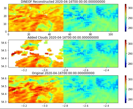
An example of LST gap infilling using DINEOF over Lake District, the reconstruction captures the general pattern of the true data effectively, with an average RMS error of less than 1 Kelvin.

Further reading:

Alvera-Azcárate, Aïda, et al. “Reconstruction of incomplete oceanographic data sets using empirical orthogonal functions: application to the Adriatic Sea surface temperature.” Ocean Modelling 9.4 (2005): 325-346. 

Barth, Alexander, et al. “DINCAE 2.0: multivariate convolutional neural network with error estimates to reconstruct sea surface temperature satellite and altimetry observations.” Geoscientific Model Development 15.5 (2022): 2183-2196. 

Beckers, J-M., Alexander Barth, and Aïda Alvera-Azcárate. “DINEOF reconstruction of clouded images including error maps–application to the Sea-Surface Temperature around Corsican Island.” Ocean Science 2.2 (2006): 183-199. 

Yan, Xiting, et al. “Application of Synthetic DINCAE–BME Spatiotemporal Interpolation Framework to Reconstruct Chlorophyll–a from Satellite Observations in the Arabian Sea.” Journal of Marine Science and Engineering 11.4 (2023): 743. 

Posted in Climate | Leave a comment

The Signal to Noise Paradox from a Cat’s Perspective

This is not the signal-to-noise paradox, this is just a tribute. 

By: Dr. Leo Saffin

The signal-to-noise paradox is a recently discovered phenomenon in forecasts on seasonal and longer timescales. The signal-to-noise paradox is when a model has good predictions despite a low signal-to-noise ratio which cannot be explained by unrealistic variability. This has important implications for long-timescale forecasts and potentially also predictions of responses to climate change. That one-line definition of the signal-to-noise paradox can seem quite confusing, but I think with the benefit of insights from more recent research, the signal-to-noise paradox is not confusing as it first seemed. I thought I would use this blog post to try to give a more intuitive understanding of the signal-to-noise paradox, and how it might arise, using a (cat) toy model. 

Seasonal forecasting is a lot like watching a cat try to grab a toy. Have a watch of this video of a cat. In the video we see someone shaking around a Nimble Amusing Object (NAO) and a cat, which we will assume is a male Spanish kitten and call him El Niño for short. El Niño tries to grab the Nimble Amusing Object and occasionally succeeds and holds it in position for a short amount of time. 

Without El Niño the cat, the Nimble Amusing Object moves about fairly randomly*, so that its average position over a window of time follows a fairly normal distribution. 

Now suppose we want to predict the average (horizontal) position of the Nimble Amusing Object in a following video. This is analogous to seasonal forecasting where we have no skill. The best we can do in this case is to say that the average position of the Nimble Amusing Object will be taken from this probability distribution (its climatology). 

This is in contrast to more typical shorter range forecasting where some knowledge of the initial conditions, e.g. the position and movement of the Nimble Amusing Object, might allow us to predict the position a short time into the future. Here, we are looking further forward, so the initial conditions of the Nimble Amusing Object gives us little to no idea what will happen. 

So, how do we get any predictability in seasonal forecasting? Let’s bring back El Niño. We know that El Niño the cat likes to grab the Nimble Amusing Object, putting its average position more often to the left. This would then affect the probability distribution. 

Now we have a source of skill in our seasonal forecasts. If we were to know ahead of time whether El Niño will be present in the next video or not, we have some knowledge about which average positions are more likely. Note that the probabilities still cover the same range. El Niño can pull or hold the Nimble Amusing Object to the left but can’t take it further than it would normally go. Similarly, El Niño might just not grab the Nimble Amusing Object meaning that the average position could still be to the right, it’s just less likely. 

To complete the analogy, let’s assume there is also a female Spanish kitten, La Niña, and she likes to grab the Nimble Amusing Object from the opposite side, putting its average position more often to the right. Also, when La Niña turns up, she scares away El Niño, so there is at most one cat present for any video. We can call this phenomenon El Niño Scared Off (ENSO). 

For the sake of the analogy, we will assume that La Niña has an equal and opposite impact on the position of the Nimble Amusing Object (to the limits of my drawing skills). 

Now, let’s imagine what some observations would look like. I’ve randomly generated average positions by drawing from three different probability distributions (similar to the schematics). One for El Niño, one for La Niña, and one for neither. For the sake of not taking up the whole screen, I have only shown a small number of points, but I have more points not shown to get robust statistics. Each circle is an observation of average position coloured to emphasise if El Niño or La Niña is present. 

Average Position

As expected, when El Niño is present the average position tends to be to the left and when La Niña is present the average position tends to be to the right. Now, let’s visualise it would look like if we tried to predict the position. 

Average Position

Here, the small black dots are ensemble forecasts and the larger dot shows the ensemble mean for each prediction. Here, the forecasts are drawn from the same distributions as the observations, so this essentially shows us the situation if we had a perfect model. Notice that there is still a large spread in the predictions showing us that there is a large uncertainty in the average position, even with a perfect model. 

The spread of the ensemble members shows the uncertainty. The ensemble mean shows the predictable signal: it shows that the distributions shift left for El Niño, right for La Niña, and are centred when no cat is present, although this isn’t perfect due to the finite number of ensemble members. 

The model signal-to-noise ratio is the variability of the predictable signal (the standard deviation of the ensemble mean) divided by uncertainty (given by the average standard deviation of the ensemble members). The model skill is measured as the correlation between the ensemble mean (predictable signal) and observations. In this perfect model example, the model skill is equal to the model signal to noise ratio (with enough observations**). 

The signal-to-noise paradox is when the model has good predictions despite a low signal-to-noise ratio which cannot be explained by unrealistic variability. So how do we get a situation where the model skill (correlation between ensemble members and observations) is better than the expected predictability (the model signal-to-noise ratio***).  Let’s introduce some model error. Suppose we have a Nimble Amusing Object, but it is too smooth and difficult for the cats to grab. 

This too-smooth Nimble Amusing Object means that El Niño and La Niña have a weaker impact on its average position in our model. 

Importantly, there is still some impact, but too weak, and we still know ahead of time whether El Niño or La Niña will be there. Repeating our forecasts using our model with a smooth Nimble Amusing Object gives the following picture. 

Average Position

What has changed is that the ensemble distribution shifts less strongly to the left and right for El Niño and La Niña resulting in less variability in the ensemble mean. However, the ensemble mean of each prediction is still shifting in the correct direction which means the correlation between the ensemble mean and the observations is still the same****. The total variability of the ensemble members also hasn’t changed, so the model signal-to-noise ratio has reduced because the only thing that has changed is the reduction in the variability of the ensemble mean. 

The second part of the signal-to-noise paradox is that this low model signal-to-noise ratio cannot be explained by unrealistic variability. We could have lowered the model signal-to-noise ratio by increasing the ensemble spread, but we would have noticed unrealistic variability in the model, which is not seen in the signal-to-noise paradox. For the example shown here, the variability of the ensemble members is equal to the variability of the observations. 

So there you have it. A signal-to-noise paradox, a model with good predictions despite a low signal-to-noise ratio which cannot be explained by unrealistic variability, in a fairly simple setting. This does bear some resemblance to the real signal-to-noise paradox. The signal-to-noise paradox was first seen from identifying skill in long-range forecasts of the North Atlantic Oscillation which is a measure of large-scale variability in weather patterns over the North Atlantic. It has also been shown that the El Niño Southern Oscillation, a pattern of variability in tropical sea-surface temperatures, has an impact of the North Atlantic Oscillation that is too weak in models. However, there are many other important processes that have been linked to the signal-to-noise paradox. 

This model is very idealised. The impacts of the two cats were opposite but also in a very specific way that the overall impact of the cats did not affect the climatological probabilities*****. This is very idealised and not true of reality or even the schematics I have drawn. From the schematics I have drawn you can imagine that the net effect of the cats is to broaden the probability distribution so it is more likely to have an average position further from zero and that the weak model does not broaden this distribution enough. 

In this situation we should see that the model distribution and the observed distribution are different, but this is not the case for the signal-to-noise paradox. There are a few possible reasons this would still be consistent. 

  1. Model tuning – We noticed that our NAO was not moving around enough so put it on a longer string to compensate 
  2. Limited data – The changes are subtle and we need to spend more time watching cats to see a significant difference 
  3. Complexity – In reality there are lots of cats that like to grab the Nimble Amusing Object in various different ways. These cats also interact with each other

To summarise, I would say the important components from this cat-toy model to having a signal-to-noise paradox are that: 

  1. There is some “external” source of predictability – the cats 
  2. This source of predictability modifies the thing we want to predict (the Nimble Amusing Object) in a way that does not dramatically alter its climatology 
  3. Our model captures this interaction, but only weakly (the overly-smooth Nimble Amusing Object)  

Footnotes:

*assuming the human would just shake around this toy in the absence of a cat 

**In the situation shown, when extended to 30 observations, the signal-noise-ratio (0.46) is actually slightly larger than the correlation between the ensemble mean and the observations (0.40) because the limited number of ensemble members leads to an overestimation in the variability of the ensemble mean, and therefore an overestimation of the signal-to-noise ratio. 

***The ratio of these two quantities is known as the “Ratio of Predictable Components” (RPC) (Eade et al., 2014) and an RPC > 1 is often seen as the starting point in identifying the signal-to-noise paradox. 

****The correlation is actually larger (0.45) for the sample I ran, but that’s just due to random chance. 

*****I used skewed Gaussian distributions to generate the observations and model predictions. The average of the two skewed Gaussian distributions results in the original unskewed Gaussian distribution. 

Posted in Climate | Leave a comment

The Carbon Footprint of Climate Science – an opinion by Hilary Weller 

By: Hillary Weller

What is the acceptable carbon footprint of climate science? Climate science cannot be done without a carbon footprint, and without climate science we would not know that burning fossil fuels is causing dangerous climate change. So without climate science, the world would burn its way to a largely uninhabitable planet. So surely the carbon footprint of climate science is worth it? I claim the following: 

  1. To make accurate predictions, we need supercomputers that have a carbon footprint equivalent to around 10,000 houses. 
  2. To improve climate predictions, we need to run variations of experimental models on supercomputers.  
  3. To do the best climate science, we must communicate internationally, and communication is best face to face. 
  4. To make progress, early career scientists need to travel widely gain knowledge of the internationally leading edge of science, gain a reputation and to develop a network of collaborators. 

Here comes the “but” … 

But, if the purpose of climate science is to predict the outcomes of a range of emissions scenarios and to inform the policy that will eradicate CO2 emissions, then surely we must do this with a reduced footprint. We are moving in the right direction – taking the train to European meetings, reducing attendance at meetings that require long haul flights and making use of regional hubs so that international meetings can be held on multiple continents simultaneously. But I argue that we must move faster. I believe that climate scientists should lead the way in low emission science. Our communication may be stilted and inefficient as a consequence, and this may slow the progress of our careers and of the science itself. But the cost is too high to keep travelling. I do not believe that we should be telling early career scientists to take long haul flights for the sake of their careers and for the advancement of science. Instead, we should be asking them how we can communicate more sustainably. My son (aged 11) had an active online social life during lockdown. I cannot picture being able to communicate in a relaxed, friendly, casual and productive way online, with chance meetings over a poster and derivations on a napkin at dinner leading to fruitful collaborations. But we need to learn how to do this with the next generation rather than insisting that long haul flights are needed for the widest possible communication of science. 

Back to the supercomputers. A carbon footprint similar to 10,000 houses seems reasonable for making weather predictions that enable the world to make more carbon efficient choices, saving far more than the initial outlay. (The 10,000 houses comparison was based on some quick web search) But there are supercomputers doing research simulations that may never have an impact. Without the research we cannot have the operational weather predictions which are so beneficial. But there doesn’t seem to be much restraint on research computing. Perhaps research grant proposals in all fields should have to estimate and justify their carbon footprint as well as their expenditure. 

This blog has been political rather than a science notebook which is the expectation. So a little now about the science that I do. I do not have high profile or a high impact career. I do, I think, some interesting and novel research that has the potential to improve weather and climate models. I have been doing some work recently about how to take long time steps without leading to spurious oscillations by using implicit time stepping for advection. This is far cheaper than previously thought and does not have much impact on accuracy. If you can increase time steps then you can reach a solution more quickly, using less computer power.  

Cite: “Adaptively implicit MPDATA advection for arbitrary Courant numbers and meshes”. Hilary Weller, James Woodfield, Christian Kühnlein, Piotr K. Smolarkiewicz, 2022. https://doi.org/10.1002/qj.4411 

I have also done some work on convection parameterisation – a method of representing clouds and precipitation without high spatial resolution. This is old fashioned. More recently, high resolution simulations with fewer parameterisations have led to more realistic simulations. But if we can make parameterisations more realistic, then we can reduce the need for high resolution simulations that need the biggest supercomputers. My work has been more mathematically interesting than impactful (so far). But I would love to see more work on parameterisation to enable realistic simulations at lower resolution and hence smaller footprint. 

Cite, eg: “Two-fluid single-column modelling of Rayleigh–Bénard convection as a step towards multi-fluid modelling of atmospheric convection”. Daniel Shipley, Hilary Weller, Peter A. Clark, William A. McIntyre, 2021. https://doi.org/10.1002/qj.4209 

Comments from Colleagues 

Pier Luigi Vidale 5/7/23: “We heard from the CEO of NVIDIA this morning. On their new Grace-Hopper based supercomputer, they can run ICON at 2.5km globally for short time scales, and the energy cost of the run, compared to a traditional multicore supercomputer, is 1/250. He claims that this is just the start, and a bit more can be done, but I think that it is already quite impressive. 

Grace-Hopper combines an ARM-type multicore CPU with a modern NVIDIA GPU, with nearly zero latency in terms of IO and memory access.” 

Thorwald Stein 3/7/23: Your two publications hint at ways to reduce the supercomputer carbon footprint in the future. To provide a positive message for ECRs [early career researchers], I wonder if you could include examples of a future for conferencing, too. One of the best conference interactions I ever had was at a video call initiated through Gather.Town and I’m sad that I’ve not seen that platform used much since. My worst conference was “hybrid” where I stayed up at home until midnight to present my poster, but it was scheduled at lunch time for all in-person attendants sad Seeing virtual conferences as the future rather than a temporary necessity for 2020-2022 requires a major culture shift. Taking it to the extreme, if humanity is ever going to colonise space, video conferencing is here to stay: https://tldv.io/blog/hybrid-remote-meetings-in-pop-culture/  

Hilary Weller 4/7/23: I like online meetings when there is unmoderated chat so that lots of discussion about talks goes on during the talks. The best online meeting I went to was PDEs on the sphere in 2021 when we had an open Google doc that we all wrote in, discussing the talks. There were also nice break out rooms where we could catch up with old friends and one person there made sure that everyone introduced themselves. We probably need more online ice-breaker events. I agree, gather.town and tools like that could be used more. But I think they need to be part of the timetabled day and with posters rather than just evening socialising, when you really want to get away from your computer. I also think that scientists should use online discussion groups more, such as with Slack. 

Anon 3/7/23 commented on Hilary’s statement “climate scientists should lead the way in low emission science”: This is a good point. Some people conflate “environmental scientists” with “environmentalists” which I find odd. Do we have a greater moral responsibility than those outside our field? 

Anon 3/7/23: Covid forced us to investigate better ways to ‘mingle’ online. I don’t think we’re anywhere near there, but it has to be the goal. The next generation, surely, will think nothing of working closely with others in a globally distributed community. Furthermore, I think science is due for a change in culture. I’ve never been a fan of the cult of the individual superstar, probably because I’m not one, but also because so much of today’s science isn’t about one person sitting in a lab or office coming up with a revolutionary idea. Look at e.g. CERN; in our case, no individual can claim to have generated a climate simulation, but if one or two say something profound about one in Nature, they are lauded as great scientific leaders. We left the Enlightenment a while ago. 

Anon 3/7/23 commented on the statement about supercomputers .. “for making weather predictions that enable the world to make more carbon efficient choices”: Of course, this isn’t the main purpose of NWP, with a few exceptions (one of which is routing long-haul flights …)) 

Hilary Weller 6/7/23: There are loads of examples, mostly because saving fuel saves money. Using renewable energy efficiently needs accurate weather forecasts, ships are routed to sail downwind, people walk or cycle to work based on the forecast, gas tankers are sent to regions that are going to be experiencing cold, calm winter conditions, supermarkets reduce foot waste by providing the food we want for a summer barbecue. 

Anon 3/7/23: I agree, many modelling centres are working on best practice guidelines. And CMIP7 preparations include environmental considerations. But it is true that models are also getting costlier, outputting more data. 

Anon 3/7/23: I have a discomfort when it is stated that supercomputers are using 100% renewable energy, which is a possible retort to the points here. My discomfort is that that renewable energy could be used for something else. Perhaps the debate has moved on over this, but I don’t know how this gets factored into discussions on renewable use.  

Anon 3/7/23: There is huge practical constraint on research computing. For example, we do not do a fraction of the hindcasting/re-forecasting we really should do to characterize our models. Whether all the CPU used is justified is certainly questionable, but it is the nature of research not to know the outcome beforehand. We could always make good use of more! But surely the issue here is about source of energy as well as amount. We have made progress in being able to locate supercomputers remotely from users, and energy use is already a major constraint, but should it be higher? 

Liz Stephens 3/7/23: In a recent call with the funder of our new grant they put to us (informally) that we should be aware of the carbon footprint of our experiments when running them, and make sure that they are all useful/necessary. 

Richard Allan 3/7/23: In terms of the IPCC work (which certainly does have impact on climate policy) although initial in person meetings (involving long haul flights) are I think essential in building the relationships necessary to collaborate and in ensuring diversity in contribution from scientists across the world, the pandemic showed that we can work effectively online, including in agreeing the summary for policy makers line by line with hundreds of government representatives.  

Anon 3/7/23 commented on my research on time stepping: “So your impact, potentially, is to substantially reduce the footprint of climate models and/or improve their accuracy.” 

Hilary: Thanks. Yes, I can have an impact if I can persuade other model developers to adopt the approach and if the approach proves useful in more practical settings. 

Pier Luigi Vidale 18/10/23: A couple of comments and clarifications. The first one is: what is the benefit of such HPC simulations for society? 

In other domains, e.g. medicine, material science, fundamental physics, the typical project is currently using far more HPC than weather and climate applications, yet no such questions about the carbon footprint are asked, mostly because it means that in those domains they can give up most of the lab experimentation, with enormous savings (often also with far more ethical protocols, when life is involved) and incredible speedups in developing new medicines, therapies, vaccines, materials, engines for cars and airplanes, etc.. In our domain we do not have a physical lab, and we are right to be asking whether we are consistent when we say that people should reduce their CO2 footprint, but we must also consider what the benefits of our simulations are. 

In most European grants, both for science and for HPC, we must always demonstrate what the societal benefit is. 

In PRIMAVERA we did use a substantial amount of supercomputing, but: 

  1. a) it was more efficient to run 8 GCMs at 25km, versus running a large number of regional models, at the same resolution, albeit without even covering the entire planet. Many groups worldwide run such downscaling experiments, and there is a lot of needless replication. But they are under the radar, because they do not use one large facility.
  2. b) the global capability in PRIMAVERA meant that industries such as the energy industry and the water industry were involved, and work we did with those industries means that they have a much clearer and more applicable estimate of their global risks and opportunities, as well as new data that they can use to manage their business (e.g. for trading renewable energy across the whole of Europe)
  3. c) PRIMAVERA outputs were widely used by the entire international community, still are (actually my 2012 UPSCALE data are still in use for publication to this date), and PRIMAVERA papers were cited 150 times in the IPCC report

In the current projects, NextGEMS and EERIE, we are working with energy (particularly solar in NextGEMS), fisheries, transportation, again to help society improve the way that resources are used. So yes, using supercomputers has a CO2 footprint, but if it helps reduce other footprints generated by other human activities, there is potential to compensate. This should be researched further. 

Before we go to NVIDIA and GraceHopper, important advances in software engineering over the last 15 years have meant that many groups can now use GPUs for their weather and climate simulations. In the COSMO consortium (Austria, Germany, Italy, Switzerland) this has reduced the energy footprint of the models to 30% of the original. ICON, the current weather and climate model used in Germany and Switzerland, has the same capabilities, and is starting to run on LUMI, which is a hybrid machine, with many GPUs. The IFS is undergoing the same technological changes, and so is NEMO. Using 1/3 of the electrical power is perhaps not going to make a substantial difference, but in terms of investments in software it was just the start, and many believe that it is possible to improve this. NVIDIA is helping the ICON developers far more, now that ICON has been ported to hybrid architectures. 

In Euro-HPC we are discussing charging research groups for the KWh, not for the core hours, so that it is up to them to become more efficient if they want to run long simulations or large ensembles. Also, for the UK, do remember that Archer and Archer2 are run entirely on renewable energy. LUMI, one of the three European exascale machines, located in Finland, promises to do something very similar. 

Posted in Climate | Leave a comment

Modelling city structure for improved urban representations in weather and climate models

By: Meg Stretton

Urban areas are home to an increasingly large proportion of the world’s population, with more people living in cities than rural areas since 2007. These large population densities mean more people are vulnerable to extreme weather events, including heatwaves, which may become more common with climate change (UK and Global extreme events – Heatwaves – Met Office). 

Extreme heatwaves may be worsened by air temperature differences between cities and their rural surroundings, known as the urban heat island (UHI) effect (MetLink – Royal Meteorological Society Urban Heat Islands). This urban-rural contrast is a result of city diversity, including increased pervious surfaces, reflective materials, and deep canyon structures that trap heat close to the surface. These can all increase local temperatures and influence people’s thermal comfort. 

It is a challenge to represent these effects in models as city geometry is so complicated. Additionally, the low resolution of numerical weather prediction (NWP) models makes it impossible to simulate individual buildings and streets. So, we make simplifications, with one common approach assuming that streets are infinitely long and of a constant width, with equal-height buildings – an ‘infinite street canyon’. Although this could be a good assumption for suburbs, it may not be representative of the complex structure of larger cities. 

Our work focuses on urban radiation, as the amount of the sun’s energy a surface absorbs and reflects controls the other urban processes. To accurately simulate urban areas and their exchanges we need information about their structure, but there is a lack of global data on urban morphology. Additionally, we need more computationally efficient ways of describing urban energy exchanges in models. Recent model developments are moving towards multi-layer urban canopy descriptions, allowing realistic effects i.e., shadowing of short buildings by taller ones. One example for urban radiation is ‘SPARTACUS-Surface’ (GitHub – ecmwf/spartacus-surface: Radiative transfer in forests and cities) which requires profiles of building cover and wall area with height. 

The main errors that arise when modelling urban radiation are from: the radiation scheme itself; determining the city morphology from a few parameters; and knowing the exact urban parameters for each city. Previously, our work quantified the first for solar radiation (Evaluation of the SPARTACUS-Urban Radiation Model for Vertically Resolved Shortwave Radiation in Urban Areas | SpringerLink). Our new paper aimed to quantify the second (Characterising the vertical structure of buildings in cities for use in atmospheric models – ScienceDirect). 

To achieve this, we identified and parameterised urban morphology profiles, with a focus on those needed for SPARTACUS-Surface – through determination of coefficients and methods that hold for multiple countries worldwide, covering the range of urban variability both between and within cities. We studied the morphology of six cities worldwide using building height data at a 2 km × 2 km resolution: Auckland (New Zealand), Berlin (Germany), Birmingham (UK), London (UK), New York City (USA), and Sao Paulo (Brazil). The main parameters we used in the work were the cover of buildings at the surface, the mean building height, and the wall area. 

Urban morphology parameters derived at 2 km × 2 km resolution for six cities (Adapted from Stretton et al. 2023)

The parameterisations developed have different complexity levels, with decreasing input data requirements, allowing us to identify which level of data is required before a difference in the results. To parameterise the building cover with height, we use the mean building height and the surface building cover. The profiles of building wall area are parameterised using an ‘effective building diameter’. This assumes that the building cover and building wall area are proportional to each other, describing the width of buildings at each height if they were identical cubes or cylinders. We find that this can be roughly assumed to be 20 m across all cities.

The impact of the relations for city structure that we developed had on the radiation fluxes were tested using SPARTACUS-Surface, focusing on the top of canopy albedo, and the absorbed radiation. The study revealed that we can determine the vertical structure of any urban area assuming we know three simple characteristics (surface building cover, mean building height, and an effective building diameter of 20 m), with errors for albedo up to 10%. This is improved to 2% when using a better effective building diameter, calculated from the exact wall area.

This work shows that there are skillful and efficient ways to characterize cities for computationally expensive NWP models. These findings are even more useful and applicable as we move to the next-generation of models that resolve the vertical structure of cities. Also, this work reflects the need for large-scale datasets to communicate the variability of cities form and materials, which are required for these parameterisation approaches. Particularly here, we show the need for datasets of building cover and mean building height.

References:

Harman, M. J. Best, and S. E. Belcher, 2004: Radiative exchange in an urban street canyon. Boundary-Layer Meteorol., 110, 301–316, https://doi.org/10.1023/A:1026029822517.

Heaviside, C., H. Macintyre, and S. Vardoulakis, 2017: The Urban Heat Island: Implications for Health in a Changing Environment. Curr. Environ. Heal. reports, 4, https://doi.org/10.1007/s40572-017-0150-3.

Hogan, R. J., 2019a: Flexible Treatment of Radiative Transfer in Complex Urban Canopies for Use in Weather and Climate Models. Boundary-Layer Meteorol., https://doi.org/10.1007/s10546-019-00457-0.

Hogan, R. J., 2021: spartacus-surface. GitHub Repos.,.

Lindberg, F., and C. S. B. B. Grimmond, 2011b: Nature of vegetation and building morphology characteristics across a city: Influence on shadow patterns and mean radiant temperatures in London. Urban Ecosyst., 14, 617–634, https://doi.org/10.1007/s11252-011-0184-5.

Mccarthy, M. P., M. J. Best, and R. A. Betts, 2010: Climate change in cities due to global warming and urban effects. Geophys. Res. Lett., https://doi.org/10.1029/2010GL042845.

Meehl, G. A., and C. Tebaldi, 2004: More intense, more frequent, and longer lasting heat waves in the 21st century. Science, 305, 994–997, https://doi.org/10.1126/SCIENCE.1098704.

Oke, T. R., G. Mills, A. Christen, and J. A. Voogt, 2017: Urban climates.

Stretton, M. A., W. Morrison, R. J. Hogan, and S. Grimmond, 2022: Characterising the vertical structure of buildings in cities for use in atmospheric models. Urban Climate, https://doi.org/10.1016/j.uclim.2023.101560.

Stretton, M. A., R. J. Hogan, S. Grimmond, and W. Morrison, 2023: Evaluation of the SPARTACUS-Urban Radiation Model for Vertically Resolved Shortwave Radiation in Urban Areas. Boundary-Layer Meteorol., 184, 301–331, https://doi.org/10.1007/s10546-022-00706-9.

Yang, X., and Y. Li, 2015: The impact of building density and building height heterogeneity on 257 average urban albedo and street surface temperature. Build. Environ., 90, 146–156.


Posted in Climate modelling, Urban meteorology | Leave a comment

Rapid developing, severe droughts will become more common over the 21st Century

By: Emily Black

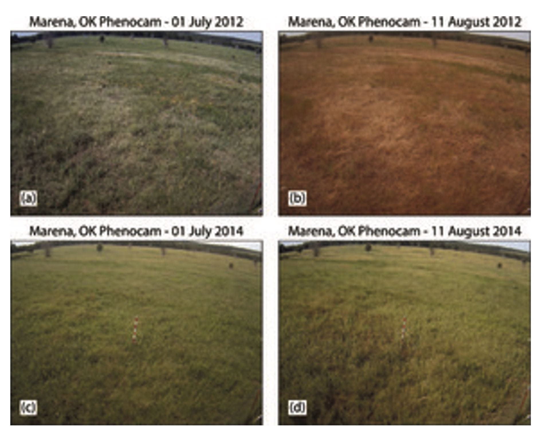
At the height of the 2012 corn growing season, two thirds of the United States was hit by a sudden drought. The photographs below compare 2012 to a normal year:  

Phenocam images taken at MOISST, which is adjacent to the Marena mesonet station, on (a) 1 Jul 2012, (b) 11 Aug 2012, (c) 1 Jul 2014, and (d) 11 Aug 2014. All images were taken at 10:30 local time. Otkin et al. 2018 https://journals.ametsoc.org/view/journals/bams/99/5/bams-d-17-0149.1.xml

Earlier this year, a similarly sudden drought dried out grasslands in Hawaii, contributing to the wildfires that devastated Maui.

There is a mounting body of evidence indicating that such ‘flash droughts’ are becoming more frequent and intense due to climate change, as discussed in this study. Consequently, understanding the factors driving flash droughts in current and future climates has become an increasingly urgent concern. 

Recent research conducted at the University of Reading and the National Centre for Atmospheric Science has shed light on this issue. The findings show that flash droughts are consistently preceded by anomalously low relative humidity and precipitation. Interestingly, the study suggests that heat waves do not cause flash droughts, although flash droughts can cause heat waves. 

Over the next century, flash droughts are projected to become more common globally. The plot below shows the percentage change in flash drought occurrence compared to 1960-2100, under a range of shared socioeconomic pathways: 

The most severe changes are projected in Europe, the continental US, eastern Brazil and southern Africa: 

To find out more, have a look at my paper in Advances in Atmospheric Science: http://www.iapjournals.ac.cn/aas/en/article/doi/10.1007/s00376-023-2366-5 

Posted in Climate, Climate change | Leave a comment

More severe wet and dry extremes as rapid warming of climate continues

By: Professor Richard Allan

The UK weather has recently been characterised by large swings between wet and dry periods and with record heat this June and September. Globally, this September was the warmest on record and 2023 is set to be the warmest year on record and will be remembered for the hot, wet and dry weather extremes including also severe wildfires. And as the climate continues to warm, the extremes of wet and dry will further intensify.

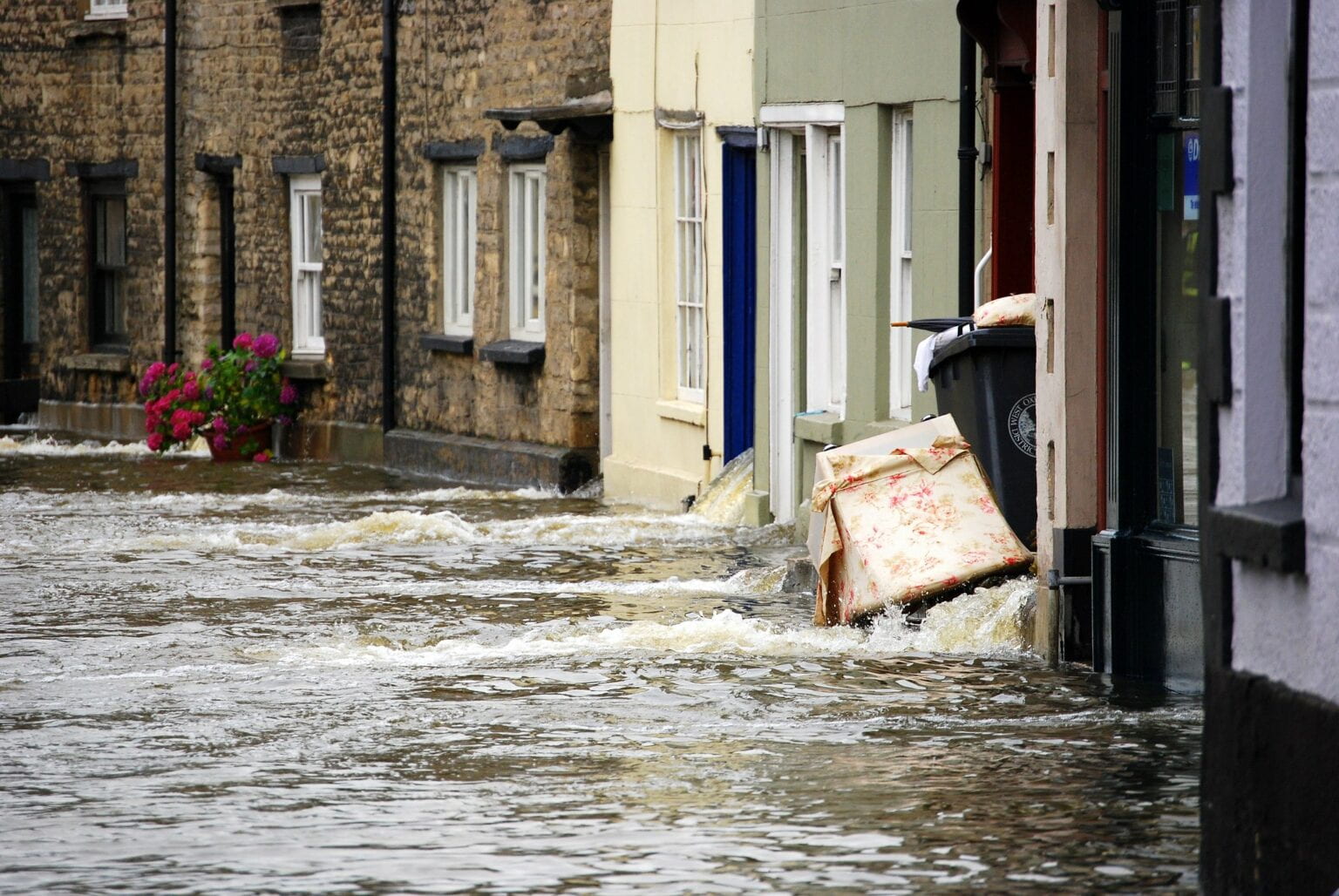
Flooding on a street in Whitley; Image via dachalan on Flickr (CC BY-NC-SA 2.0).

Image via dachalan on Flickr (CC BY-NC-SA 2.0 – https://creativecommons.org/licenses/by-nc-sa/2.0/).

In new research published in Environmental Research Letters, satellite and ground-based data are combined with simulations since the 1950s to show that the range between the wettest and driest time of the year is growing as the climate warms.

This work looks in detail at the difference between the amount of water arriving at the surface from precipitation such as rain and snow and the amount leaving due to evaporation. This is important in affecting how much water people and plants can use. If there is too much building up, flooding can occur but when there is a lack of rain, the soils can dry and eventually lead to drought conditions.

The new analysis finds that the global water cycle is becoming more intense. Wet times of the year, when precipitation is much more than evaporation, are becoming even wetter, but periods of drying, when evaporation can be larger than precipitation, are also becoming more intense.

For every degree Celsius of global warming, the difference between precipitation and evaporation in the wettest and driest times of the years is becoming larger by about 3 or 4 percent. This means there is a larger contrast between wet and dry spells.

In some regions such as northern North America and northern Eurasia, the contrast between wet and dry is expected to increase more than 20% by the end of this century (see diagram).

A world map diagram which shows increasing range between the wettest and driest time of the year by the end of the twenty-first century, in percent. The contrasts between wet and dry times of the year increases by more than 20% in some regions.

This is important since it means that ensuring a reliable availability of fresh water becomes an increasing challenge but also because the most damaging wet and dry seasons in a year will become more dangerous.

Patterns of future change are also found to resemble present day trends, which adds to evidence for a more variable and extreme water cycle as the climate continues to warm.

It may seem strange that we could get more extreme dry and more extreme wet spells as the climate warms, but this is possible because a warmer atmosphere is a thirstier atmosphere – it can more effectively sap the soil of its moisture in one region and dump this extra water as heavy rainfall in storms and monsoons, increasing the contrast in weather between regions and between different times of the year.

This increasing contrast can lead to severe consequences, such as more intense flooding during wet periods and more rapidly developing droughts as dry spells take hold.

Rapid swings between drought and severe flooding are known to be particularly difficult for countries to deal with. Recent research published in Advances in Atmospheric Sciences by Professor Emily Black has shown that the frequency of “flash” droughts are projected to more than double in many regions over the twenty-first century. These types of rapidly developing droughts can damage crops and will likely become more frequent in parts of the world including South America, Europe, and southern Africa.

As our greenhouse gas emissions continue to heat the planet, there will be greater swings between drought and deluge conditions that will become more severe over time.

We have already seen severe flooding in Japan, China, South Korea and India in 2023, which has caused deaths, damage and power cuts.

It is only with rapid and massive cuts in greenhouse gas emissions that we can limit warming and the increasing severity of wet and dry spells. Understanding these changes is vital for planning and managing our water resources, as well as improving predictions of how the water cycle will evolve in a warming world.

Richard Allan is Professor of Climate Science at the University of Reading.

Posted in Climate, Climate change | Leave a comment

“…since records began” – Christopher Wren’s first automatic weather station

We restart the weekly blog with a contribution from Professor Giles Harrison. With the blog being down over the summer, Giles‘ contribution was posted on Professor Maarten Ambaum’s excellent blog, where we direct readers until regular service resumes next week.

https://readingphysics19265874.wordpress.com/2023/07/28/since-records-began-christopher-wrens-first-automatic-weather-station/

The tercentenary of Wren’s death this year is being marked with a series of events, including an exhibition on his ideas about Sign Language, Beehives, Anaesthesia, Astronomy, Microscopy, Urban Design, Sheltered Living and Weather Recording, at the Old Royal Naval College at Greenwich. The exhibition continues until 12 Nov 2023, https://ornc.org/whats-on/christopher-wren-what-legacy-now/

Posted in Climate | Leave a comment

How to improve a climate model: a 24-year journey from observing melt ponds to their inclusion in climate simulations

By: David Schroeder

Melt ponds are puddles of water that form on top of sea ice when the snow and ice melts (see Figure). Not all the water drains immediately into the ocean, but it can stay and accumulate on top of the sea ice for several weeks or months (Ref: https://blogs.reading.ac.uk/weather-and-climate-at-reading/2017/melt-ponds-over-arctic-sea-ice/

Figure: Melt ponds on sea ice (Credit: Don Perovich)

A momentous field campaign was carried out in 1998 on the Arctic sea ice: the Surface Heat Budget of the Arctic Ocean (SHEBA) experiment (https://www.nsf.gov/pubs/2003/nsf03048/nsf03048_3.pdf) – a role model for the latest and largest Arctic expedition MOSAIC in 2019/2020 (https://mosaic-expedition.org/expedition/). One aim was to understand and quantify the sea ice-albedo feedback mechanism on scales ranging from meters to thousands of kilometers. The differences in albedo (fraction of shortwave radiation reflected at the surface and, thus, not used to heat the surface) between snow-covered sea ice (~85%), bare sea ice (~60-70%), ponded sea ice (~30%) and open water (<10%) are huge and cause the most important feedback for sea ice melt: The more and the earlier snow and ice melts, the larger the pond and open water fraction, the more shortwave radiation will be absorbed increasing the melting. Melt ponds play an important part in the observed reduction and thinning of Arctic sea ice during last decades.

Continuous SHEBA measurements over the whole melt season in 1998 allowed the development of models representing the melting cycle: from the onset of melt pond formation, spreading, evolution and drainage over late spring and summer, towards freeze-up in the late summer and autumn. Starting with a one-dimensional heat balance model (Taylor and Feltham, 2004), it took about 10 years to develop a pond model suitable for a Global Climate Model (GCM) (Flocco et al., 2010; 2012). Melt pond formation is controlled by small-scale sea ice topography. This is not available in a GCM with coarser resolution. However, we could use the sub-gridscale ice thickness distribution (5 different ice thickness categories for each grid cell) as a proxy for topography and simulate the evolution of pond fraction assuming melt water runs from the thicker ice to the thinner ice. With further adjustments to the albedo scheme (Ridley et al., 2018), the pond model could finally be used in the UK Climate Model HadGEM3. The HadGEM3 simulations for the latest IPPC report (https://www.ipcc.ch/report/ar6/wg2/) include our pond model.

What is the impact of the melt pond model on the performance of the HadGEM3 simulations? It is noteworthy that HadGEM3  has a stronger climate sensitivity (global warming with respect to CO2 increase) compared to its predecessor HadGEM2  or most other climate models (Mehl et al., 2020). But is this due to the melt ponds? Lots of model components were changed at the same time, so it is impossible to specify the individual impact. To address this, Diamond et al. (2023) carried out HadGEM3 simulations with 3 configurations which only differ with respect to melt pond treatment (our pond scheme, simple albedo tuning to account for the impact of melt ponds and no melt ponds). Historical or future projections would require an ensemble simulation to distinguish between internal variability and impact of pond scheme. Thus, 100 year long constant forcing simulations have been chosen.

While Arctic sea ice results between the simple albedo tuning and our full pond scheme do not differ significantly for pre-industrial conditions, the impact on near future conditions are remarkable: The simple tuning never yields an ice-free summer Arctic, whilst our pond scheme yields an ice-free Arctic 35% of years and raises autumn Arctic air temperatures by 5 to 8 °C.  Thus, the pond treatment has a large impact on projections when the Arctic will become ice-free. This is a striking example of the impact

References:

Diamond, R., Schroeder, D., Sime, L.C., Ridley, J., and Feltham, D.L.: Do melt ponds matter? The importance of sea-ice parametrisation during three different climate periods. J. of Climate, under review.

Flocco, D., D. L. Feltham, and A. K. Turner, 2010: Incorporation of a physically based melt pond scheme into the sea ice component of a climate model. Journal of Geophysical Research: Oceans, 115 (C8).

Flocco, D., D. Schroeder, D. L. Feltham, and E. C. Hunke, 2012: Impact of melt ponds on arctic sea ice simulations from 1990 to 2007. Journal of Geophysical Research: Oceans, 117 (C9).

Mehl, G. A., C. A. Senior, V. Eyring, G. Flato, J.-F. Lamarque, R. J. Stouffer, K. E. Taylor, and M. Schlund, 2020: Context for interpreting equilibrium climate sensitivity and transient climate response from the cmip6 earth system models. Science Advances, 6 (26).

Ridley, J. K., E. W. Blockley, A. B. Keen, J. G. Rae, A. E. West, and D. Schroeder, 2018b: The sea ice model component of hadgem3-gc3. 1. Geoscientific Model Development, 11 (2), 713–723.

Taylor, P., and D. Feltham, 2004: A model of melt pond evolution on sea ice. Journal of Geophysical Research: Oceans, 109 (C12).

Posted in Arctic, Climate modelling, Cryosphere, IPCC, Numerical modelling, Polar | Leave a comment

Cycling In All Weathers

By: David Brayshaw

In a few weeks’ time, I’ll be taking some time off for an adventure: spending 3-weeks cycling the entire 3,400 km of this year’s Tour de France (TdF) route.  I’ll be with a team riding just a few days ahead of the professional race, aiming to raise £1M for charity.  Although this is a purely personal challenge – unrelated to my day job here in the department – being asked to write this blog set me thinking about the connections between cycling and my own research in weather and climate science.

Weather is obviously important to anyone cycling outdoors: be it extremes of rain, wind or temperature.  Cycling in the rain can be miserable but, more than that, it can lead to accidents on slippery roads and poor visibility for riders.   Cold temperatures and wind chill pose challenges particularly when descending at speeds of up to 50 mph in the high mountains (in years gone by professional cyclists often took a newspaper from a friendly spectator at the top of a climb to shove it down the front of their cycling jersey to protect themselves from the worst of the wind chill).  Air resistance and wind play a major role more generally: the bunching up of the peloton occurs as riders save energy by staying out of the wind and riding close behind the cyclist in front.  While, while headwinds sap riders’ energy and lower their speed, it’s crosswinds that blow races apart.  In that situation, the wind-shielding effect runs diagonally across the road, shredding the peloton into diagonal lines as riders fight for position and cover.

Photo: Grim conditions on a training ride in the Yorkshire Wolds, April 2023.

Last year’s TdF race, however, took place in a heat wave.  The athletes did their work in air temperatures approaching 40 oC, stretching the limits of human performance in extreme temperatures.  On some days the roads were sprayed with water to stop the tarmac melting (road temperatures were often closer to 60 oC), and extreme weather protocols were called upon (potential adjustments include changes to the start time or route, making more food and water available, even cancelling whole stages).  All this comes with risks and costs (human, environmental, financial) for a range of people and organisations (the riders and spectators; the organisers and sponsors; and the towns and communities the ride goes through).  Moreover, heatwaves can only be expected to become more common in the years to come.

From a meteorological perspective, the “good news” is that tools are available to help quantify, understand and manage weather risks.  High-quality short-range (hours to days) forecasting is obviously essential during the event itself but subseasonal to seasonal (S2S) forecasts or longer-term climate change projections may also help to manage risk over a longer horizon (e.g., hire of water trucks, anticipating the need for route modification, use of financial products to mitigate losses if stages are cancelled or adjusted, even reconsidering the timing of the event itself if July temperatures become intolerable in the decades to come).

The specifics of the decisions and consequences described here for this particular race are simply speculation on my part (I have not done any in-depth research on climate services for cycling!).  However, the nature of the “climate impact problem” should be familiar to anyone working in the field.  As an example, some recent work I was involved in which produced a proof-of-concept demonstration of how weeks-ahead forecasts could be used to improve fault management and maintenance scheduling in telecommunications (see figure below and full discussion here), but many more examples can be found (see here for a recent review).  In such work, there are usually two core challenges.  Firstly, to link quantitative climate data (say, skillful probabilistic predictions of air temperature weeks ahead) with the impact of concern (say, the need to cancel part of a stage and the financial losses incurred by the host town that is then not visited).  Then, secondly, to identify the mitigating actions that can take place (say, the purchase of insurance or a financial hedge) and a strategy for their uptake (say, a decision criteria for when to act and at what cost).  The broad process is discussed in two online courses offered here in the department (“Climate Services and Climate Impact Modelling” and “Climate Intelligence: Using Climate Data to Improve Business Decision-Making”).

Figure: Use of week-ahead sub-seasonal forecasts to anticipate and manage line faults.  Left panel demonstrates that predictions of weekly fault rates made using a version of ECMWF’s subseasonal forecast system (solid and dashed lines represent two different forecast methods) outperform predictions made using purely historic “climatological” knowledge (dotted line).  The right panel illustrates the improved outcomes possible with the improving forecast information (from red to purple to blue curves): i.e., by using a “better” forecast it is possible to achieve either higher performance for the same resources, or the same performance for fewer resources (here as an illustrative schematic but an application to “real” data is available in the cited paper).  Figures adapted from or based upon Brayshaw et al (2020, Meteorological Applications), please refer to the open-access journal article for detailed discussion.

For this summer, however, I’m just hoping for good weather for my ride.  Thankfully I won’t be trying to “race” the distance (merely survive it!), so a mix of not too hot, not too wet, not too windy would just be perfect.  With a bit of luck, hopefully, I’ll make it all the way from the start line in Bilbao to the finish in Paris!

If you’d like to find out more about my ride or the cause I’m supporting then please visit my personal JustGiving page (https://www.justgiving.com/fundraising/david-brayshaw-tour21-2023).

References:

  • Brayshaw, D. J., Halford, A., Smith, S. and Kjeld, J. (2020) Quantifying the potential for improved management of weather risk using subseasonal forecasting: the case of UK telecommunications infrastructure.Meteorological Applications, 27 (1). e1849. ISSN 1469-8080 doi: https://doi.org/10.1002/met.1849

  • White, C. J., Domeisen, D. I.V., Acharya, N., Adefisan, E. A., Anderson, M. L., Aura, S., Balogun, A. A., Bertram, D., Bluhm, S., Brayshaw, D. J. , Browell, J., Büeler, D., Charlton-Perez, A., Chourio, X., Christel, I., Coelho, C. A. S., DeFlorio, M. J., Monache, L. D., García-Solórzano, A. M., Giuseppe, F. D., Goddard, L., Gibson, P. B., González, C. R., Graham, R. J., Graham, R. M., Grams, C. M., Halford, A., Huang, W. T. K., Jensen, K., Kilavi, M., Lawal, K. A., Lee, R. W., MacLeod, D., Manrique-Suñén, A., Martins, E. S. P. R., Maxwell, C. J., Merryfield, W. J., Muñoz, Á. G., Olaniyan, E., Otieno, G., Oyedepo, J. A., Palma, L., Pechlivanidis, I. G., Pons, D., Ralph, F. M., Reis, D. S., Remenyi, T. A., Risbey, J. S., Robertson, D. J. C., Robertson, A. W., Smith, S. , Soret, A., Sun, T. , Todd, M. C., Tozer, C. R., Vasconcelos, F. C., Vigo, I., Waliser, D. E., Wetterhall, F. and Wilson, R. G. (2022) Advances in the application and utility of subseasonal-to-seasonal predictions. Bulletin of the American Meteorological Society, 103 (6). pp. 1448-1472. ISSN 1520-0477 doi: https://doi.org/10.1175/BAMS-D-20-0224.1

Posted in Climate Services, Environmental hazards, Seasonal forecasting, subseasonal forecasting | Leave a comment