The Devil Is In The Details, Even Below Zero

By: Ivo Pasmans 

An anniversary is coming up in the family and I had decided to create a digital photo collage. In the process I was scanning a youth photo and noticed that the scan looked a lot less refined than the original. The resolution of my scanner, the number of pixels per square inch, is limited and since each pixel can record only one colour, details smaller than a pixel get lost in the digitization process. Now I doubt that the jubilees will really care that their collage isn’t of the highest quality possible, after all, it is the thought that counts. The story is probably different for a program manager of a million-dollar earth-observation satellite project.  


Figure 1: (A) original satellite photo of sea ice. (B) Same photo but after 99.7% reduction in resolution (source: NOAA/NASA). 

Just like my analogue youth photo, an image of sea-ice cover taken from space (Figure 1A) contains a lot of details. Clearly visible are cracks, also known as leads, dividing the ice into major ice floats. At higher zoom levels, smaller leads can be seen to emanate from the major leads, which in turn give rise to even smaller leads separating smaller floats, etc. This so-called fractal structure is partially lost on the current generation of sea-ice computer models. These models use a grid with grid cells and, like the pixels in my digitized youth photo, sea-ice quantities such as ice thickness, velocity or the water/ice-coverage ratio are assumed to be constant over the cells (Figure 1B). In particular, this means that if we want to use satellite observations to correct errors in the model output in a process called data assimilation (DA), we must average out all the subcell details in the observations that the model cannot resolve. Therefore, many features in the observations are lost.

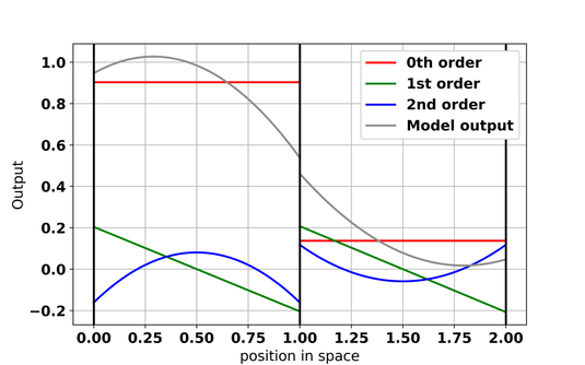
Figure 2: schematic example of how model output is constructed in DG models. In each of the two shown grid cells (separated by the black vertical lines), the model output is the sum of a 0th order polynomial (red), 1st order polynomial (green) and 2nd order polynomial (blue). 

The aim of my research is to find a way to utilise these observations without losing details in the DA process for sea-ice models. Currently, a new sea-ice model is being developed as part the Scale-Aware Sea Ice Project (SASIP). In this model, sea-ice quantities in each grid cell are represented by a combination of polynomials (Figure 2) instead of as constant values. The higher the polynomial order, the more `wiggly` the polynomials become and the better small-scale details can be reproduced by the model. Moreover, the contribution of each polynomial to the model solution does not have to be the same across all of the model domain, a property that makes it possible to represent physical fields that vary very much over the domain. We are interested to make use of the new model’s ability to represent subcell details in the DA process and see if we can reduce the post-DA error in these new models by reducing the amount of averaging applied to the satellite observations.  

As an initial test, we have set up a model without equations. There are no sea-ice dynamics in this model, but it has the advantage that we can create an artificial field mimicking, for example, ice velocity with details at the scales we want and the order of polynomials we desire. For the purpose of this experiment, we set aside one of the artificial fields as our DA target, create artificial observations from this one and see if DA can reconstruct the ‘target’ from these observations. The outcome of this experiment has confirmed our assumptions: when using higher-order polynomials, the DA becomes better in reconstructing the ‘target’ as we reduce the width over which we average the observations. And it is not just the DA estimate of the `target` that is improved, but also the estimate of the slope of the `target`. This is very promising: Forces in the ice scale with the slope of the velocity. We cannot directly observe these forces, but we can observe velocities. So, with the aid of higher-order polynomials we might be able to use the velocities to detect any errors in the in sea-ice forces.  

High-resolution sea-ice observations definitely look better than their low-res counterparts, but to be able to use all details present in the observations DA has to be tweaked. Our preliminary results suggest that it is possible to incorporate scale dependency in the design of the DA scheme thus making it scale aware. We found that this allows us to take advantage of spatially dense observations and helps the DA scheme to deal with the wide range of scales present in the model errors. 

Posted in Arctic, Cryosphere, Numerical modelling | Tagged | Leave a comment

Outlook For The Upcoming UK Winter

By: Christopher O’Reilly

In this post I discuss the outlook for the 2022/23 winter from a UK perspective: what do the forecasts predict and what physical drivers might influence the upcoming winter?

 An important winter

 The price of utilities has risen dramatically over the last year for people, businesses and organisations in the UK. As we move towards winter there is great concern about the effect of these price rises on people’s lives. In the UK, winter temperatures have a strong impact on the demand for gas and electricity. For example, a winter with a 1 degree temperature anomaly results in roughly a daily average gas demand anomaly of 100 GWh over a winter season. In monetary terms, based on the UK October gas price cap (i.e. 10.3p/kWh), this equates to about £1 billion for each 1 degree UK temperature anomaly (though likely much higher due to the higher unit costs for businesses/organisations – not to mention the governments costs to underwrite the price cap). The numbers are pretty big, and the stakes are pretty high.

What do the forecast models predict?

So can we predict what is in store for the UK this winter? Seasonal forecasts out to six months in the future are performed operationally by weather centres across the world. The European Commission’s Copernicus Climate Change Service (or, more snappily, “C3S”) coordinates these long-range forecasts from 7 international centres (including the UK Met Office). When forecasting many months ahead we cannot predict the weather on a particular day, however, forecasts demonstrate some skill in determining average conditions on monthly timescales.

Ideally, we would examine the 2m temperature from the forecasts but these do not demonstrate clear skill over the UK. However, there is skill in the sea-level pressure over the North Atlantic and this can be utilised to provide predictions of the UK temperature (as demonstrated in several previous studies).

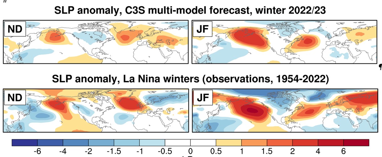
Figure 1: (Top) Forecasts of sea-level pressure (SLP) anomaly for the early winter (ND) and late winter (JF) from the C3S multi-model forecasts, initialised at the start of September. (Bottom) Observational SLP anomalies for the early winter (ND) and late winter (JF) during La Nina winters with respect to other years (1954-2022).

For the upcoming winter it is useful to first consider predictions of the large-scale atmospheric circulation because the winter temperatures in the UK are largely determined by wind anomalies (and the associated advection) in the surrounding Euro-Atlantic sector. The multi-model forecasts of the sea-level pressure anomalies for the 2022/23 winter are plotted in Figure 1.

The sea-level pressure anomalies over the North Atlantic exhibit notable changes in characteristics between early winter and late winter. In the early winter period (November-December or “ND”) there are high pressure anomalies across most of the midlatitude North Atlantic, extending into Europe. In the late winter period (January-February or “JF”) there are low pressure anomalies over Iceland and high pressure anomalies further south, more closely resembling the positive phase of the North Atlantic Oscillation or “NAO”, which typically causes warmer winters in the UK. But what is driving these signals?

La Nina conditions in the Tropical Pacific

As we approach this winter, forecasts are confident that we will have La Nina conditions, associated with cooler sea surface temperatures in the eastern/central Tropical Pacific. The observed impact of La Nina on the large-scale atmospheric circulation in the Euro-Atlantic sector shows a clear difference in the early winter compared with late winter. Composite anomalies during observed La Nina years are shown in Figure 1.

The resemblance of this observational composite plot to the predictions from the seasonal forecasts is clear. In the early winter the ridging over the North Atlantic is followed by the emergence of positive NAO conditions in late winter. The La Nina conditions are clearly, and perhaps inevitably, driving the circulation anomalies in the seasonal forecasts and the comparison with observations suggests that this is a sensible forecast.

A possible role for the Quasi-Biennial Oscillation (QBO)? 

Another driver that can confidently be predicted (mostly) several months in advance and can influence the extratropical large-scale circulation is the Quasi-Biennial Oscillation (QBO). The QBO refers to the equatorial winds in the stratosphere that oscillate between eastward and westward phases, which have been shown to influence the large-scale tropospheric circulation in the Euro-Atlantic region. The QBO is currently in a “deep” westerly phase, with strong westerly winds that span the depth of the equatorial stratosphere. Winters with westerly QBO conditions in observations demonstrate a clear signal in early and late winter, both of which project onto the positive phase of the NAO.

A number of studies have shown that seasonal forecasting models capture the correct sign of the relationship between the QBO and the NAO but that it is substantially weaker than in observations. We might therefore reasonably expect/anticipate/suppose that this effect is not adequately represented in the forecasts for this winter.

What does this mean for UK temperatures?

The La Nina and deep QBO-W conditions tend to favour milder winters for the UK, however, there remains significant variability. For example, the record cold period during early winter in 2010/11 occurred during La Nina and deep QBO-W conditions (and was possibly linked to North Atlantic SST anomalies). Nonetheless, the drivers analysed here tend to favour circulation anomalies in both the early and late winter that favour milder UK conditions, and support the signals seen in the seasonal forecast models.

So we can be cautiously optimistic…?

Milder conditions would certainly be welcome this winter in the UK so it’s positive that the forecasts and drivers seem to point in this direction. However, there is of course still a clear possibility for cold conditions. One possible cause would be a sudden stratospheric warming event, in which the stratospheric polar vortex breaks down, favouring the development of negative NAO conditions and associated cold conditions in the UK. An example of this was the “Beast from the East” event in February 2018. Weather geeks get very excited about sudden warmings – and understandably so – but we might hope to forego such excitement this winter. The C3S seasonal models show no clear signal on the probability of a sudden stratospheric warming event occurring at present.

So milder conditions might be on the cards for the UK this winter, which would be good news. But warmer winters also tend to be wetter here in the UK, so at least we’ll still have that to moan about.

A version of this blog is also available with additional figures, references and footnotes here.

Posted in Atmospheric circulation, Climate, Climate modelling, ENSO, North Atlantic, Oceans, Seasonal forecasting, Stratosphere, Teleconnections | Leave a comment

Weather vs. Climate Prediction

By: Annika Reintges

Imagine you are planning a birthday party in 2 weeks. You might check the weather forecast for that date to decide whether you can gather outside for a barbeque, or whether you should reserve a table in a restaurant in case it rains. How much would you trust the rain forecast for that day in 2 weeks? Probably not much. If that birthday was tomorrow instead, you would probably have much more faith in the forecast. We all have experienced that weather prediction for the near future is more precise than prediction for a later point in time.

A forecast period of 2 weeks is often stated to be the limit for weather predictions. But how then, are we then able to make useful climate predictions for the next 100 years?

For that, it is important to keep in mind the difference between the terms ‘weather’ and ‘climate’. Weather changes take place on a much shorter timescale and also on a smaller scale in space. For example, it matters whether it will rain in the morning or the afternoon, and whether a thunderstorm will hit a certain town or pass slightly west of it. Climate however, are weather statistics averaged over a long time, usually over at least 30 years. Talking about the climate in 80 years, for example, we are interested whether UK summer will be drier. We will not be able to say whether July of the year 2102 will be rainy or dry compared to today.

Because of this difference between weather and climate, the models differ in their specifications. Weather models have a finer resolution in time and space than climate models and are run over a much shorter period (e.g., weeks), whereas climate models can be run for hundreds or even thousands of years.

Figure 1: ‘Weather’ refers to short-term changes, and ‘climate’ to weather conditions averaged over at least 30 years (image source: ESA).

But there is more to it than just the differences in temporal and spatial resolution:

The predictability is based on two different sources: Mathematically, (1) weather is an ‘initial value problem’, (2) climate is a ‘boundary problem’. This is related to the question: how do we have to ‘feed’ the model to make a prediction? In other words, which type of input matters for (1) weather and (2) climate prediction models. A weather or climate model is just a set of code full of equations. Before we can run the model to get a prediction, we have to feed it with information.

Here we come back to the two sources of predictability:

(1) Weather prediction is an ‘initial value problem’: It is essential to start the model with initial values of one recent weather state. This means several variables (e.g., temperature and atmospheric pressure) given for 3-dimensional space (latitudes, longitudes and altitudes). This way, the model is informed, for example, about the position and strength of cyclones that might approach us soon and cause rain in a few days.

(2) Climate prediction is a ‘boundary value problem’: For the question whether UK summers will become drier by the end of the 21st century, the most important input is the atmospheric concentration of greenhouse gases. These concentrations are increasing and affecting our climate. Thus, to make a climate prediction, the models needs these concentrations not only from today, but also for the coming years, we have changing boundary conditions. For this, future concentrations are estimated (usually following different socio-economic scenarios).

Figure 2: Whether a prediction is an ‘initial value’ or ‘boundary value’ problem, depends on the time scale we want to predict (image source: MiKlip project).

And the other way around: For the weather prediction (like for the question of ‘will it rain next week?’), boundary conditions are not important: the CO2 concentration and its development throughout the week do not matter. And for the climate prediction (‘will we have drier summers by the end of the century?’), initial values are not important: it does not matter whether there was a cyclone over Iceland at the time we started the model run.

Though, hybrid versions of weather/climate prediction exist: Say we want to predict the climate in the ‘near’ future (‘near’ in climate timescales, for example in 10-20 years). For that, we can make use of both sources of predictability. The term used in this case would be ‘decadal climate prediction’. With this, we will of course not be able to predict the exact days when it will rain, but we could be able to say whether the UK summers in 2035-2045 will on average be drier or wetter than the preceding 10 years. However, when trying to predict climate beyond this decadal time scale, the added value of adding initial values to climate prediction is very limited.

Posted in Climate, Climate modelling, Predictability, Weather forecasting | Tagged | Leave a comment

Monitoring Climate Change From Space

Richard Allan

It’s never been more crucial to undertake a full medical check-up for planet Earth, and satellite instruments provide an essential technological tool for monitoring the pace of climate change, the driving forces and the impacts on societies and the ecosystems upon which we all depend. This is why hundreds of scientists will be milling about the  National Space Centre, Leicester at the UK National Earth Observation Conference, talking about the latest innovations, new missions and the latest scientific discoveries about the atmosphere, oceans and land surface. For my part, I will be taking a relatively small sheet of paper showing three current examples of how Earth Observation data is being used to understand ongoing climate change based on research I’m involved in.

The first example involves using satellite data measuring heat emanating from the planet to evaluate how sensitive Earth’s climate is to increases in heat trapping greenhouse gases. It’s important to know the amount of warming resulting from rising atmospheric concentrations of greenhouse gases, particularly carbon dioxide, since this will affect the magnitude of climate change. This determines the severity of impacts we will need to adapt to or that can be avoided with the required rapid, sustained and widespread cuts in greenhouse gas emissions. However, different computer simulations give different answers and part of this relates to changes in clouds that can amplify or dampen temperature responses through complex feedback loops. New collaborative research led by the Met Office show that the pattern of global warming across the world causes the size of these climate feedbacks to change over time and we have contributed satellite data that has helped to confirm current changes.

The second example uses a variety of satellite measurements of microwave and infrared electromagnetic emission to space along with ground-based data and simulations to assess how gaseous water vapour is increasing in the atmosphere and therefore amplifying climate change. Although there are some interesting differences between datasets, we find that the large amounts of invisible moisture near to the Earth’s surface are increasing by 1% every 10 years in line with what is expected from basic physics. This helps to confirm the realism of the computer simulations used to make future climate change projections. These projections show that increases in water vapour are intensifying heavy rainfall events and associated flooding.

In the third example, we exploit satellite-based estimates of precipitation to identify if projected intensification of the tropical dry seasons is already emerging in the observations. My colleague, Caroline Wainwright, recently led research showing how the wet and dry seasons are expected to change, and in many cases intensify, with global warming. But we wanted to know more – are these changes already emerging? So we exploited datasets using satellite measurements in the microwave and infrared to observe daily rainfall across the globe. Using this information and combining it with additional simulations of the present day we were able to show (and crucially understand why) projected intensification of the dry season in parts of South America, southern Africa and Australia are already emerging in the satellite record (Figure 1). This is particularly important since the severity of the dry season can be damaging for perennial crops and forests. It underscores the urgency in mitigating climate change by rapidly cutting greenhouse gas emissions, but also gauging the level of adaptation to the impacts of climate change needed. This research has just been published in the Geophysical Research Letters journal.

There is a huge amount of time, effort and ultimately cash that is needed to design, develop, launch and operate satellite missions. The examples I am presenting at the ukeo.org conference highlight the value in these missions for society through advancing scientific understanding of climate change and monitoring its increasing severity across the globe.

Figure 1 – present day trends in the dry season (lower 3 panels showing observations and present day simulations of trends in dry season dry spell length) are consistent with future projections (top panel, changes in dry season dry spell length 2070-2099 minus 1985-2014) over Brazil, southern Africa, Australia (longer dry spells, brown colours) and west Africa (shorter dry spells, green colours), increasing confidence in the projected changes in climate over these regions (Wainwright et al., 2022 GRL).

References

Allan RP, KM Willett, VO John & T Trent (2022) Global changes in water vapor 1979-2020, J. Geophys. Res., 127, e2022JD036728, doi:10.1029/2022JD036728

Andrews T et al. (2022) On the effect of historical SST patterns on radiative feedback, J Geophys. Res., 127, e2022JD036675. doi:10.1029/2022JD036675

Fowler H et al. (2021) Anthropogenic intensification of short-duration rainfall extremes, Nature Reviews Earth and Environment, 2, 107-122, doi:10.1038/s43017-020-00128-6.

Liu C et al. (2020) Variability in the global energy budget and transports 1985-2017, Clim. Dyn., 55, 3381-3396, doi: 10.1007/s00382-020-05451-8.

Wainwright CM, RP Allan & E Black (2022), Consistent trends in dry spell length in recent observations and future projections, Geophys. Res. Lett. 49, e2021GL097231 doi:10.1029/2021GL097231

Wainwright CM, E Black & RP Allan (2021), Future Changes in Wet and Dry Season Characteristics in CMIP5 and CMIP6 simulations, J. Hydrometeorology, 11, 2339-2357, doi:10.1175/JHM-D-21-0017.1

Posted in Climate, Climate change, Climate modelling, Clouds, earth observation, Energy budget, Water cycle | Tagged | Leave a comment

The Turbulent Life Of Clouds

By: Thorwald Stein

It’s been a tough summer for rain enthusiasts in Southern England, with the region having just recorded its driest July on record. But, there was no shortage of cloud: there will have been the slight probability of a shower in the forecast, a hint of rain on the weather radar app, or you spotted a particularly juicy cumulus cloud in the sky getting tantalisingly close to you before it disappeared into thin air. You wonder why there was a promise of rain a few hours or even moments ago, and you brought in your washing or put on your poncho for no reason. What happened to that cloud?

The first thing to consider is that clouds have edges, which, while not always easily defined, for a cumulus cloud can be imagined where the white of the cloud ends and the blue of the sky begins. In this sense, the cloud is defined by the presence of lots of liquid droplets due to the air being saturated, i.e. very humid conditions, and the blue sky – which we refer to as the “environment” – by the absence of droplets, due to the air being subsaturated. The second realisation is that clouds are always changing and not just static objects plodding along across the sky. Consider this timelapse of cumulus clouds off the coast near Miami and try to focus on a single cloud – see how it grows and then dissipates!

Notice how each cloud is made up of several consecutive pulses, each with its own (smaller scale) billows. If one such a pulse is vigorous enough, it may lead to deeper growth and, ultimately, rainfall. But, the cloud edge is not solid: through turbulent mixing from those pulses and billows, environmental air is trapped inside the clouds, encouraging evaporation of droplets and inhibiting cloud growth. Cumulus convection over the UK usually does not behave in such a photogenic fashion, as it often results from synoptic-scale rather than local weather systems, but we observe similar processes.

Why, then, are there often showers predicted that do not materialise? (1) Consider that the individual cumulus cloud is about a kilometre across and a kilometre deep. The individual pulses are smaller than that and the billows are smaller still, “… and little whirls have lesser whirls and so on to viscosity” (L.F.Richardson, 1922): we are studying complex turbulent processes over a wide range of scales, from more than a kilometre to less than a centimetre. Operational forecast models are run at grid lengths of around 1 km, which would turn the individual cumulus cloud into a single Minecraft-style cuboid. The turbulent processes that are so important for cloud development and dissipation are parameterised: a combination of variables on the grid-scale, including temperature, humidity, and winds will inform how much mixing of environmental air occurs. Unfortunately, our models are highly sensitive to the choice of parameters, affecting the duration, intensity, and even the 3-dimensional shapes of showers and thunderstorms predicted (Stein et al. 2015). Moreover, it is difficult to observe the relevant processes using routinely available measurements.

At the University of Reading, we are exploring ways to capture the turbulent and dynamical processes in clouds using steerable Doppler radars. Steerable Doppler radars can be pointed directly to the cloud of interest, allowing us to probe it over and over and study its development (see for instance this animation, created by Robin Hogan from scans using the Chilbolton Advanced Meteorological Radar). The Doppler measurements provide us with line-of-sight winds where small variations are indicative of turbulent circulations and tracking these variations from scan to scan enables us to estimate the updraft inside the cloud (Hogan et al. 2008 (4)). Meanwhile, the distribution of Doppler measurements at a single location informs us of the intensity of turbulence in terms of eddy dissipation rate, which we can use to evaluate the forecast models (Feist et al. 2019). Combined, we obtain a unique view of rapidly evolving clouds, like the thunderstorm in the figure below.

Figure: Updraft pulses detected using Doppler radar retrievals for a cumulonimbus cloud. Each panel shows part of a scan with time indicated at the top, horizontal distance on the x-axis and height on the y-axis. Colours show eddy dissipation rate, a measure of turbulence intensity, with red indicative of the most intense turbulence, using the method from Feist et al. (2019). Contours show vertical velocity and arrows indicate the wind field, using a method adapted from Hogan et al. (2008). The dotted line across the panels indicates a vertical motion of 10 meters per second. Adapted from Liam Till’s thesis.

There are numerous reasons why clouds appear where they do, but it is evident that turbulence plays an important role in the cloud life cycle. By probing individual clouds and targeting the turbulent processes within, we may be able to better grasp where and when turbulence matters. Our radar analysis continues to inform model development (Stein et al. 2015) ultimately enabling better decision making, whether it’s to bring in the washing or to postpone a trip due to torrential downpours.

Footnote:
(1) Apart from the physical processes considered in this blog, there are also limitations to predictability, neatly explained here: https://blogs.reading.ac.uk/weather-and-climate-at-reading/2019/dont-always-blame-the-weather-forecaster/ 

References:

Feist, M.M., Westbrook, C.D., Clark, P.A., Stein, T.H.M., Lean, H.W., and Stirling, A.J., 2019: Statistics of convective cloud turbulence from a comprehensive turbulence retrieval method for radar observations. Q.J.R. Meteorol. Soc., 145, 727– 744. https://doi.org/10.1002/qj.3462

Hogan, R.J., Illingworth, A.J. and Halladay, K., 2008: Estimating mass and momentum fluxes in a line of cumulonimbus using a single high-resolution Doppler radar. Q.J.R. Meteorol. Soc., 134, 1127-1141. https://doi.org/10.1002/qj.286

Richardson, L.F., 1922: Weather prediction by numerical process. Cambridge, University Press.

Stein, T. H. M., Hogan, R. J., Clark, P. A., Halliwell, C. E., Hanley, K. E., Lean, H. W., Nicol, J. C., & Plant, R. S., 2015: The DYMECS Project: A Statistical Approach for the Evaluation of Convective Storms in High-Resolution NWP Models, Bulletin of the American Meteorological Society, 96(6), 939-951. https://doi.org/10.1175/BAMS-D-13-00279.1

Posted in Climate, Clouds, Turbulence, Weather forecasting | Tagged | Leave a comment

How would climate-change science look if it was structured “as if people mattered”?

By Ted Shepherd

The scientific understanding of climate change is represented by the Assessment Reports of the Intergovernmental Panel on Climate Change (IPCC), most recently its Sixth Assessment Report. IPCC Working Groups II and III deal respectively with adaptation and mitigation, both of which explicitly relate to human action. Working Group I is different: its scope is the physical science basis of climate change.

Physical science is generally seen as concerning objective properties of the real world, where scientists should act as dispassionate observers. This paradigm is known as the ‘value-free ideal’, and has long underpinned Western science. Although individual scientists have human weaknesses, the argument is that the wider institutional arrangements of science counteract these effects. However, the value-free ideal has been criticized by philosophers of science because unconscious biases can be embedded in what might appear to be objective scientific practices. It is important to emphasize that this critique does not undermine science, which is still grounded in the real world; indeed, identification of such issues only serves to strengthen science. The same is true of climate-change science, as has been acknowledged by IPCC Working Group I (Pulkkinen et al. 2022).

This raises the question of whether climate-change science — where for brevity the term is used here in the restrictive sense of physical climate science, represented by IPCC Working Group I — might usefully adopt a more human face. Such a prospect makes some physical climate scientists nervous, because it seems to open the door to subjectivity. But if some degree of subjectivity is unavoidable —  and note that IPCC Working Group I is entirely comfortable with the concept of ‘expert judgement’, which is intrinsically subjective —  then perhaps it is better for the subjectivity to be explicit rather than swept under the carpet and invisible.

Contrast between the ‘‘top-down’’ approach in climate-change science, which is needed for mitigation action, and the ‘‘bottom-up’’ approach needed for adaptation action. From Rodrigues and Shepherd (2022).

Figure 1: Contrast between the ‘‘top-down’’ approach in climate-change science, which is needed for mitigation action, and the ‘‘bottom-up’’ approach needed for adaptation action. From Rodrigues and Shepherd (2022).

The questions asked of climate-change science for the purposes of adaptation and mitigation are quite different (Figure 1). For mitigation, the science informs the United Nations Framework Convention on Climate Change, and the questions mainly revolve around the anthropogenic greenhouse gas emissions that are compatible with global warming levels such as 1.5C or 2C. This “top-down” perspective aligns with the international policy context which requires single (rather than multiple) expert judgements on quantities such as climate sensitivity and carbon feedbacks. For adaptation, in contrast, climate-change science informs locally coordinated action, where multiple voices need to be heard, societal values necessarily enter in, and a more plural, “bottom-up” perspective is arguably more appropriate.

Nearly 50 years ago, the economist E.F. Schumacher published his celebrated book, Small is Beautiful. Schumacher asked how economics might look if it was structured “as if people mattered”, i.e. from a people-first perspective. There might not seem to be much in common between physical climate science and economics, but economics also strives to be an ‘objective’ science. With oceanographer Regina Rodrigues at the University of Santa Catarina in Brazil, we asked Schumacher’s question of climate-change science for adaptation, and found many interesting parallels (Rodrigues and Shepherd 2022).

Causal network for the 2013/14 eastern South America drought. The purple shading indicates elements whose causality lies in the weather and climate domain, the blue shading indicates the hazards, the gray shading exposure and vulnerability, and the green shading the impacts. From Rodrigues and Shepherd (2022).

Figure 2: Causal network for the 2013/14 eastern South America drought. The purple shading indicates elements whose causality lies in the weather and climate domain, the blue shading indicates the hazards, the gray shading exposure and vulnerability, and the green shading the impacts. From Rodrigues and Shepherd (2022).

The first is the need to grapple with the complexity of local situations. The nature of the challenge is exemplified in a case study of the 2013/14 eastern South America drought, which affected the food-water-energy nexus (Figure 2). The proximate cause of the drought was a persistent blocking anticyclone. The understanding of how this feature of the local atmospheric circulation will respond to climate change is very poor. Yet it crucially mediates compound events such as this one. We argue, with Schumacher, that the way to respect the complexity of the local risk landscape whilst acknowledging the deep (i.e. unquantifiable) uncertainty in the climate response is to express the climate knowledge in a conditional form, as in the causal network shown in Figure 2.

The second parallel is the importance of simplicity when dealing with deep uncertainty. Schumacher argued for the centrality of ideas over conveying a false sense of precision from overly sophisticated methods. We argue that the way to do this is through physical climate storylines, which are self-consistent articulations of “what if” hypotheticals expressed in terms of a set of causal elements (e.g. how the influence of remote teleconnections on local circulation could change). In particular, several storylines spanning a range of plausible outcomes (including extreme events) can be used to represent climate risk in a discrete manner, retaining the correlated aspects needed to address compound risk.

The third parallel is the need to empower local communities to make sense of their own situation. We argue that this can be addressed by developing what Schumacher called ‘‘intermediate technologies’’ which can be locally developed. In Schumacher’s case he was referring to physical equipment, but in our case we mean analysis of climate data. Causal networks and storylines represent such “intermediate technologies”, since they privilege local knowledge and involve comparatively simple data-science tools (see Kretschmer et al. 2021).

Regina and I aim to put this vision into practice over the coming years through our co-leadership of the World Climate Research Programme (see Rowan Sutton’s blog) Lighthouse Activity ‘My Climate Risk’ (https://www.wcrp-climate.org/my-climate-risk).

References:

Kretschmer, M., S.V. Adams, A. Arribas, R. Prudden, N. Robinson, E. Saggioro and T.G. Shepherd, 2021: Quantifying causal pathways of teleconnections. Bull. Amer. Meteor. Soc., 102, E2247–E2263, https://doi.org/10.1175/BAMS-D-20-0117.1

Pulkkinen, K., S. Undorf, F. Bender, P. Wikman-Svahn, F. Doblas-Reyes, C. Flynn, G.C. Hegerl, A. Jönsson, G.-K. Leung, J. Roussos, T.G. Shepherd and E. Thompson, 2022: The value of values in climate science. Nature Clim. Change, 12, 4–6,  https://doi.org/10.1038/s41558-021-01238-9

Rodrigues, R.R. and T.G. Shepherd, 2022: Small is Beautiful: Climate-change science as if people mattered. PNAS Nexus, 1, pgac009, https://doi.org/10.1093/pnasnexus/pgac009


Posted in Atmospheric circulation, Climate, Climate change, Data processing, IPCC | Tagged | Leave a comment

Modelling Convection In The Maritime Continent

By: Steve Woolnough

The Maritime Continent, the archipelago, including Malaysia, Indonesia, the Philippines and Papua New Guinea is made up of hundreds of islands of varying shapes and sizes. It lies in some of the warmest waters on Earth and consequently is a major centre for tropical atmospheric convection, with most of the region receiving more than 2000mm of rainfall a year and some parts over 3500mm of rainfall. The latent heat released by the condensation of water vapour into rain in the clouds drives the tropical circulation and is collocated with the ascending branch of the Walker Circulation. On interannual timescales the rainfall over the region is modulated by El-Nino, and on sub-seasonal (2-4 week) timescales it’s modulated by the Madden-Julian Oscillation (the MJO, see Simon Peatman’s blog from 2018). The variations in heating associated with El Nino, the MJO and other modes of variability drive changes in the global circulation including influences over the North Atlantic and Europe (see Robert Lee’s blog).

Figure 1: Animations of one day of precipitation over the Maritime continent from: GPM-IMERG observations (top panel), a 2km model with explicit convection (middle panel) and a 12km model with convective parametrization (bottom panel).

Given the importance of this region for the tropical and global circulation it’s critical that the models we use for weather and climate predictions are able to represent the processes that control the variation in precipitation in the region. Precipitation is organized on a range of spatial and temporal scales from meso-scale convective systems (with scales of a few hundred kilometres) to synoptic scale systems like the Borneo Vortex, Equatorial Waves and Tropical Cyclones, and is strongly tied to the diurnal cycle. The top panel of Figure 1 shows an animation of one day of precipitation as observed from the Global Precipitation Measurement Mission (Huffman et al., 2019). It’s clear that precipitation is organized into clusters with regions of very intense precipitation. The bottom panel shows the precipitation simulated by model with Met Office Unified Model at 12km horizontal resolution, with parametrized convection typical of global weather forecast models. Whilst the model is able to capture some semblance of organization the simulation is dominated by weak to moderate precipitation over a large proportion of the domain.

As reported by Emma Howard, the TerraMaris project aims to improve our understanding of the processes that organize convection in the region and in particular their interaction with the diurnal cycle. We had planned a field campaign in Indonesia to observe the convection over Java and Christmas Island, along with a series of high resolution simulations as described by Emma, but the COVID-19 pandemic has finally put paid to the field campaign so we’re now relying on the high resolution model simulations. We have run 10 winter seasons of the Met Office Unified Model model at 2km horizontal resolution with no convective parametrization where the convection is explicitly simulated. The middle panel of the animation shows 1 day from these simulations. There is a clear difference between the representation of convection in the 2km model compared to the 12km model with small regions of intense convection, more similar to the observed precipitation, although the 2km model perhaps tends to produce precipitation structures which are two small.

Figure 2: Timing of the diurnal maximum precipitation in the 2km model simulations (left panel) and the 12km model simulations (middle panel). Precipitation anomaly composites in Phase 5 of the MJO in the 2km model (top right) and the 12km model (bottom right).

These differences in the representation of convection also lead to differences in the way variability is represented in the model. The left two panels of figure 2 shows the time of the diurnal maximum in precipitation, which typically occurs in the early afternoon/evening in the 12km model compared to late evening/early morning in the 2km model, much closer to observations. Notice that the 2km model also has a clear diurnal cycle of precipitation in the oceans surrounding the islands associated with offshore propagation of convective systems during the morning, which the 12km model largely doesn’t capture. The right-hand panel shows an example of the modulation of the precipitation by the MJO over the region, it’s clear that the 2km model shows a much larger impact of the MJO on the precipitation over the islands. During the next few years we hope to use the simulations to understand how large-scale variability associated with the MJO and El Nino modulates these meso-scale  convective systems, and the impact that has on the vertical structure of the heating over the region and it’s potential influence on the global circulation.

Reference:

Huffman, G.J., E.F. Stocker, D.T. Bolvin, E.J. Nelkin, Jackson Tan (2019), GPM IMERG Final Precipitation L3 Half Hourly 0.1 degree x 0.1 degree V06, Greenbelt, MD, Goddard Earth Sciences Data and Information Services Center (GES DISC), https://doi.org/10.5067/GPM/IMERGDF/DAY/06

Posted in Maritime Continent, Numerical modelling, Tropical convection | Leave a comment

What Is The World Climate Research Programme And Why Do We Need It?

By: Rowan Sutton

My schedule last week was rather awry.  Over four days I took part in a meeting of 50 or so climate scientists from around the world.  Because of the need to span multiple time zones, the session times jumped around, so that on one day we started at 5am and on another day finished at 11pm.  I’m glad I don’t have to do this every week.

But it was a valuable meeting. Specifically, it was a meeting of the Joint Scientific Committee of the World Climate Research Programme, known as WCRP. The WCRP aims to coordinate and focus climate research internationally so that it is as productive and useful as possible. In particular, the WCRP envisions a world “that uses sound, relevant, and timely climate science to ensure a more resilient present and sustainable future for humankind.”

Why does the world need an organisation like WCRP?  The key reason is that climate is both global and local. We humans – approximately 7.96 billion of us at the last count – all live on the same planet.  The global climate can be measured in various ways, but one of the most common and useful measures is the average temperature at the Earth’s surface.  Many factors influence this average temperature and, when it changes significantly, the effects are felt in every corner of the world.  This is what has happened over the last 100 years or so, during which time Earth’s surface temperature has increased by about 1.1oC as a result of rising concentrations of greenhouse gases in the atmosphere.

More specifically, if I want to understand the climate of the UK, I need to consider not only local influences like hills, valleys, forests and fields, but also influences from far away, such as the formation of weather systems over the North Atlantic Ocean. Even climatic events on the other side of the world, such as in the tropical Pacific Ocean, can influence the weather and climate we experience in the UK.

Because climate is both global and local, climate scientists rely heavily on international collaborations.  We need these collaborations to sustain the global network of observations, from both Earth-based and satellite-based platforms, that tell us how climate is changing.  We also rely on international collaborations to share data from the computer simulations that are a key tool for identifying the causes of climate change and for predicting its future evolution.

So now that we are living in a climate emergency, what are the priorities of the World Climate Research Programme? And what were some of the topics at our meeting?  A lot of attention was devoted to questions of priorities: for example, how can we improve our computer simulations as rapidly as possible in directions that will produce the most useful information for policy makers and others? Alongside reducing greenhouse gas emissions, policy makers are increasingly grappling with questions about how societies can adapt to the changes in climate that have already taken place and those that are expected, and how they can become more resilient.  The urgency of these issues is highlighted almost every year now by destructive extreme events we observe around the world – such as the record-shattering heatwave that occurred in Canada last year and the unprecedented flooding in northern Germany and of course we are experiencing a very serious heatwave in the UK right now.

At a personal level, contributing to the WCRP is a privilege.  It brings opportunities to engage with a diverse group of dedicated scientists all working toward very challenging but important shared goals. Through involvement with WCRP over many years I have developed valuable collaborations and made good friends. Whilst COVID has brought many challenges, the growth of online meetings has enabled WCRP to become a more inclusive organisation, which is essential for it to fulfil its mission going forward.  Especially important is the need for two-way sharing of knowledge, ideas and solutions with those working in and with countries in the Global South, which often lack scientific capacity and are particularly vulnerable to the impacts of climate change.  This will be an important focus for a major WCRP Open Science Conference to be held in Rwanda in 2023.

Figure:  More information about the World Climate Research Programme can be found at https://www.wcrp-climate.org/

Posted in Climate change, Climate modelling | Leave a comment

The Golden Age Of Radar

By: Rob Thompson

One of the most frequently viewed pages on weather apps is the radar imagery. We see them on apps, websites and TV forecasts, and have done for years. But rarely do we see much about what we are seeing, and that’s going to change, now.

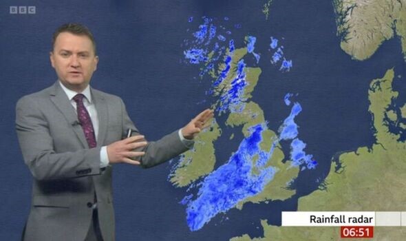
Figure 1: Matt Taylor presenting the radar on the BBC (image source: BBCbreakfast)

The radar maps we see are actually a composite of data taken from 18 different weather radar facilities scattered around the UK and Ireland. The radars are mostly owned by the Environment Agency and MetOffice, operated by the Met Office, though data sharing also gives us data from Jersey Meteorological Department and Met Éireann radars. Each radar is very similar, they send out pulses of microwaves (they have wavelength of 5.6cm) and measure the length of time to get a returned signal from the target precipitation (rain, but also snow, hail, etc. – even flying ants) essentially the same way radar detects aircraft or ships. For the bulk of weather radar’s history, this is what we got, a “reflectivity” which “sees” the rain, and we convert that to a rainfall rate with assumptions on the sizes and numbers of raindrops present (while on the subject of radar and seeing, take a look at the source of the well known “fact” that carrots make you see in the dark). During the 90s and 00s the radars began to also detect the wind from the motion of the drops being detected, which helped, but the data quality remained a problem. It was very difficult to know the source of any power detected, was that power caused by heavy rain? The radar beam hitting the ground? A flock of birds? Or interference? Techniques were used to do our best at finding the power from hydrometeors (rain drops, snow flakes, hail … basically falling water or ice), but they were far from perfect.

But given coverage and software have improved since the first radar was installed in the UK in 1974, why do I think that right now is “the golden age of radar”? The answer is a recent technological leap taken across the UK (and many other worldwide) radars, which was completed in 2019. The new technology uses polarisation (like in glare reducing polarised glasses for driving, fishing etc.) of the microwaves to learn much more information on the particles we are viewing. This means that as well as an overall power of the return, the differences between waves oscillating in the vertical, or horizontal can tell us information on the shape and size of the drops, snow flakes, etc. we view. This means the radars tell us far more about what they are detecting than they did a decade ago, and that means the algorithms for the rainfall maps we see are far better.

Figure 2: New Weather Radar Network infographic  (image source: MetOffice)

We have measurements that detect the shape of the drops – a raindrop is not the tear shape as classically drawn, but small drops (smaller than about 1mm) are spherical, the become more smartie shape as they get larger, falling with the large circle downwards – which tells us how big they are. Some time spent in the front seats of a car will tell you that rain isn’t all the same, sometimes there are a few large drops, other times there are few large drops, but huge numbers of small drops, the radar can now tell the difference. Knowing how real rain, snowflakes, hail but also, birds, insects, aircraft, interference, the sea or the ground appear in the various available radar observations means that the radar network is now able to do a much better job of determining what is a genuine weather signal, and what should be removed – this has hugely reduced the amount of data the network losses and means the network can also detect lighter rainfall. Interference (which causes radar blind spots), has the potential to prevent the radar observing heavy and dangerous rains (such as cause flash flooding), can be traced, which can help prevent it from continuing.

Finally, there’s the actual rainfall rates derived from the radar network. There’s no other way to view a wide area of rainfall on a scale as small as radar can (one kilometer – just over half a mile – squares), and now, with the new radars, the rainfall rate estimates are more accurate than ever before. In the presence of the heaviest rains, with the potential for dangerous flash flooding, the old radars would struggle the most, sometimes failing to see rain at all (see figure 2). The new radar measurements are utilised to improve the rainfall rates, overcoming many of the challenges of the past, helping with a number of potential issues to get accurate rainfall information in near real time.

Figure 3:Heavy rain missed by radar in July 2007.

These are just the things in place now, but there is much more to come and more research to be done. Improvements on detecting the type of precipitation are being developed, corrections to handle the melting of snow (much UK rain falls as snow high above us). New methods of interpreting the data are being considered, and more uses, such as automatic calibration and detection of blocked beams, with more direct use of the radar for initiating weather forecast models being implemented.

It’s a time of huge and rapid improvement for UK weather radar observations and to me, that makes this the golden age of weather radar.

Posted in Climate, earth observation, Flooding, Hydrology, Measurements and instrumentation | Tagged | Leave a comment

Density Surfaces In The Oceans

By: Remi Tailleux

Below the mixed layer, shielded from direct interaction with the atmosphere, ocean fluid parcels are only slowly modified by turbulent mixing processes and become strongly constrained to move along density surfaces of some kind, called `isopycnal’ surfaces. Understanding how best to define and constrain such surfaces is central to the theoretical understanding of the circulation of the ocean and of its water masses and is therefore a key area of research. Because seawater is a complicated fluid with a strongly nonlinear equation of state, the definition of density surfaces has remained ambiguous and controversial. As a result, oceanographers have been using ad-hoc constructs for the past 80 years, none of which are fully satisfactory. Potential density referenced to some constant reference pressure has been one of most widely used of such ad-hoc density constructs. For instance, the variable σ2 denotes the potential density referenced to 2000 dbar. Physically, σrepresents the density (minus 1000 kg/m3) that a parcel would have if displaced from its actual position to the reference pressure 2000 dbar while conserving its heat and salt content. σ0 and σcan be similarly defined for the reference pressure 0 dbar (surface) and 1000 dbar.

Figure 1: Behaviour of different definitions of density surfaces for the 27 degrees West latitude/depth section in the North Atlantic Ocean defined to coincide at about 30 degrees North in the region close to the strait of Gibraltar. The background depicts the Turner angle, whose value indicates how temperature and salinity contribute to the local stratification. The figure illustrates how different definitions of density can be, which is particularly evident north of 40 degrees North. ρref  defines the same surfaces as the variable γTanalytic defined in the text. Also shown are surfaces of constant potential temperature (red line) and constant salinity (grey line).

Potential density, however, is usually assumed to be useful only for the range of pressures close to its reference pressure. As the range of pressures in the ocean varies from 0 dbar to about 11000 dbar (approximately 11,000 meters) in its deepest trenches, it follows that in practice, oceanographers had to resort to using different kind of potential density for different pressure ranges (called patched potential density or PPD). This is not satisfactory, however, because this introduces discontinuities as one moves from one pressure range to the next. To circumvent this difficulty, McDougall (1987) and Jackett and McDougall (1997) introduced a new variable, called empirical neutral density γn, as a continuous analogue of using patched potential density. However, while potential density is a mathematically explicit function that can be manipulated analytically, γn can only be computed by means of a complicated black-box piece of software that only works north of 60N latitude and for the open ocean thus excluding interior seas such as the Mediterranean. The neutral density algorithm works by defining a neutral density surface as made up of all the points that can be connected by a `neutral path’. Two points with pressures p1 and p2 are said to be connected by a neutral path if they have equal values of potential density referenced to the mid pressure (p1+p2)/2. Figure 1 illustrates that different definitions of density can lead to widely different surfaces and therefore how important it is to understand the nature of the problem!

The lack of mathematical expression defining γn, even in principle, has been problematic as it makes it very hard to develop any kind of theoretical analysis of the problem. Recently, we revisited the problem and proposed that γshould be regarded as the approximation of the so-called Lorenz reference density, denoted ρref .  The latter is a special form of potential density, in the sense that it is referenced to a variable reference pressure that physically represents the pressure that a fluid parcel would have in a notional state of rest. This state of rest can be imagined to be the state that the ocean would eventually reach if one were to suddenly turn off the wind forcing, the surface fluxes of heat (due to the sun and exchanges with the atmosphere), and the freshwater fluxes (due to precipitation, evaporation, and river runoff). While this state of rest may sound to be something complicated to compute in practice, Saenz et al. (2015) has developed a clever and efficient way to do it. Figure 2 (a) illustrates an example of such a variable reference pressure field for the 30 degrees West latitude/depth section in the Atlantic Ocean. This shows that in most of the section, the variable reference pressure is close to the actual pressure, which means that over most of the section, fluid parcels are very close to their resting position. This is clearly not the case in the Southern Ocean, however, where reference pressures are in general much larger than their actual pressure. Physically, it means that all fluid parcels in the Southern Ocean `want’ to go near the bottom of the ocean. Tailleux (2016) used this reference pressure to construct a new analytical density variable called γTanalytic that can explain the behaviour of γn almost everywhere in the ocean, as illustrated in Figure 2(b). In contrast to γnγTanalytic has an explicit mathematical expression that can be computed in all parts of the ocean. This is an important result, as it provides for the first time a clear and transparent definition of how to define ‘density surfaces’ in the ocean. Indeed, what this means is that the density surfaces thus defined are simply the density surfaces that would lie flat in a state of rest, which seems the most physically intuitive thing to do, even if this has not been considered before. In contrast, σsurfaces or any other definitions of density surfaces would still exhibit horizontal variations in a resting state, which does not seem right.

Figure 2.: (a) Example of the new variable reference pressure for the latitude/depth section at 30 degrees West in the Atlantic Ocean. (b) Comparison of γn and our new density variable γTanalytic along the same section, demonstrating close agreement almost everywhere except in the Southern Ocean.

An important application is that it now makes it easy to construct `spiciness’ variables,  whose aim is to quantify the property of a fluid parcel of a given density to be either warm and salty (spicy) or cold and fresh (minty). To construct a spiciness variable, simply take any seawater variable (the simplest being salinity and potential temperature), and remove its isopycnal mean. Spiciness is the part of a variable that is advected nearly passively along isopycnal surfaces, where the term `passive’ means being carried by the velocity field without modifying the velocity field. The construction of spiciness variables allows for the study of ocean water masses, as was recently revisited by Tailleux (2021) and illustrated in Figure 3. The construction of γTanalytic  opens many exciting new areas of research, as it promises the possibility of constructing more accurate models of the ocean circulation as will be reported in a future blog!

Figure 3: Different constructions of spiciness using different seawater variables, obtained by removing the isopycnal mean and normalising by the standard deviation, here plotted along the longitude 30W latitude/depth section in the Atlantic Ocean. The blue water mass is called the Antarctic Intermediate Water (AAIW). The Red water mass is the signature of the warm and salty waters from the Mediterranean Sea. The light blue water mass in the Southern Ocean reaching to the bottom is the Antarctic Bottom Water (AABW). The pink water mass flowing in the rest of the Atlantic is the North Atlantic Bottom Water (NABW). The four different spiciness variables shown appear to be approximately independent of the seawater variable chosen to construct them. The variables τ and π used in the top panels are artificial seawater variables constructed to be orthogonal to density in some sense. S and θ and used in the lower panels are salinity and potential temperature.

References

Jackett, D.R., and T.J. McDougal, 1997: A neutral density variable for the world’s ocean. J. Phys. Oceanogr., 27, 237—263. DOI: https://doi.org/10.1175/1520-0485(1997)027%3C0237:ANDVFT%3E2.0.CO;2

McDougall, T.J., 1987: Neutral surfaces. J. Phys. Oceanogr., 17, 1950—1964. DOI: https://doi.org/10.1175/1520-0485(1987)017%3C1950:NS%3E2.0.CO;2

Saenz, J.A., R. Tailleux, E.D. Butler, G.O. Hughes, and K.I.C. Oliver, 2015: Estimating Lorenz’s reference state in an ocean with a nonlinear equation of state for seawater. J. Phys. Oceanogr., 45, 1242—1257. DOI: https://doi.org/10.1175/JPO-D-14-0105.1

Tailleux, R., 2016: Generalized patched potential density and thermodynamic neutral density: Two new physically based quasi-neutral density variables for ocean water masses analyses and circulation studies. J. Phys. Oceanogr., 46, 3571—3584. DOI: https://doi.org/10.1175/JPO-D-16-0072.1

Tailleux, R., 2021: Spiciness theory revisited, with new views on neutral density, orthogonality, and passiveness. Ocean Science, 17, 203—219. DOI: https://doi.org/10.5194/os-17-203-2021


Posted in Climate, Fluid-dynamics, Oceanography, Oceans | Leave a comment